Few things sparks a developers interest more than arguing about languages and frameworks. Which language and framework is new and cool is a very popular discussion in a room full of it nerds. Every day we see new ones appear, and jobs that use late technologies are not popular among young and energetic developers. From Visual Basic through COBOL to Haskell we see that old languages are losing popularity and ultimately dieing.
But exceptions exist…
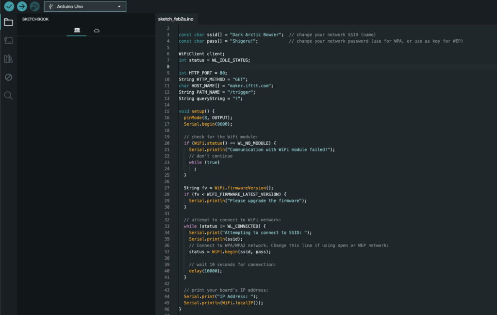
Perhaps no programming language has stood the test of time better than C. C is alive in so many ways – theres language derivatives such as Arnold.C, Objective C, C# and C++. C also is what you find under the hood of Python packages like numpy. C also still lives as its own language and is the preferred language for many embedded engineers. But (in our opinion) most importantly, C is the language of the Arduino!
We use the arduino controller to notify the driver when using our app. We have IoT-ified our solution by connecting the arduino to a wifi-connected endpoint. Because of this, we get to write C. Oh, the glory days. How beautiful to behold this relic that still lives on.
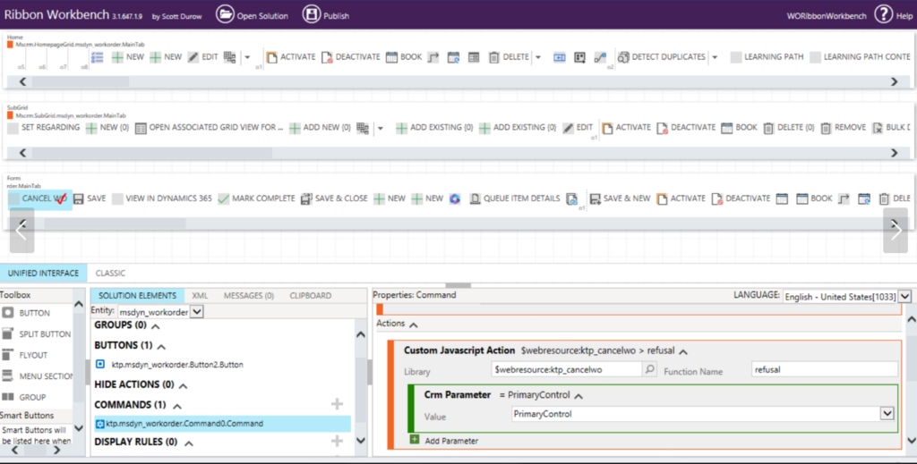
We all know that Power FX is supposed to revolutionize the way we implement new buttons the D365 ribbon. But we stick to the good stuff, we used the beloved XRM Toolbox tool Ribbon Workbench to implement a cancelling button for Donkey Kong, in order for him to save time cancelling Work orders:
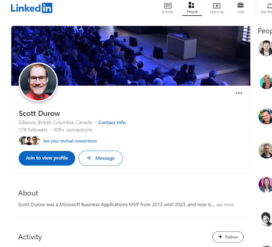
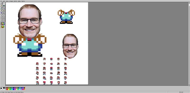
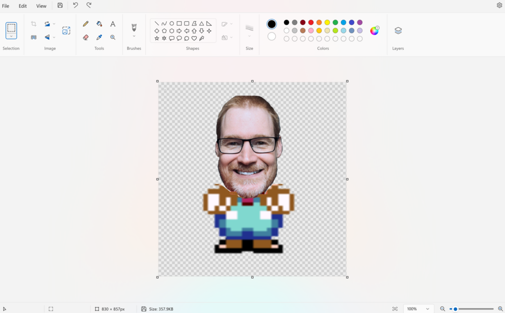
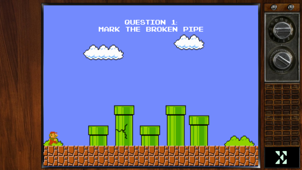
As we are using different main characters in our retro maze game, we figured out that it would be fun to design these characters using the retro graphic editor, paint. And to make it even more nostalgic, we used both the older version and the newer one.
First we found a photo of Scott on LinkedIn.
2. Secondly, we used the erase function in paint so we only have Scott’s face left. Then we put his face on top of a 2D Super Mario game body.
3. Thirdly, we had to use the newer version of Paint in order to get a transparent background, which we use in our game.
This is how the character Scott will look like in the game:
Based on the following article: https://synoptek.com/insights/it-blogs/evolution-of-microsoft-dynamics-ax/ X++ can be dated all the way back to 1998 (and maybe even earlier)!
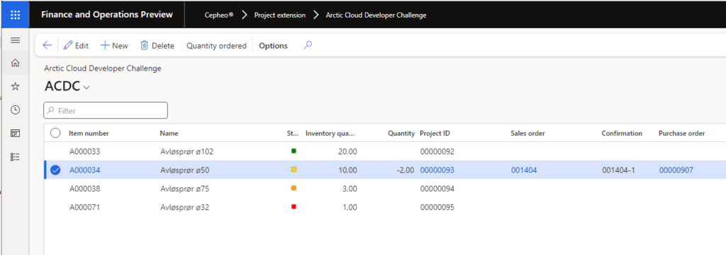
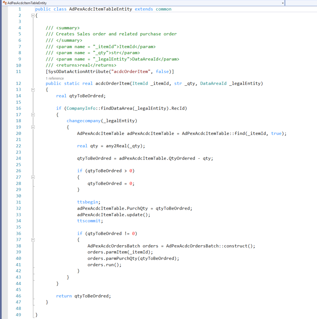
With help from our own wise wizard – AKA Grandfather/Frank – we have been able to create our own magic in FinOps. The screenshot below shows a customized screen of item number and item related information, in addition to purchase and sales order and project links:
With the help from X++ and Power Automate we are able to send order quantity to FinOps which automatically creates a purchase and sales order. And it does not stop here – it also creates a link between the purchase and sales orders, which is critical to understand what actually triggered the purchase order in the first place. Additionally, we link the orders to project as that would gain a lot of business value for industries such as the construction business. The code below ends with returning the quantity that is going through the order process, which triggers email to the Hololens-user with an order confirmation.
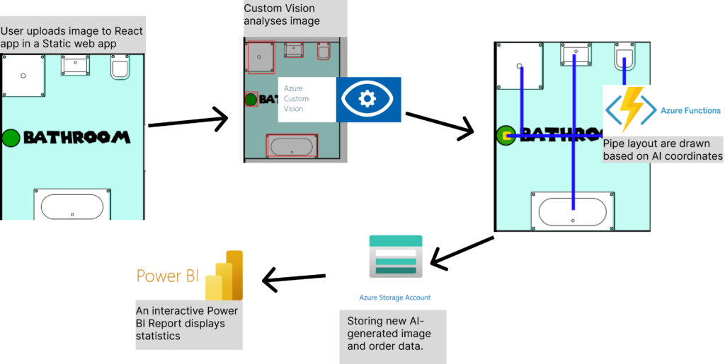
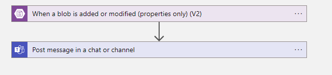
To make our amazing service Tubi work, a lot of cloud is needed. We aim to make the plumber’s job easier by recommending the best layout for where the pipes should go, and for that, we need AI. We have trained a model in Custom Vision to recognize all components in a bathroom that need water. So, when the plumber uploads a floor plan to our Static Web App, the image is sent to our Azure Function App backend in C# Asp.net through our own API. But both the image and the equipment list must be stored somewhere. Therefore, we have also connected to Azure Blob Storage. Then last but not at all least. The people working in the back office have instant interactive reports available to help them with filing and billing through Power BI and alerting the using an automated flow (Badges: Feature Bombing)
Sometimes it works, and that’s plenty
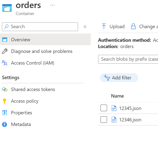
Databases are good, but sometimes it’s easier to just dump everything in one place until you need it again. Yes, it might not be very scalable or very normalized. SQL became too heavy, and we already needed a Blob storage to store the images, so we also dump the order data in the same blob storage as JSON files. It’s old fashioned way of serverstorage, and a bit dirty, but it works! (Badges: Nasty hacker, Retro badge)
Power the backoffice
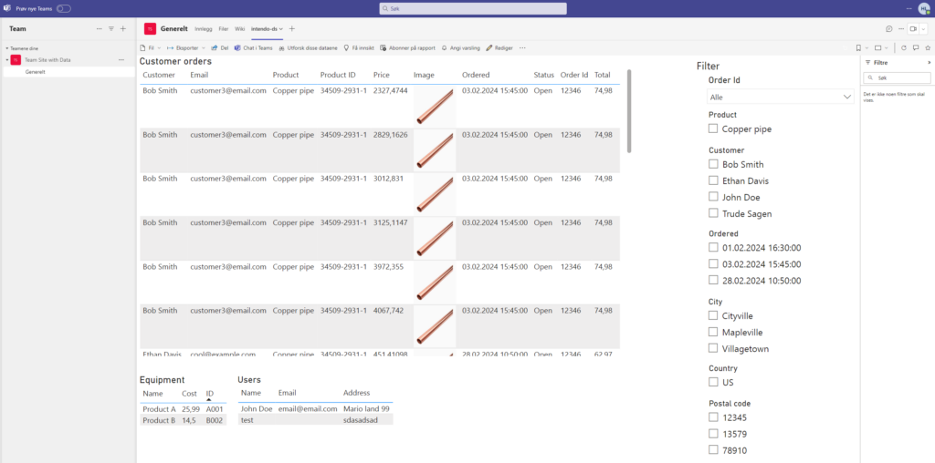
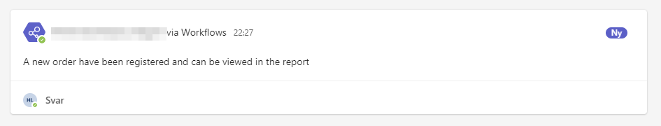
As the final list of components are decided, they still have to be approved from the accounting team in the office. To make sure they have all the information they require, we have developed a Power BI dashboard to crawl through our registered data and make sure the orders are handled properly (Badges: Crawler, Dash it Out, Dataminer). And to make sure the orders are handled easy and fast, the dashboard is embedded into teams and an alert is automated by using a logic app to make sure the workers can receive and cooperate in realtime (Badges: Embedding Numbnuts, Go with the flow, Pug N’ Play, Power user love, Right Now, Stairway to heaven).
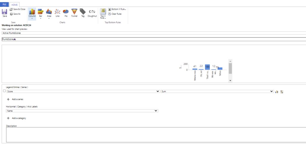
We have created a dashboard in dynamics, and in that context we feel obliged to ask for the retro badge at the same time. Dynamics is fun to deal with when it comes to a lot, but dashboard and charts feels like it has been collecting dust since 2008 (poor thing). Its reliance on outdated aesthetics compromises functionality and accessibility.
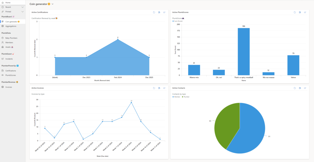
Our “PlumbBoard” shows the key values in our enviroment – Certifications Renewal – PlumbScore: The number of individuals trying to obtain certification through our ‘Plumber PowerUp’ games – Invoices: With an overview of when the invoices are due – Contacts: It’s also important to have some indications of our different memberships. In our case, we have plumbers and members.
Client Side Salsa – for the react code for PCF control
Hipster – for using node.js for secure communication
Right now – for socket io for real time communication with the active users in Model driven app
Nasty Hacker – for incredibly awesome solution with dirty hack on the model driven side
Power User Love – for using socket io with Azure Function in low-code power apps
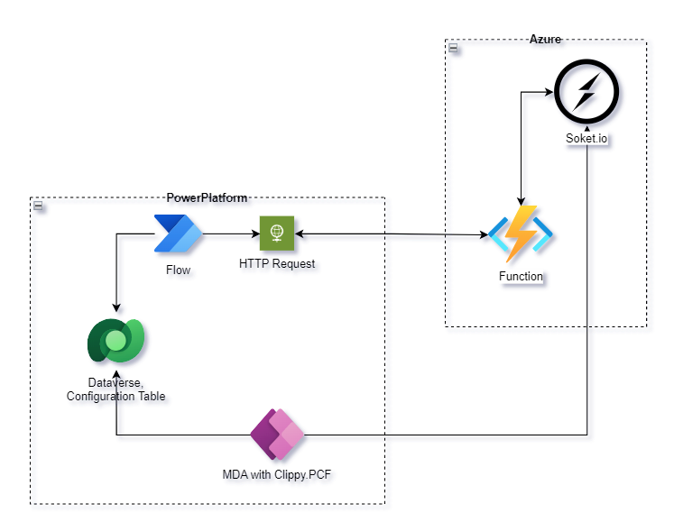
High Level Diagram
Implementation
All realtime communication is implemented via the soket.io that hosted on Azure.
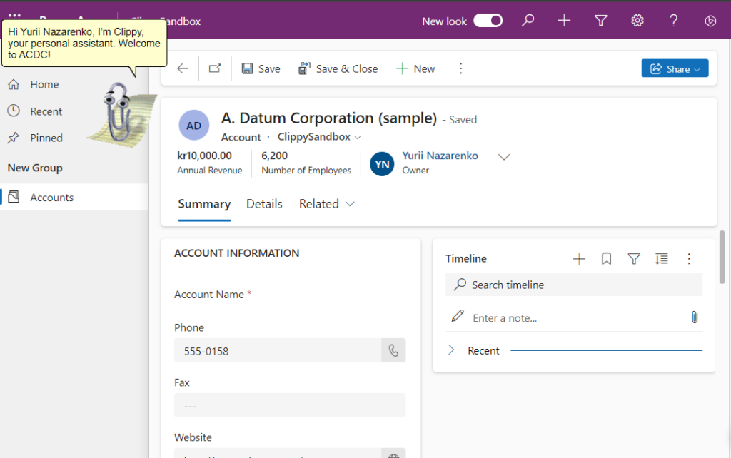
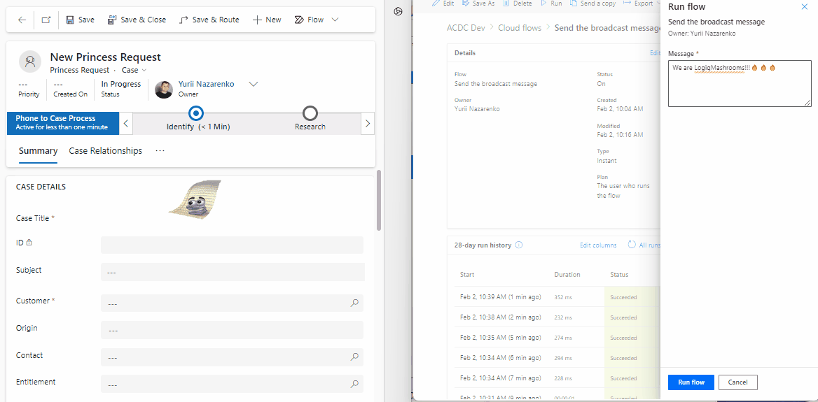
Project Update: Real-Time Communication and Enhanced User Interaction!
We’re excited to share the latest update on our project, featuring a significant enhancement in real-time communication capabilities. Now, administrators and backend integrations can seamlessly send messages to users who have opened specific records. This means that when there’s a change in the record status (e.g., case completion, modification), users will receive instant notifications prompting them to update their page for the latest changes.
This feature not only streamlines communication but also serves as a handy tool for various onboarding processes. Additionally, it facilitates users in understanding what has changed post the deployment of a new release.
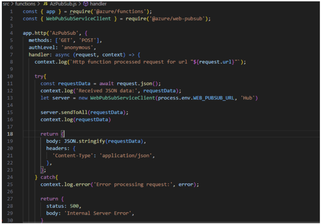
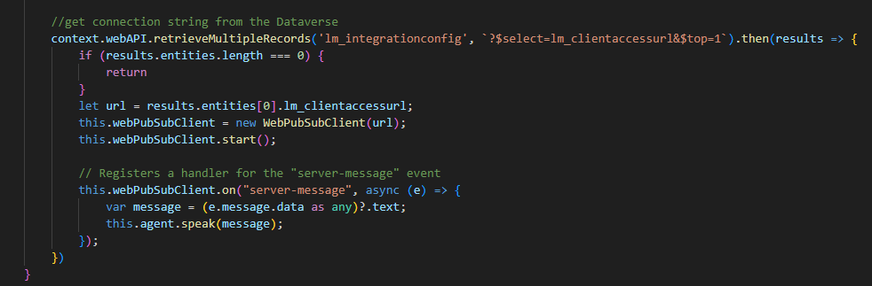
Behind the scenes, we’ve implemented Clippy PCF, built upon the ClippyJs project, to empower this real-time communication. Leveraging the power of socket.io hosted on Azure, our solution ensures swift and efficient message delivery.
Moreover, the backbone of the real-time communication lies in Azure Functions, written in Node.js. These functions diligently send out notifications to the socket.io instance hosted on Azure, creating a seamless and responsive user experience.
Exciting times lie ahead as we continue to innovate and refine our project to meet the evolving needs of our users. Stay tuned for more updates, and thank you for being a part of our journey!
Business scenario
It supports real-time communication. So, Administrator or backend integration can send the message to the user that has opened the record. For instance: backend integration changed the status of the record (case has been completed, changed, etc..), all user that has opened record will receive the notification that they need to update the page to receive the lates changes.
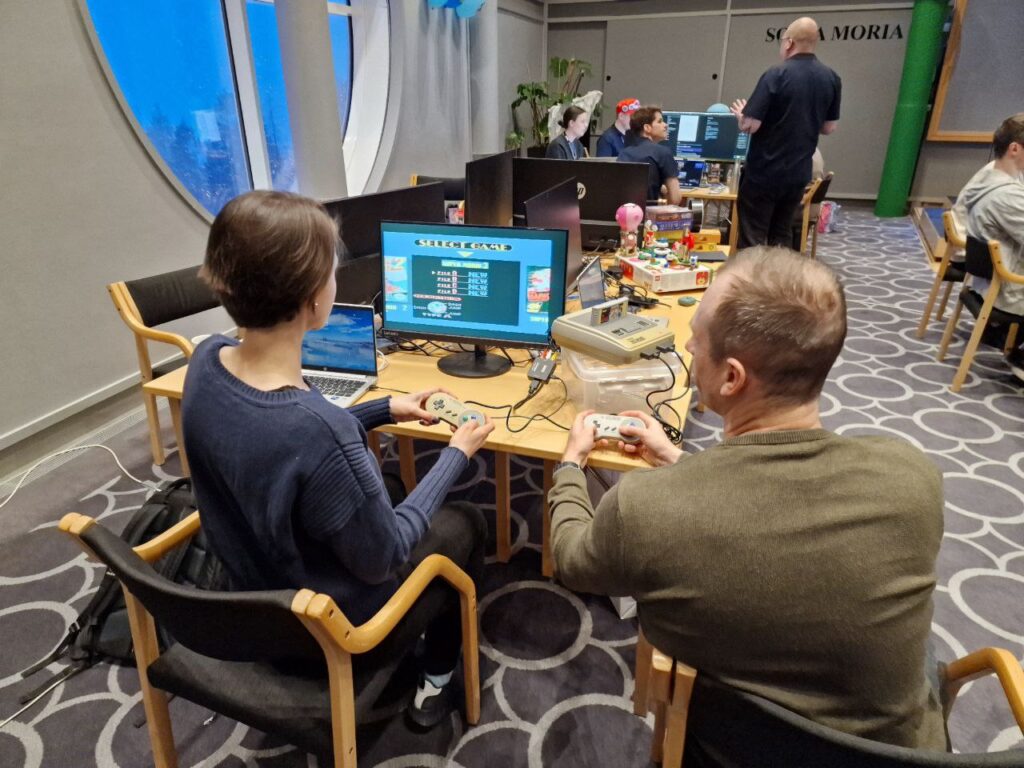
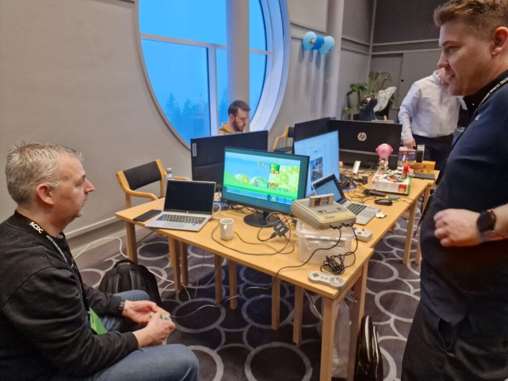
Happy Camper – for using a lot of extraordinary goods like Lego building, game consoles and a lot of sweets
Community Champion – for encouragin other teams build something cool, inspire by old nintendo and sharing the sweets
Remarkable Teamspirit – for keeping an incredible team spirit
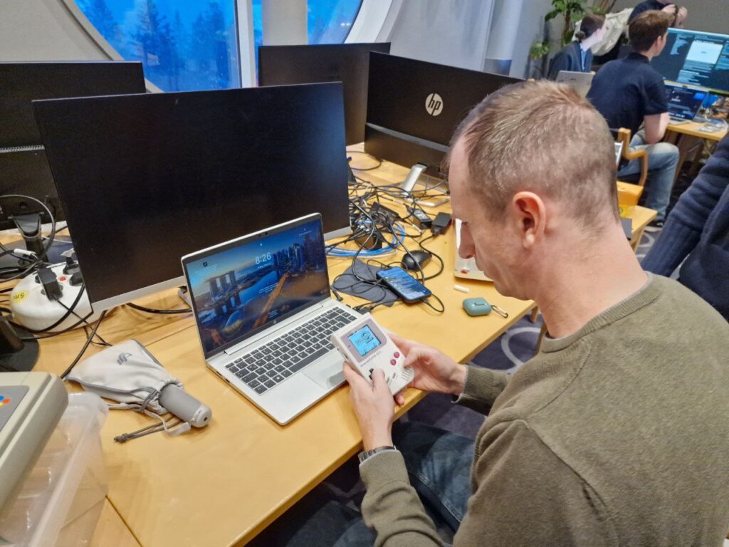
In a world where technology moves at the speed of light, it’s the nostalgia for the past that often brings us together, grounding us in the shared memories of simpler times. This sentiment is beautifully captured in the latest night update from Nintendo, a surprise that has sent waves of excitement through the team!
Now we have two oldest nintendos!
And the Nintendo GAMEBOY:
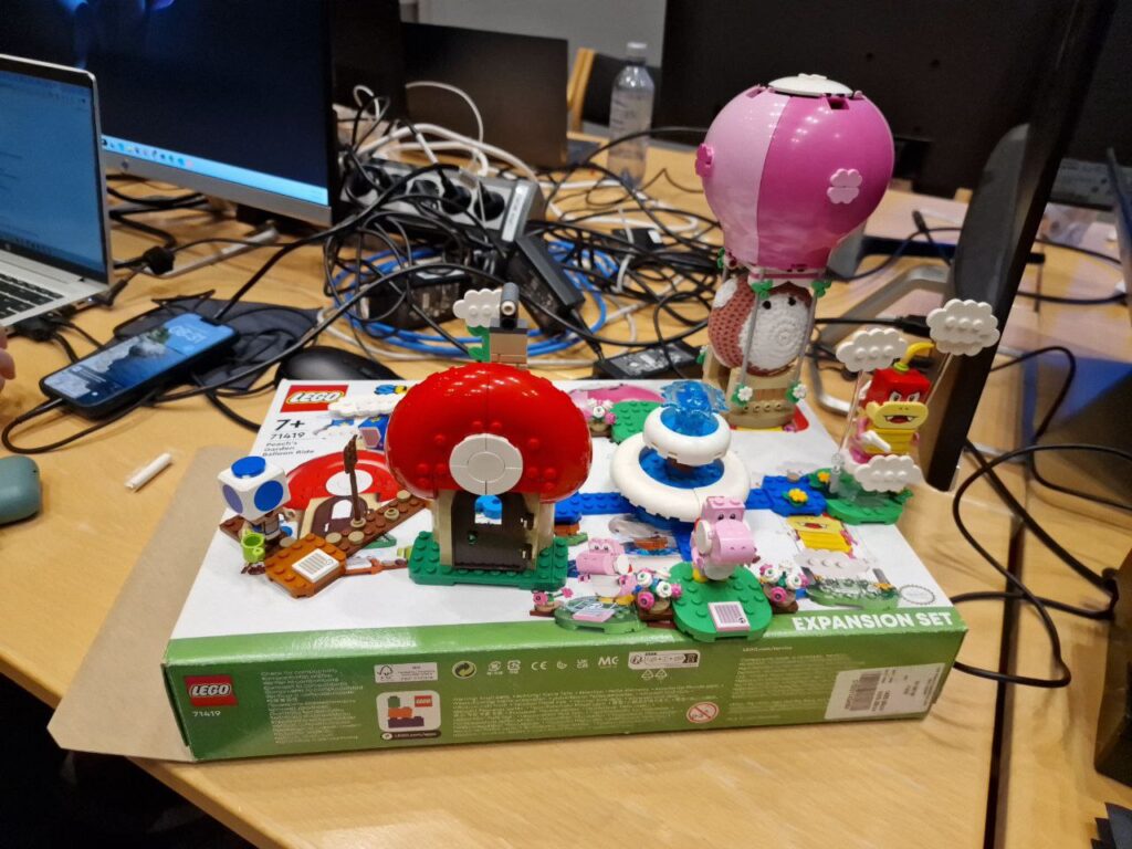
And, naturally, the LEGO serves to enhance team spirit.
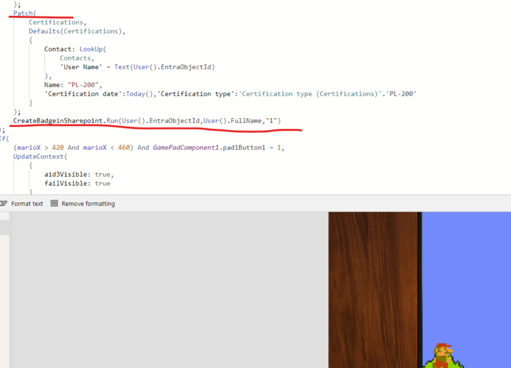
New aspiring plumbers can now apply do get rank 1 certification through our certificatior app. If completed a badge will be generated on SharePoint in the users own folder!
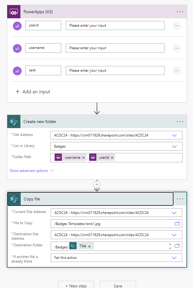
Go with the flow clairification: Heres the code that runs the flow (second red line) to create a user folder in sharepoint with the corresponding badge.
First updating data verse from the cansvas app – then triggering the flow in context of the authenticated user The actual Power Automate flow
Retro badge statement: I mean, look at the apperal used…. nothing more retro than that!
Thieving, shameless… Using unsigned gamepad hax code component to fire up the (retro) controllers, happenly stolen from John Lius Github: GitHub – johnnliu/gamepad (Thanks John) In addition we have stole more than a few dozens of original super mario assest from the dark corners of the internet ( dont tell anyone)!
1. Customer Service Portal To create the ticket/case that should be resolved. Add live chat support using real time Communications. We will be using Socket.IO as technology. 2. The Kiosk App and Device(iPad) is powered by AI and based on the canvas app. Business needs: Every solution requires some Marios(agents) to help the princess solve the problems. So, our kiosk allows you to create Mario’s profile: The avatar, skillset, and story will be generated based on your photo, and then Mario’s profile can participate in solving the cases for the princeses. (no personal data will be collected)
3. Model-driven app: Provide the opportunity to match the agents and manage the case-solving process in a more advanced mode.
4. Clippy
We traveled to past and get back with Clippy. Using PCF controls we managed to implement Clippy in model driven app. Our original plan was to connect Clippy to AI and use it to help users. When the App is updated and the user logs in for the first time it will show a notification and highlight changed parts. We were so impressed by Scott’s video of the copilot that we decided to add some familiar and modern features to the model-driven app. So we are glad to announce Clippy – your GPT-powered copilot. He will help you establish the most optimal process by providing insights based on AI. We found a very nice looking github library for implementing clippy with pcf.