The Final Solution: KoopaKonstruct Manager
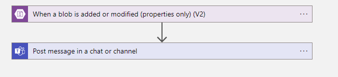
The BPMN diagram below is a simple representation of our KoopaKonstruct Manager.
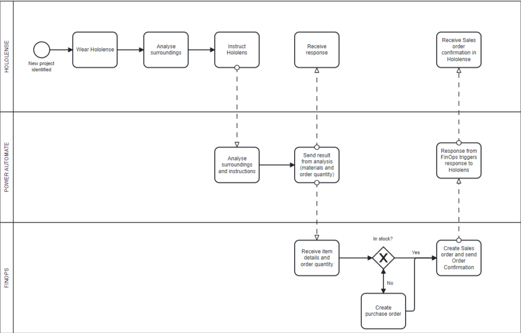
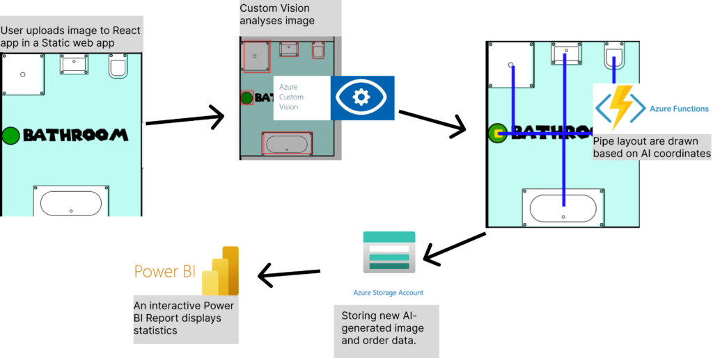
In summary we are using Hololenses to inspect a chosen area where we want to e.g. hang up a coat rack, build a table, and similar. In order to make the Hololenses smart, we have integrated OpenAI. We are using Function calling to provide instructions about the requested project, information about necessary materials and quantity.This is where we are making our KoopaKonstruct really smart.
As real #Crawlers we use OpenAI’s Function calling to dynamically create the search criterias based on natural language. Google Speach to text is used to capture the natural language query. We are really integrating into everything that flips bits #Embedding numbnuts! With help of the search criterias, we are able to provide critical information further into the supply chain, meaning all the way down to the FinOps where we are improving critical business processes (this will be explained later in this blog post).
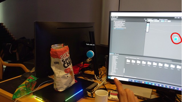
Below is a picture from the Hololenses where we use a button to speak with AI:
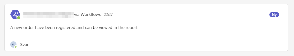
GPTVision helps us interpret work drawings and breaks it down into the steps needed, so that we can get a clear instruction of what materials we need, how many and how to build the desired object. Using Power Automate, we are able to share and send the item details and necessary quantity into FinOps.
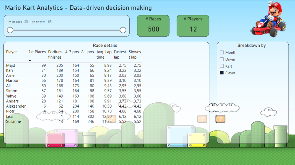
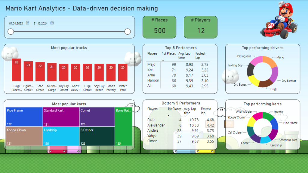
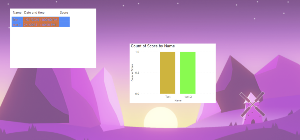
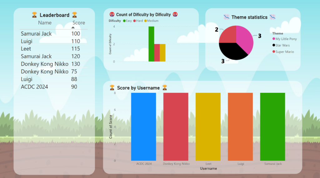
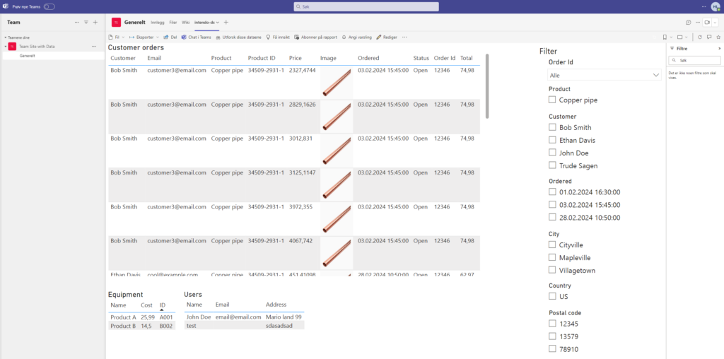
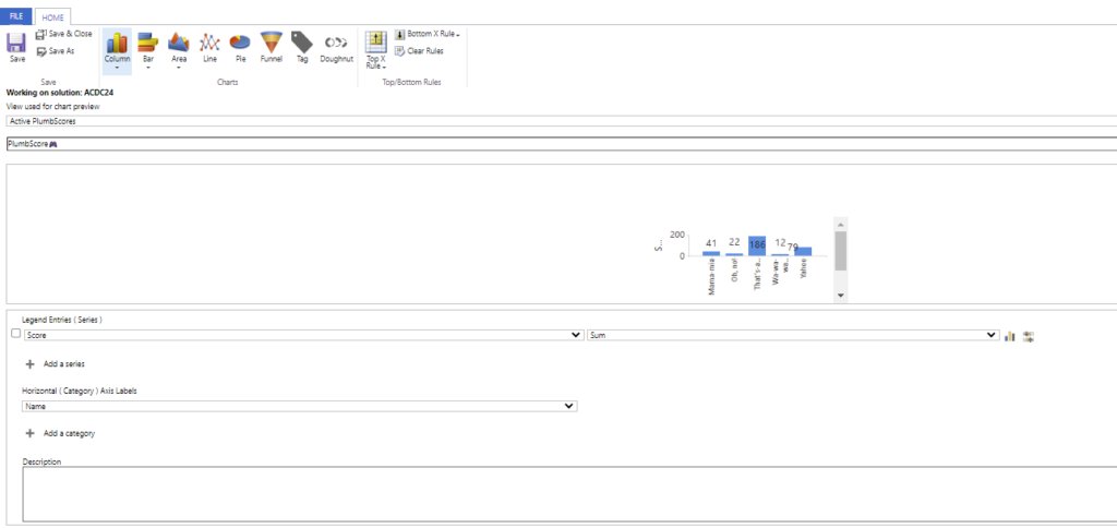
As an addition to the OpenAI magic, we have also created a canvas app that is integrated in the Hololense #PlugN’Play. From this app you can perform business processes, such as triggering sales orders, check inventory status, and 4 different Power BI reports to monitor sales orders and follow up late deliveries #Dash it out.
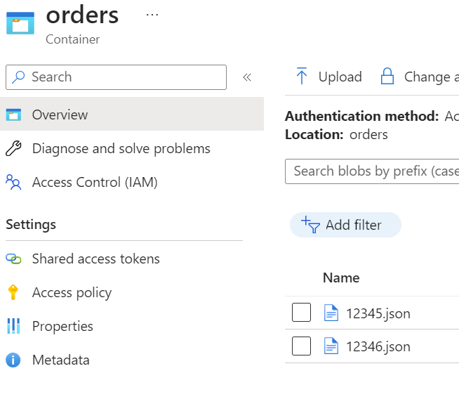
And here is where we really improve business processes; when the information is sent to FinOps we use X++ code to check inventory status. If materials are in stock, a sales order is created and sales order confirmation is sent. If there are no (or not enough) materials in stock, we also create a purchase order in addition to the sales order. A link between the purchase order and sales order is created, enabling the ability to understand where the demand is coming from. Additionally, to make the KoopaKonstruct Manager adaptable to e.g. construction companies, we have created the possibility to link the purchase and sales orders with projects. This provides a lot of possibilities for detailed project management for the finance geeks.
Below is our argumentation to why we believe we should score high on all 4 categories!
Most Extreme Business Value
Our team embarked on a quest to redefine the meaning of business value, and we present to you KoopaKonstruct Manager – a solution that not only orders products through Hololenses but catapults business efficiency into a realm beyond imagination.
Automating the Complete Supply Chain with Hololenses
We harnessed the power of Hololenses to revolutionize the way products are ordered. One user, equipped with the mighty Hololens, registers the necessary quantity with a mere wave of the hand, triggering a Power Automate flow like a seasoned Mario collecting power-ups.
The adventure doesn’t stop there! Our Power Automate flow seamlessly transmits the order information to FinOps using the Execute action. The magic unfolds as FinOps automatically generates a sales order and a purchase order based on inventory stock. But here’s where the plot thickens – these orders are not solitary entities; they are linked together, creating a dynamic duo that unravels the mystery behind each purchase. There is no need to spend as much as a second wondering how or why the orders were created; the link indicate that there is a demand behind each purchase order.
See yourself sitting in an ordering office at a company where the customers are able to generate sales orders by only entering a demand. And, in addition to the automatic creation of sales order, imagine that you did not have to study the master plan to generate the purchase order as it is automatically created! And as a side salsa, you did not even have to trigger the sales order confirmation as it is sent automatically. So, while you are sitting there wondering about what to do with your life (and how long it takes before the CEO finds out that you are useless as the power of Power Automate and X++ took your job), you can relax and focus on other more important things in life, such as playing a Super Mario game.
Power Stars: Automated Project Linkage
But wait, there’s more! We also increased the business value for construction and engineering enterprises. With the ability to automatically link both the purchase and sales orders to projects, we’ve bestowed upon industries that thrive on projects a golden opportunity to enhance their efficiency and project management. It’s not just about ordering; it’s about constructing a bridge to a new era of project-linked prosperity.
The Warp Whistle to Most Extreme Business Value
We make a bold claim for the “Most Extreme Business Value” category in this year’s ACDC Hackathon. Here’s why our adventure deserves the highest score:
- Efficiency: Our solution isn’t just about ordering; it’s about efficiency power-ups that automate the entire supply chain process, from order initiation to linkage in FinOps.
- Dynamic and Time-saving: The automatic creation of linked sales and purchase orders provides unparalleled visibility into demand and supply, laying the foundation for strategic business decisions.
- Project Linkage: For construction and engineering businesses, our automated project linkage is a treasure trove of golden coins, offering enhanced project management capabilities and business value beyond the ordinary.
- Adaptable: Our solution is not only limited to the B2B-market, but can also be used for the B2C-market. Making the app available to customers, they can create orders automatically and receive high quality service as the complete supply chain has become even more efficient.
Excellent User Experience
We have created a Super Mario inspired canvas app that is adapted into the Hololenses. In other words, our app transforms ordinary into extraordinary!
Features:
Killer AI
Whether you’re a seasoned AI veteran or just dipping your toes into the mushroom-filled waters of innovation, our solution is a testament to the power that AI holds in shaping the future.
KoopaKonstruct Manager is not just a game-changer; it’s a game-transformer. Through the mastery of machine learning, we’ve empowered our solution to evolve, adapt, and learn from the challenges it encounters. From predicting order quantities to optimizing supply chain processes in the real world (and in FinOps), our AI-driven approach is a power-up for efficiency and foresight.
In the quest for the Killer AI “crown”, KoopaKonstruct offers more than just automated processes. It also includes magic in form of predictive insights, providing a glimpse into the future of demand, supply, and project landscapes. Strategic decision-making becomes second nature as our AI-driven system transforms data into actionable intelligence.
A mind of its own
In the pursuit of the existential risk badge, our AI solution goes beyond mere execution—it thinks, learns, and adapts with a mind of its own. Through autonomous decision-making capabilities, it navigates the complexities of supply chain processes and provides responses not even a 20 year old is able to find without searching the web.
KoopaKonstruct isn’t just smarter than a 5th grader; it engages in intelligent conversations that transcend the limitations of a classroom. It doesn’t just provide answers; it grapples with FinOps and supply chain complexities, understands nuances, and offers insights that reflect a level of intelligence resembling a dynamic dialogue.
Why KoopaKonstruct Manager deserves the Killer AI “crown”
- Innovation Beyond the Blocks: KoopaKonstruct isn’t confined to the traditional boundaries. It breaks through the blocks of conventional solutions, paving the way for a new era of AI-driven innovation.
- Adaptability in Every Pixel: Our solution dynamically adapts to the ever-changing business environment, ensuring resilience and adaptability in every pixel of our solution.
- Mind Mastery: Our AI isn’t just a tool; it’s a mastery that elevates KoopaKonstruct into a symphony of efficiency, intelligence, and strategic foresight.
Pandoras Box
Equipping a Hololens with AI that can answer questions, order materials, and assist in selecting the right materials and tools for any project based on online instructions transforms DIY into an accessible experience for the less handy. This technology takes the guesswork out of building, offering tailored advice on what to build, the best materials and tools for the job, and even suggesting projects that match your interests and available space. It’s like having a personal tutor and assistant rolled into one, guiding you through the entire process from conception to completion. This seamless integration of technology with hands-on work not only makes crafting projects more approachable for beginners but also enriches the experience with educational value, ensuring that anyone can undertake and succeed in their DIY endeavors with confidence.