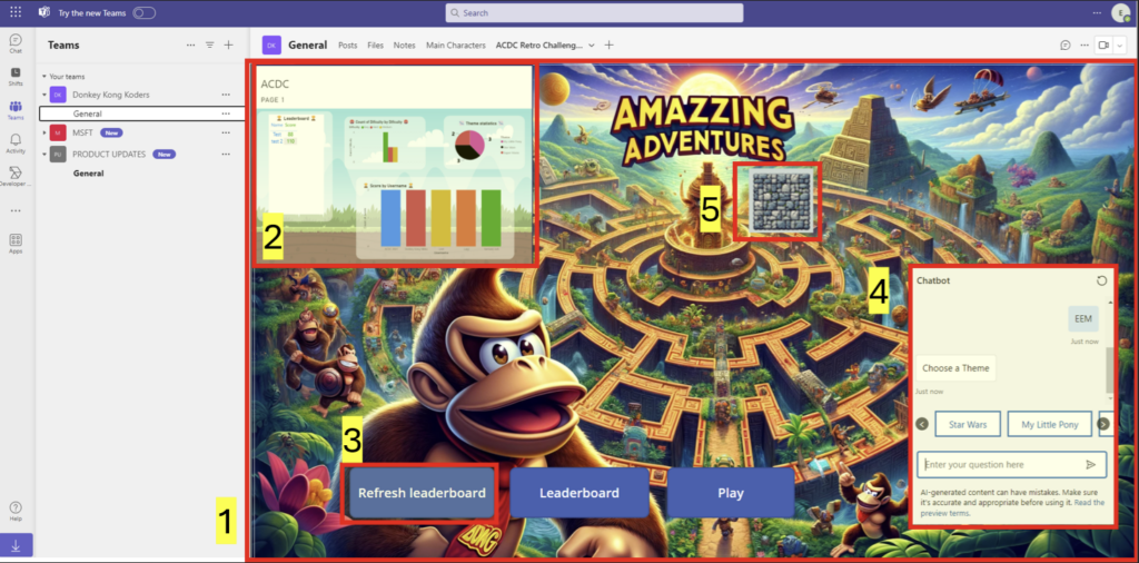
Our project’s crowning glory is the integration of an array of user features within a single screen, a feat that not only meets but exceeds the criteria for the Feature Bombing badge. This dense yet intuitive design includes the Power Page, PCF component, Highscore component, Power BI for current progress, and a Chatbot. Each element is crafted to complement the others, providing a comprehensive, engaging user experience without overwhelming the interface. This strategic feature cramming showcases our team’s ability to balance complexity with coherence, ensuring every addition delivers value and enhances usability.
As we conclude this intense development phase, our array of badges reflects more than just our technical achievements; they’re a testament to our team’s innovative spirit, collaborative ethos, and unwavering commitment to excellence. These badges aren’t just accolades; they’re milestones on our journey of learning, growth, and contribution in the dynamic world of hackathons.
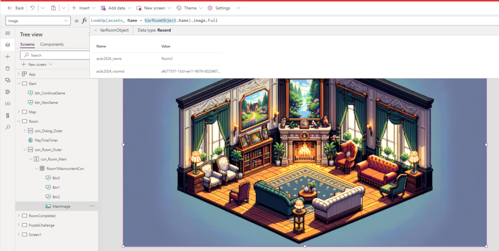
We have done the ultimate feature bombing in our canvas app. Our game app is solely relaying on data from tables in Dataverse. By creating a good Information Model with relations we have structured the data in a way that makes our App development way more dynamical.
The User progresses through the game by solving puzzles in different rooms. We use the same screen in our app to present every room. The Room is then populated with excercises based on information in our dataverse table.
This means that we can expand the game just by adding new Rooms, and excercises and link them in our dataverse table.
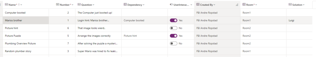
And don’t forget the fact that we differentiate on the tasks/excercises and if they are so complex that they need to break out in a different screen – or if its a simple information or user interaction – then we show a pop-up dialog on the same screen. All ofcourse – determined by the excercise type defined in the dataverse table.
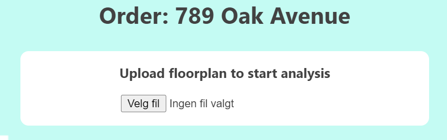
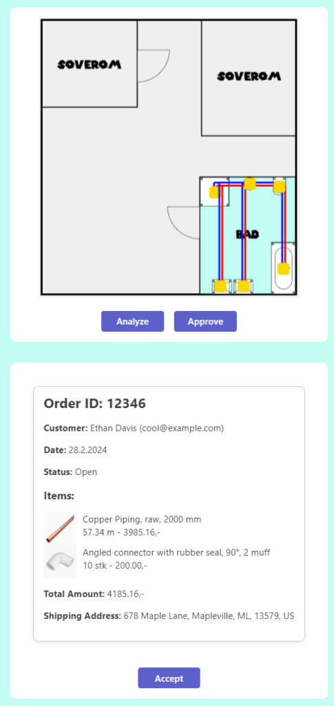
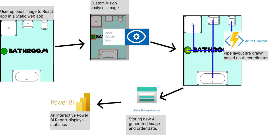
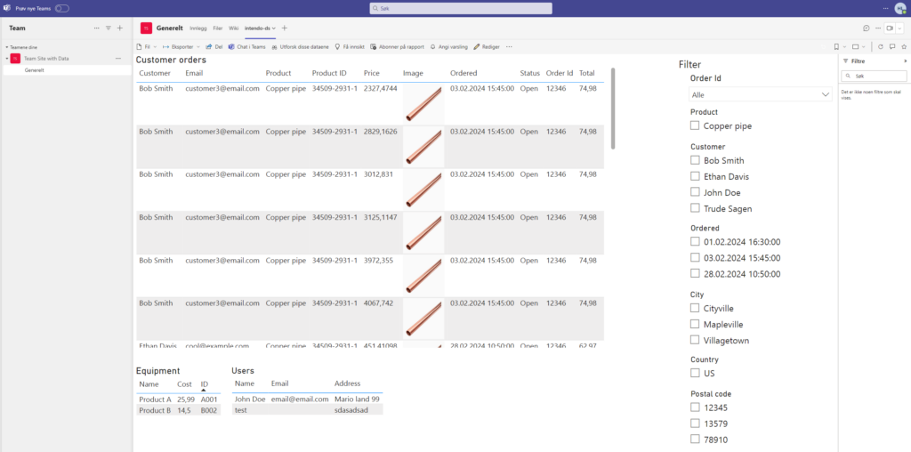
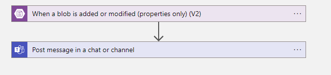
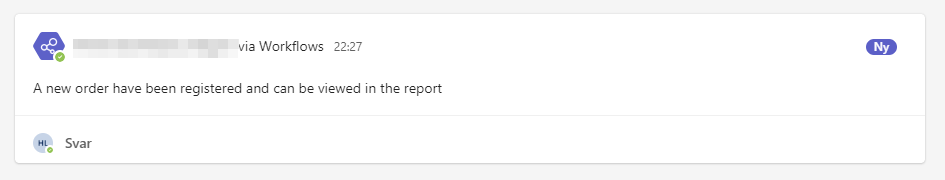
To make our amazing service Tubi work, a lot of cloud is needed. We aim to make the plumber’s job easier by recommending the best layout for where the pipes should go, and for that, we need AI. We have trained a model in Custom Vision to recognize all components in a bathroom that need water. So, when the plumber uploads a floor plan to our Static Web App, the image is sent to our Azure Function App backend in C# Asp.net through our own API. But both the image and the equipment list must be stored somewhere. Therefore, we have also connected to Azure Blob Storage. Then last but not at all least. The people working in the back office have instant interactive reports available to help them with filing and billing through Power BI and alerting the using an automated flow (Badges: Feature Bombing)
Sometimes it works, and that’s plenty
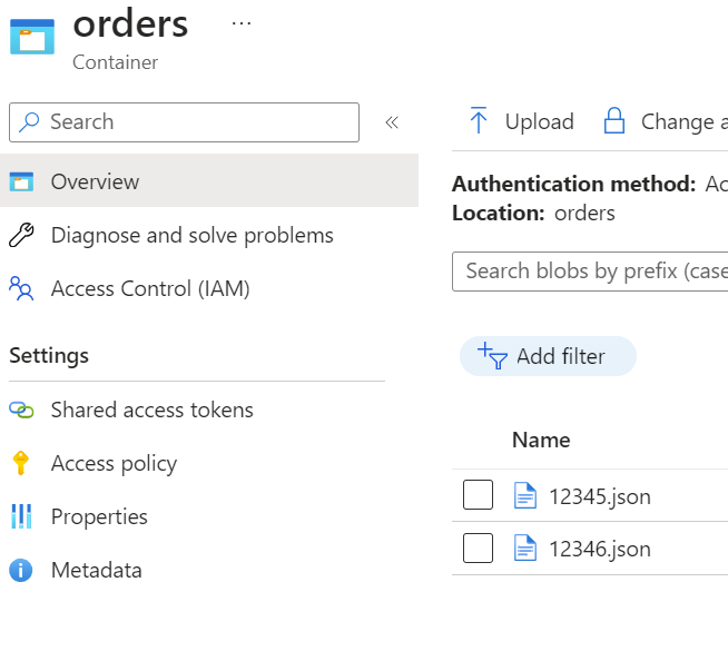
Databases are good, but sometimes it’s easier to just dump everything in one place until you need it again. Yes, it might not be very scalable or very normalized. SQL became too heavy, and we already needed a Blob storage to store the images, so we also dump the order data in the same blob storage as JSON files. It’s old fashioned way of serverstorage, and a bit dirty, but it works! (Badges: Nasty hacker, Retro badge)
Power the backoffice
As the final list of components are decided, they still have to be approved from the accounting team in the office. To make sure they have all the information they require, we have developed a Power BI dashboard to crawl through our registered data and make sure the orders are handled properly (Badges: Crawler, Dash it Out, Dataminer). And to make sure the orders are handled easy and fast, the dashboard is embedded into teams and an alert is automated by using a logic app to make sure the workers can receive and cooperate in realtime (Badges: Embedding Numbnuts, Go with the flow, Pug N’ Play, Power user love, Right Now, Stairway to heaven).
Our main goal with this years ACDC was to make the workday a lot easier for both the Pirate Planners and the Pirates itself. We had identified that the use of Finance and Operations standard functionality for both planning and Employee Self-Service is far from easy and user friendly to use. Therefor we decided to use these days to create this:
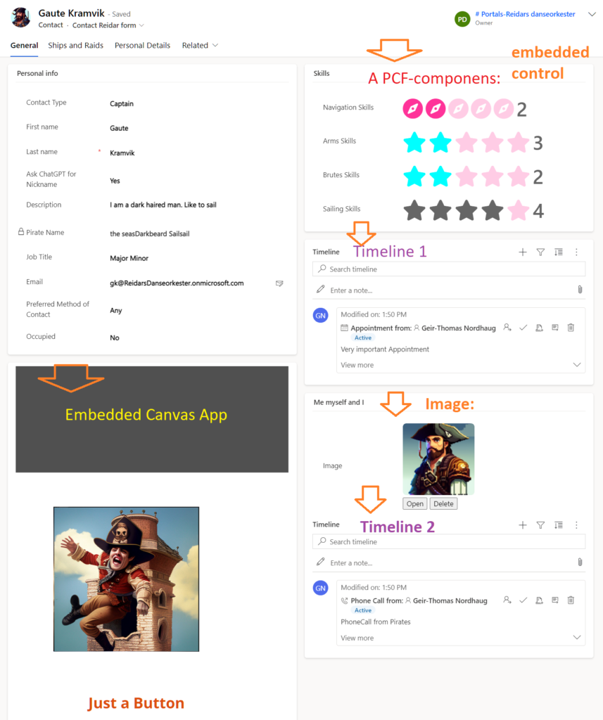
A Model driven app for the Pirate Planners to use when they plan for what raid what pirate should be on, based on the skills that pirate has. This Planner app receives all the data it needs regarding the raids/projects and the pirates with skill profile directly from F&O, so that they always have the up to date data to work with as this is crucial to be able to do the correct planning.
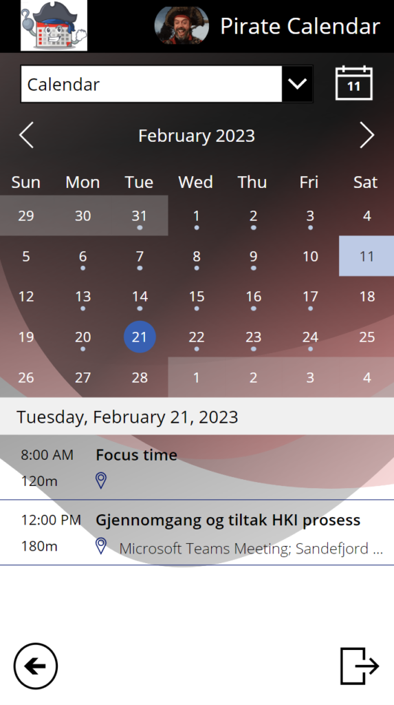
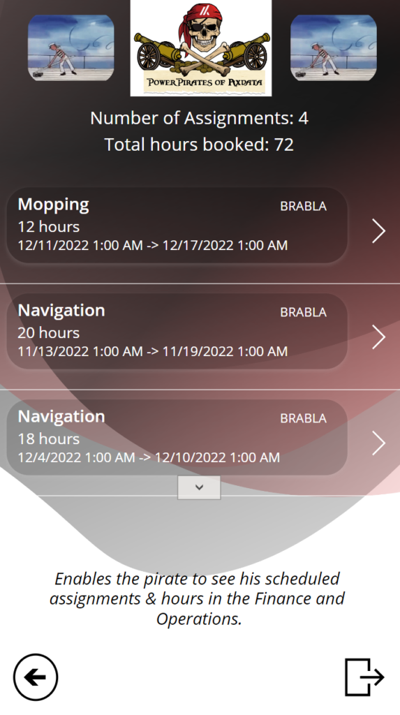
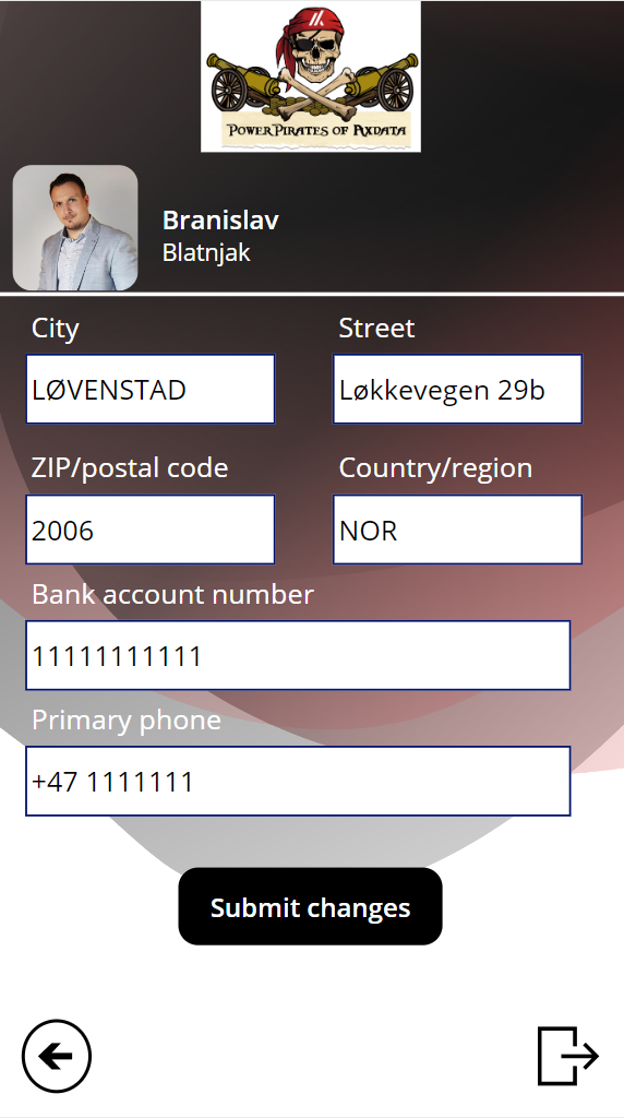
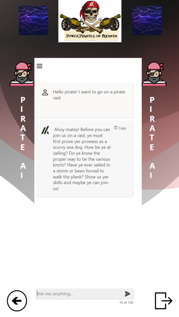
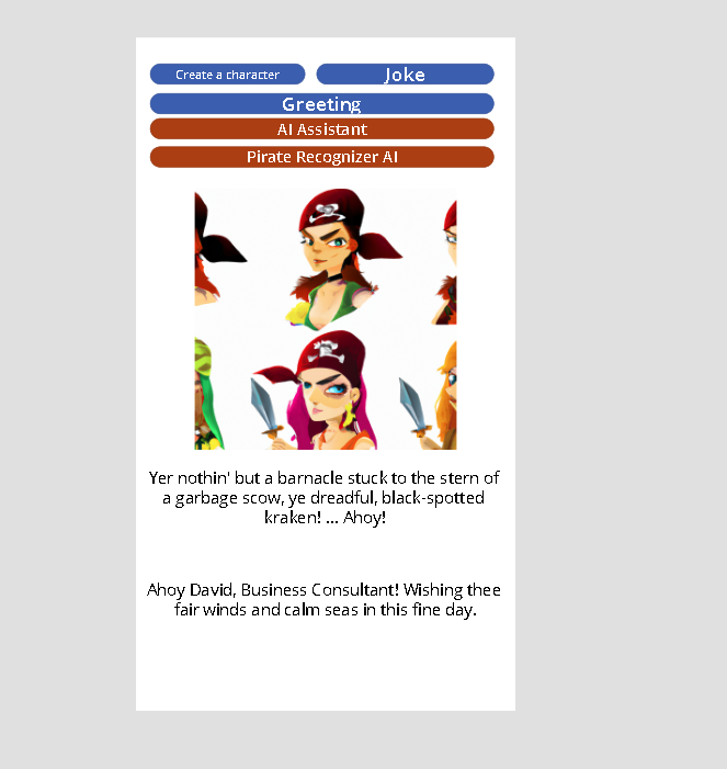
A Canvas app for the Pirates to use on their mobiles, where they can see and update their personal information while the app talks directly with F&O, accsess other information that is relevant for them that we have integrated into the app like your calendar and meeting, let you see where the Planners has booked you, an AI chat that can give you answers for whatever you want and more.
PowerBI reports showing what the Planners have planned for in the different raids and other relevant information.
And, to make it easier for you judges, here are the reasons why we think we deserve a lot of points in the different categories:
Excellent User Experience:
Our entire idea before the ACDC was that we wanted to create something that gives everyone that struggles with the user experience in F&O a better workday, every day! The solution we now have created will give all the Planners out there a new, innovative and very user friendly way to plan their pirates and other resources with the data that is already in place in F&O. And, for every pirate and other employee in the company, their experience with the brand-new mobile app for Self-Service, they difference from what they experience now in F&O is almost impossible to describe! This is so much more user friendly, cool and awesome that they will be amazed!
Most Extreme Business Value:
As we have said before, this work is not easy for companies using it today. We know that for example with planning, many companies have a excel sheet that they update manually with data from F&O to do raid/project planning. All of these companies will be thankful that we created this Model driven app these days, as it really will both save them time, make sure they always have the correct data to work with, and give the company a much better up-to-date overview over how their pirates and employees are booked the next weeks.
And if that wasn’t good enough (to be honest, we first only planned to create the solution over, but we also wanted to do something very good for all the pirates, not just the planner), the Canvas app will give a huge business advantage to all companies using F&O! Even if they don’t do Planning for their resources, they can of course still use the Pirate app for all their employees, where they can show and give the employees the possibilities to do everything they do in F&O as Self-Service today, and we can include whatever other data or solutions they use directly in the mobile app so that the employee gets all the information and possibilities they need in one place instead of having to go several places! And, the app will of course be teamed with the companies logo and colors, so that for the Employee, the experience will be that this is an app only for them!
Rock Solid Geekness:
When we are three low-code and two no-code pirates going to a Hackaton, then something we really wants to learn more about is code and Geekness. We have learned a lot and used react and Node.js as you will see in the solution under, and all the time we have spent drilling into how to use the data from F&O correctly in POwerPlatform… Phu, we now know a lot more about many more tables and data coming out from F&O and how we can use it than what we did before. And, that ladies and gentlemen, is rock solid geekiness in the ERP world!
Killer App:
The way all components in this solution is tied together, really is what makes it a Killer App! We have connected F&O to a Model driven app and to a Canvas app, and the canvas app updates data back in F&O. In addition to this, PowerBI collects data both from F&O and the Model driven app, to show the reports we want. We have also extended the Canvas app to have so much more information that is relevant for the Pirate (and remember, the canvas app also shows information from the Model driven app regarding how they are planned!). When all of this is connected in a solution we now only have used 3 days to build, yeah, this deserves a lot of point! If you haven’t worked with F&O data in PowerPlatform before, then it’s hard to know, but this not straight forward.
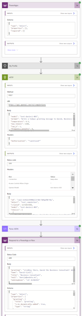
Screenshoots of the Pirate Planner app and the technology used to fill it with data (with explenations under the pictures):
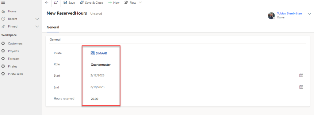
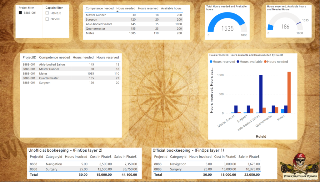
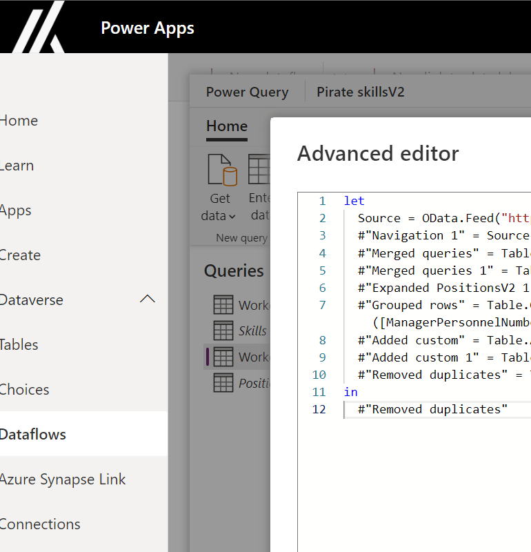
For the captain to check the various available project raidsOnce the project/raid is selected, you set what assignement you want to rederve hours forAnd then you reserve the piratePowerBI report that shows the info needed from the model driven Planner appTo save time without a datalake when gathering data from F&O we use the old and lovely tool PowerQuery inside Dataflows
Screenshots of the Pirate app and the technology used for that app (with explenations under the pictures):
Frontpage of the appView your calendar and meetingsView your bookings coming from what the planners has done in the new Planner appView your information from F&O and directly update the infor in F&O when you submit changesOpenAI embedded chat for the Pirate to use to whatever!PCF code used to integrate a PowerApps Custom Control to run the Node.js (shown under)React and Node.js web app on Azure used for the OpenAI chatbotCustom connector for Microsoft Graph API we have built to get picture and other data for the logged in user of the Canvas app.Custom connector codePowerAutomate to give you the greating of the dayPowerAutomate to find jokes/insults
And what has this even given us?
Why we have clamied the badges we have in this post: ACDC Craftsman: For the entire solution, how it all is connected and works! Dash it out: The PowerBI report for the data fra F&O and model driven app Client side salsa: For the OpenAI embedded chat using react and node.js Retro: For using PowerQuery to collect data from F&O Feature bombing: For this fun screen in a canvas app that gives you a lot of features at the same time:
Thank you all for an amazing event!! This has been so much fun and we will definetly be back next year!
When plundering and sailing keeping track of pesky DM’s is no job for the captain or crew. This’ why we summoned the services of Power Automate and Power Apps to do our bidding: Enabling our ship to run smoothly and commands being forwarded at the correct time to the correct people.
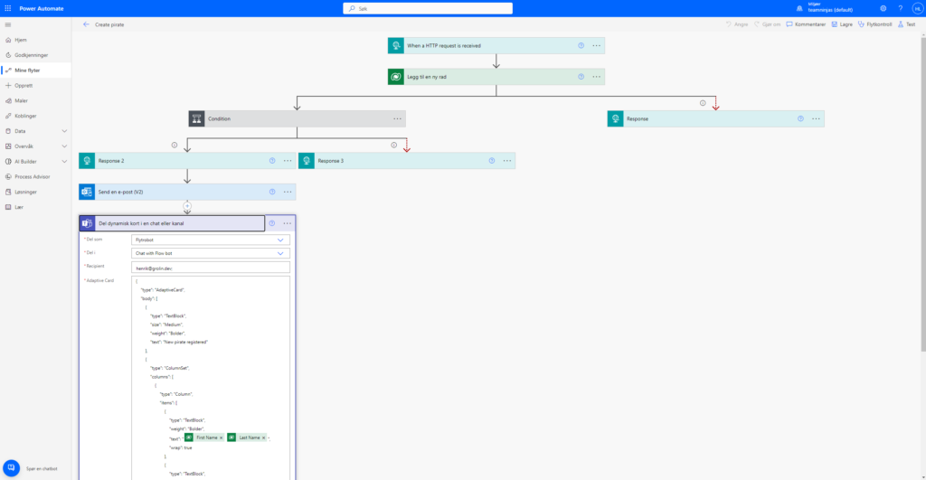
It all starts with the Consumer of Data “Power Automate” who collects data from all our different intelligence points. Working in the shadows, this ghost can be attached to any workflow. Currently, since it thrives on human flesh for its operations, we started by attached to our crew log. Whenever Power Automate smells the fear of a new deck hand, laddie or lassie onboard it goes to work!
On a new pirate record Power Automate does two things:
Creates an Adaptive Card in teams and posted it to the ships group chat
Sends a welcome e-mail to the fresh pirate, explaining how they need to obey or walk the plank (all pretty standard pirate stuff).
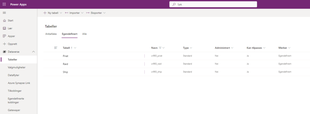
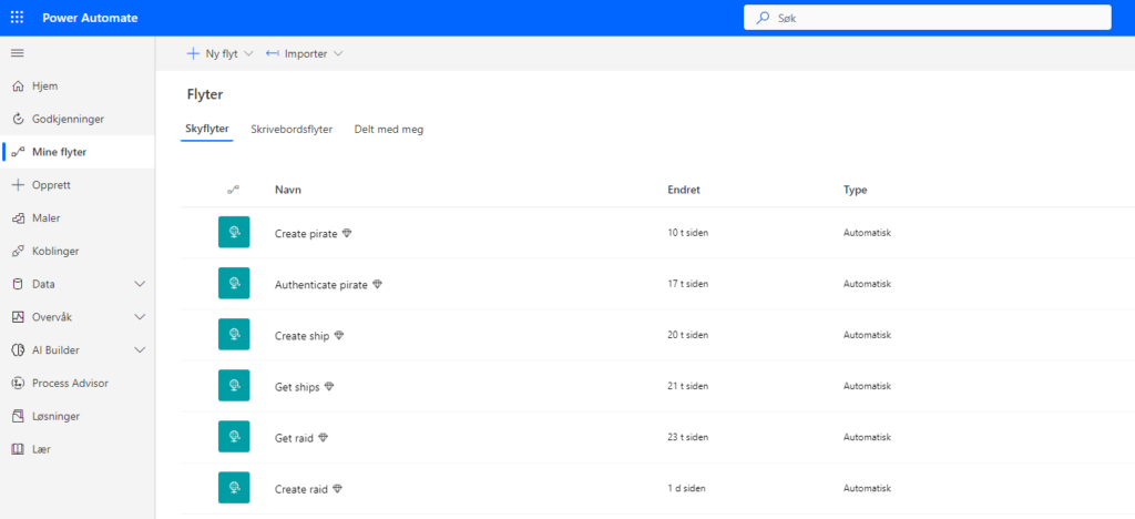
Current Dataverse Tables the flow can write to and read from.Power automate flows that creates and updates records, when records for pirates are updated we trigger a Teams Integration.
Making the Captain’s work Screen Agnostic
We further improve the Captain’s life with Power Apps connected to the Power Flows. The Power App sits on the users phone, implemented via Teams or as a standalone app, and enables the Captain to administrate the crew roster, so any stowaway can be added to the crew and receive the required e-mail package with plank rules and NDA’s. This mobile approach lets the captain be in full control even when venturing away from his cabin and the desktop computer therein.
Screen snippet showing Power Automate triggering Teams Adaptive Card on new shipmate record.
The convenience of having the Power Apps in teams means the captain can manipulate his Ship, The Raids and roster from any surface, be it mobile, desktop og even tablet!
Screen snippet showing the Power App integrated into a Teams. Notice the responsive nature of teams adapting to any viewport.
Using Power Apps means we can also simulate raids adding new test data on the fly, without it needing to come from our Power Automate flow.
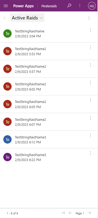
User generated Raids in the raid table, created directly within Power App.
In Summary, for Sleepy Pirates:
The Power App enables our users to directly manipulate our data storage.
The Power Automate allow other sources and application to remotely access our data.
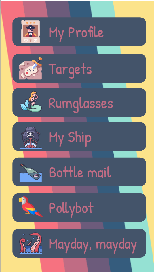
This is every pirate’s best friend and a must have!! Loaded with awesome features this killer app should be installed on the mobile phone of all pirates in your organization.
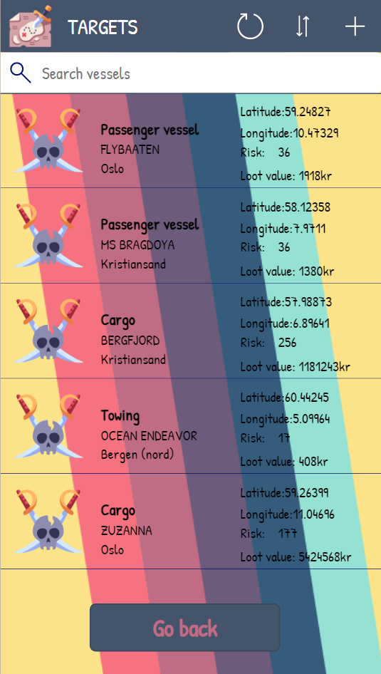
Targets
Get a quick overview of your targets. Once a ship has been become a target in Dynamics 365, you will be able to see it in your mission overview. This is perfect when you have a long day of plundering i front of you and need to know which ones to do next.
Rumglasses
Have you ever been too deep in the rum bottle and close to do something stupid with what you believed to be a mermaid out on the seven seas? Or maybe you actually did and are now in for a hard time facing your mates with humiliation and regret?
Not anymore! Rumglasses let you take a picture of your believe-to-be mermaid and tells you if you are right or not. By training an AI to recognize and distinguish manatees from mermaids you can now relax.
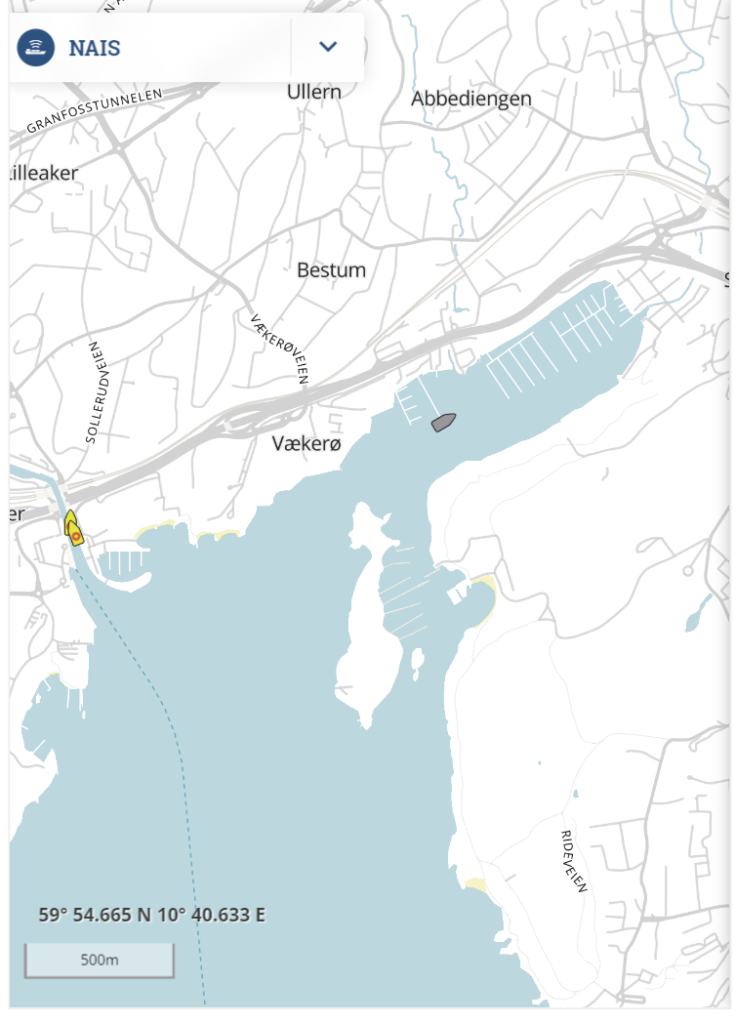
My Ship
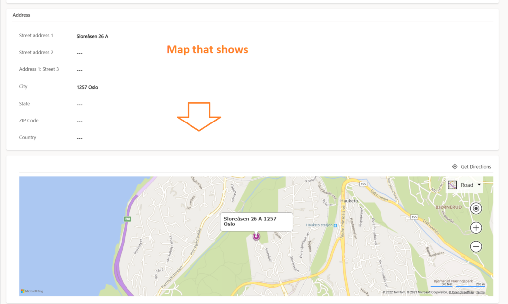
A map showing your location when out on the seven seas. You will se both your ship on the map and all other ships in the area. This is how you know you are close to your target when out on a plunder. The best part is that military or law enforcement ships will occur on the map as well so you can wait until the right moment before attacking the target.
Bottle Mail
Communicate with your mates by using bottle mail – a feature for sending email when you are on the fly. It suggests recipients in you address book or you can write to a pirate outside your organization. This way, you don’t have to switch to another app (email client) to send messages to your crew.
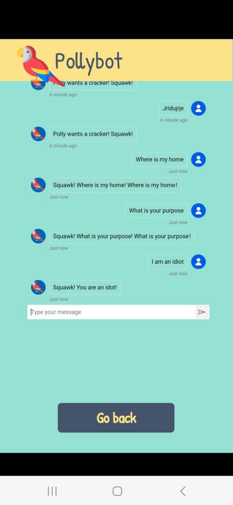
Pollybot
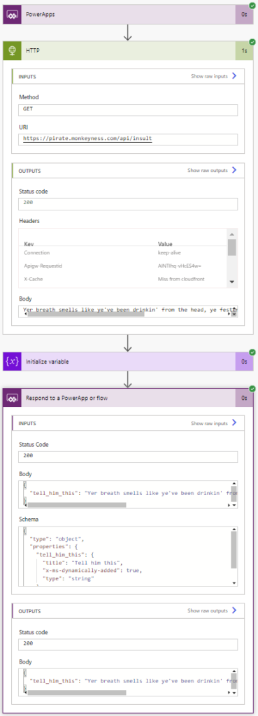
You are not a real pirate unless you have a parrot. Unfortunately (or luckily) there are laws about how to treat your animals today that did not exist in the old glory days. It might not be appropriate to bring it with you on a raid :/ This is where Pollybot comes to the rescue! Your own digital parrot who you can talk to, ask questions and keep you with company. As a real parrot, it sometimes answer your questions, but most of the time you will get an insult or just nonsense in return. But that doesn’t matter! Where a real parrot will fly away to save itself, Pollybot will always stay close.
Mayday, Mayday
When Jack Sparrow was stranded on a desert island, he managed to escape by tying his back hair together and catch a couple of sea turtles who gave him a ride back home. As fun and comfortably that sounds, not all pirates are equipped with back hair that long. However, most of us got their phone in their pockets at all times!
Whether you are stranded at a desert island, your ship is about to sink or you are stuck in a safe full of treasure, this feature will save you.
When using the mayday function your coordinates are then sent to a email address monitored by you crew so they can come and pick you up. If your mates prioritize your request is however another matter.
Because of the fancy design, the use of AI and the huge amount of useful features in this app, we hereby claim the Glossy pixels, Existential Risk and Feature Bombing badges. We also claim the Power user Love because the app is created in Power Platform 😀 #ProCodeNoCodeUnite