Before the hackathon we used some hours doing research, which included doing use research. Sofie on our team had experienced that renovating a bathroom includes a lot of back and forth between plumber, carpenter, project manager and several other people. It took more time then it needed to, to finish the bathroom due to bad communication, jo flere kokker, jo mere søl/Too many cooks spoil the broth.
We talked to two amazing plumbers, first asking a random question:
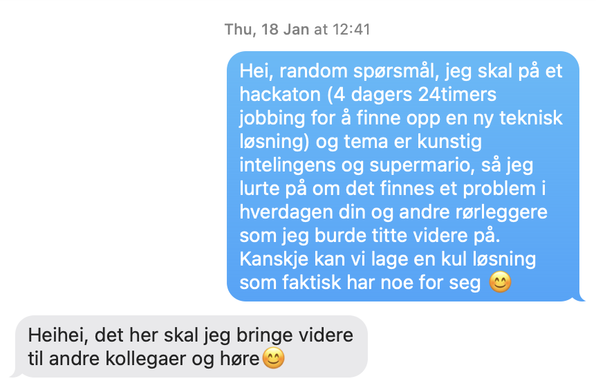

They, and their colleagues wanted:
– A pipe planner for when they renovate a bathroom
– Supply list with which pipes and other equipment
– Pipe (hehe)line for all the workers including in building a bathroom
Sofie wanted:
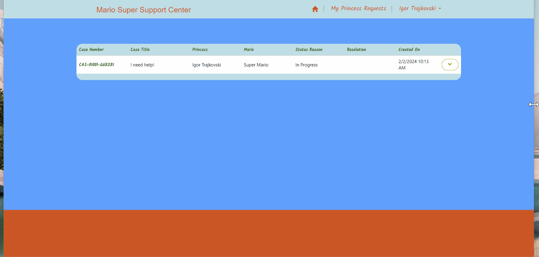
– Certificate of completion automatically …
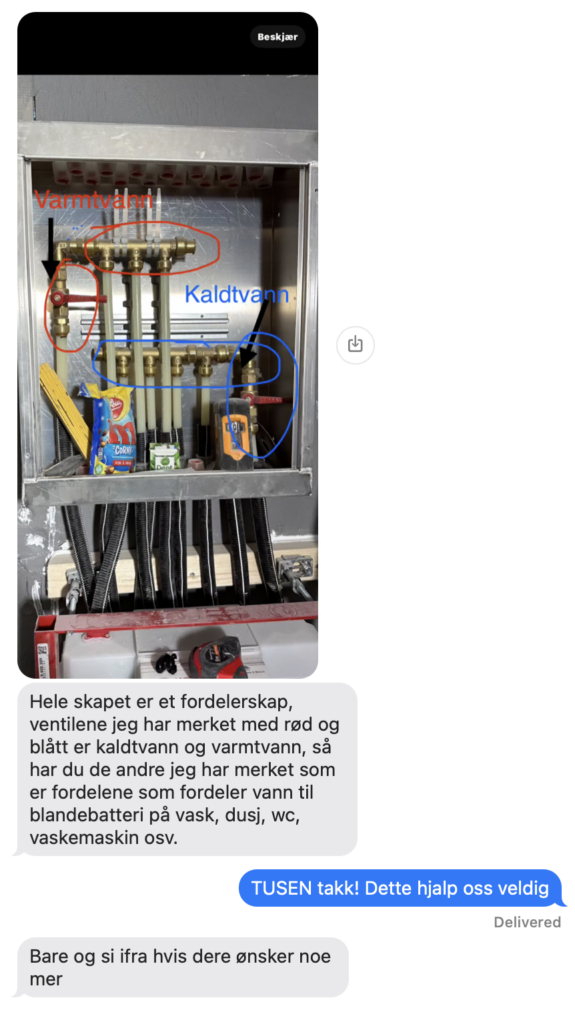
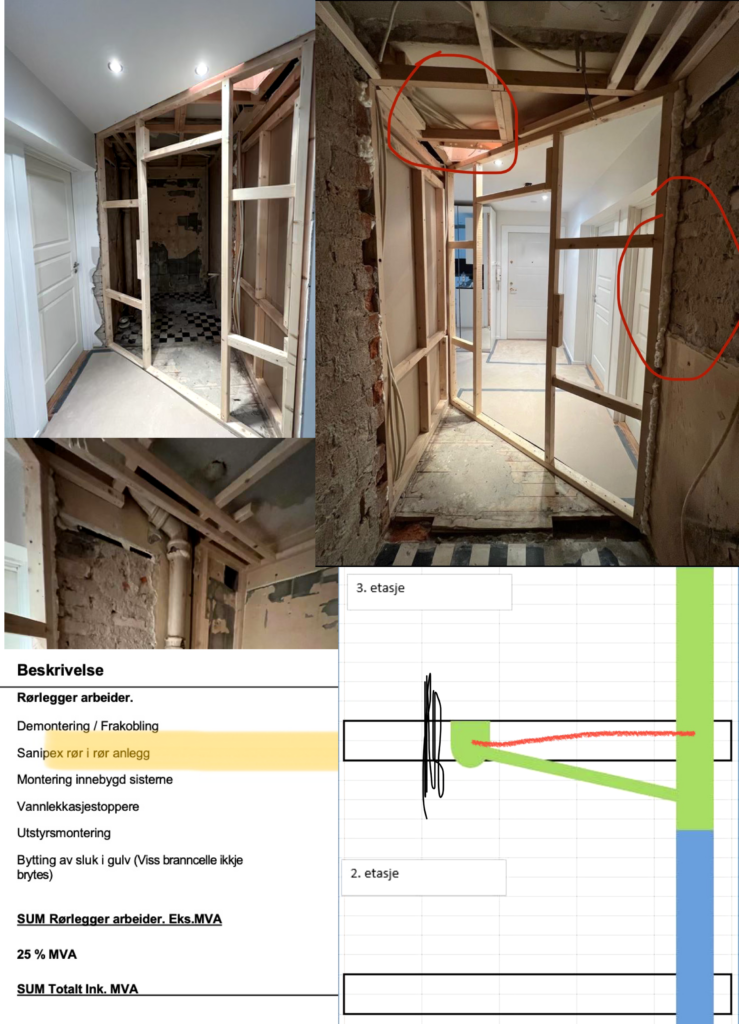
We hade several calls with them before and during the hackathon, they gave us invaluable information and insight, and they have evaluated our solution each day.
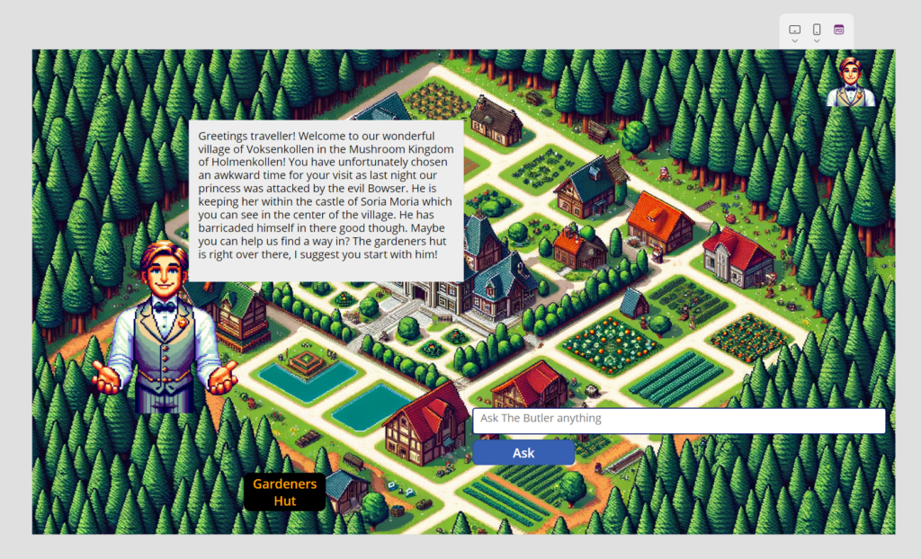
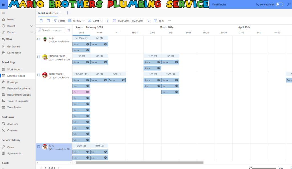
This is our user journey
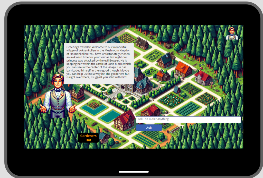
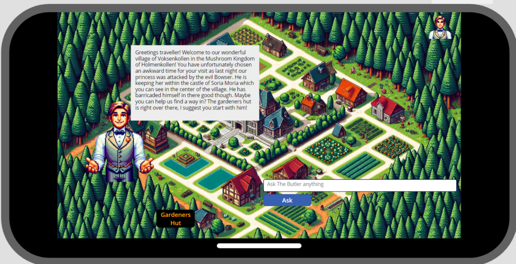
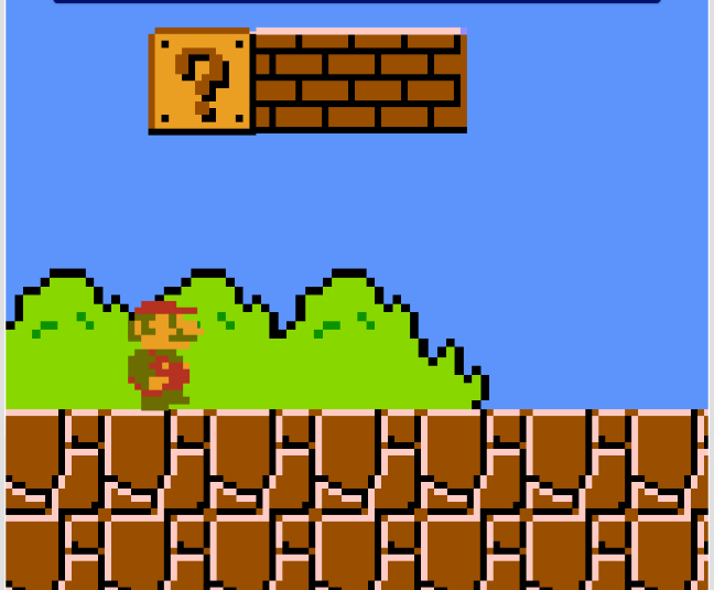
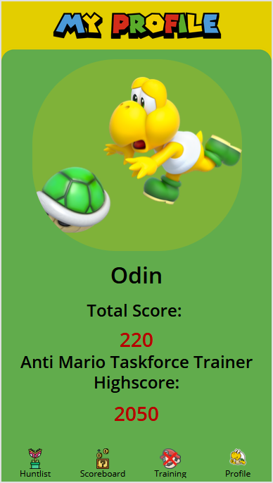
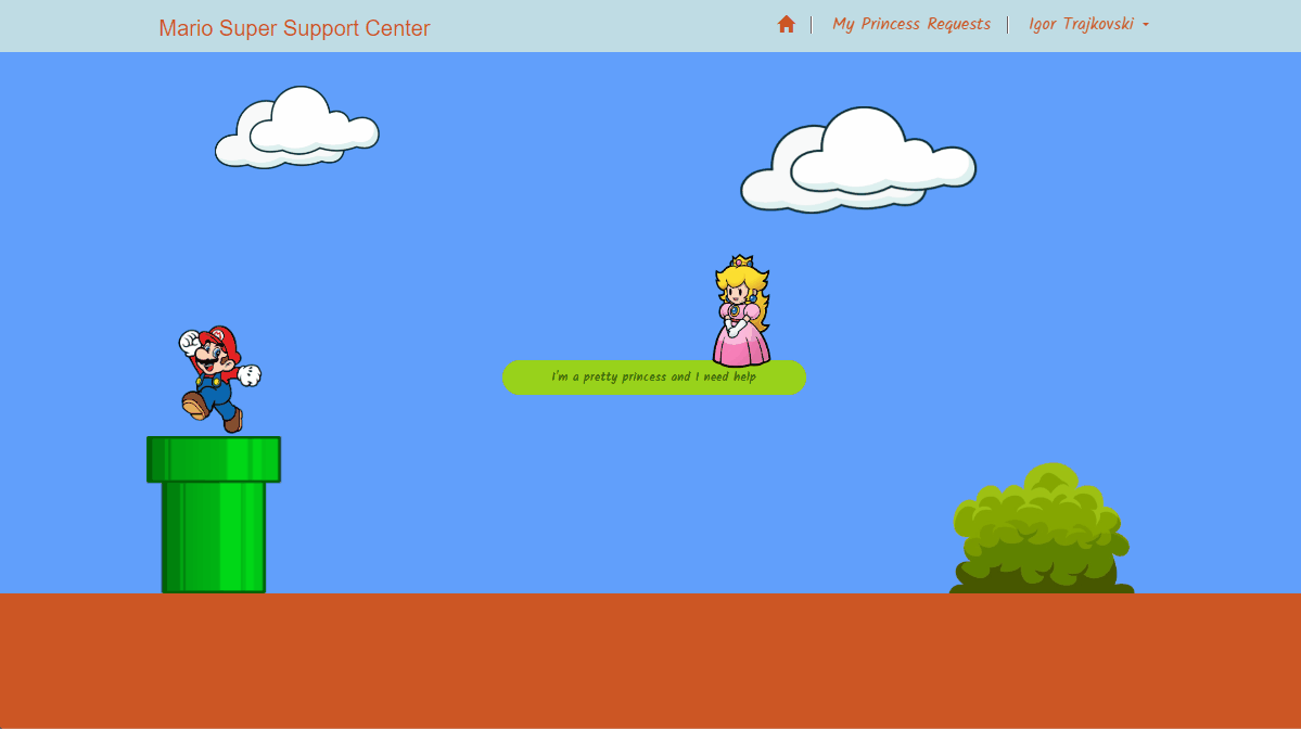
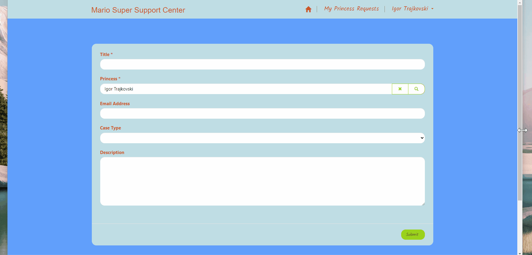
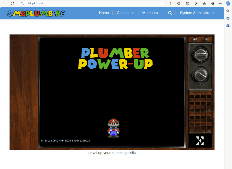
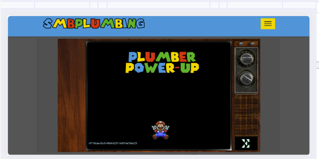
And of course, here is the user journey translated to Super Mario (please zoome in)
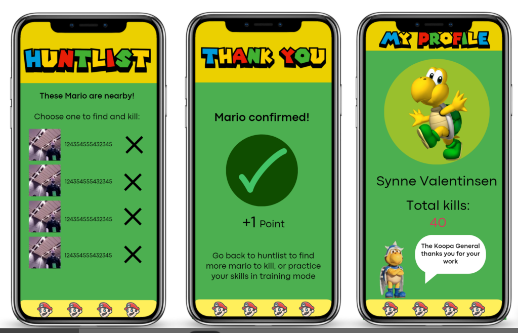
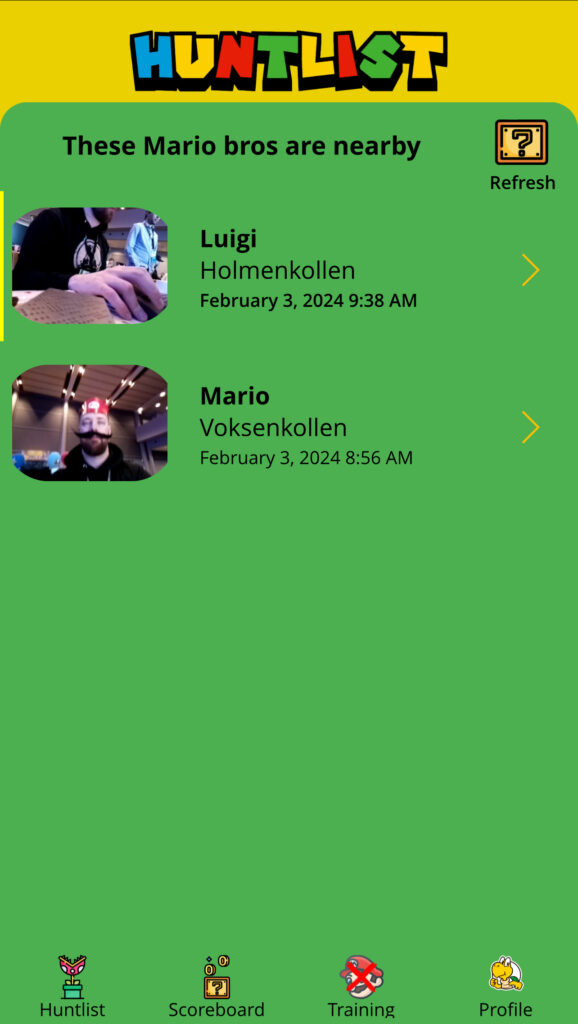
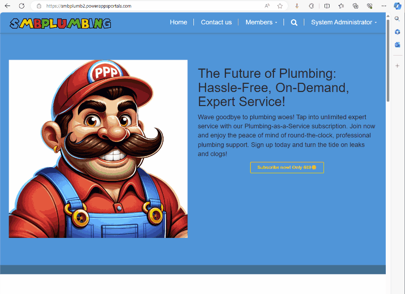
Late last night, after a couple of beers we finally found the perfect name for our plumber solution! Say hello to Tubi! We made a logo we are happy with, short and sweet!
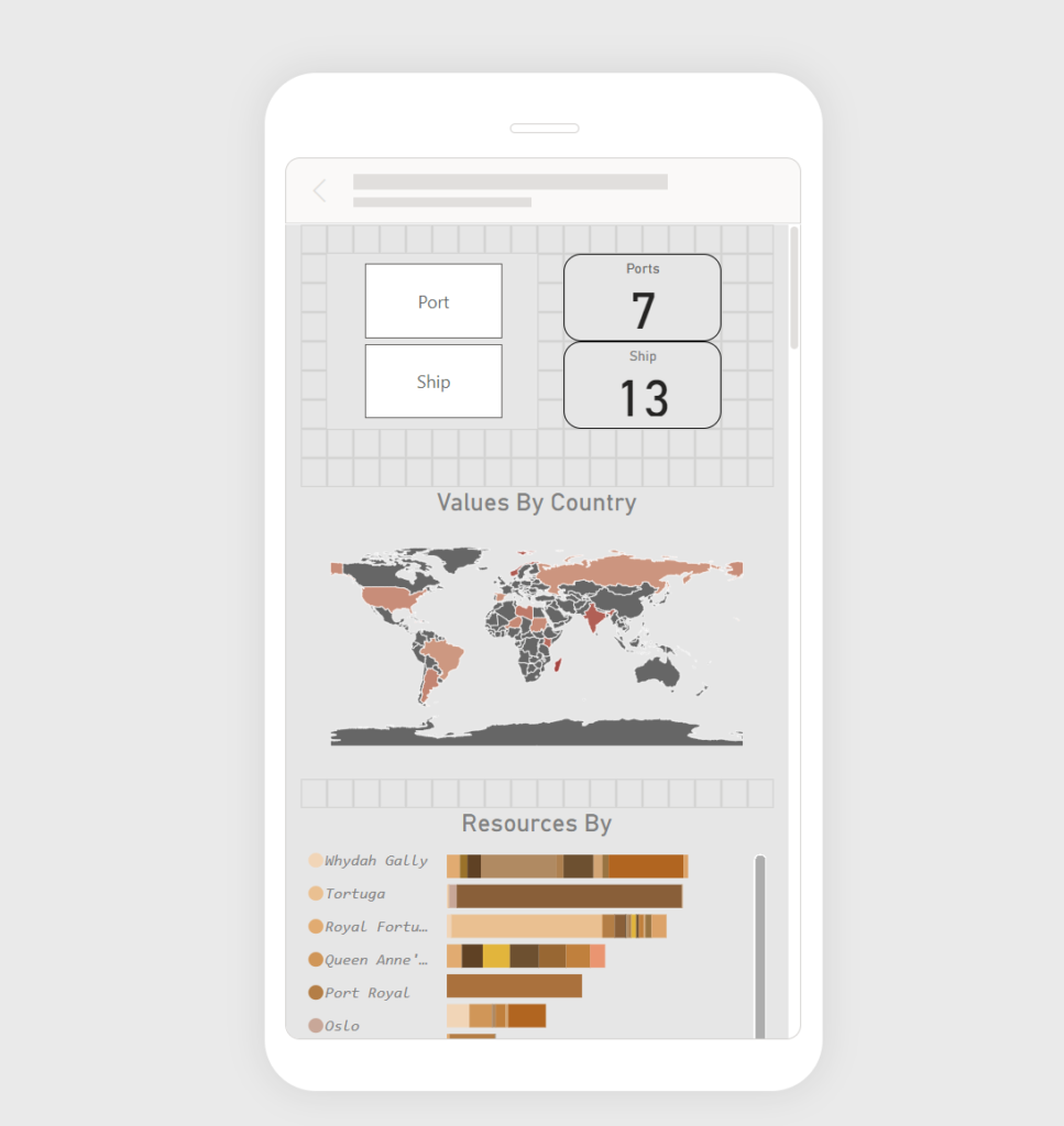
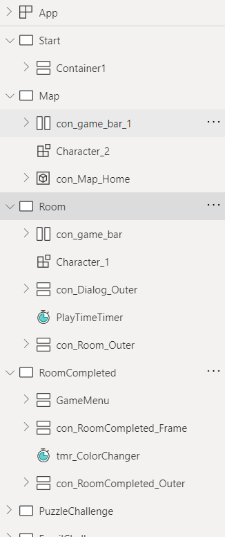
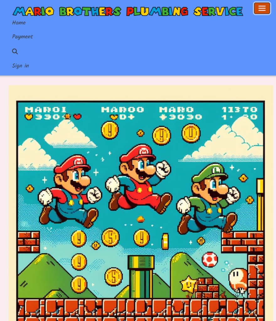
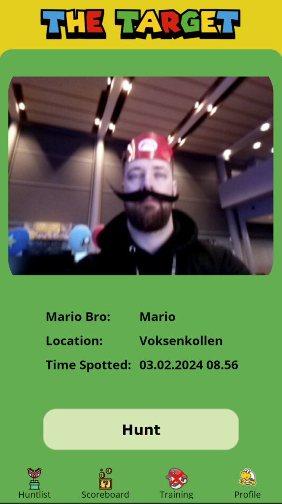
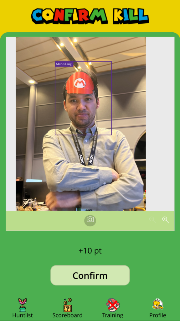
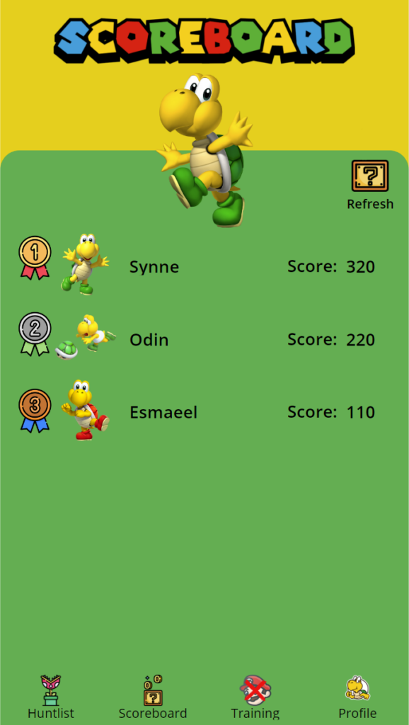
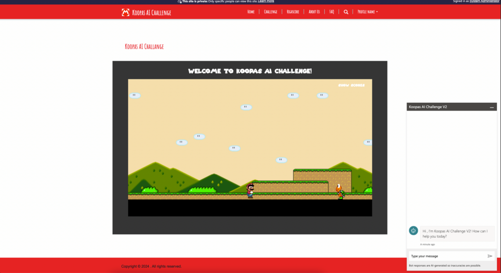
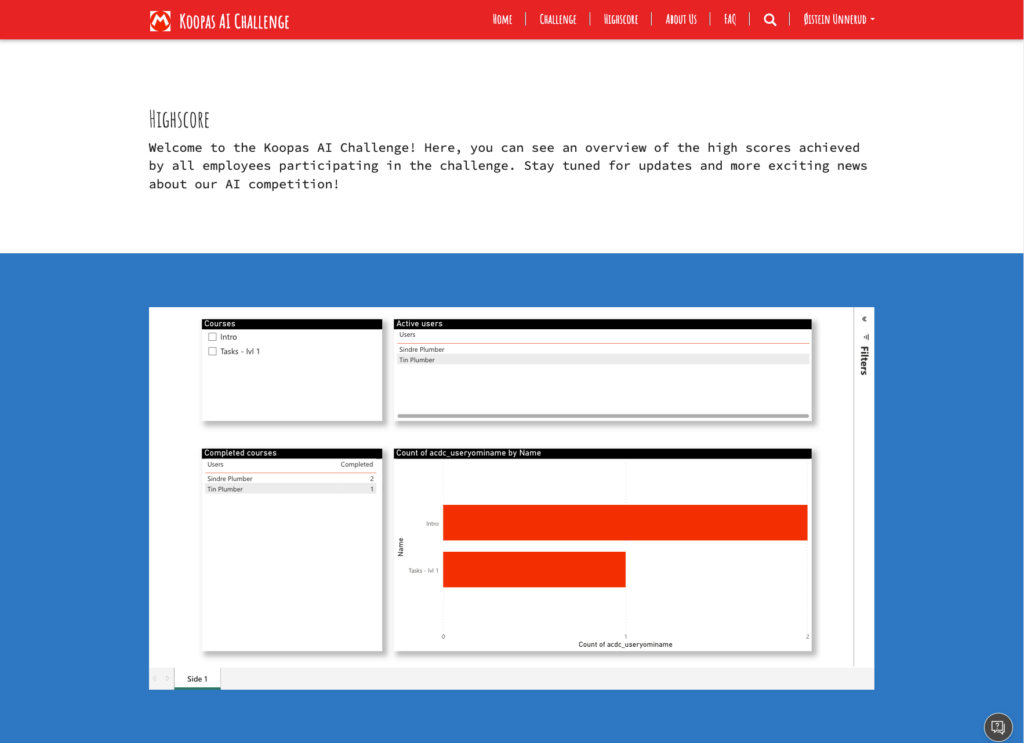
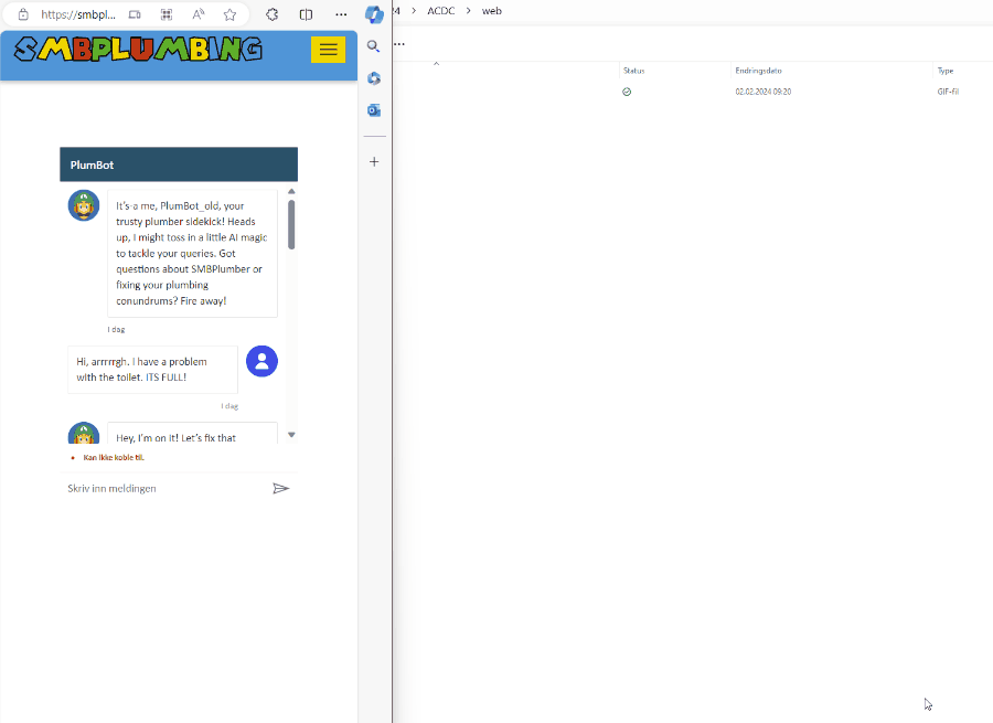
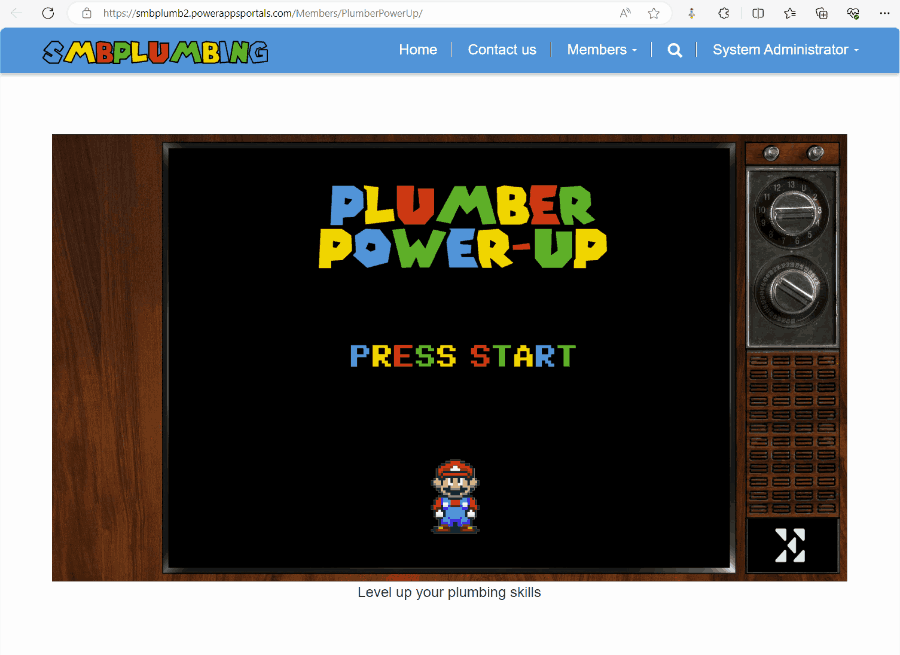
Using Microsoft UI components, with a dash of Super Mario sprinkles on top, the UI is done.
Since this blog isn’t the best medium to showcase the design, please check it out at Behance

