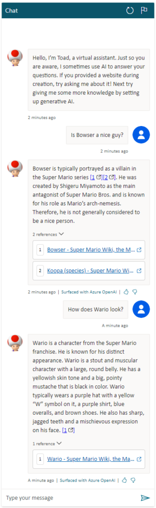
Toad, a character widely recognized as Mario’s loyal companion, assumes a different role in our scenario. Instead of assisting Mario, Toad will be guiding Princess Peach through the perilous landscapes of the Mushroom Kingdom. Known for his extensive knowledge, Toad has documented everything in his personal wiki, which serves as a comprehensive guide to their world. In our application, Toad will utilize this knowledge to answer Princess Peach’s queries via a chat interface. This interactive feature will allow Princess Peach to navigate her journey with greater confidence and understanding.
Toad, an AI bot powered by Copilot Studio, learns from the web and adapts to new data. It uses advanced machine learning algorithms to understand and interpret information. This continuous learning makes Toad a versatile tool for tasks like data analysis, content creation, and problem-solving. It represents the next generation of AI, ready to assist with its ever-growing knowledge. (New text added here)
Live demo of Toad:
Who can resist the thrill of a captivating game? Our app takes you on an exhilarating journey, brimming with elements of gamification. It features a sophisticated scoring system for our beloved Princess Peach, tracking her progress throughout the game.
Live demo of score:
But that’s not all! Princess Peach has access to a dynamic Power BI dashboard, allowing her to review her progress and identify her strengths and areas for improvement. This interactive tool serves as a constant motivator, pushing her to strive for excellence
Last night, we celebrated a significant achievement as we won the award for ‘Excellent User Experience’ for Thursday. This accolade is a testament to the hard work of our experienced UX designer, who has crafted a fabulous Figma prototype to assist our developers. This victory leads us to the final chapter of our journey.
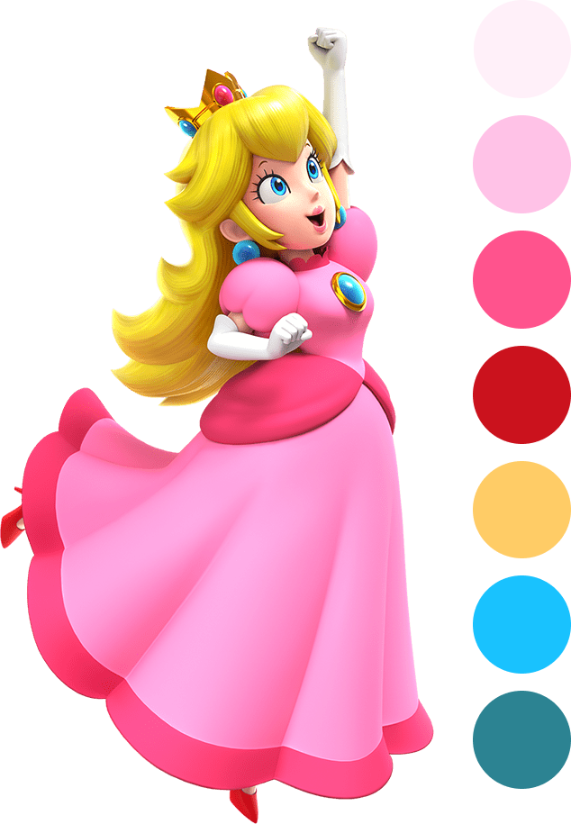
Last but not least, we invite you to step into the world of our application. Here, a vibrant pink palette, reminiscent of Peach’s dress, meets a shiny and glossy user interface, crowned with a touch of yellow, much like Peach’s crown. Our design choices, carefully considered for ease of navigation, make interacting with our app not just user-friendly, but a truly delightful experience. (New text added here)
Color palette from Figma
Live demo of shiny and glossy design (the design is not 100% complete in this video):
This post was edited 03.02 12:40
New text is marked with: (New text added here)
Added live demo of bot and some text
Added live demo of gamification
Added live demo of glossy design, picture and some text
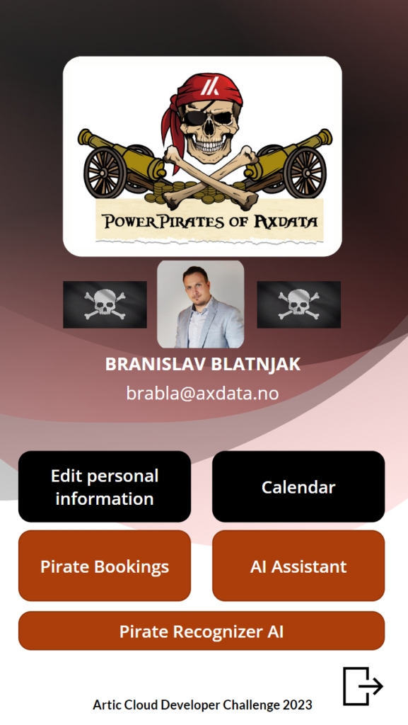
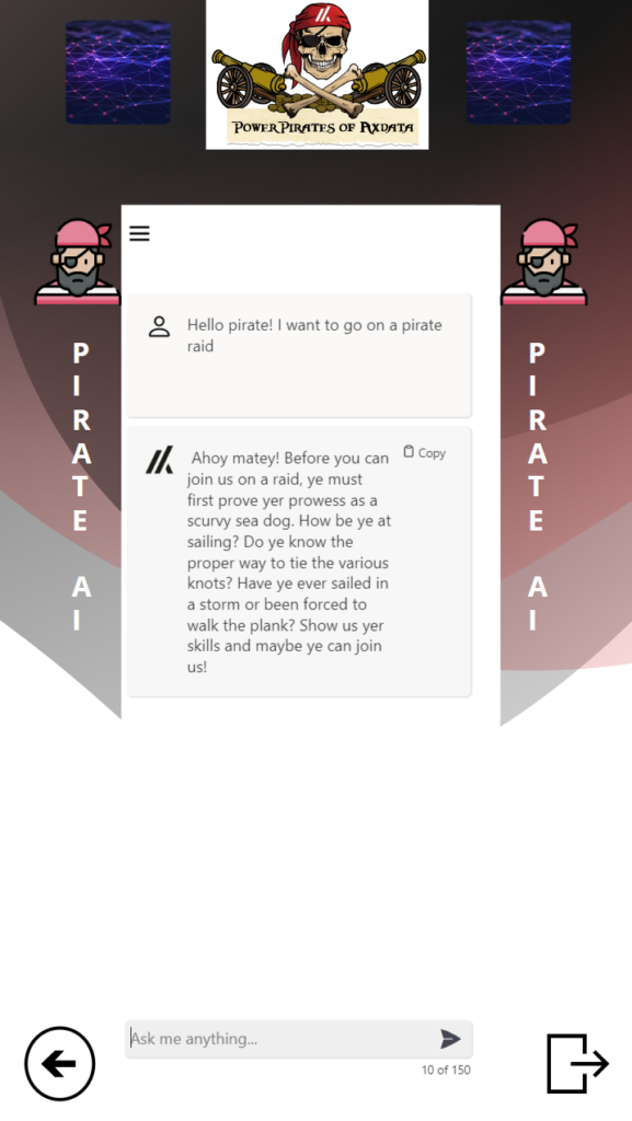
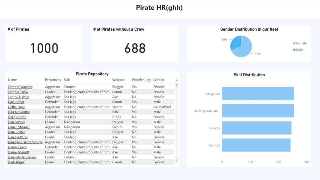
Our main goal with this years ACDC was to make the workday a lot easier for both the Pirate Planners and the Pirates itself. We had identified that the use of Finance and Operations standard functionality for both planning and Employee Self-Service is far from easy and user friendly to use. Therefor we decided to use these days to create this:
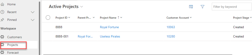
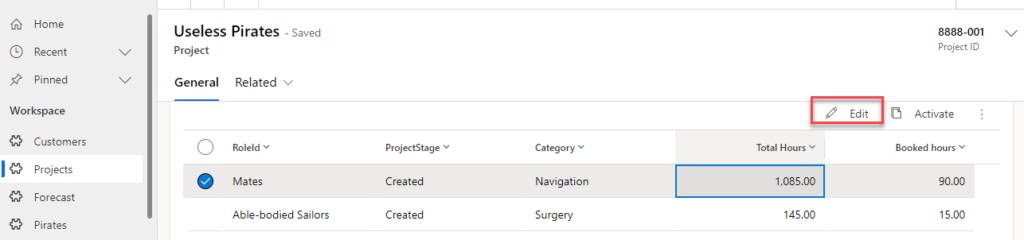
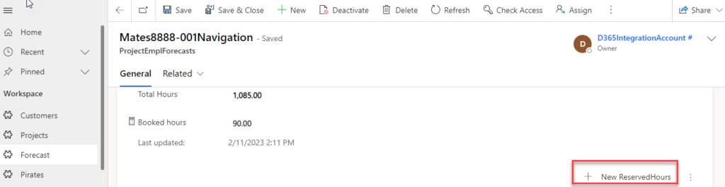
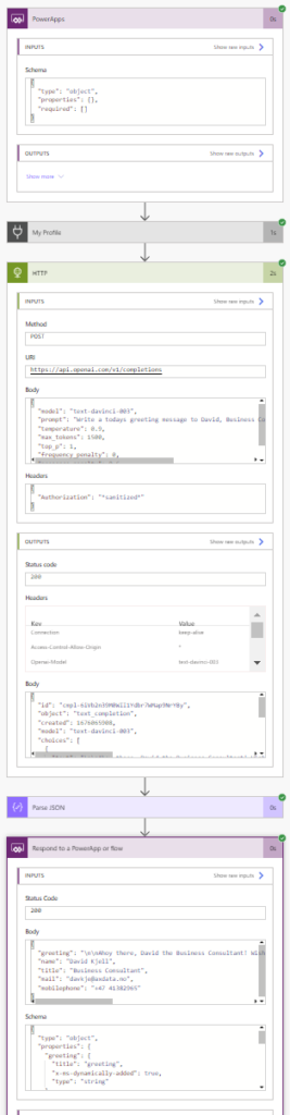
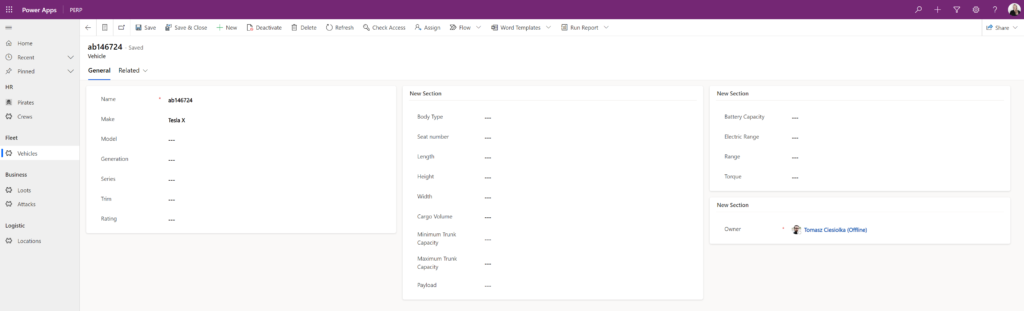
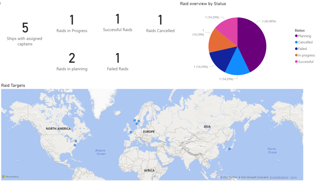
A Model driven app for the Pirate Planners to use when they plan for what raid what pirate should be on, based on the skills that pirate has. This Planner app receives all the data it needs regarding the raids/projects and the pirates with skill profile directly from F&O, so that they always have the up to date data to work with as this is crucial to be able to do the correct planning.
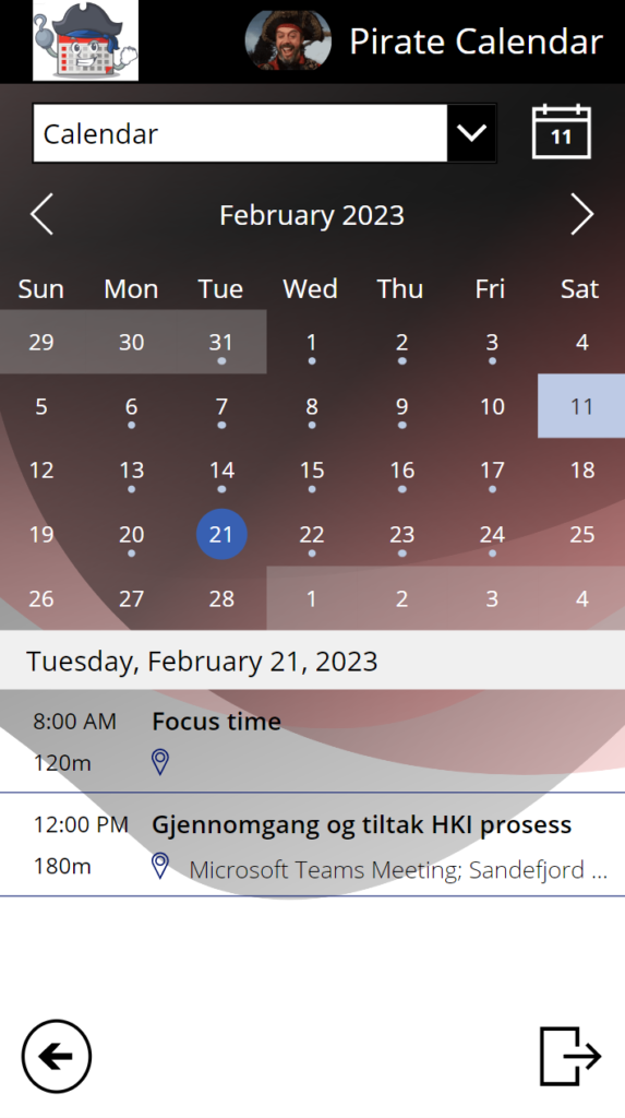
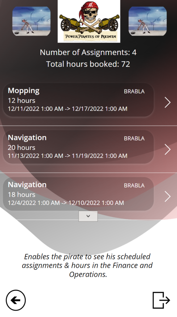
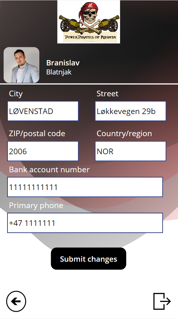
A Canvas app for the Pirates to use on their mobiles, where they can see and update their personal information while the app talks directly with F&O, accsess other information that is relevant for them that we have integrated into the app like your calendar and meeting, let you see where the Planners has booked you, an AI chat that can give you answers for whatever you want and more.
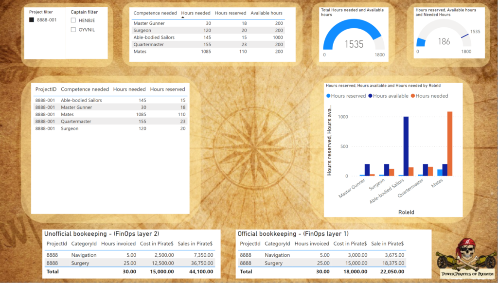
PowerBI reports showing what the Planners have planned for in the different raids and other relevant information.
And, to make it easier for you judges, here are the reasons why we think we deserve a lot of points in the different categories:
Excellent User Experience:
Our entire idea before the ACDC was that we wanted to create something that gives everyone that struggles with the user experience in F&O a better workday, every day! The solution we now have created will give all the Planners out there a new, innovative and very user friendly way to plan their pirates and other resources with the data that is already in place in F&O. And, for every pirate and other employee in the company, their experience with the brand-new mobile app for Self-Service, they difference from what they experience now in F&O is almost impossible to describe! This is so much more user friendly, cool and awesome that they will be amazed!
Most Extreme Business Value:
As we have said before, this work is not easy for companies using it today. We know that for example with planning, many companies have a excel sheet that they update manually with data from F&O to do raid/project planning. All of these companies will be thankful that we created this Model driven app these days, as it really will both save them time, make sure they always have the correct data to work with, and give the company a much better up-to-date overview over how their pirates and employees are booked the next weeks.
And if that wasn’t good enough (to be honest, we first only planned to create the solution over, but we also wanted to do something very good for all the pirates, not just the planner), the Canvas app will give a huge business advantage to all companies using F&O! Even if they don’t do Planning for their resources, they can of course still use the Pirate app for all their employees, where they can show and give the employees the possibilities to do everything they do in F&O as Self-Service today, and we can include whatever other data or solutions they use directly in the mobile app so that the employee gets all the information and possibilities they need in one place instead of having to go several places! And, the app will of course be teamed with the companies logo and colors, so that for the Employee, the experience will be that this is an app only for them!
Rock Solid Geekness:
When we are three low-code and two no-code pirates going to a Hackaton, then something we really wants to learn more about is code and Geekness. We have learned a lot and used react and Node.js as you will see in the solution under, and all the time we have spent drilling into how to use the data from F&O correctly in POwerPlatform… Phu, we now know a lot more about many more tables and data coming out from F&O and how we can use it than what we did before. And, that ladies and gentlemen, is rock solid geekiness in the ERP world!
Killer App:
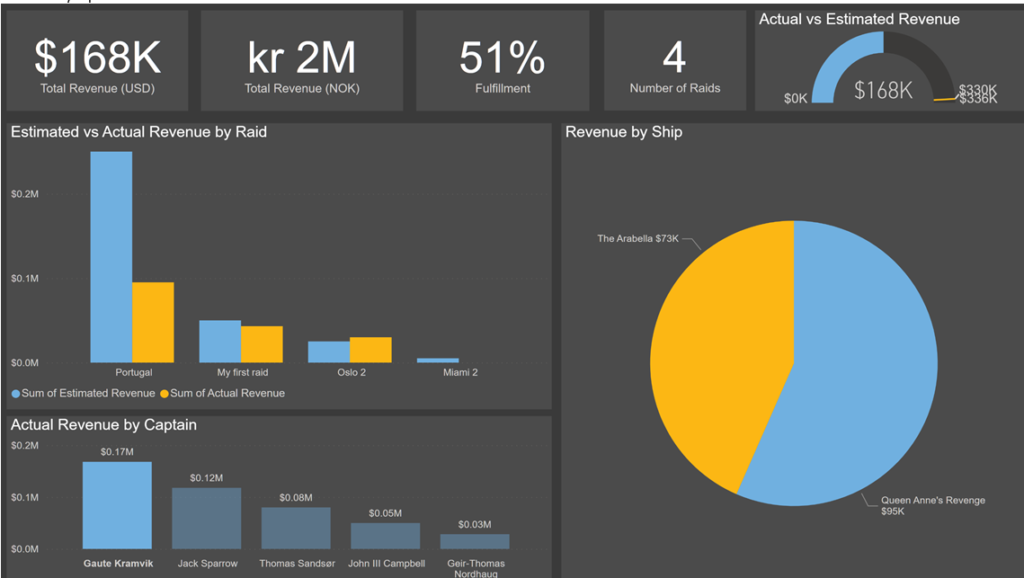
The way all components in this solution is tied together, really is what makes it a Killer App! We have connected F&O to a Model driven app and to a Canvas app, and the canvas app updates data back in F&O. In addition to this, PowerBI collects data both from F&O and the Model driven app, to show the reports we want. We have also extended the Canvas app to have so much more information that is relevant for the Pirate (and remember, the canvas app also shows information from the Model driven app regarding how they are planned!). When all of this is connected in a solution we now only have used 3 days to build, yeah, this deserves a lot of point! If you haven’t worked with F&O data in PowerPlatform before, then it’s hard to know, but this not straight forward.
Screenshoots of the Pirate Planner app and the technology used to fill it with data (with explenations under the pictures):
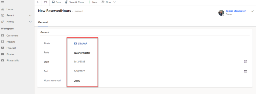
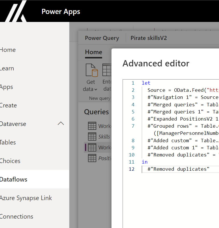
For the captain to check the various available project raidsOnce the project/raid is selected, you set what assignement you want to rederve hours forAnd then you reserve the piratePowerBI report that shows the info needed from the model driven Planner appTo save time without a datalake when gathering data from F&O we use the old and lovely tool PowerQuery inside Dataflows
Screenshots of the Pirate app and the technology used for that app (with explenations under the pictures):
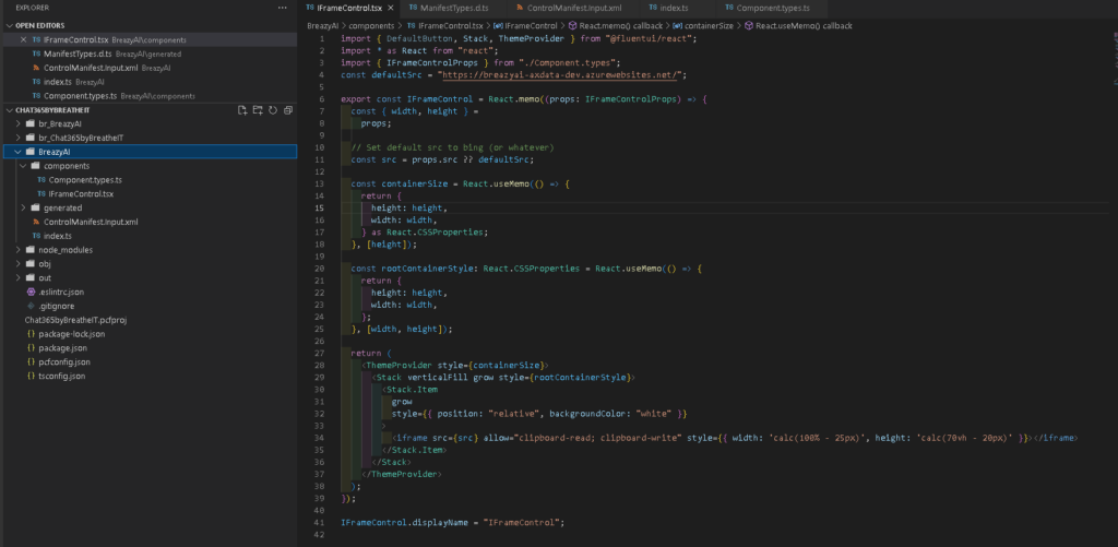
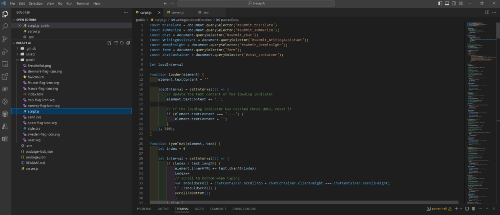
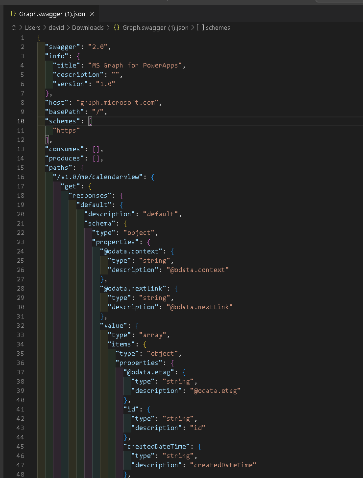
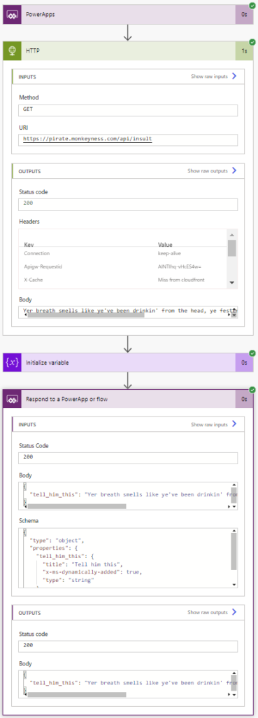
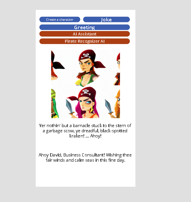
Frontpage of the appView your calendar and meetingsView your bookings coming from what the planners has done in the new Planner appView your information from F&O and directly update the infor in F&O when you submit changesOpenAI embedded chat for the Pirate to use to whatever!PCF code used to integrate a PowerApps Custom Control to run the Node.js (shown under)React and Node.js web app on Azure used for the OpenAI chatbotCustom connector for Microsoft Graph API we have built to get picture and other data for the logged in user of the Canvas app.Custom connector codePowerAutomate to give you the greating of the dayPowerAutomate to find jokes/insults
And what has this even given us?
Why we have clamied the badges we have in this post: ACDC Craftsman: For the entire solution, how it all is connected and works! Dash it out: The PowerBI report for the data fra F&O and model driven app Client side salsa: For the OpenAI embedded chat using react and node.js Retro: For using PowerQuery to collect data from F&O Feature bombing: For this fun screen in a canvas app that gives you a lot of features at the same time:
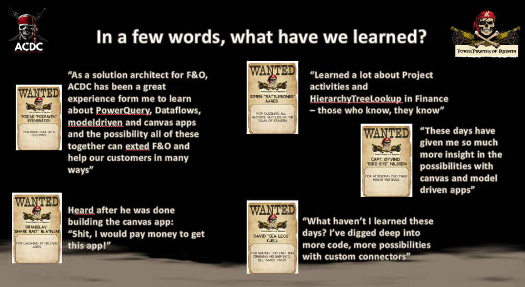
Thank you all for an amazing event!! This has been so much fun and we will definetly be back next year!
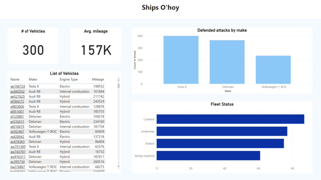
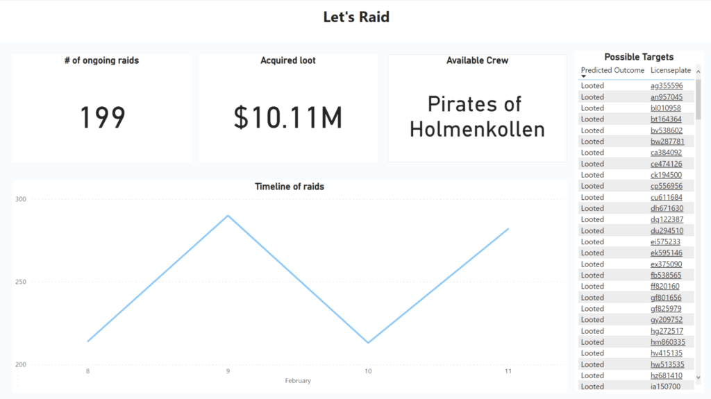
Arrr matey! Welcome to the world of reporting on port ships, pirates and fleets!
As ye might already know, Power BI is a powerful data visualization tool that can help ye track and monitor yer fleet, port ships and even pirate activities. Ye can easily gain insights into yer fleet’s performance, inventory & pirate attacks, and so this is what we have done as shown in the images below.
HRGhh reportShips O’hoy Fleet Management report
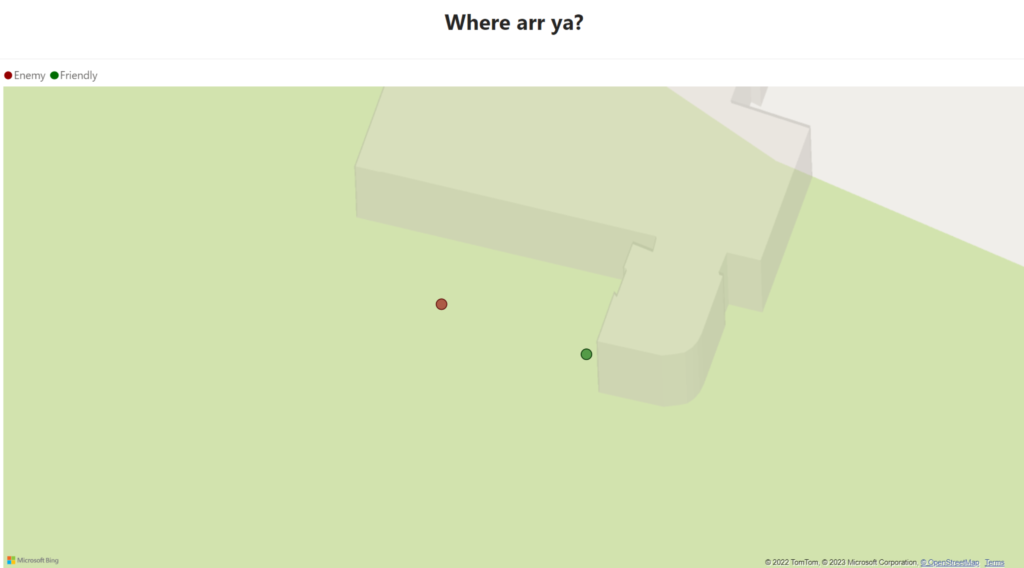
Arrr matey, we’ve created not just 4 graphs, but 4 report pages to address some of the various business needs a pirate may face on the high seas. Thar be a pirate HRGhh report, a Ship o’hoy report for fleet management, a map displayin’ our location and foes in real-time usin’ the DirectQuery capabilities in Power BI, and lastly a raid report utilizin’ Azure ML to predict which pirate ships we may loot successfully. This’ll aid us in makin’ informed decisions about the future of our fleet and help us chart our next course.
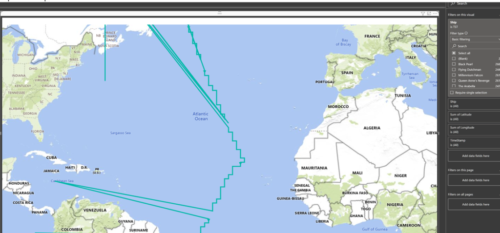
Below be a snapshot of the real-time, allowin’ captains and pirates to collaborate from different ports. This way the captain can signal which pirate to attack or stand down based on their proximity to the enemy, makin’ the collaboration smoother, even from a distance. This map be based on the location data from other ships and our own (Raspberry Pi) and displays the last recorded location through longitude and latitude.
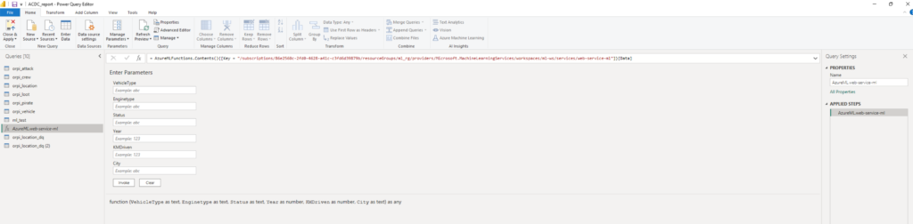
When it be comin’ to pirate raids, there be other booty that be worth a king’s ransom, and that be understandin’ the chances of a successful pillage. To be doin’ this, we scallywags created a simple map usin’ Azure ML that be givin’ us the lay of the land, predictin’ our loot based on the target’s worth such as their ship’s maker, the distance they’ve sailed, the power of their engine, and their current state.
We be feedin’ th’ AutoML model int’ th’ Power BI report, savvy? This be allowin’ us t’ do predictions on new data ’bout our enemies, which we be displayin’ in our report fer th’ captains t’ make well informed decisions, specially when coupled with th’ map. By clickin’ on a license plate number as ye see below, th’ captain will be taken t’ our model driven app and shown more information ’bout th’ possible target, aye aye!
Once upon a time, in the world of Business Intelligence, there was a ship with 3 crew members, who were struggling to make ends meet. They would sail from port to port, hoping to find some treasure, but to no avail. That was until they discovered Power BI.
They were able to analyze data from different sources and turn it into valuable insights. They used Power BI’s interactive visuals and dashboards to identify the ports and ships with the most valuable cargo. No more guessing, no more wandering aimlessly. so were able to sail straight to the ports or ships with the most valuable treasures.
The captain is a very visual person and wanted an easy way to get a feeling if the crew is happy or not.
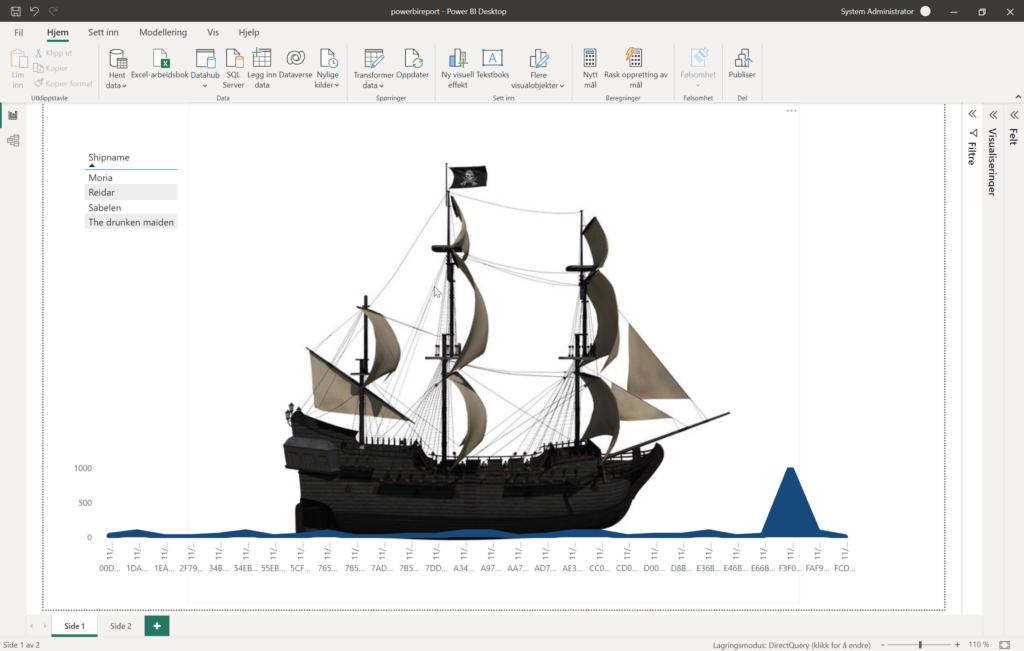
We created a Power BI report that show mutiny score over time for each ship.
You can filter the report in the top right corner and select the ship you want to see data for.
The boat is a picture of the ship.
The blue line at the bottom, looking like water, is actually a line diagram showing the mutiny score over time. If the score is high you will see a rise in sea level, and if it’s low the sea level will be low.
If the score is consistently low the water will be nice and calm, but if the score varies because of unsteady mood in the crew the water will have big waves. If the score is consistently high the boat will look like it’s going under.
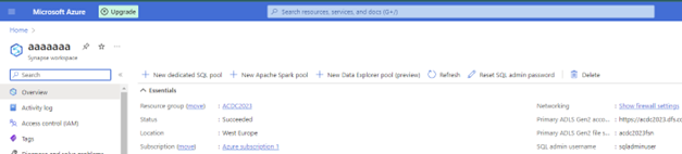
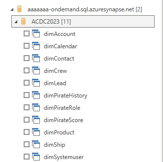
We startet by setting up an Azure Synapse workspace and a Data Lake Storage Gen2. Then we gave ourself the required access roles which is “Owner” and “Storage Blob Data Contributor”. After this was done, we started making the Synapse Link from Power Apps and picked the tables that we needed for our solution. We created a new SQL database and created views with the tables that we imported through Synapse Link. We chose to use Azure Synapse Analytics because we wanted to have near real-time data which is detecting whenever new data comes in. Our next step was to connect Power BI with “Azure Synapse Analytics SQL” using Direct Query. We started working on the report when all the data was imported and the relationship between the tables was working properly.
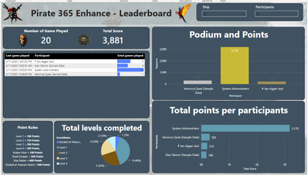
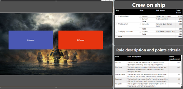
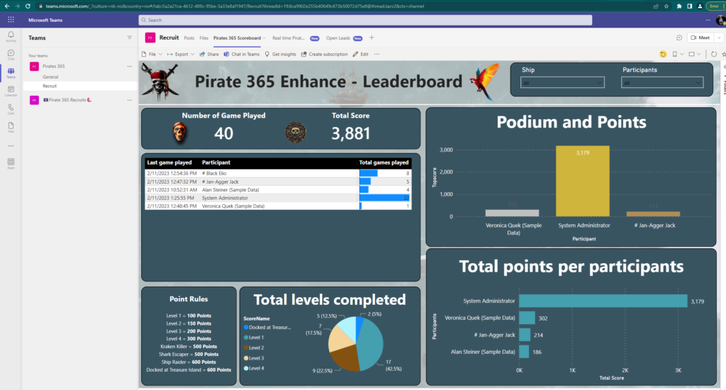
Any people who want to be recruited to a pirate organization must go through our recruitment process. It starts by being recruited by a parrot which is used by face recognition, and it is going to put a pirate head on your head automatically. After this, everyone will have the chance of trying out our ship simulator called “Pirate 365 Enhance”. Your performance will be recorded, and the data will be sent to our Power BI record which uses direct query in order to get real-time data.
We will have multiple reports, “Pirate 365 Enhance”, “Pirate 365 Enhance Evaluation” and “Parrot Obervation AI”.
The data from our participants will firstly be used to create a leaderboard in order to see who perform the best. We display the number of games played, total score, participants and how many levels have been completed. Our next page is “Pirate 365 Enhance Evaluation” (which is not created yet) will be used by the people in HR who are going to evaluate each participant by their performance. The total score will have a huge part in which ship you will be recruited to, and which role you will get. If your score is too low, then you must walk the plank!
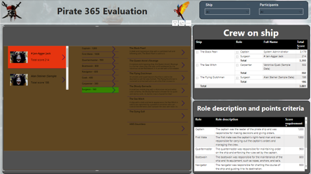
The next site “Pirate 365 Evaluation” have an embedded canvas app from Power Apps. Here you will see how many points each participant from the ship simulator got and the canvas app will suggest which role suits the participants the best based on a points-criteria, but you don’t have to pick the suggested role. The person evaluating this process can choose which ship the participant has to go to.
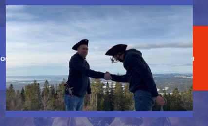
In this case. We gave “Jan-Agger Jack” a role as a “Surgeon” in “The Black Pearl”. This next step is to either onboard or offboard this participant.
Then a video will be shown where the captain of the ship will either welcome you to the ship or to walk the plank based on the option that you pick.
The reports are embedded in the recruitment Teams channel so HR easily can follow up
The waters run deep and dark when you are at sea. This is why intel like maps, a spyglass and knowing the tides help. To give our pirates an advantage we crawl barenswatch.no for other ships location. But, just as in dogeball, it is not enough to know where something is, you need to know where it is going and when you need to be there to intercept. So how do we calculate the best opportunities and how to intercept them?
Step 1: Crawl and Hijack Valuable Data 🦀
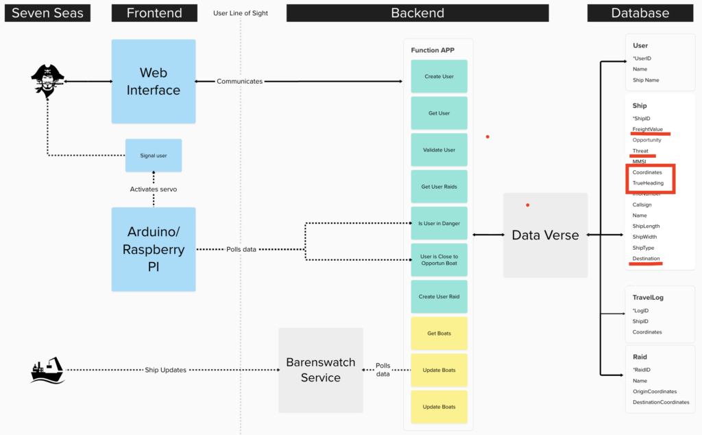
From the system diagram we see our Functions App communicates with the Braenswatch API and stors all boats data including current location. We poll this information several times giving us multiple data points not only for ballast and weight, but also for speed, location and direction (this will be important later).
Screen grab of system model for the Pirate Pillaging app
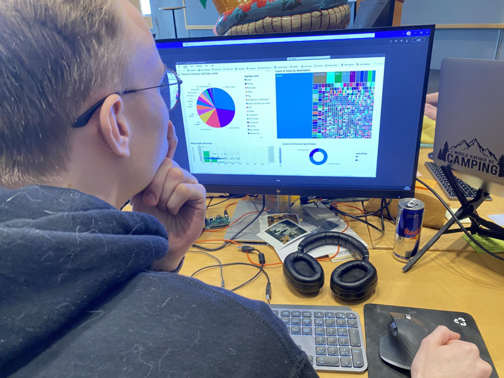
For ease of use while creating the service we compiled all the data using Power BI Dashboards to see what we were working with. The dashboard can also be used to help captains understand the state of the seven seas, although we appreciate that more data is not necessarily better data. It depends on how you visualize, precent and timing of when to precent data to you user.
Video of Solveig ☀️ explaining how we gather, structure, compile and visualize ship data in a way highlighting opportune targets.
Step 2: Knowing which Opportunities to Strike 🏆
From the ships length, type and destination we can estimate its value. Slow moving ships heading for freight docs are ripe for looting, fast moving ships heading for a dry dock are empty and better left alone. For the sharp eye you have also spotted we have a Threat flag in or model, this is for marking known pirates, intercepters and the fuzz of the seven seas. Once again referencing to Sun Tzu: You always win the wars you never fight (dont search this quote).
Image displaying famous quote from Sun Tzu about fighting good
If we decide that this opportunity is ripe for plundering, we look at its course and if it is feasible to intercept based on our current course. Good opportunities are heavy, slow moving ships. Bad opportunities are war ships of any kind or any opportunity in the vicinity of a war ship.
There is also a certain Goldilocks of opportunities: Based on your own vessel, you do not want to attack another ship that is too large, since it will be a harder fight, or too small, since it carries less booty. We can use the dashboard to visually find the opportune boats and use this investigation to write code that targets these boats automatically.
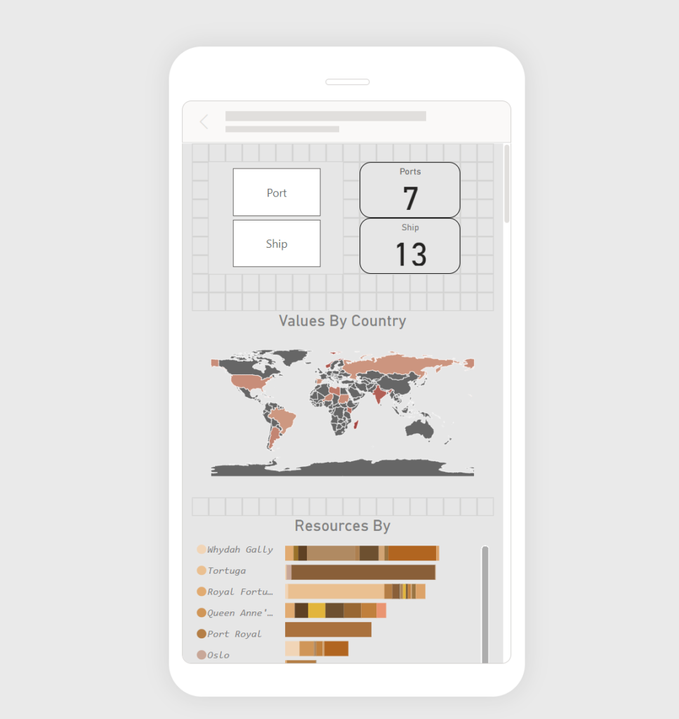
Captain Mats looking at data The Power BI Dashboard populated with crawled and manipulated data from Barenswatch.no, structured by ship type, weight and destination, highlighting the most opportune ships in the collection
When we flag ships that are both opportune and not adjacent to warships we plot paths to figure out where they are going in relations to our course.
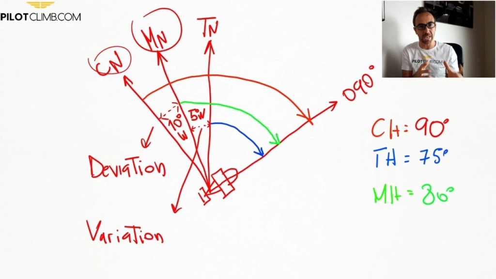
Step 3: Using Advanced Trigonometry to Pinpoint your Enemy 🎯
Youtube can teach you the basics about how to calculate a ships heading based on longitude, latitude, direction, true north and the course deviation.
Youtube is telling us what we need to know about complex
True north will change depending on where on the globe you are positioned, so for intercept courses it is paramount to get this stuff right. You want to be at the place where your target ship will be, not where they have been. And you want to be there before they get there, not to ride up after them and trailing them forever. This is where we use the latitude, longitude, direction and speed from earlier and _try_ to plot the path of the ships. I stress try because Solveig just looked at Sebastian with the “do you mind not being an idiot” when he asked how se was doing it and if it was done. Then just sort of sigh’ed and continued clicking keys. So it works, trust us.
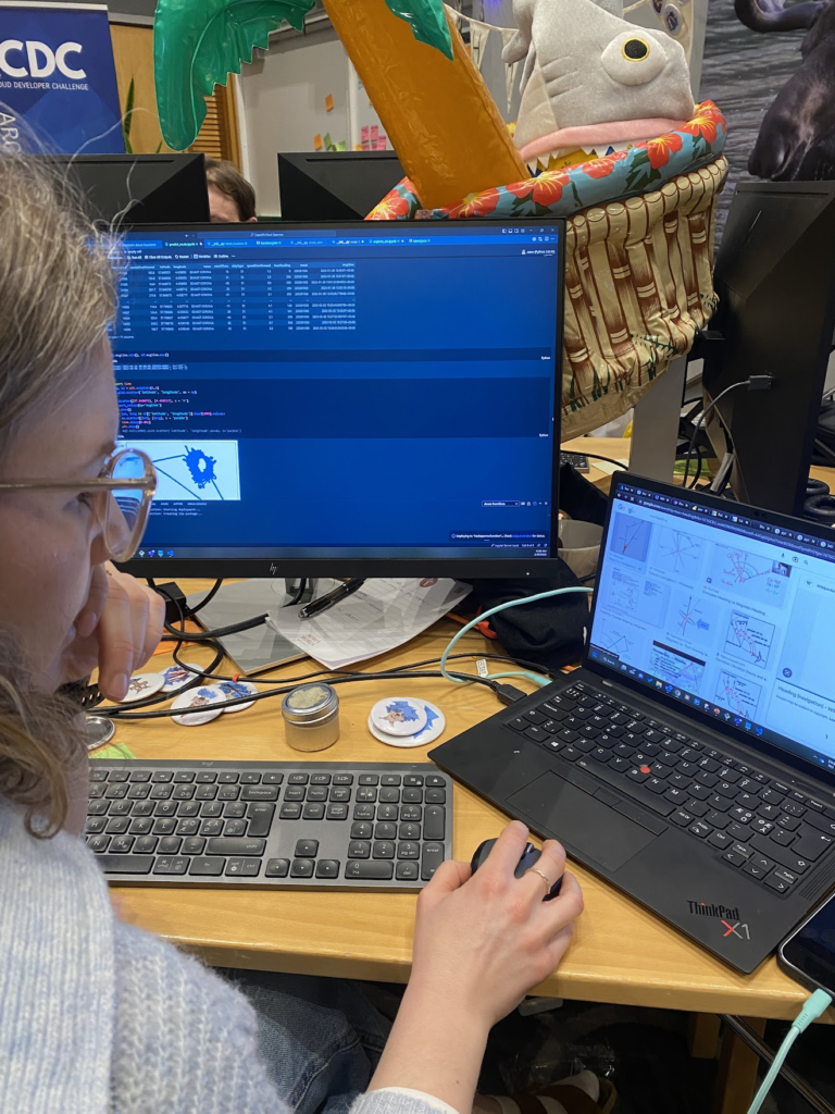
Solveig ☀️ working on triangulating and plotting ships path to calculate intercept courses.
For our challenge we also need to estimate if it is a viable option to change our current corse to intercept the opportunity. For all business cases there is a cost/effect probability calculation. Fo us this depends on added time to destination with deviation and added length of trip, both of which adds to the total cost of provisions and consumables like petrol.
Step 4: Plot Optimal Course for Interception 🏴☠️
Finally when we have a list of opportune targets, we know which targets will be adjacent to our planned course form A to B we plot intercept maneuvers. Which, is a topic for another blog post – because this part is most certainly done… Trust us… 🤞🤞🤞
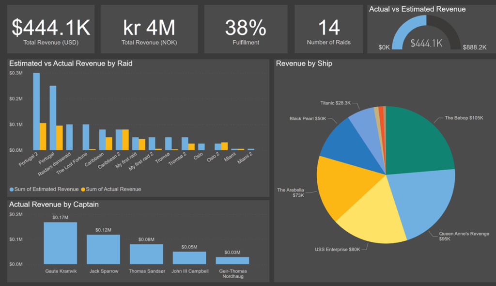
The management team of every pirate organization with a measure of self-respect desires comprehensive reporting of all their operations, including both the positive and negative aspects. This can be achieved by utilizing PowerBI connected directly to the Dataverse behind the Raid Management System. By doing this, the management team will have access to all the data they need to effectively evaluate their operations and make informed decisions. The report provides real-time data visualization, making it easier for the Captains to track their progress and identify areas for improvement. Thus enabling them to make data-driven decisions and improve their overall operations.
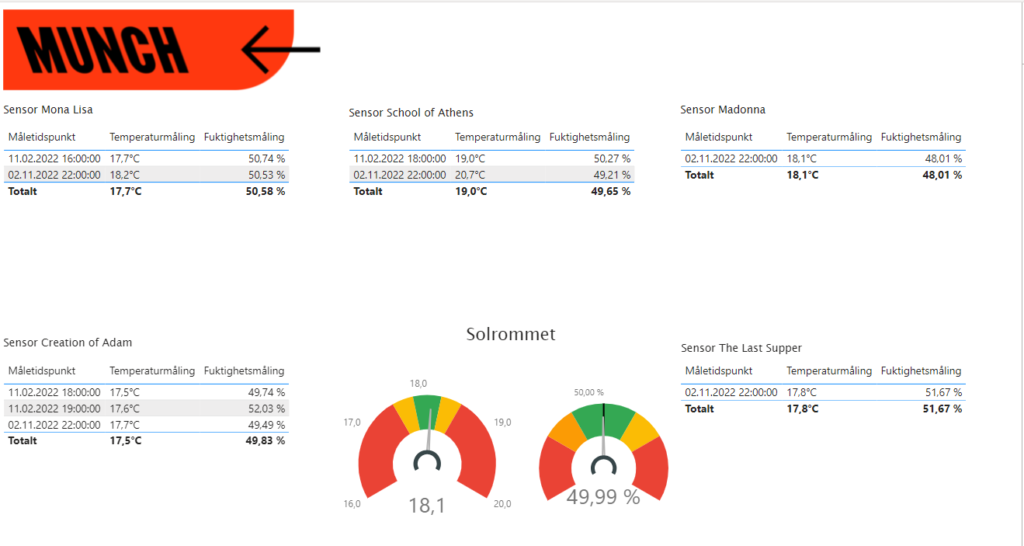
Ved hvert maleri er det satt opp IoT enheter for måling av fuktighet og temperatur. Dette er for å overvåke at målingene ikke går over terskelverdier som kan skade de uvurderlige maleriene. Etter at dataen har blitt hentet fra IoT-enhetene så må de visualiseres slik at ansatte kan bruke dataen for og enkelt ha oversikt over hvordan forholdene til maleriene er.
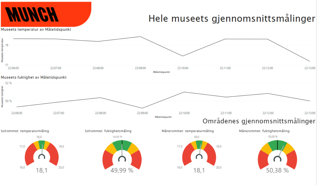
Når de åpner Power BI dashbordet så møter de denne skjermen her:
Fargene for dashbordet er valgt etter museets fargeprofil: rød, hvit og svart, og følger dermed også fargeprofilen som er satt for resten av den totale løsningen med besøkende-delen.
Helt på toppen får de gjennomsnittsmålingene fra alle sensorene gjennom hele museet ved de tidspunktene målingene ble gjort, med et minutts oppløsning.
På bunnen får vi opp temperatur- og fuktighetsmålinger for de to rommene som det er satt opp sensorer for: “Solrommet” og “Månerommet”. Der har man mulighet til å klikke inn på rommene for å få mer detaljerte data om målingene for hvert maleri. Trykker man for eksempel inn på solrommet får man opp:
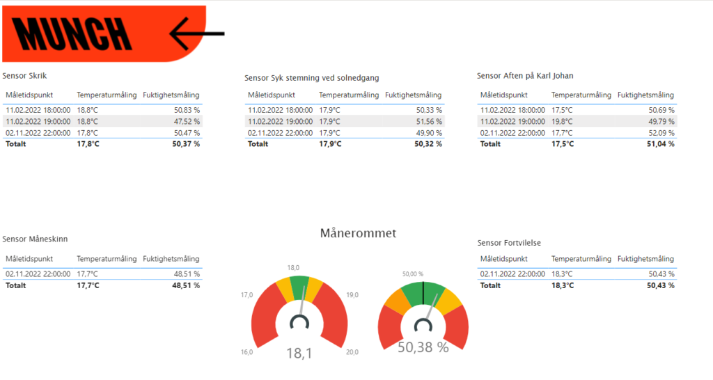
Der man kan se på de målingene som er gjort for sensorene de siste timene. Pilen på logoen tar deg til forsiden og gir deg også mulighet til å klikke deg inn på data for det andre rommet:
Som viser en lignende side som Solrommet, men med sensordata fra Månerommet.