
Our game produces data on game configuration, high score and completed games. This is visual data that we love to look at so we better understand the users.
We have had quite the journey in learning on this badge. Consultant had never used Power BI before and created this as their first post.
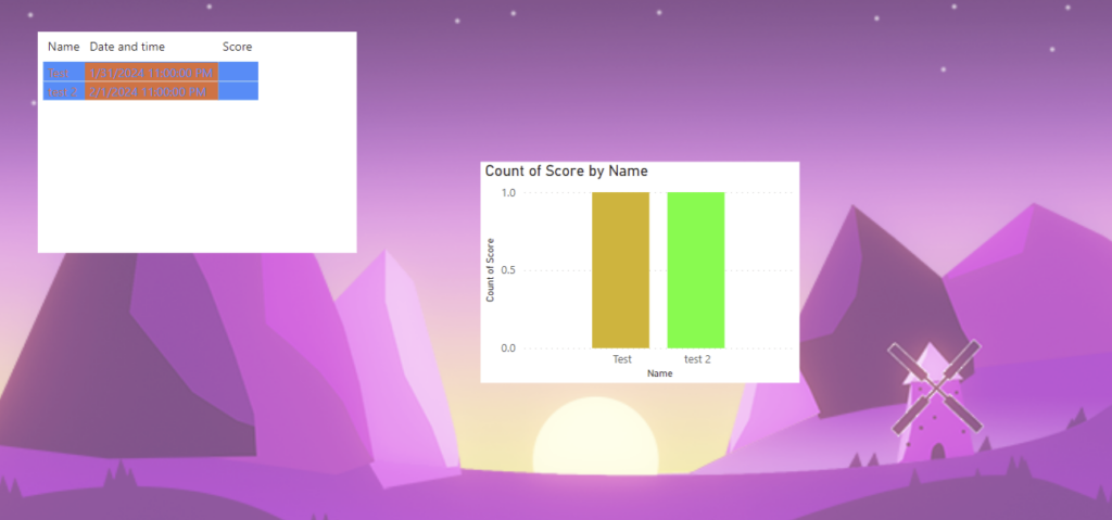
Eventually after receiving help from community members and judges the graph matured and materialized itself to something more presentable.
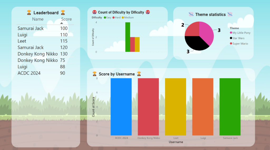
Looking good, but can you drop the white background and align the boxes? 😉 Think this is a quick fix
I’ve updated the dashboard 🙂 I have also submitted this for the badge “Glossy Pixles”.