
With this blog post we claim

The captain is a very visual person and wanted an easy way to get a feeling if the crew is happy or not.
We created a Power BI report that show mutiny score over time for each ship.
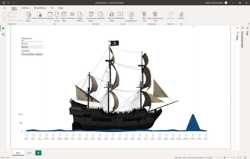
You can filter the report in the top right corner and select the ship you want to see data for.
The boat is a picture of the ship.
The blue line at the bottom, looking like water, is actually a line diagram showing the mutiny score over time. If the score is high you will see a rise in sea level, and if it’s low the sea level will be low.
If the score is consistently low the water will be nice and calm, but if the score varies because of unsteady mood in the crew the water will have big waves. If the score is consistently high the boat will look like it’s going under.