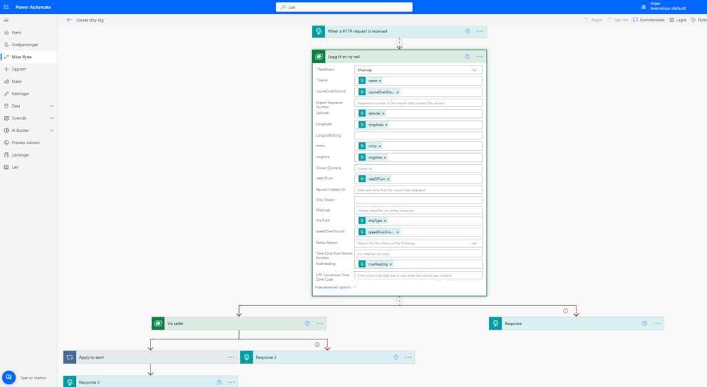
In our solution, users will be gathering ingredients using object detection in a Canvas App. The AI model used for this has been trained on objects around the conference venue, and so we wanted to enhance the connection between the app and the real world. Already having access to the users geo location through the geolocation web API inside the Canvas App and any PCF components, we decided to these data to place the active users on a 3D representation of the venue, expressing our power user love by merging 3D graphics with the OOB Canvas App elements.
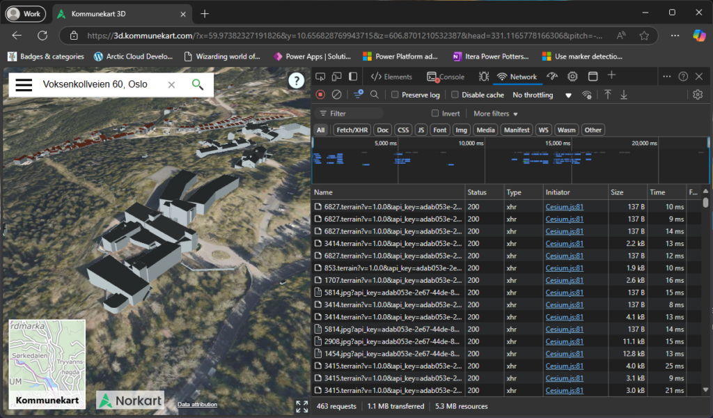
We were able to find a simple volume model of the buildings on the map service Kommunekart 3D, but these data seem to be provided by Norkart, which is not freely available.
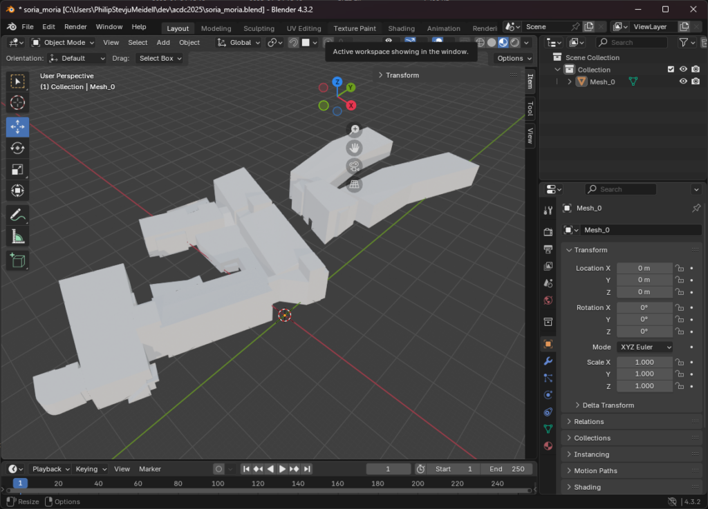
Like the thieving bastards we are, we decided to scrape the 3D model off of the site, by fetching all the resources that looked like binary 3D data. We found the data was in B3DM format and we found the buildings in one of these. We used Blender to clean up the model, by removing surrounding buildings and exporting it to glTF 3D file format, for use in a WebGL 3D context.
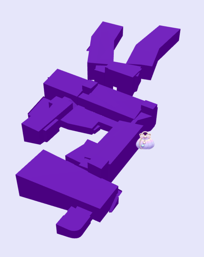
The representation of the 3D model, we decided to do with Three.js, which let us create an HTML canvas element inside the PCF component and using its WebGL context to render out the model in 3D. The canvas is continuously rendered using requestAnimationFrame under the hood, making it efficient in a browser context. The glTF model was loaded using a data URI, as a workaround for the web resource file format restrictions.
The coordinates from the user’s mobile device comes in as geographical coordinates, with longitude, latitude and altitude. The next step was to map these values relative to a known coordinate in the building, which we chose to be the main entrance. By using the main entrance geographical coordinates, we could then convert that to cartesian coordinates, with X, Y and Z, do the same to the realtime coordinates from the user, and subtract the origin, to get the offset in meters. The conversion from geographic to geocentric coordinates were done like so:
// eslint-disable-next-line @typescript-eslint/consistent-type-definitions
export type CartesianCoordinates = { x: number; y: number; z: number };

// eslint-disable-next-line @typescript-eslint/consistent-type-definitions
export type GeographicCoordinates = { lat: number; lon: number; alt: number };

// Conversion factor from degrees to radians
const DEG_TO_RAD = Math.PI / 180;

// Constants for WGS84 Ellipsoid
const WGS84_A = 6378137.0; // Semi-major axis in meters
const WGS84_E2 = 0.00669437999014; // Square of eccentricity

// Function to convert geographic coordinates (lat, lon, alt) to ECEF (x, y, z)
export function geographicToECEF(coords: GeographicCoordinates): { x: number; y: number; z: number } {
	// Convert degrees to radians
	const latRad = coords.lat * DEG_TO_RAD;
	const lonRad = coords.lon * DEG_TO_RAD;

	// Calculate the radius of curvature in the prime vertical
	const N = WGS84_A / Math.sqrt(1 - WGS84_E2 * Math.sin(latRad) * Math.sin(latRad));

	// ECEF coordinates
	const x = (N + coords.alt) * Math.cos(latRad) * Math.cos(lonRad);
	const y = (N + coords.alt) * Math.cos(latRad) * Math.sin(lonRad);
	const z = (N * (1 - WGS84_E2) + coords.alt) * Math.sin(latRad);

	return { x, y, z };
}
This gave us fairly good precision, but not without the expected inaccuracy caused by being indoors.
In our solution the current position is then represented by an icon moving around the 3D model based on the current GPS data from the device.
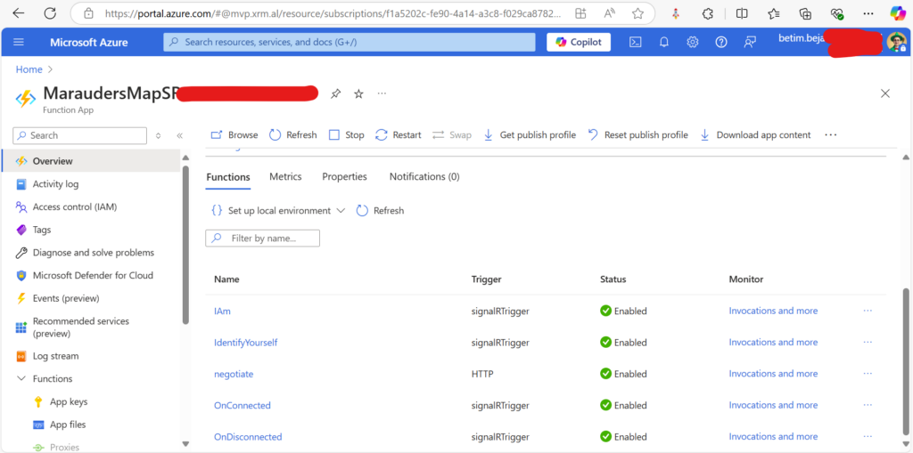
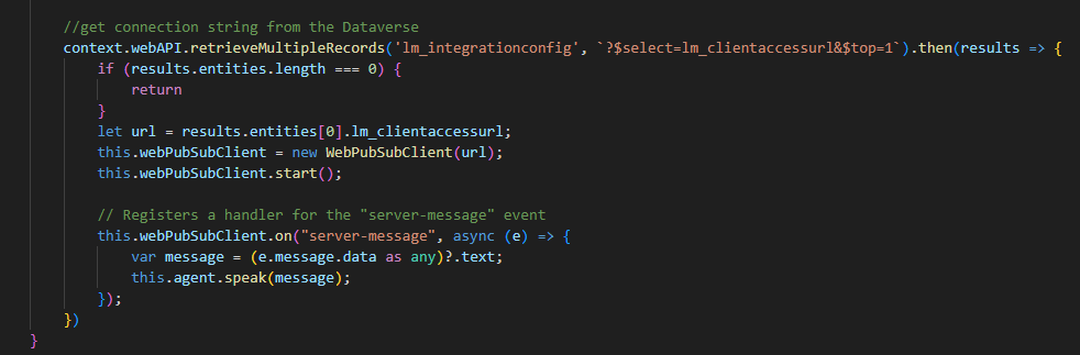
To connect this representation to realtime data from all the currently active users, we decided to set up an Azure SignalR Service, with an accompanying Azure Storage and Azure Function App for the backend, bringing it all to the cloud, almost like a stairway to heaven. With this setup, we could use the @microsoft/azure package inside the PCF component, receiving connection, disconnection and location update message broadcast from all other users, showing where they are right now.
14:41: Updated to include additional information around embedding the map in a mobile app and searching in multiple ways.
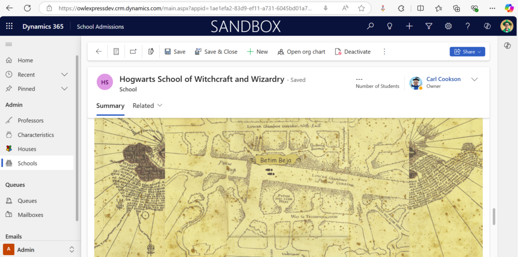
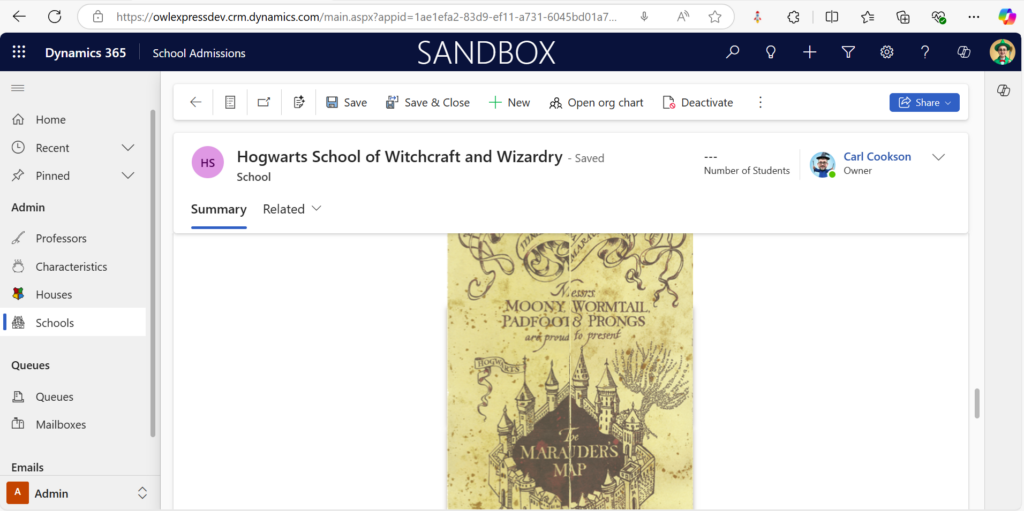
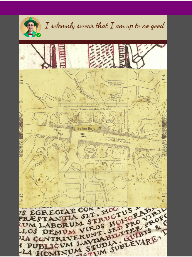
You want to see if other professors are around in the school? We found a magical map in the School form of our OwlExpress app. The Marauder’s Map is using Websockets magic to track everyone on the school premises Right Now.
It also is using device embedded voice recognition to understand your spells, you need to say: “I solemnly swear that I’m up to no good.” if you want to see the map.
When you are done and want to hide the map you must say: “Mischief Managed!”.
Do you like the glossy pixels of this map?
Mobile Map
We have also managed to embed this into a canvas app for a mobile delivery for sneaky students upto no good.
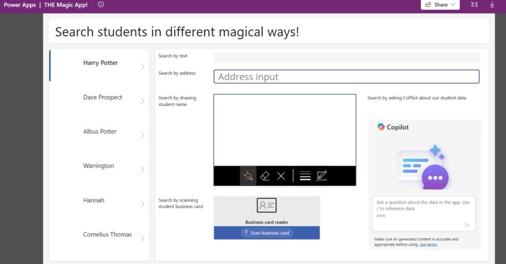
Searching in many ways
We have also introduced a glossy new feature for searching our student database in multiple magical ways, searching via standard text boxes, searching by scanning a business card, drawing a students name and utlising Copilot.
PowerPotters of Cepheo: Brewing Badge-Winning Elixirs with Pro-Code Potions and Beyond!”
Greetings, magical tech community! 🧙♂️✨ Team PowerPotters of Cepheo is thrilled to unveil our progress in automating elixir production for the ACDC 2025 hackathon. Our solution blends the powers of pro-code Python and low-code Power Platform to craft a system that’s both functional and badge-worthy. Today, we’ll reveal how we’re targeting the Pro-Code Potions category as well as these coveted badges:
Right Now
ACDC Craftsman
Thieving Bastards
Power User Love
Let’s dive into the details of how our Python-powered magic aligns with these badge aspirations!
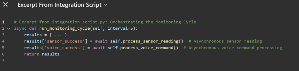
1. Claiming the “Right Now” Badge: Python – The Heart of Our Brew
The “Right Now” badge rewards smart, clean, and efficient code that elevates solutions beyond the realm of low-code alone. For us, Python isn’t just an enhancement—it’s the engine of our magical elixir automation.
Python Scripts: Unlocking Advanced Functionality
Our Python scripts (sensor_script.py, voice_script.py, integration_script.py) are designed for tasks that Power Platform cannot handle natively:
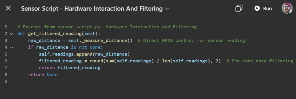
Direct Hardware Interaction: Using RPi.GPIO, our sensor_script.py captures real-time data from the potion cauldron’s liquid level sensor. Power Platform simply cannot replicate this hardware integration.
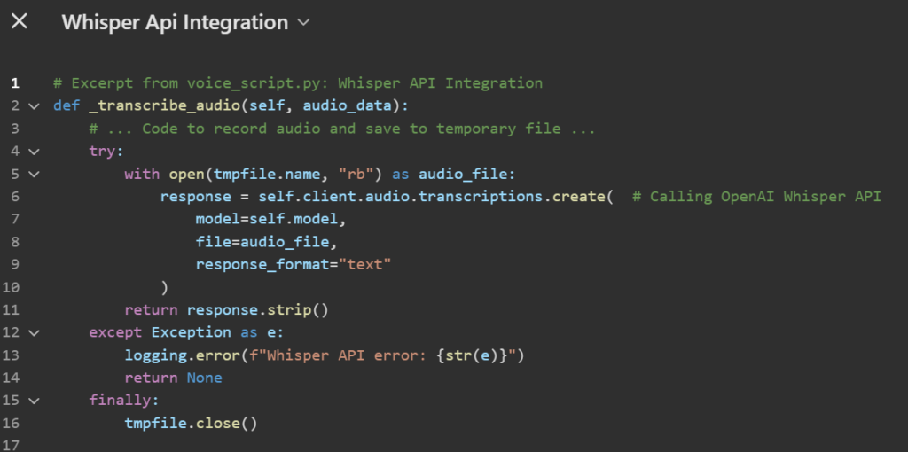
AI-Powered Voice Recognition: Our voice_script.py leverages the OpenAI Whisper API for advanced speech-to-text processing, turning verbal commands into actionable automation triggers.
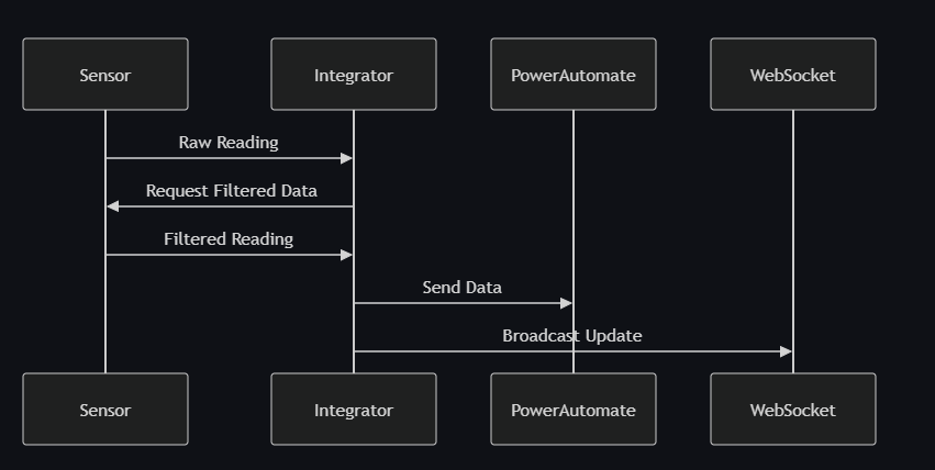
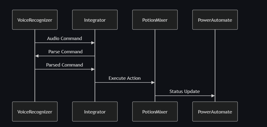
Intelligent Orchestration: The integration_script.py ties everything together—sensor readings, voice commands, and workflows via Power Automate.
With these examples, we demonstrate how Python serves as the lifeblood of our system, embodying the essence of “Right Now.”
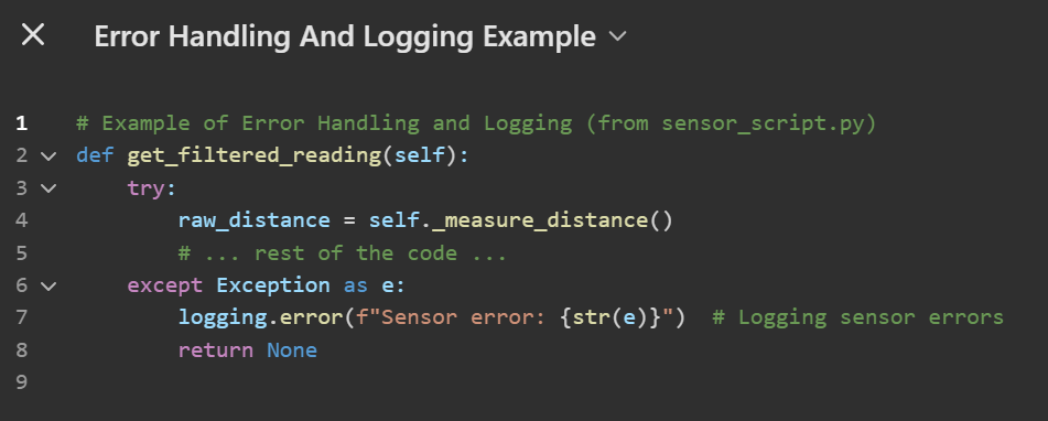
2. The “ACDC Craftsman” Badge: Best Practices in Code
The “ACDC Craftsman” badge celebrates development and deployment excellence. Our commitment to best practices is reflected in every line of Python code we write.
Highlights of Craftsmanship:
Modular Structure: Each script (sensor_script.py, voice_script.py, etc.) has a single responsibility, ensuring clarity and maintainability.
Error Handling and Logging: Robust try...except blocks and detailed logging ensure stability and traceability
Mocking for Testability: The Mock folder includes a GPIO.py mock module, allowing us to test sensor logic without a physical Raspberry Pi. This approach accelerates development while maintaining code quality.
By embracing modularity, testability, and robust error handling, we ensure our code stands as a shining example of “ACDC Craftsman” principles.
3. The “Thieving Bastards” Badge: Leveraging External Tools and APIs
The “Thieving Bastards” badge rewards the clever use of third-party tools to amplify solutions. Here’s how we “borrowed” brilliance:
Open-Source Libraries:
RPi.GPIO and requests for hardware and API interaction.
sounddevice and scipy for audio recording and processing.
python-dotenv for secure environment variable management.
OpenAI Whisper API: This external AI service powers our voice recognition functionality, enabling seamless integration of advanced speech-to-text capabilities without reinventing the wheel.
We’ve strategically combined these tools to accelerate development and expand functionality, earning our place as “Thieving Bastards” in the best sense!
4. The “Power User Love” Badge: Pro-Code and Low-Code Unite
The “Power User Love” badge highlights the magic that happens when pro-code customization enhances low-code platforms. Our project is a perfect example:
Power Platform for Low-Code Power: Power Automate orchestrates workflows, while Power BI visualizes potion progress.
Python for Pro-Code Power: Python bridges the physical and digital realms, enabling sensor integration and AI-driven voice commands.
Together, these platforms create a seamless, intelligent, and user-friendly potion production system.
Conclusion: Badge-Winning Elixir Automation!
With our meticulously crafted Python pro-code and Power Platform low-code synergy, we’re confident our solution is a contender for:
Right Now
ACDC Craftsman
Thieving Bastards
Power User Love
PowerPotters of Cepheo are proud to combine technical excellence with magical creativity. We look forward to seeing the results and continuing to share our journey. Stay tuned, fellow wizards!
NOTE TO THE JURY: we have taken your comment in and added details in the bottom of this article.
In our Wayfinder Academy, we take a comprehensive and magical approach to understanding the student’s history, aspirations, and potential to recommend the best possible new school. The process is detailed, thorough, and personalized, ensuring the student is matched with an environment where they can thrive.
Just to remind the process, here we assume a student who didn’t feel right about their current faculty, filed an application. Immediately after that we request the tabelle from their current faculty (historical data), ask a student to upload some photos from most memorable moments, and then invited to an interview. While we are still working on the interview step and will share the details later, with this article we want to add more details about one of our approaches to mining extra insight from the student’s interview by analysing the emotions.
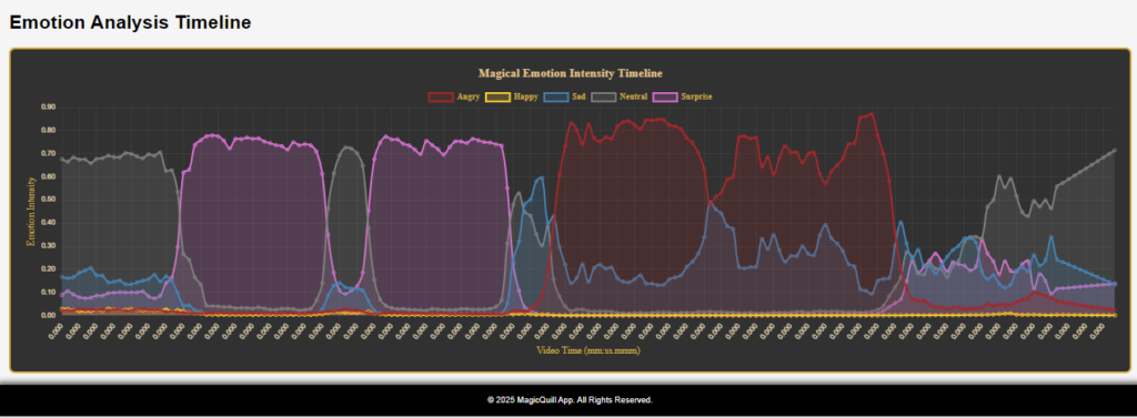
We use this emotional recognition along with the interview, to get 360 degree insight on the student`s reaction to the questions, that are designed to figure out their values, aspirations, fears, etc we can use to calculate the probability of their relation to the faculties and identify the one with the highest score (the scoring approach will be shared in a different post).
So, we are using a video stream capture to record an interview session and extract the emotional dataset.
It allows us to receive one more dimension that will extend standard datasets of the student, such as feedback, historical data from previous schools, etc.
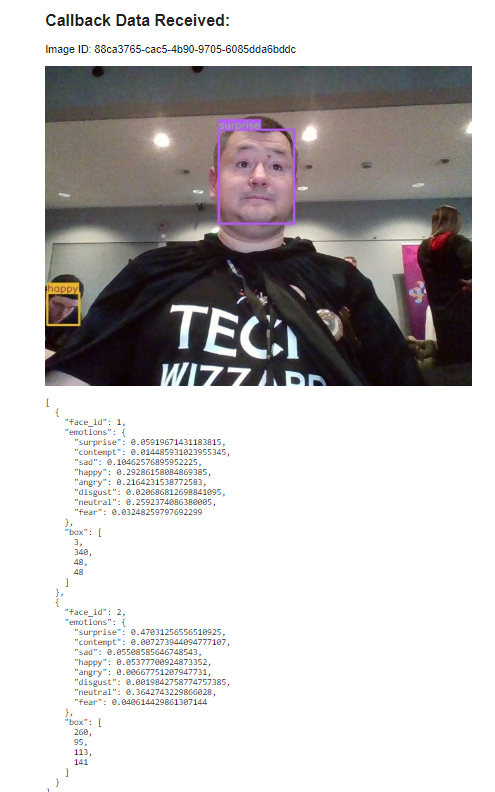
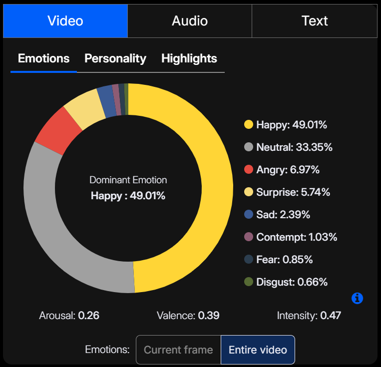
We use the imentiv.ai API to analyze the video and grab the final report. We then make the final dashboard in Power BI (we love it)
and embed it into OneLake.
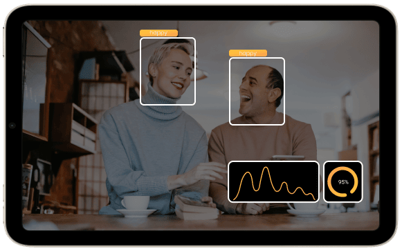
Imentiv AI generates emotion recognition reports using different types of content, such as video, photos, text, and audio.
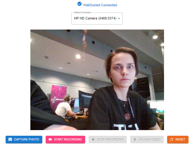
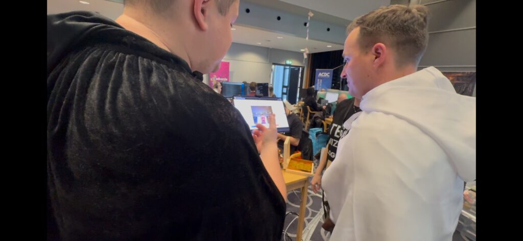
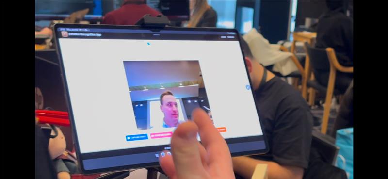
We implemented the single-page application to create an interactive experience by recognizing the emotions in the image captured via the webcam on our tablet. The analysis of the video stream takes more time, so we will demonstrate it later.
The app consists of two parts: a PoC to recognize the emotions in a photo from a webcam and an example of an emotion recognition report.
To build that PoC application, we decided to use the NodeJS stack. The engine is based on Bun, which is a modern and highly effective alternative to NodeJs. Compared to NodeJs, Bun was written with Rust.
For the front end, we are using React and ChartJs. We are hosting the PoC on our laptop. To make it available to the public internet, we are using CloudFlare tunnels. It also covers the SSL certificate termination, so your service will be secured by default without any significant effort.
The app server and the client app run inside a docker container, so you can deploy easily with a single command: docker-compose up—build.
To optimize the final container size and improve the speed of the build, we are using docker files with two stages: one to build the app and the second one to run the final artifacts.
PS:
Badges we claim:
Thieving bastards – we are using third party platform to recognize emotions in video and photo.
Hipster – we use BUN to run the application
Hogwarts Enchanter – we use Mystical AI imentiv.ai API to grab the emotional reports and visualize it in an user friendly way (see the screenshot above). Our enchanted workflow is using the data and making it available in OneLake. Wizarding world becomes closer when we see the AI based deep insight from various data sources in one place, in easy to read and interpret format.
Right now – we are using web socket server to implement real time communication between client and server site.
Client side salsa – we use React to implement front end.
PS2: pls come over to our camp and test it out! We want to know how you feel! 🙂
What is it good that you can have improved customer communication with chatbots and forums, if the plumbers can’t get notified in realtime of relevant cases? Moreover, Mario and Luigi as CEO and CTO respectively want real-time data for improving decision support (e.g. plumber allocation) and PlumbQuest trends for further analysis.
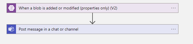
Dataverse Webhook on Incident reports
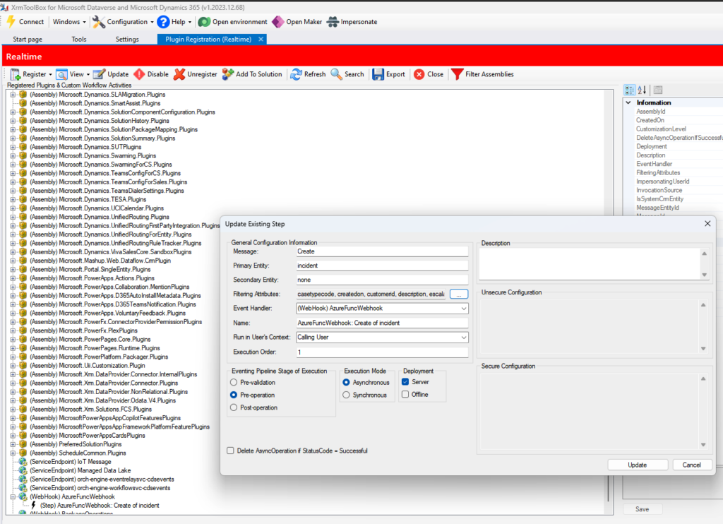
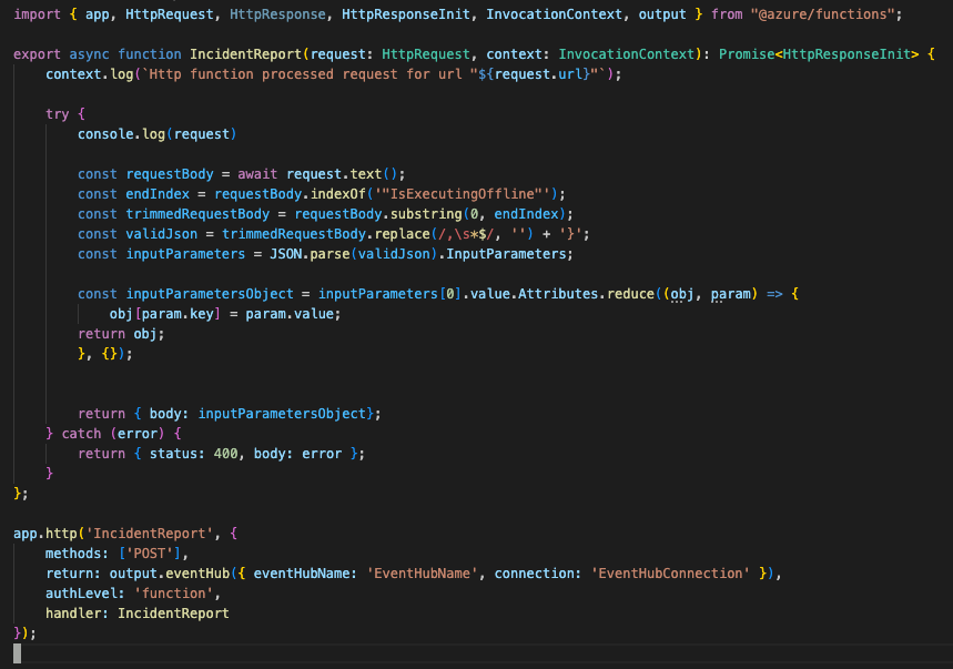
To extract real time data, we created a Web hook using the plugin tool box for Dataverse, which calls our Azure Function whenever a new PlumbQuest is made.
XRMToolbox to add a Web hook to Dataverse for real time PlumbQuest analysis
To ensure safe access, function level authentication is applied, where the toolbox allows for HTTP Query parameters, safely accessing our Function which uses a traditional HTTP-trigger:
However – Here is the hacky part. The Web hook payload is too large, which makes the traditional JSON-payload corrupted with highly dynamic lengths and content of each PlumbQuest. Therefore we had to do some custom string manipulation to extract the values of most business and de-corrupt the JSON and preparing it for analysis – Almost a Complete ETL-pipeline (*cough*)!
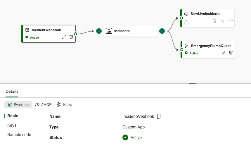
But to access this real-time data in an Analytics environment – Fabric is the way to go (as by Microsoft huge Hype-wave). We created a Custom app Source for an Event Stream in Fabric with an EventHub output binding, which then can map to many different destinations, including a Lakehouse for historisation and trend analysis, as well as Data Factory Reflexes for reactive actions in real-time.
With Data Activator’s Reflexes directly on the stream, one can e.g. trigger additional flows for highly acute PlumbQuest from members in distress, or highlight plumbers who did not provide proper service according to the PlumbQuest review.
Our Fabric Event Stream with the Custom app as Source and the Lakehouse for historisation and down-the-line processing and analysis
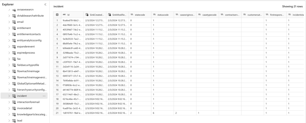
In addition, we set up a Dataverse Shortcut (Link) to Fabric, allowing for direct access to Dataverse without ETL or ingestion, providing ease of access and down-the-line deeper analysis on key business metrics, trends and community engagement.
Our PlumbQuests in Fabric Lakehouse using a Dataverse Connection for e.g. a more complete 365 customer view using Fabric items
Reproducible deployment
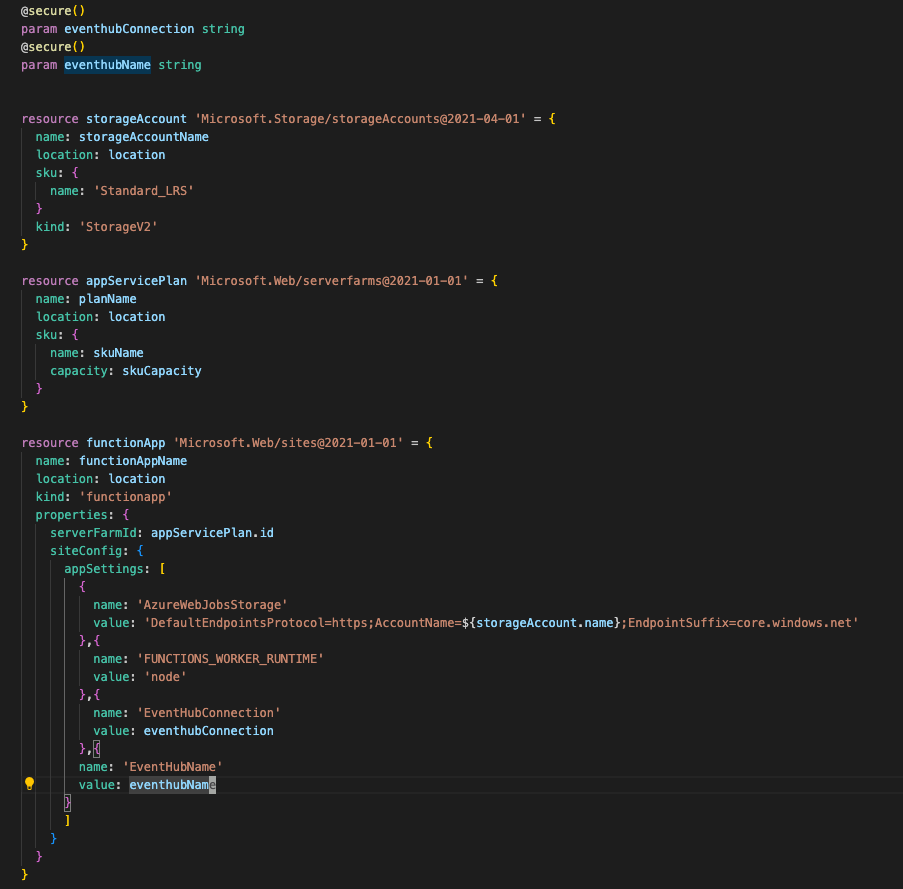
Although we are nasty hackers, we are reproducible hackers. As these were the only Azure resources used (directly), we deployed them using bicep and the Azure CLI. Sensitive variables are marked as secure and not included in the scripts, but parameterised.
The main bicep deployment definitions for our Azure Function app and related resources, the resource group naturally had a separate BICEP definition.
So if you want to do it hacky, at least make it traceable.
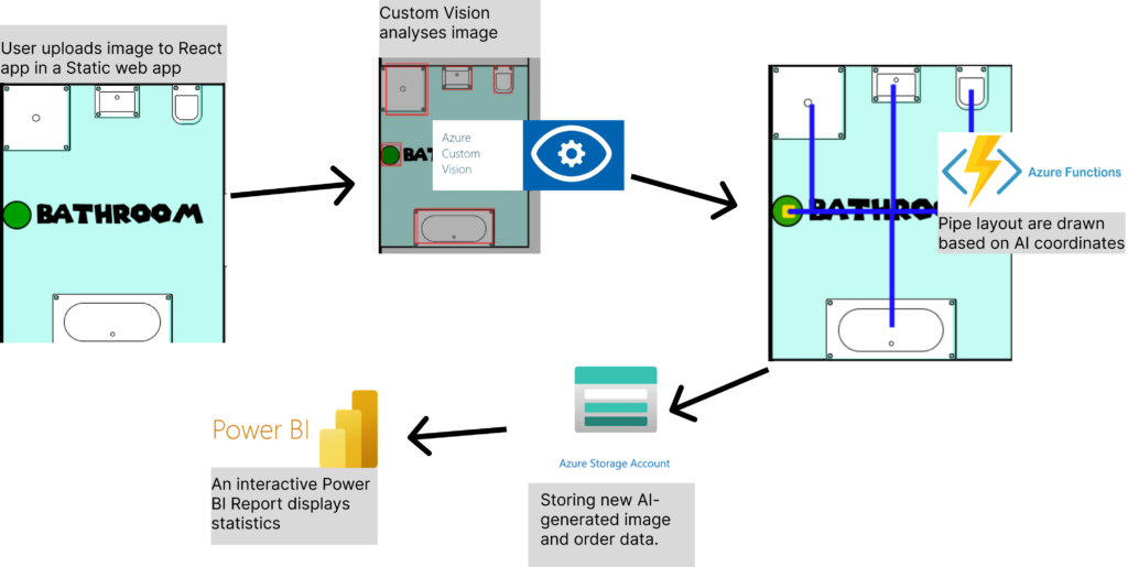
To make our amazing service Tubi work, a lot of cloud is needed. We aim to make the plumber’s job easier by recommending the best layout for where the pipes should go, and for that, we need AI. We have trained a model in Custom Vision to recognize all components in a bathroom that need water. So, when the plumber uploads a floor plan to our Static Web App, the image is sent to our Azure Function App backend in C# Asp.net through our own API. But both the image and the equipment list must be stored somewhere. Therefore, we have also connected to Azure Blob Storage. Then last but not at all least. The people working in the back office have instant interactive reports available to help them with filing and billing through Power BI and alerting the using an automated flow (Badges: Feature Bombing)
Sometimes it works, and that’s plenty
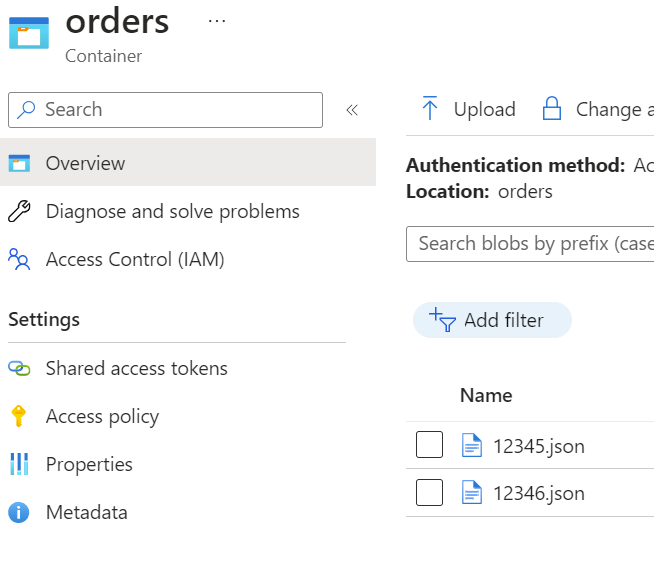
Databases are good, but sometimes it’s easier to just dump everything in one place until you need it again. Yes, it might not be very scalable or very normalized. SQL became too heavy, and we already needed a Blob storage to store the images, so we also dump the order data in the same blob storage as JSON files. It’s old fashioned way of serverstorage, and a bit dirty, but it works! (Badges: Nasty hacker, Retro badge)
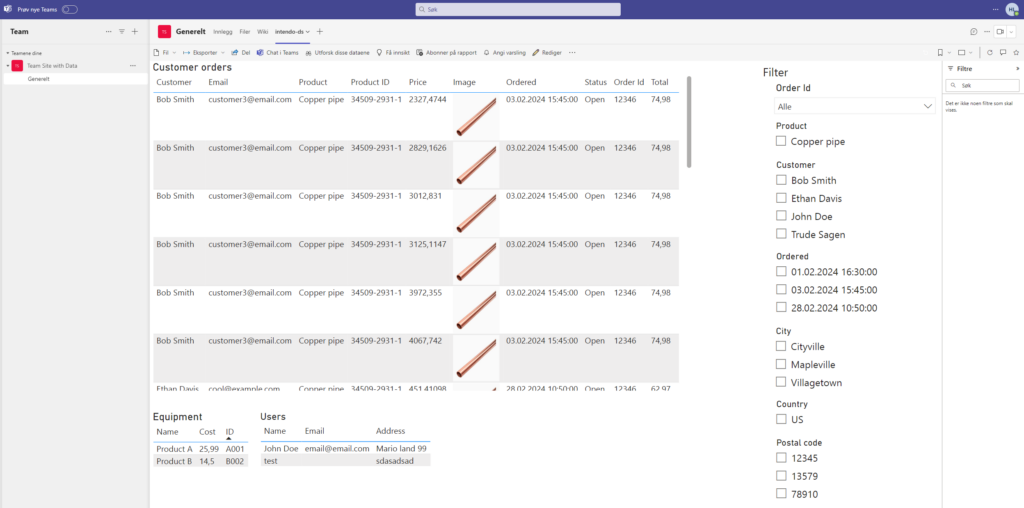
Power the backoffice
As the final list of components are decided, they still have to be approved from the accounting team in the office. To make sure they have all the information they require, we have developed a Power BI dashboard to crawl through our registered data and make sure the orders are handled properly (Badges: Crawler, Dash it Out, Dataminer). And to make sure the orders are handled easy and fast, the dashboard is embedded into teams and an alert is automated by using a logic app to make sure the workers can receive and cooperate in realtime (Badges: Embedding Numbnuts, Go with the flow, Pug N’ Play, Power user love, Right Now, Stairway to heaven).
Client Side Salsa – for the react code for PCF control
Hipster – for using node.js for secure communication
Right now – for socket io for real time communication with the active users in Model driven app
Nasty Hacker – for incredibly awesome solution with dirty hack on the model driven side
Power User Love – for using socket io with Azure Function in low-code power apps
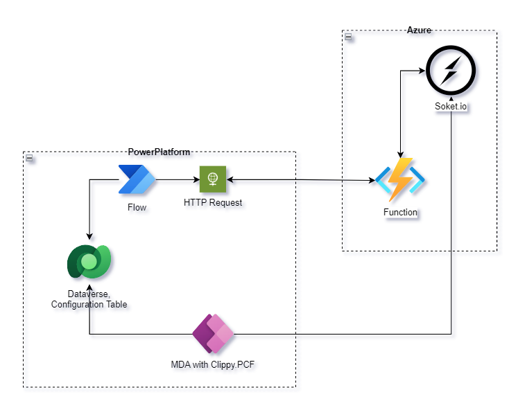
High Level Diagram
Implementation
All realtime communication is implemented via the soket.io that hosted on Azure.
Project Update: Real-Time Communication and Enhanced User Interaction!
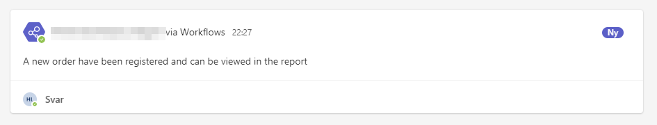
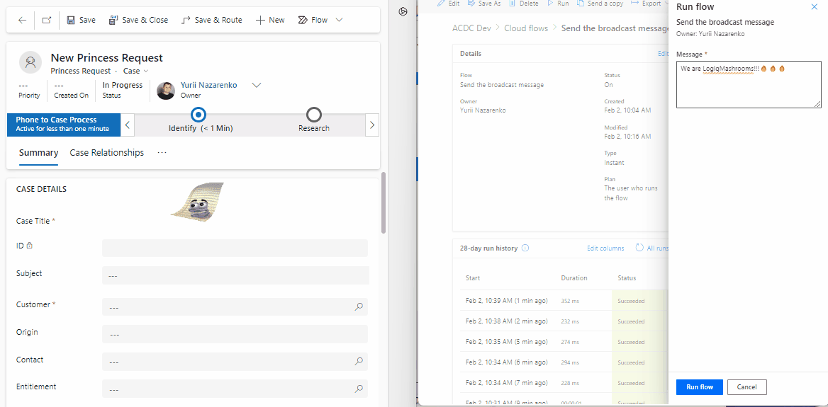
We’re excited to share the latest update on our project, featuring a significant enhancement in real-time communication capabilities. Now, administrators and backend integrations can seamlessly send messages to users who have opened specific records. This means that when there’s a change in the record status (e.g., case completion, modification), users will receive instant notifications prompting them to update their page for the latest changes.
This feature not only streamlines communication but also serves as a handy tool for various onboarding processes. Additionally, it facilitates users in understanding what has changed post the deployment of a new release.
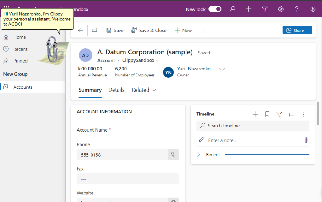
Behind the scenes, we’ve implemented Clippy PCF, built upon the ClippyJs project, to empower this real-time communication. Leveraging the power of socket.io hosted on Azure, our solution ensures swift and efficient message delivery.
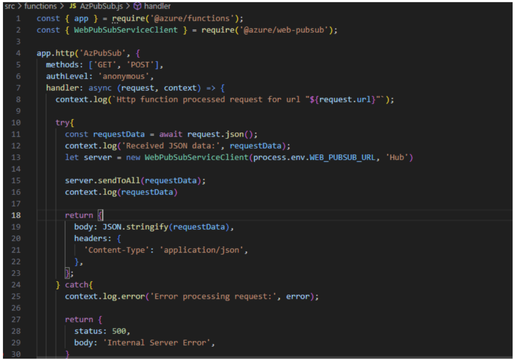
Moreover, the backbone of the real-time communication lies in Azure Functions, written in Node.js. These functions diligently send out notifications to the socket.io instance hosted on Azure, creating a seamless and responsive user experience.
Exciting times lie ahead as we continue to innovate and refine our project to meet the evolving needs of our users. Stay tuned for more updates, and thank you for being a part of our journey!
Business scenario
It supports real-time communication. So, Administrator or backend integration can send the message to the user that has opened the record. For instance: backend integration changed the status of the record (case has been completed, changed, etc..), all user that has opened record will receive the notification that they need to update the page to receive the lates changes.
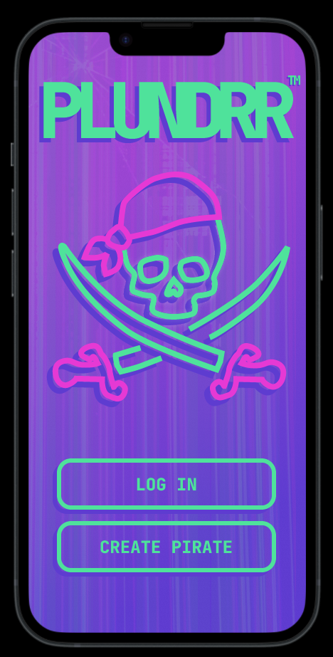
Picture yourself as a pirating entrepreneur: You are eager to get rich, be feared and get results faster than the old generation. We know you are vell versed in apps such as Uber, Fiverr, Porterbuddy and AirBnB. In short you want things on time, at the right location and as convenient as possible. This is why you need Plundrr.
“I never thought I could loot this much of coin in such a few moons. Yarr!”
– Pirate Captain Beta testing Plundrr
Art showing the Plundrr Skull and Sword logo with Plundrr name and tagline “get richer faster” underneat
Plunder is a Raid Planner
At the a first glanse Plundrr is a simple app, but it does a lot of the heavy lifting for you. You set your desired course – from one cove to another – and Plundrr uses machine learning, data scraping, powerful automation, advanced trigonometry and vector calculations to pinpoint prime targets and map intercept courses for you. All you need to do is to show up in time and keep the sails full. However, for every raid there are are key factors for business success:
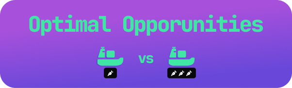
Find the Best Opportunities to Plunder
Steering Clear of Threats
Intercept all opportunities in most cost efficient manner
Challenge 1: Find the Best Opportunities to Plunder
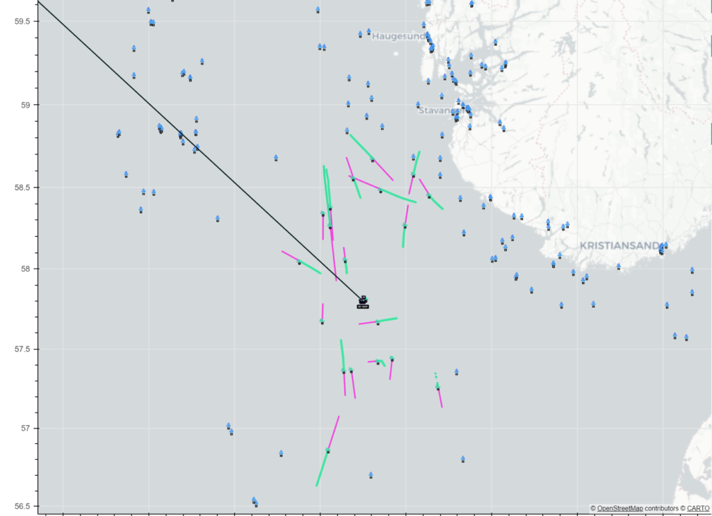
Based on your ships course and destination Plundrr can estimate which boats will be in your path. But it is not enough to know what boats are there, you also want to know which one has the better booty. this is where Barenswatch comes into play: We scrape all data about all vessels on your rout and calculate estimated value of the ship. We use the ship classification and size of vesle to estimate the value of the ships cargo.
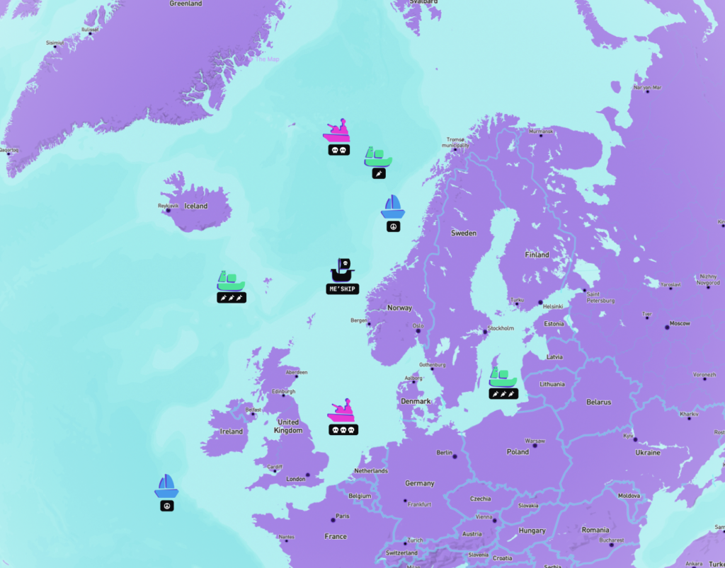
All opportunities are ranked and given a carrot score 🥕. The more carrots the better. Optimally we want to strike all triple carrot targets in our path and also deviate if total yield will be better persuiting triple carrots over single carrots. In short, 🥕🥕🥕 is better than 🥕.
“Using carrots for value! Haha, thats stupid but also so correct”
– øystein from @in1
Challenge 2: Steering Clear of Threats
There will be compassion out there. No worries, Plundrr’s has your stern. From barenswatch we also get classification types for warships, police and even with some tinkering and estimation: Other Pirates.
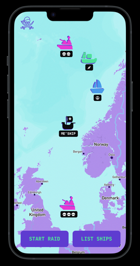
We label all ships as opportunities, friendly or threats and higlight which to avoid and what strength they have in the UI. We call this the Scull Score 💀. As for carrots, the more sculls the more danger. We allways reccomend avoiding tripple scull boats, however we give you the intel and freedom to choose to attach tripple carrot ships even when they are close to a single skull. This risk/reward judgement is for you to decide.
Screen grab showing the interactive map in Plundrr with icons for opportunities, threats and passive ships. Every ship is given a score from 1–3 carrots or 1–3 skulls denoting estimated value or threat level.
“Wow, I love how the UI is really clear. Also the boats are fun!”
– Håvard from @in1
Challenge 3: Intercept all Opportunities in most Cost Efficient Manner
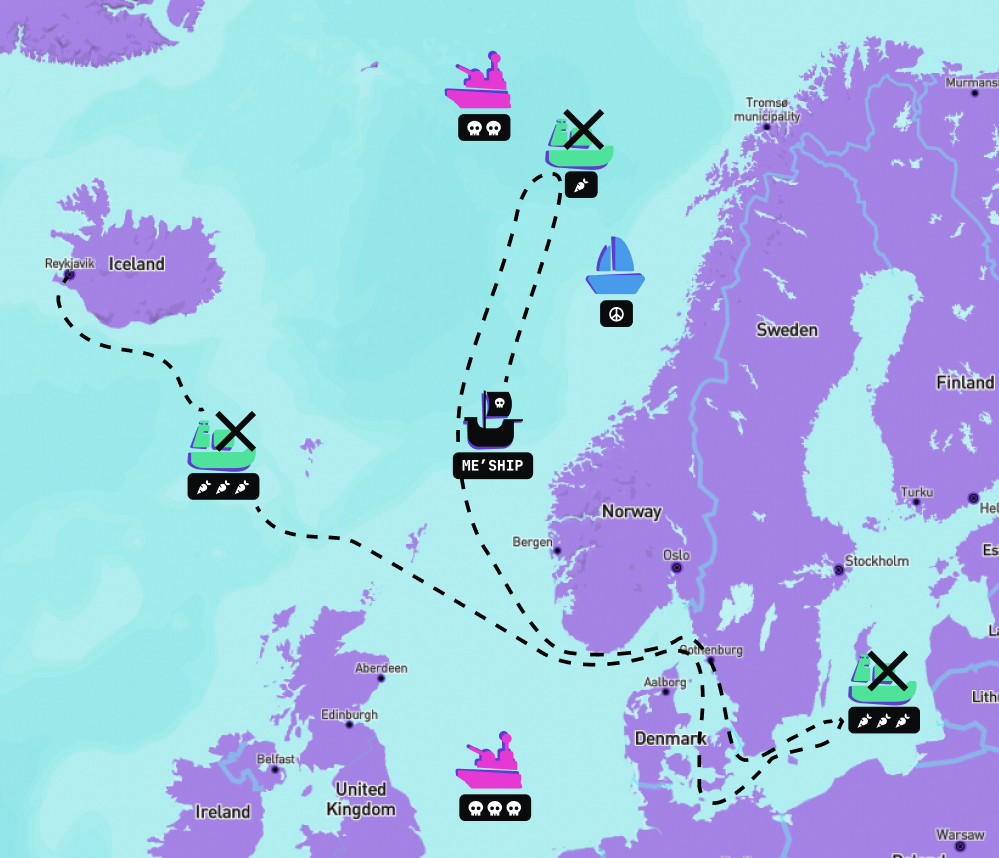
Once the user has chosen a rout, we plot that rout and use machine learning to simulate optimal target vectors. The problem we are solving is called the traveling salesman’s problem: A person travels from point A to point N ion a two dimensional plane. In between his origin and destination there are multiple opportunities for sales scattered in every direction. Our challenge is to plot the optimal course between ale opportunities traveling the shortest totalt distanse. Although for sea travel we need to slightly adopt the model to account for sea current and the travel of other ships.
Illustration of plotted path between opportunities avoiding high risk
Exploring the Technical Side
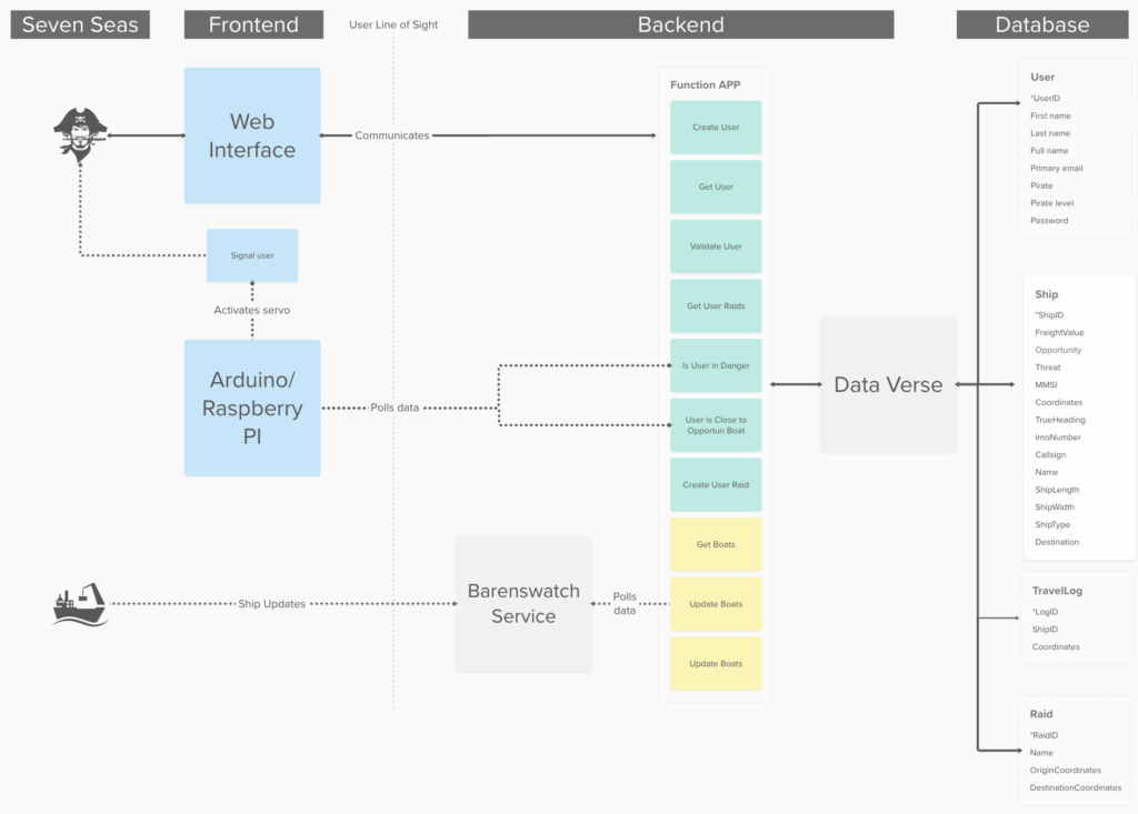
The technical Architecture, although straight forward leverages Power Automation and Power Flows to achieve more with less.
System diagram showing the technological architecture of the app, moving from what the user sees on the left, crossing the “users line of sight” into the backend structure showing the Function APPs services and how the are connected to Dataverse and its data storage
Mining Data
Data is predominant gathered from Bareenswatch, an open API for ship traffic on the Seven Seas. For each ship we get heading, size, global position and weight. We store the data in Dataverse for further use and manipulation.
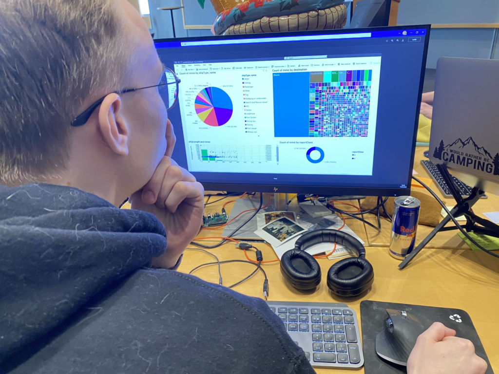
One of the ways we used the mined data during this hackathon was to viziualise ships as opportunities based on weight and size. The data was rendered in a Power App dashboard enabling the team to examine data to better understand how we should define high opportunity targets for Plundrr.
The data mining and visualization granted us badges in:
Dash it Out
Dataminer
Captain Mats looking at a dashboard showing data from barenswatch grouped and prioritized based on estimated value
Storing Data data Using Data Verse
The backend functions of the solution is mainly built on the Power Platform allowing an excellent user experience when it comes to accessing and managing data. A modeldriven Power App is used as a killer app for administrators to work with saved information about raids, pirates and ships with travel logs. This data is saved in Dataverse to make sure a database is available for all kinds of applications created by users of rock solid geekness.
Flow fetching data from Barenswatch and storing to Dataverse
The tables in Dataverse can be accessed using Power Automate API, wich allow us to manipulate and control the dataflow, making sure each request is handled based on where it comes from and what it is used for. This way, a various amount of data can be returned based on input value, and therefore creating a most extreme business value where customers can retrieve amounts of data defined by how much coin they invest in the solution.
Flow that triggers events to Microsoft teams from new records in our pirate rooster
Use of Data Verse for the backend granted us badges in:
Go with the Flow
Power User Love
Plotting Paths using Python and Bokeh
We use the coveted algorithm “shameless extrapolation”, taking into account the ships current speed to estimate the ships future route. The 20 closest ships are considered opportunities and highlighted with the bright turquoise icon. Hovering over ships in the map gives information about name, type and destination.
Paths are plotted using Bokeh – a Python framework for creating graphs and plots.
Initial research into plotting and vector calculation made us explore prediction algorithms taking into account additional factors to predict opportunities location even furter in the future. Luckily after working on this we discovered we can achieve the same results with less complex algorithms like the “shameless extrapolation”, meaning we can decrease the cost of our service to the end user: Granting even more bang for theoretical buck.
“This is ridiculous. So much effort must have gone into this!”
– Rune from @in1
Solveig’s ☀️ amazing work awarded us badges in:
Crawler
The Existential Risk
Retro
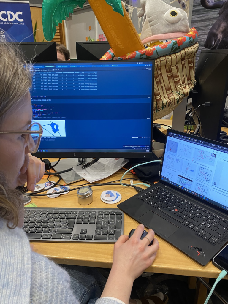
Solveig ☀️ researching vactor calculation based on tru north and origin of vessles.
Automating Deployment and Infrastructure
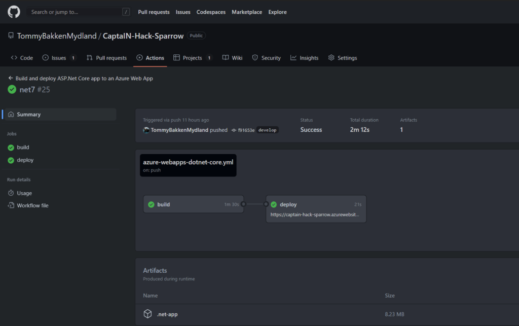
We built a SPA application with .NET 7 and React. With these tools, we have build a sturdy vessel that’ll weather any storm.
.NET 7 provides us a robust backend framework while React keep front-end shipshaped. Together they make a formidable team that can take on any challenge on the high seas the is web development.
With GitHub Actions our ship will get the lates features and bug fixes in no time. Our ship is deployed with Pulumi, so we have Infrastructure as code and is running in Azure.
Screengrab from Github showing deployment and merging routines.
Use of these technologies awarded us the badges
Sharing is Caring
Power User Lover
ACDC Craftsman
Client Side Salsa
Packaging the User Experience
Good design is never an afterthought nor a last feature. Good design comes from understanding human needs and quality experiences. We wanted to appeal to an audience that grew up in the 90’s and are aquented to all the services the 20’s afford, like Uber, Tinder, Porterbuddy and Oda. Following an initial brainstorming we landed on Neon Retro as inspiration (cyberpunk music was playing at the time which might have sparked the idea).
“Wow! You can do this with Figma? I never knew. I’m installing Figma now.”
– Guy at luch I cant remember the name of
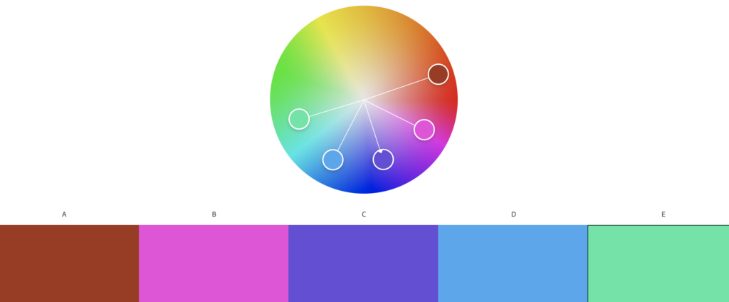
Fist step was to find a pallet and to create some sort of brand. We used Adobe Color to mix a color pallet based on a selected base. This base was used to make custom vector inspiring the rest of the apps design.
Screenshot from Figma prototype showing login screenScreenshot from Figma prototype showing map with highlighted opportunities, threats and friendliesScreenshot from Adobe Color showing how Analogous color ceperation was used to create a color palletCustom Vector Graphic for main logo inspired by Neon Futuristic designs.
The color pallet and main logos look and feel is used throughout the UI to make a modern yet eery subtly retro design. Icons for the app are altered versions for existing icons from Nounproject. Since they are heavily modified from originals we claim fair use.
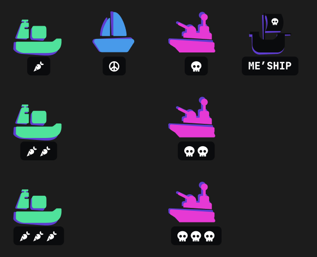
Example of buttons in the app, one style for main button and one for secondary action like “back”Set of icons for Opportunities, friendly, hostile and your own ship.
Prototyping using Figma awarded us these badges:
Retro
Glossy Pixels
Summarizing Three Amazing Days
During the hackaton we’ve all been forced to take a step back and reconsider the direction of the project and our solutions. We tried connection an arduino to a Raspberry pi to use as a notification system for when the ship was in danger, but with (almost) faulty equipment and with limited knowledge, we had to scrap the idea. A lot of hours spent, and one could say wasted. But its not really wasted at all, as we definetly learned something on the way.
We are truly happy we got to test our limits, share our ideas with new friends and discover how awesome it is to be a happy camper and spread joy.
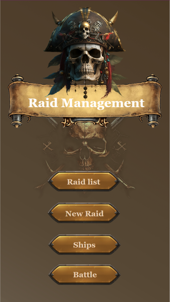
“MMM.. is the ultimate tool for pirate captains looking to maximize their raids. With our comprehensive system, you’ll be able to plan, organize, and execute the perfect plunder. No more manual logs, no more disorganized crew. Just a streamlined, efficient process for taking what you want from the high seas. Upgrade your pirate game today with Maritime Mischief Manager.”
Pirates are met with a friendly user interface where they can manage all aspects of pillaging.
Creating a Raid
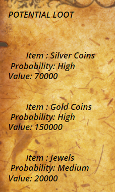
Under the “New Raid” menu, pirates with the rank of Captain can take a look at possible raid prospects and get an overview of the best possible strategy and also an estimation of the loot potential in the selected location.
The results we are seeing above comes from a query against the ChatGPT API with the use of Power Automate.
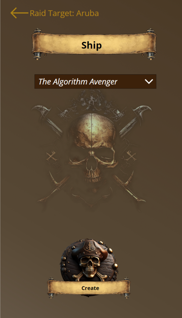
Being satisified with the current target, the Captain selects the vessel for the raid, choose to create it and the raid enters planning mode.
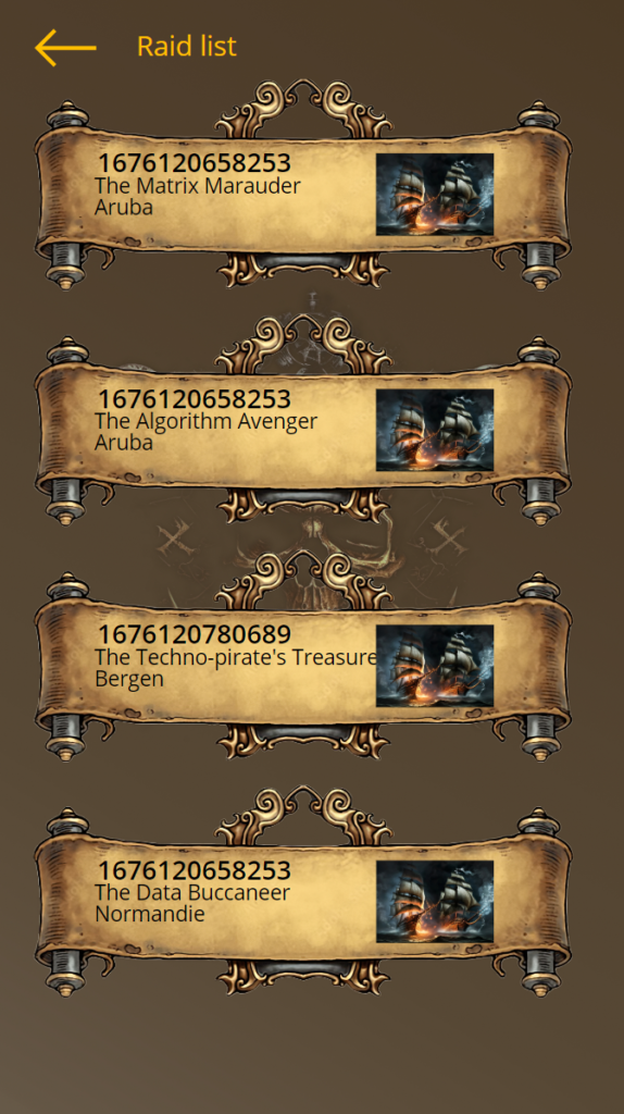
Raid planning
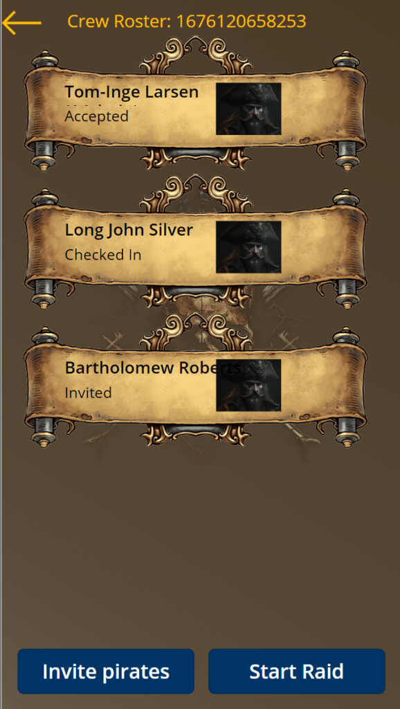
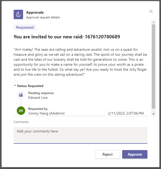
From the raid list, piratescan view raids in the planning stage. Simple pirates can choose to join a raid if they want to, but Captains can also choose to invite his best men. Pirates receiving an invitation will have to accept/reject the invitation through their Teams account.
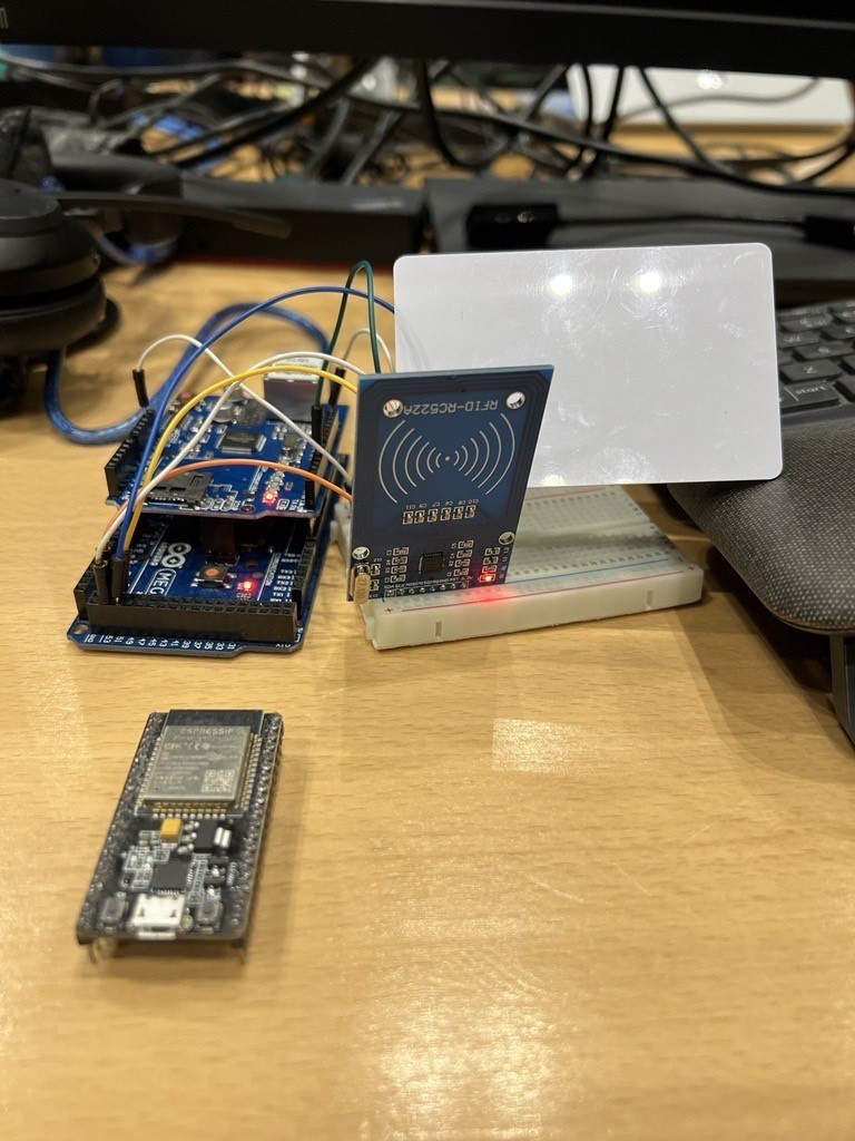
Once the pirate has received and accepted an invitation, they have to scan their provided RFID card when they board the ship. They will then enter the status of Checked in.
Once the RFID card is scanned at the ship, a HTTP request is sent to the raid check-in flow, the flow will update the crew status.
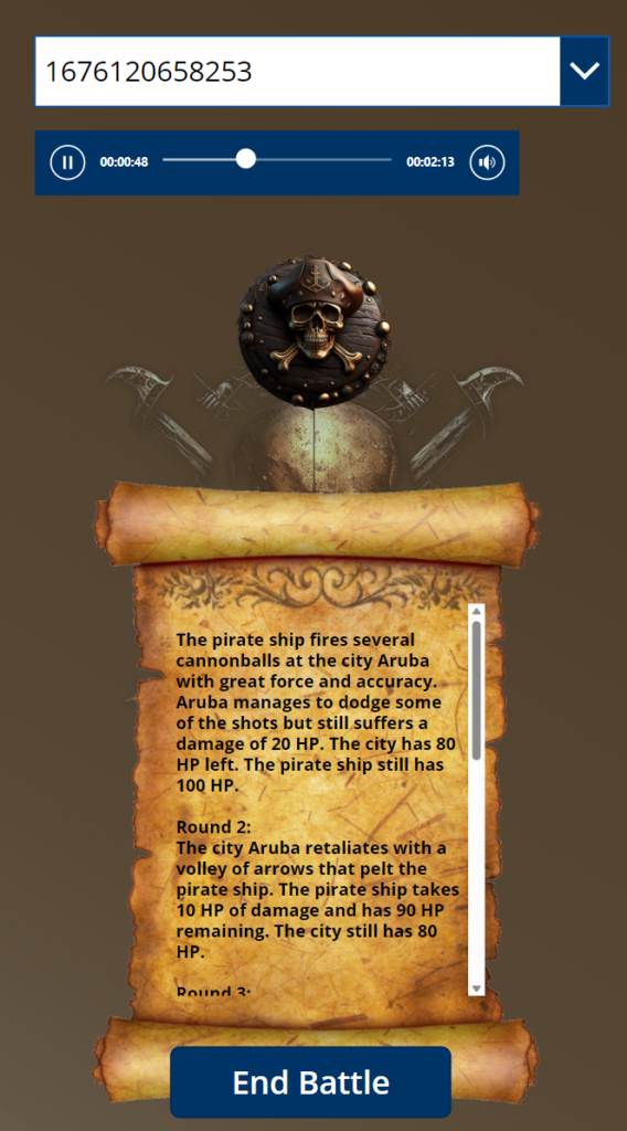
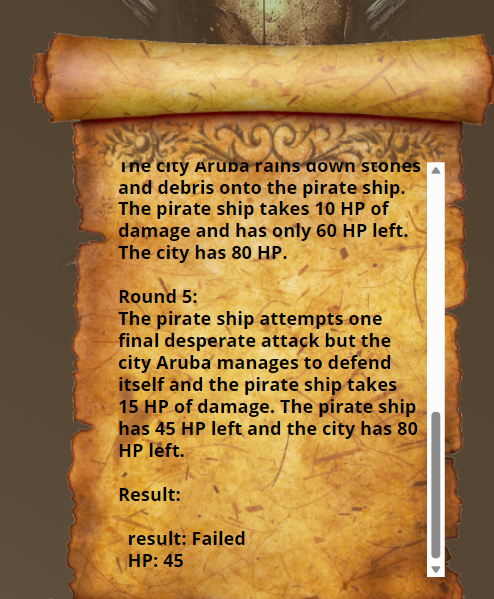
When the Captain is happy with his band of criminals, he chooses to start the raid. The app conveniently simulates the battle as well, together with some nifty battle music. This is of course to save the hassle of actually raiding a place.
Reporting
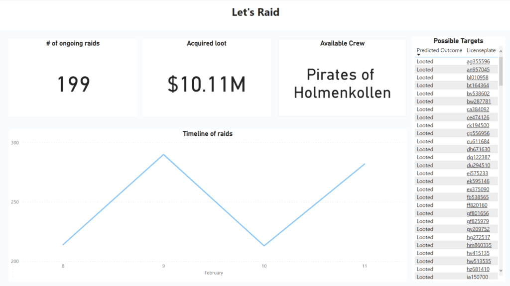
The pirate management team of course also have access to beautiful numbers of the entire operation
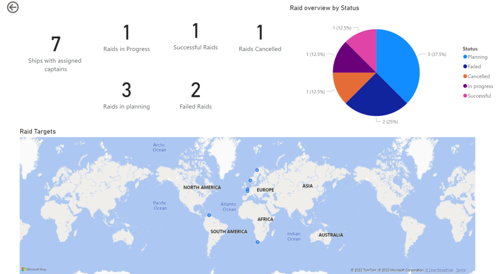
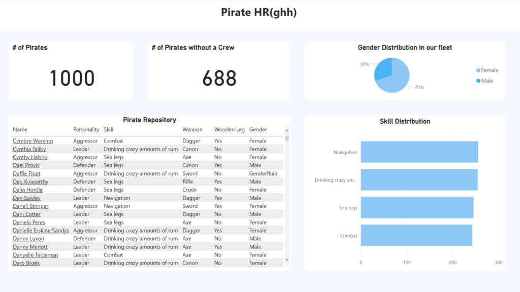
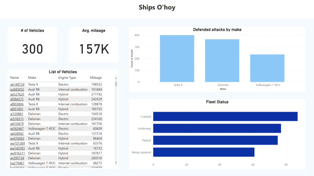
Arrr matey! Welcome to the world of reporting on port ships, pirates and fleets!
As ye might already know, Power BI is a powerful data visualization tool that can help ye track and monitor yer fleet, port ships and even pirate activities. Ye can easily gain insights into yer fleet’s performance, inventory & pirate attacks, and so this is what we have done as shown in the images below.
HRGhh reportShips O’hoy Fleet Management report
Arrr matey, we’ve created not just 4 graphs, but 4 report pages to address some of the various business needs a pirate may face on the high seas. Thar be a pirate HRGhh report, a Ship o’hoy report for fleet management, a map displayin’ our location and foes in real-time usin’ the DirectQuery capabilities in Power BI, and lastly a raid report utilizin’ Azure ML to predict which pirate ships we may loot successfully. This’ll aid us in makin’ informed decisions about the future of our fleet and help us chart our next course.
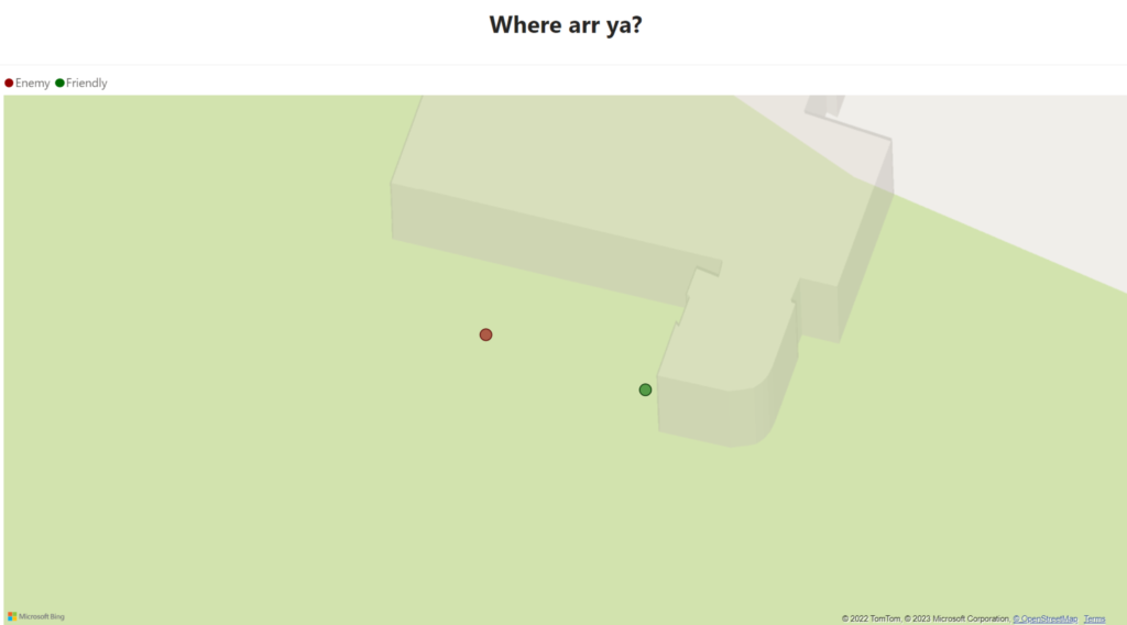
Below be a snapshot of the real-time, allowin’ captains and pirates to collaborate from different ports. This way the captain can signal which pirate to attack or stand down based on their proximity to the enemy, makin’ the collaboration smoother, even from a distance. This map be based on the location data from other ships and our own (Raspberry Pi) and displays the last recorded location through longitude and latitude.
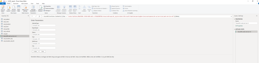
When it be comin’ to pirate raids, there be other booty that be worth a king’s ransom, and that be understandin’ the chances of a successful pillage. To be doin’ this, we scallywags created a simple map usin’ Azure ML that be givin’ us the lay of the land, predictin’ our loot based on the target’s worth such as their ship’s maker, the distance they’ve sailed, the power of their engine, and their current state.
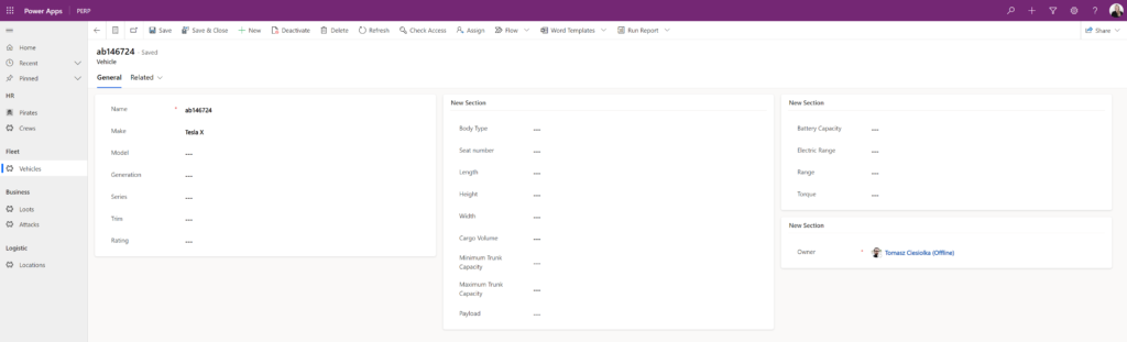
We be feedin’ th’ AutoML model int’ th’ Power BI report, savvy? This be allowin’ us t’ do predictions on new data ’bout our enemies, which we be displayin’ in our report fer th’ captains t’ make well informed decisions, specially when coupled with th’ map. By clickin’ on a license plate number as ye see below, th’ captain will be taken t’ our model driven app and shown more information ’bout th’ possible target, aye aye!