With great tools comes great responsibility to be productive. With the myriad of application surfaces today each individual has the option to use any app on any device to get the job done.
By providing functionality via native and PowerApps it’s super simple to provide entry points to needed functionality from most productivity tools in M365.
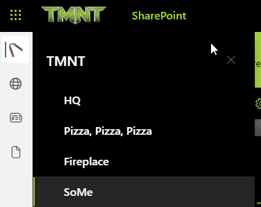
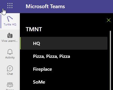
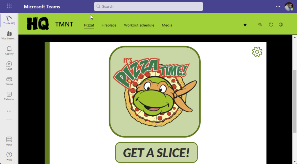
If you’re in a MetaOS Hub like SharePoint or Teams (more to come), Viva Connections with its Home Site functionality is fully integrated with a global entry point to the most useful apps. Develop ones, configure once, use all the time!Viva baby!
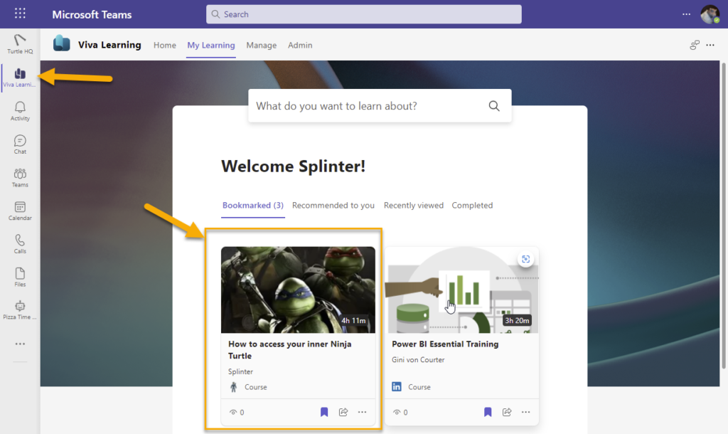
Throw in some Viva Learning, easily extendible with custom learning sources and you have learning at your fingertips as well.
Viva Learning – with custom content
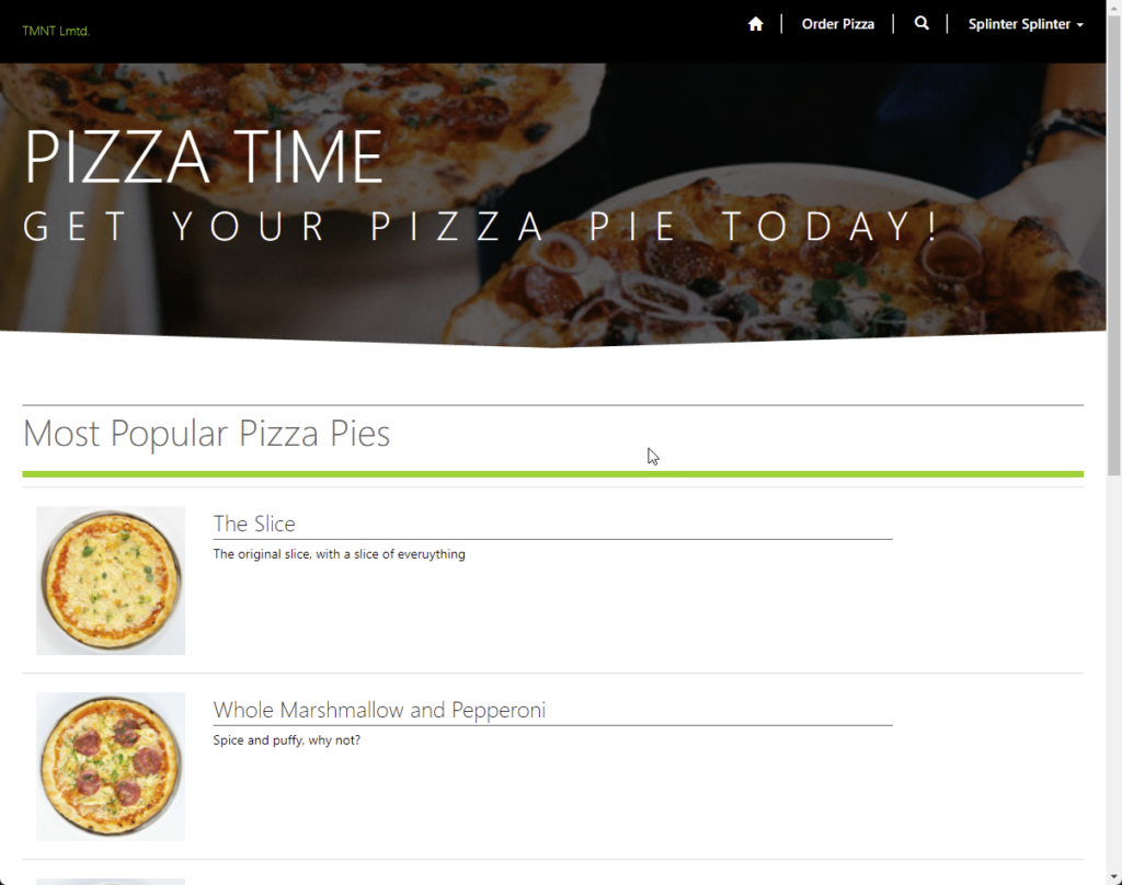
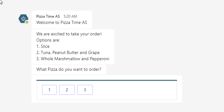
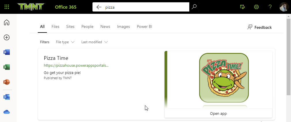
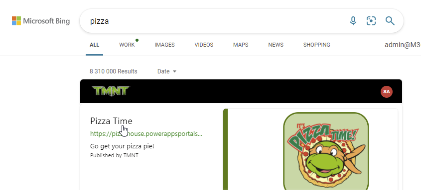
For those who fancy typing and chatting – which might be harder for turtle flippers, we provide pizza ordering via a virtual agent chat bot (ok, this is mostly used my TMNT IT to order overtime pizza).
Chat up a pizza pie!
Ordering at your finger tips
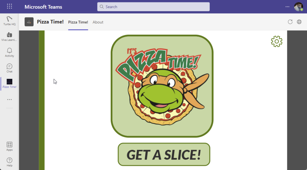
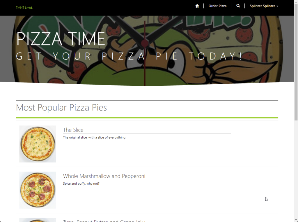
Pizza Time app in TeamsPizza Time app in Teams via Viva ConnectionsPizza Time app via search navigation in office.comPizza Time app via public web search – linked from workPizza Time public web site ordering – inclusive for the old peeps
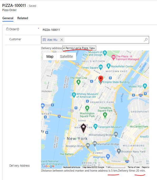
In the native pizza ordering app we have developed a custom component to calculate estimated delivery time of the pizza.
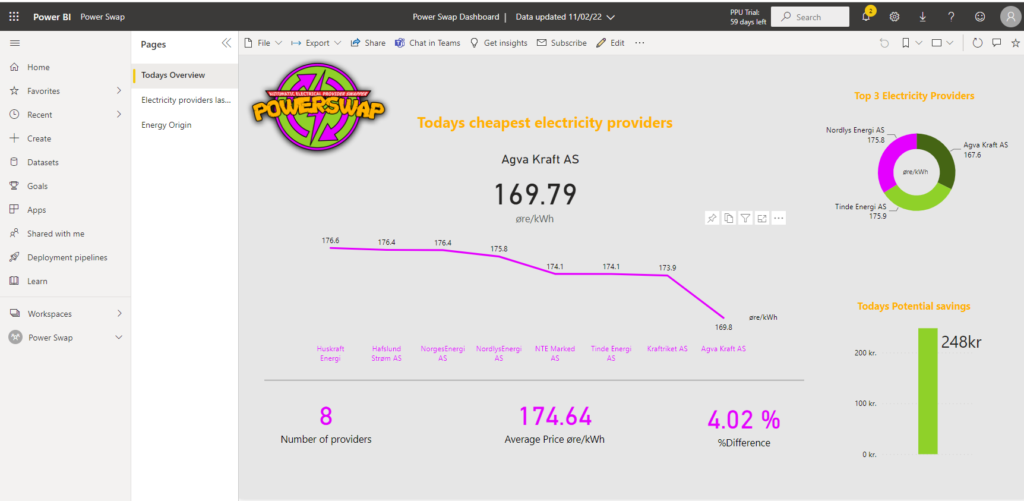
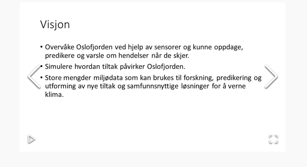
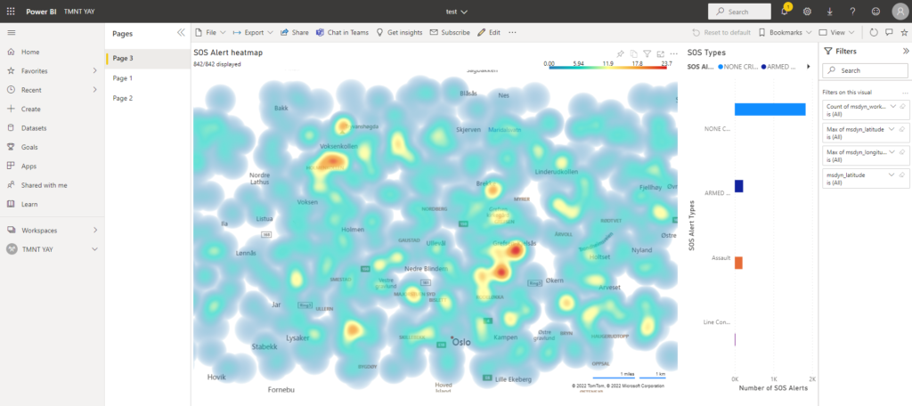
SOS Operator life is hard, and even harder when you have to handle everything on a SOS-by-SOS basis. In order to aid operators in dispatching the correct resources and communicating preventative measures, MaMNT have now set up a Power BI dashboard that gives operators an overview of the current and past situation in the Oslo area.
Being new to Power BI, we explored a number of different metrics that could be useful to operators in report form. Not all of them were feasible, but the heatmap we set up is the crown jewel of the report. It will act as a basis for preventative measures and staffing (turtle) needs around the city.
The first page of the report contains a heatmap of SOS calls throughout the Oslo area, which is updated every 15 minutes with new, incoming SOS calls. It also shows the spread of SOS types, and the map can be filtered to specific types by clicking the columns.
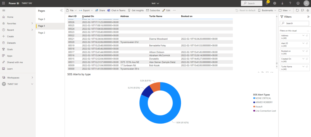
The second page shows a pie chart of the SOS types, combined with a list that shows detailed data on each SOS call.
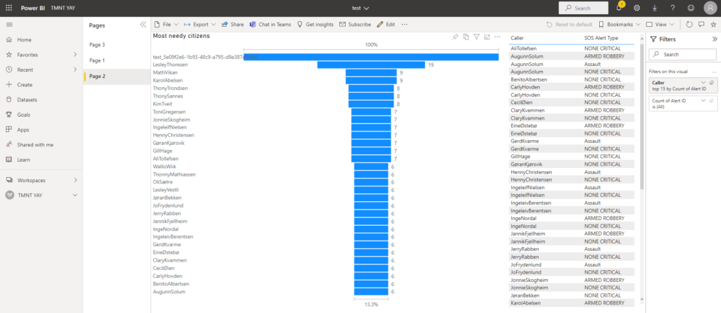
The third page shows the 30 “neediest” citizens by number of SOS calls. The list on the right shows the types of calls made by each of the needy citizens.
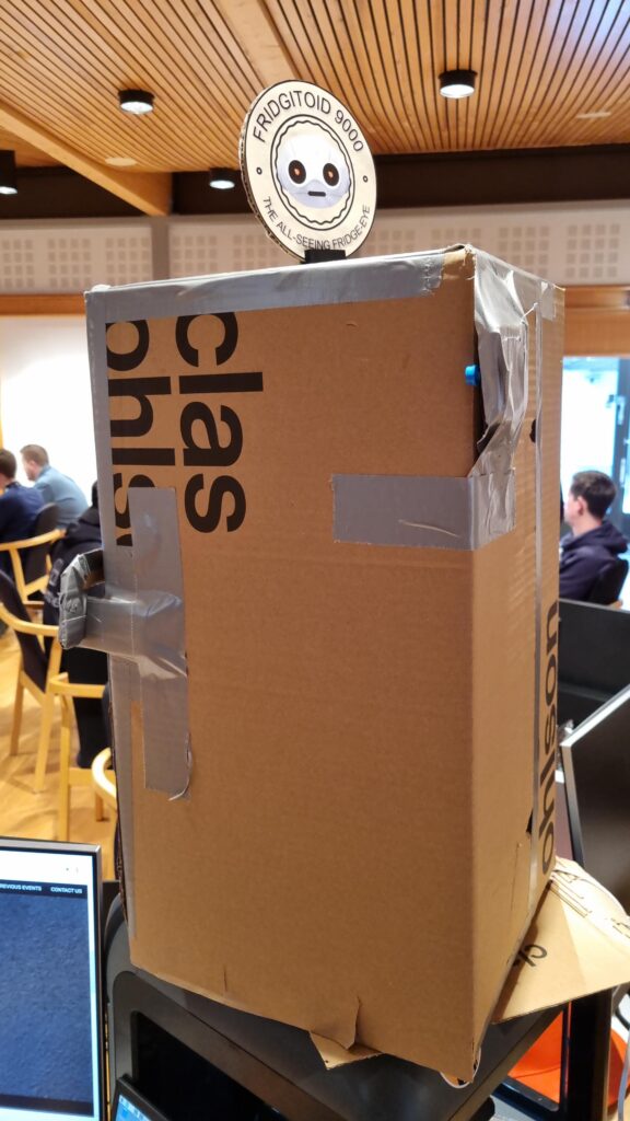
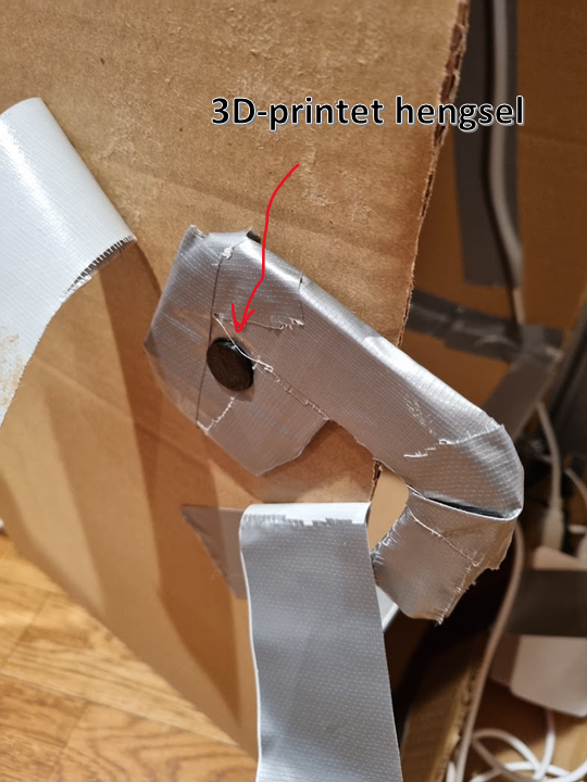
Ideen om verdens beste kjøleskap ble unnfanget få dager før ACDC gikk av stabelen, men vi hadde et kjempeproblem… Vi manglet jo et faktisk kjøleskap å «smartifisere». Heldigvis sitter teammedlemmene på enorme kunnskaper innen papp- og gaffateipkonstruksjon. Med en 3D-printer, semi-god kjennskap til 3D modellering en livlig fantasi klarte vi å lappe sammen en pappeske som absolutt minner om ekte vare.
Her er en video som viser vår fantastiske kjøleskapslogo som spinner rundt og indikerer at det er liv. Når døren åpnes trigges vår knappesensor som gjør at kamera tar bilde. Dette oppsettet hadde ikke vært mulig uten den trofaste Arduinoen, som bygger på det eldgamle programmeringsspråket C som først brukt i 1972. Some things never change, og hvorfor bytte ut noe som fungerer?
Bildet sendes til Azure Cognitive services. Responsen kan du se på skjermen i videoen. Helt klart og tydelig en appelsin der altså. Deretter sendes dette til Power Automate for å oppdatere innholdet i ingredients-tabellen som beskriver hva som finnes i kjøleskapet. Orange = True!
Her har vi et flott B2C-produkt som forenkler hverdagen til alle mennesker og skillpadder med middagskvaler! Det beste av alt, latterlig lave produksjonskostnader! Hvis ikke det er Business Value så vet ikke jeg 😉
Cohesive branding across platforms and applications is important for the end user and create trust in the application. That’s why it’s important to have the same primary colour profile, images, fonts and logos across the platform. Also, applications need to be joyful and delightful to use. Good design is invisible in a sense. When it done right the user doesn’t think that it’s good design; it’s just “the way it’s meant to be”.
Seller Canvas Apps
Sellers on the go need to easily and swiftly approve or deny incoming contracts form new customers. We have open registration on our portal, and that means that anyone can sign up for å power agreement. Before we can start swapping electricity contracts for new customers, we need to manually check each one to know that it’s valid.
When creating interaction designs it’s good to look for established design patterns that exist and that users are already used to. For example Tinder’s Swipe Gesture. We waned to use the swiping as a was of approving or denying new contracts.
If you want to increase your app adoption (for whatever reasons: revenue, targets or just ambitions) you have to care about UX (User Experience). Swipe behaviors can help you with that. How?
Positive effect of the Swipe gesture is connected to our brain neurology. The move, if used in a write context, contribute to a feeling of empowerment in the user. The more positive effect your app has – the higher is its adoption.
The tendency to abandon a shopping session is often attributed to choice paralysis — the inability to make a decision in the face of too many options and too much information. Swipe supports a binary output: yes or no, right or wrong, accept or reject, left or right.
Swiping behavior are more attractive to mobile users
Swipe will be natural in eCommerce, gastronomy and all company processes that requires binary decisions preferably with an image information
Another point is that gallery control in Power Apps may cause delay in items display when user quickly scroll so using swiping behaviour with one item display at a time can positively influence overall app UX.
This is what the finished app works:
You can see the loading screen that engages the user right away while data loads into the application. At the start screen you can open the “Approve or deny” screen, or a form for creating new customers.
The “Approve or deny” first show the list of new agreements to give you a sense of the work load. Then when you open an agreement you can swipe right to approve – get to a success screen – or swipe left to deny – and get to a “successfully denied” page.
You can also create new contacts from the list page. When a seller is on the go it’s important that they easily can sign new contracts.
User Experience is very important to PowerSwapCorp. To create great user experience we make sure that our visual identity is clear and consistent across all apps; for the customer as well as for the backoffice.
Visual identity
To start with a strong and clear visual identity is important. This is a guideline that all developers follow and will be embedded into all applications and communication we do as a company.
Logo
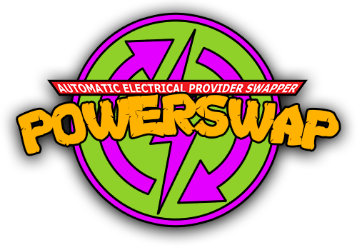
The logo comes first; it needs to depict the spirit of the company and tell you something about the company’s tone of voice. Our logo has a cartoony fell to it, has bright colours and high levels of contrast between the colours. This makes for an unserious appearance, a light and playful personality and personal tone of voice.
We created three versions of our logo – for different purposes.
The full logo looks like this:
The icon-version is the circle without the text. This version works well as icon, favicon in the browser and app icon.
The version with only the text is suitable for business apps and other applications where there is limited vertical space:
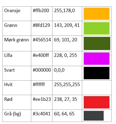
Colours
We get the primary colours from the logo, and use them to get attention, provide usability clues and add playfulness. The colours are:
Fonts
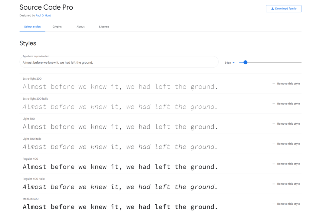
We wanted to use a special font that has the same associations as the logo and the colours; unseriousness, youth and innovation – but add a flare of techiness and geekiness. That’s why we chose the Google font “Source Code Pro” as our primary font.
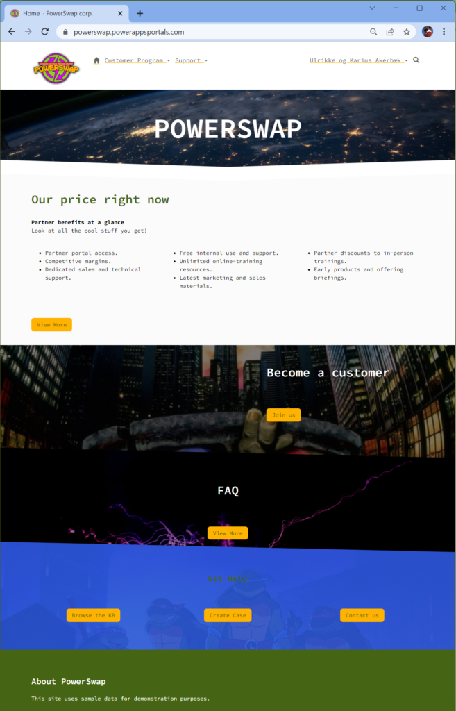
The customer portal is branded with the logo, our font and the colours. It’s the most important window out to our customers, and therefore the most important way we can infuse our brand.
First, we made sure the favicon (browser icon) is our icon-version of the logo.
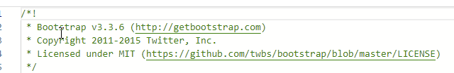
Then we implemented a theming system using SCSS based on bootstrap. Portals are built on Bootstrap 3.3.5. The font is added as well as images that enforce our visual brand as playful and fun.
Canvas App – Seller App
Customers can sign up in the portal by themselves, but sellers are also on the road selling to customers. We created a canvas app that enables the sellers to sign new contracts on the road from their phone. It’s also branded to to enforce the brand. This is important for employee apps as well as customer apps, as it will enforce the brand presence.
PowerBI
We also have PowerBI reports for the end under; embedded on the portal. This report also have branding with colours and logo according to the visual profile.
This report is also a tool for management when they need to follow up on customers savings and how the business is going.
Model Driven
Of course the business apps the backoffice is using to handle all the customers, the contacts, their contracts and other related tables is branded.
This concludes the branding and glossy pixels for our solution.
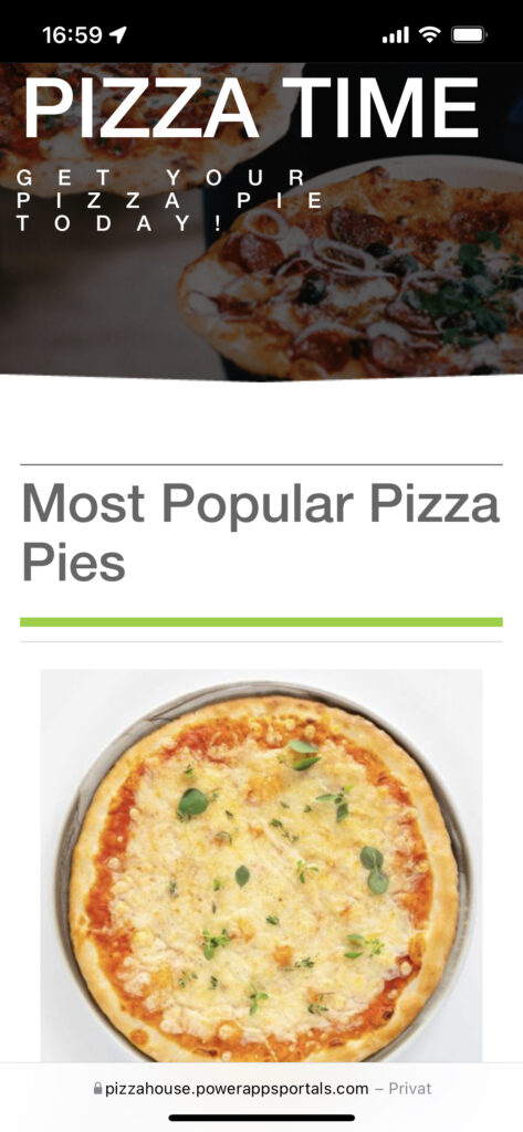
PowerApp Portals might not be your first choice as a pizza landing place, but it is what it is. Using retro technology like bootstrap.css it will present pizza pies in the most delightful way.
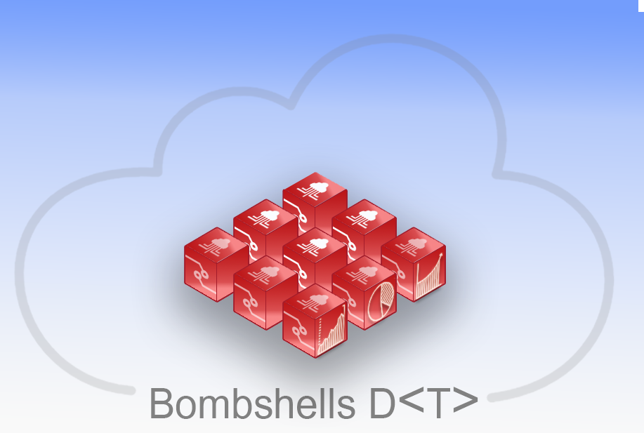
Bombshells har satt Donatello til å utforme deres nye grafisk identitet. Selv om profilen sikkert kommer til å være offer for en del diskusjon i tiden som kommer, har de i alle fall klart å bli enige om hvilke elementer logoen bør inneholde.
Navn
Navnet Bombshells stående alene skal gi inntrykk at hva Bombshells gjør og derfor har man landet på Bombshells Data. For å ta vare på nerde-identiteten som har inntatt gjengen, har man valgt å legge bokstaven “A” på siden for å holde på linken mot programmering og informasjonsbehandling hvor < og > representerer størrelsesforhold.
Font
Fonten som er brukt i logoen er av font Family “Arial Narrow”.
Grafisk identitet
Den fulle grafiske opplevelsen skal gi et bilde av virksomheten. Bombshells dekker hele kjeden fra innhenting av informasjon, behandling av informasjon i skyen, til analyse og fremstilling av data i rapporter og dashbord.
Farger
Fargene skal gi mulighet for å utforme identiteten til Bombshells og gi en frisk og gjenkjennelig profil både i branding av presentasjoner i Powerpoint og på nett.
Red: #c31414 RGB : 195.20.20
Grey: #818181 RGB: 129.129.129
Blue: #a2b9ec RGB: 162.185.236
White: #f9f9f9 RGB: 249.249.249
Re-branding for å fremme Bombshells sin visjon!
Skilpaddene har tatt til seg tilbakemeldinger og bestemt seg for at re-brandingen skal nå ut til så mange som mulig så må en nettside komme på plass. Derfor har skilpaddene stupt uti det store åpne hav av frontend rammeverk for å kickstarte produksjonen av nettsiden.
Det overrasker nok ingen at valget falt på selveste;
React!
React er nemmelig et rammeverk som lar deg bygge modulære komponenter som kan brukes og gjenbrukes enten i prosjektet eller andre prosjekter. Samtidig så lar React deg håndtere ‘states’ ved bruk av React Hooks. Dette er funksjonalitet som lar deg oppdatere ønskede elementer ved en nettside uten at du må re-rendere hele nettsiden.
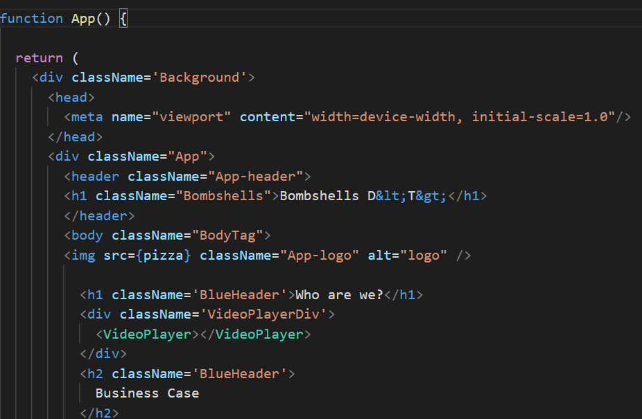
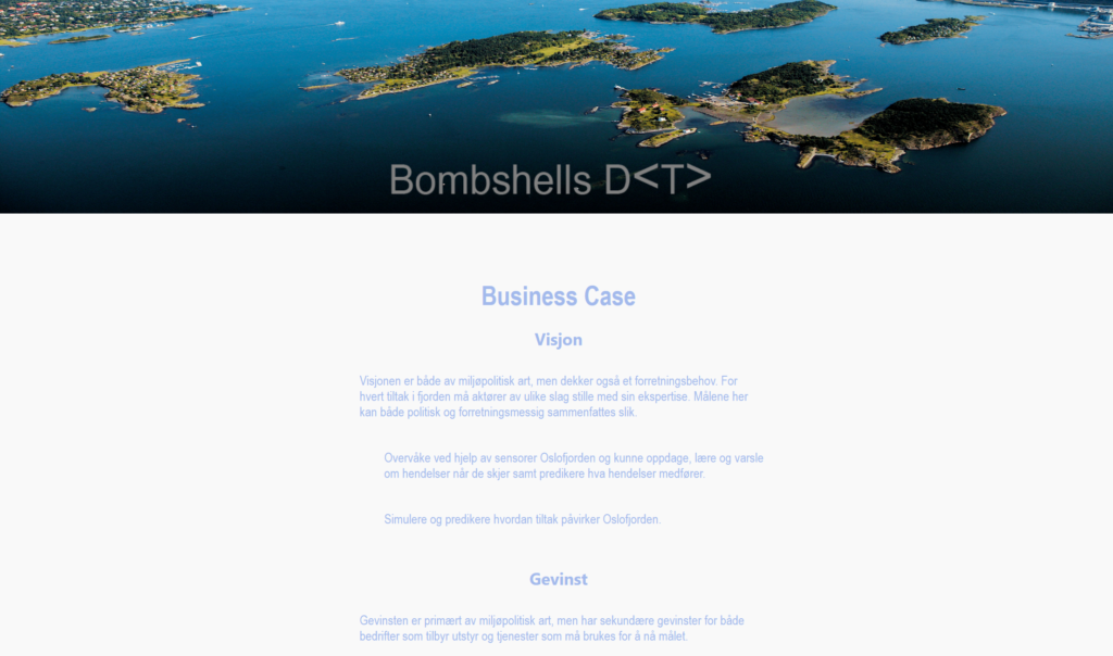
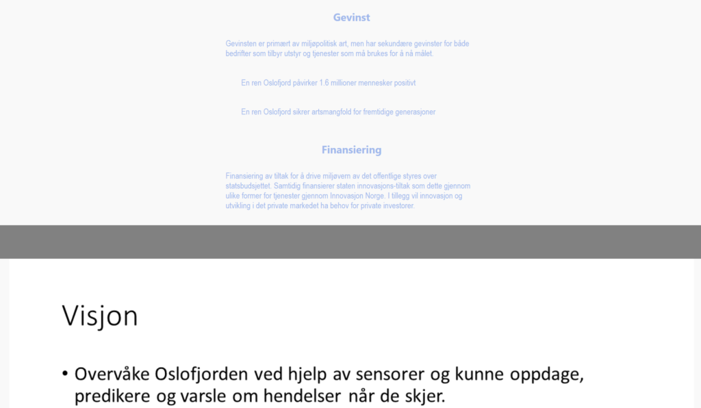
Som resultat av re-brandingen så har en nettside blitt satt opp for å presentere Skill Bombshells sin visjon og understreke business casen og hvilken verdi som ligger i prosjektet.
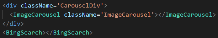
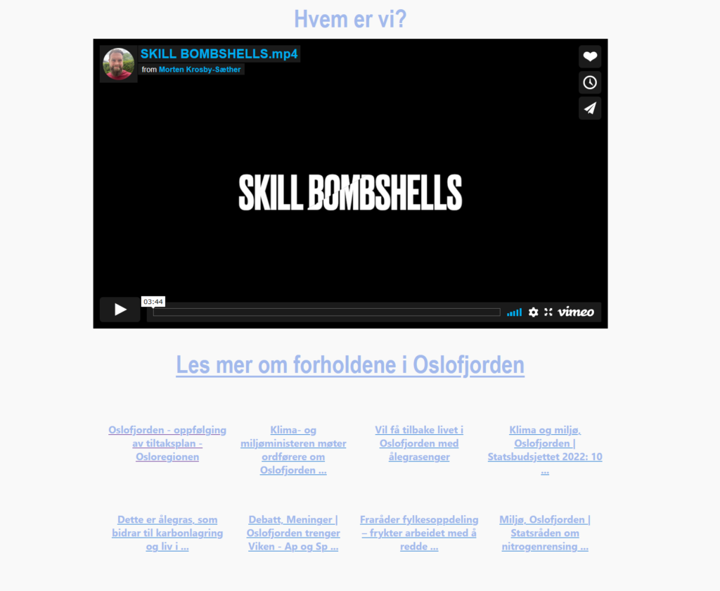
Denne siden består av ulike funksjoner som fulger med HTML5 bl.a taggene egne tagger for header og footer samt mulighet for en egen <video> tag! I tillegg til dedikerte <nav> tagger for navigasjon. Nettsiden innholder dermed en introduksjonsvideo til skilpaddene, samt et bildegalleri for å presentere vår visjon med prosjektet. Etterfulgt av nyttige lenker til nyhetssaker rundt klimaet i og rundt Oslofjorden.
Disse nyhetssakene blir oppdatert gjennom React ved bruke av hooks for å re-rendere states. Dette er funksjonalitet som kan bygges på videre for å presentere data fra ulike kilder for å presentere live-data fra våre IoT devices.
Med dette så vil vi gjerne claime; High 5 for bruk av funksjoner som ble introdusert med HTML5, samt Client Side Salsa for bruk av React hooks for å håndtere states og til slutt selveste Glossy Pixels, ettersom vi har et responsivt design!
We are proud to announce the launching of our website with our new concept. This website is responsive and adapts to different screen sizes. Our website is created with the help of the third party solution; webflow. Please take a look to learn more about our work!
