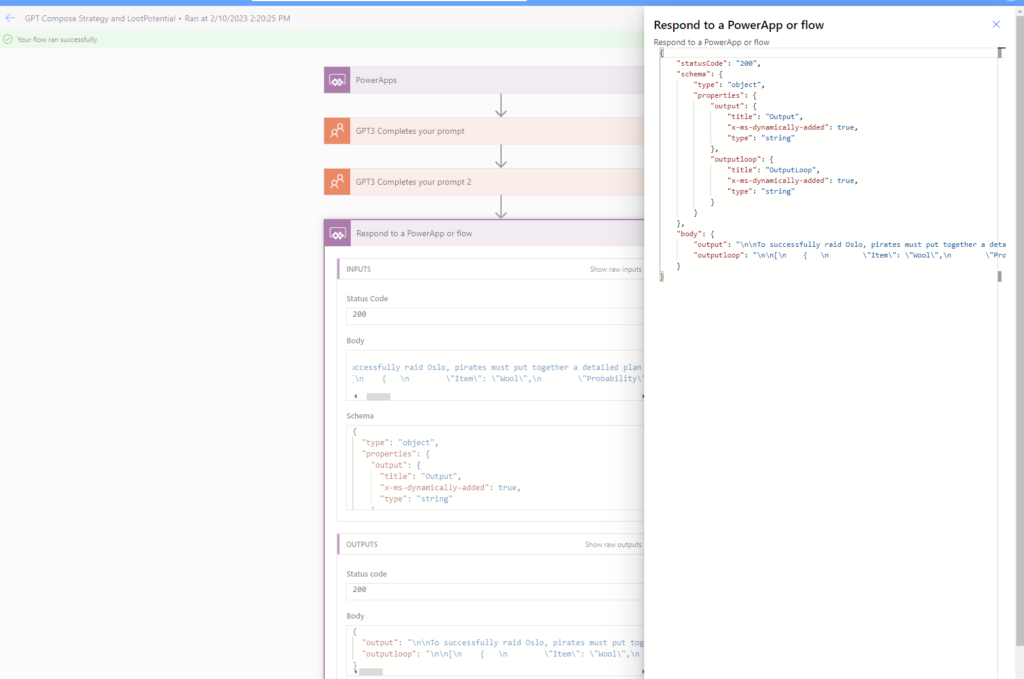
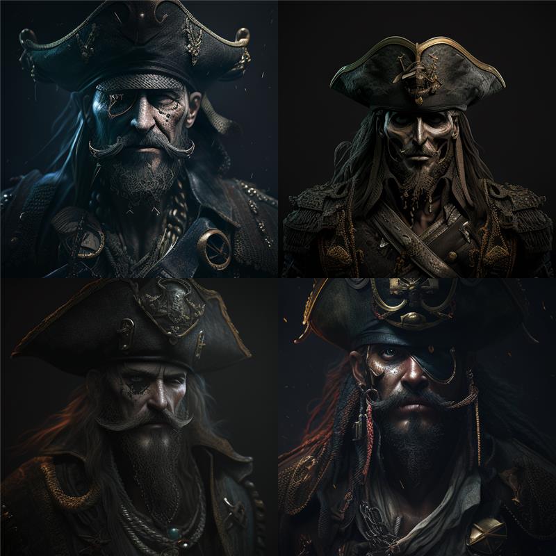
Captain Black Bart, is planning a big raid, Oslo is the target and according to ChatGPT the loot potential is #awsome.
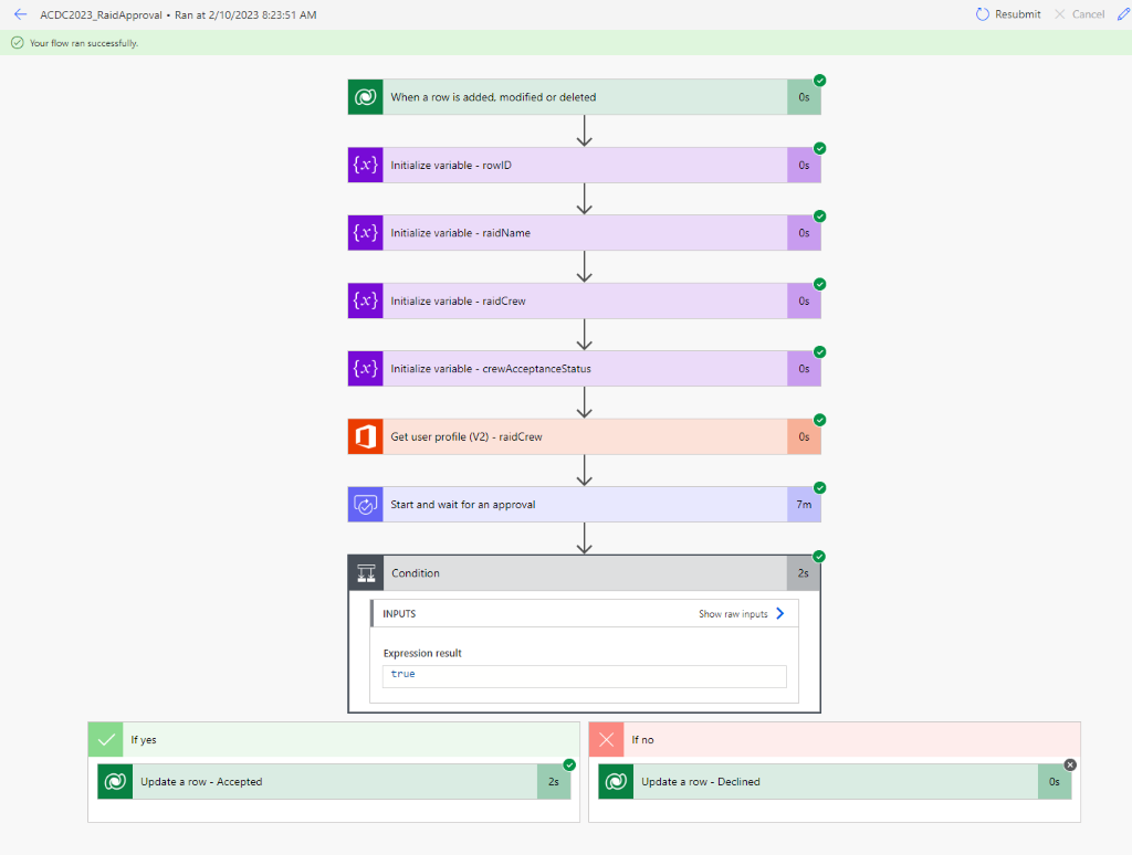
Invitation is sent to all chosen crewmates using top of the art “Power Automate flows”. Crewmates are free to Accept or Decline the raid invitation.
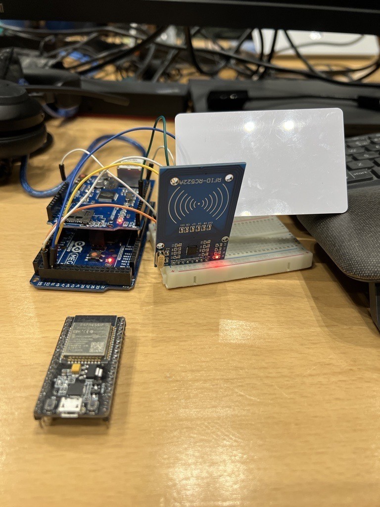
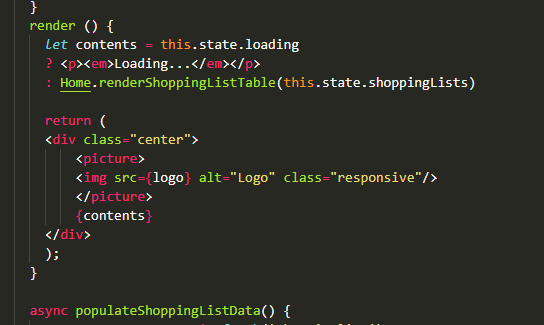
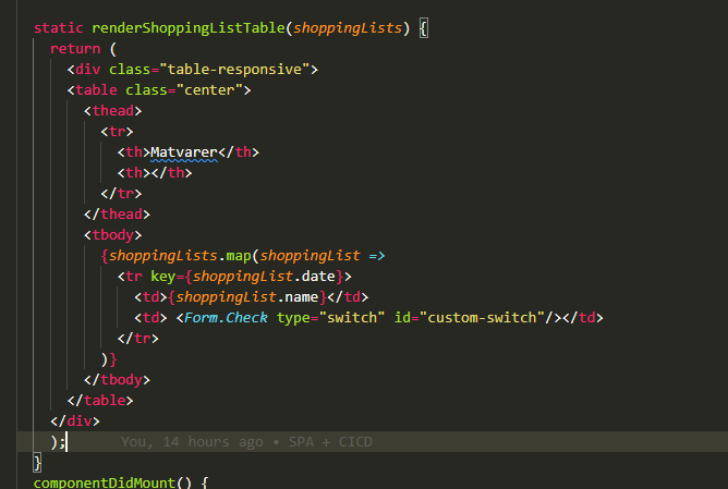
When it’s time for the raid, we requires all crew members who have accepted the raid to check in, using their RFID card or phone.
If the crewmate have accepted more than one raid, he/she can choose to check in using our Raid Planning App
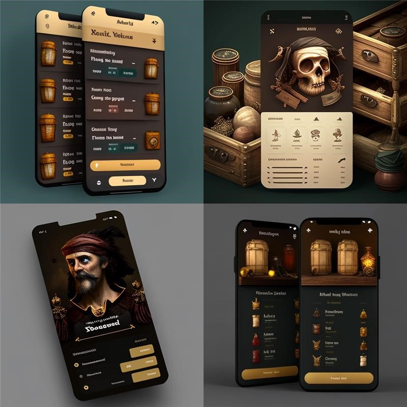
With the help of Midjourney AI, https://docs.midjourney.com/, we generated the app design component by asking the AI to provide us witht the latest & greates piracy themes.
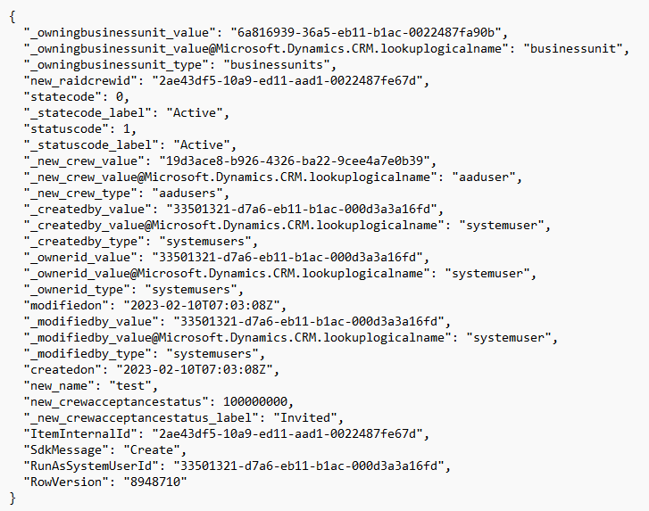
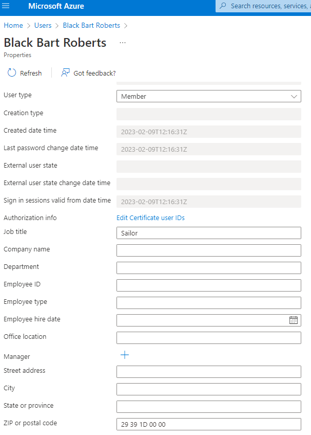
The RFID data for all potential crewmates is stored in Azure AD using the “Postal Code” field, pretty “Nasty Hack” according to our “bosun”.
This data is imported to Dataverse “AAD User” virtual table for our app.
During the last 24 hours, we have all learned to love the magic of Power Pages.
But with some custom CSS and a webpage instead of a modal window, we can change the dour and uninspiring look from the standard out of the box “I work in corporate accounting”-look.
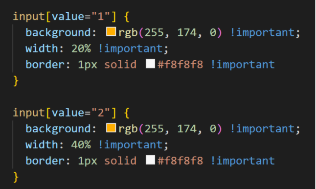
Change from a modal window:
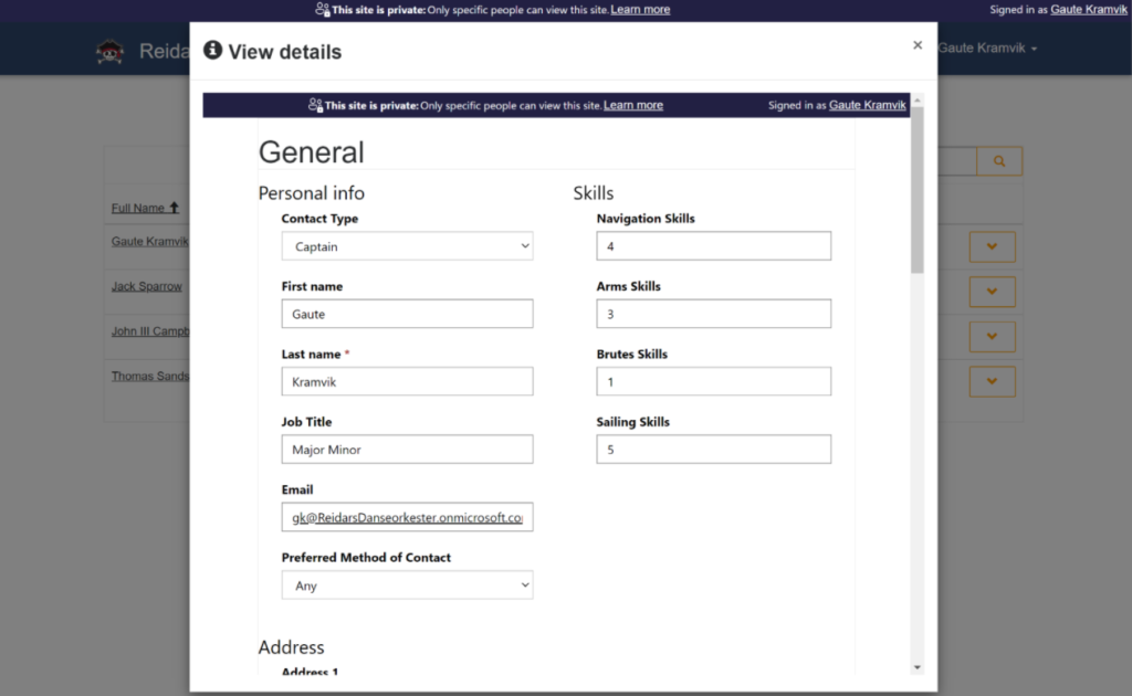
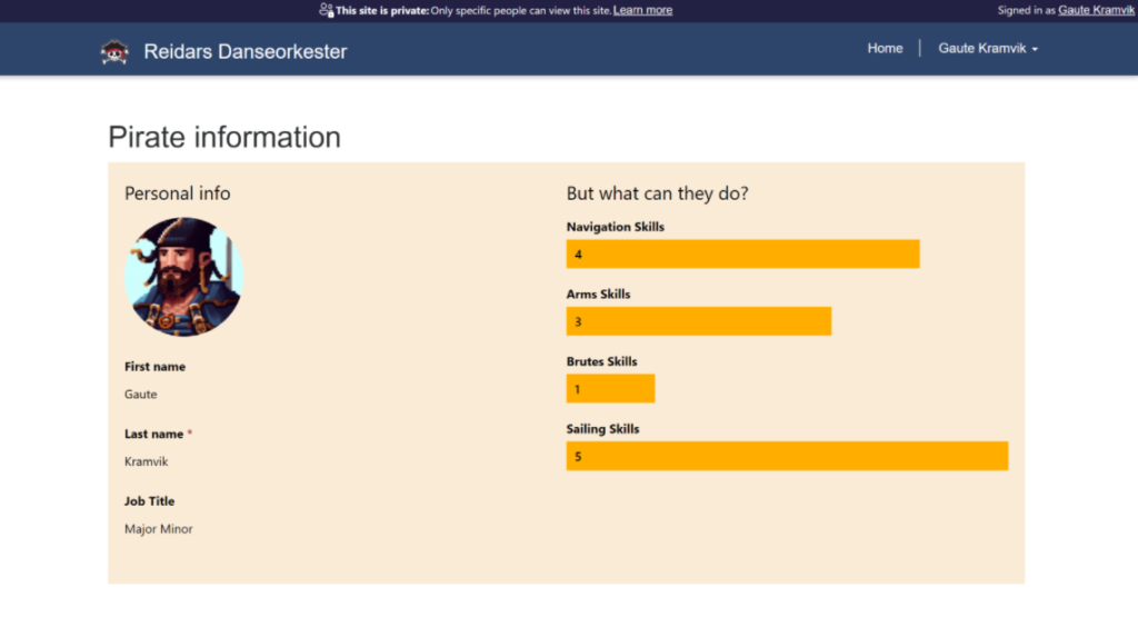
To a nice, classical scorecard for all our important pirate skills, just like the ones we got from school back in the 80s
The dread pirate Gaute is good at sailing but sucks at fighting.
As for displaying the form values as columns, if it is stupid but it works…
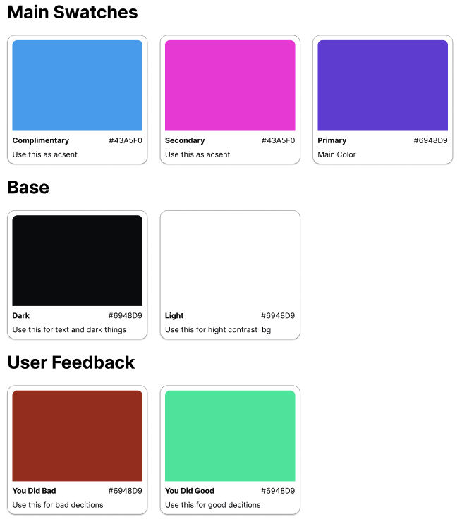
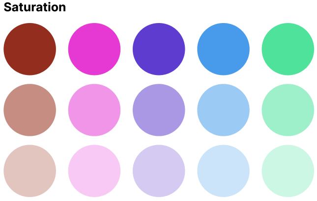
Colors are an important part of the User Experience, however there are more to design than colors. Let us dig deeper into our color pallet for this app.
UI Color Swatches with descriptions for use from the UI design tool Figma.
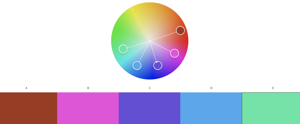
Our Swagger of Cloth Sebastian has shown us some tricks of the trade. Where other teams have opted for machine learning to create their color template, Sebastian has chosen for Adobe Color – a tool for mixing beautiful color pallets.
Screenshot from Adobe Color
The pallet was mixed using our Captain Mats’ favorite color: Blood red (or a slightly rusted maroon if you like) as the base. Then for electric flair we skewed the color pallet using Analogous color harmony towards the violet spectrum. Since the maroon is quite soft this results in a calm nautical palate with some poppy vibes towards pink and green.
Building on the swatches we made de-saturated versions to help with shading and possible scenarios where we might need less color to achieve more in the design. Typical places would be illustrations and clustered sections that need soft, mellow containers.
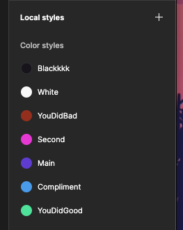
Implementing the Colors into a UI
Adding the colors as swatches to Figma’s color management makes et easier to try different colors and alter the colors if needed. We also named the colors with logical names, describing how they should be used rather than descriptive. Form experience and also rooted in best practise we find this way of managing colors more versatile and easier to work with than having explicit names, like “blue-bg-color” because what happens when your token has a descriptive name, and that description is no longer correct? You need to defector or just remember, both options are bad for speed,
Screenshot from Figma’s color swatch styles
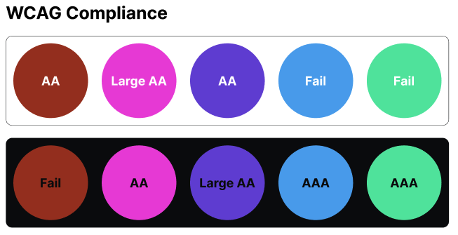
Lastly it is important to calibrate your colors for the visually impaired. One common tool is the WCAG color contrast guidelines requiring contrasts of 1:4.5 for normal text and 1:3 for large text. Sadly we can see our selected pallet is not optimal for all cases and still needs work.
WCAG compliance check for the color swatches against the darkest and lightest color in the pallet
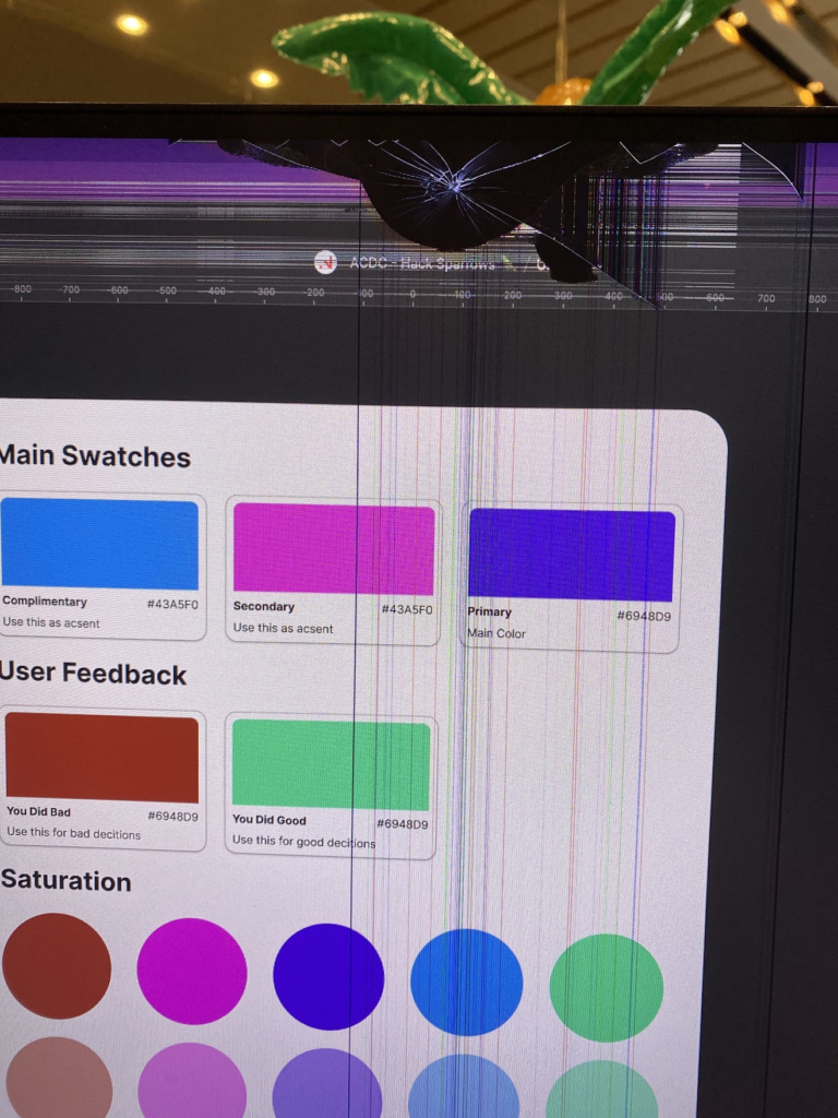
Also, the resident pixel pusher is very happy he has to hack all this together on a broken screen where everything looks janky. We are so bold to say this is living like a true swashbuckler, powering through this hackathon.
Figma, the hippest UI kid on the block, has a setting for components called “properties”. They are intended to mimic how we use properties in frameworks like React. However when working with multiple components and when swapping components they grant some extra value to the design process.
Updating multiple instances of the same component
Having properties for the values makes it easier to update multiple values though-out your design.
Remembering override values when swapping components
But more importantly, when using variations of a component the component remembers its override-values even when switching to a variant that does not have the same values in the component, making updating your design that much easier.
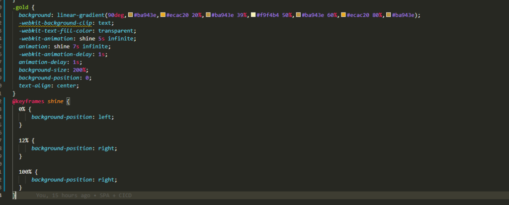
Ved hjelp av litt css magi får vi et reponsivt bilde og en responsiv tabell. Vi har blinget opp appen vår og fått en overskrift i ekte gull! (24 carats baby!) Den lyser opp hverdagen til en hvilken som helst appbruker.
Vi har vært på bloggkurs og har lært at det er viktig med clickbait-titler for å få clicks. Men jokes aside, vi har forsøkt å dra den visuelle identiteten til PowerAppen langt ut over normalen.
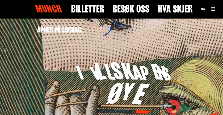
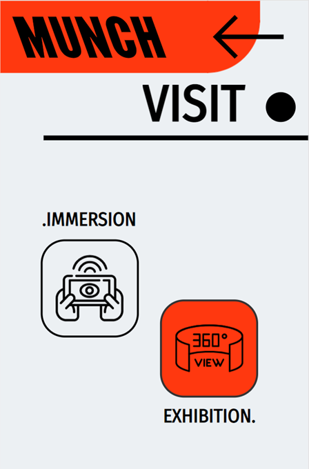
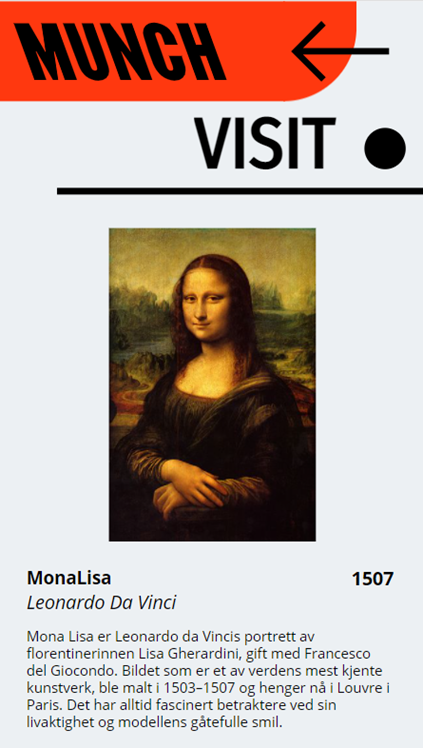
Vi har latt oss inspirere av Munch-museets visuelle identitet. Blant annet bruk av store kontraster, fete fonter og høy grad av asymetri.
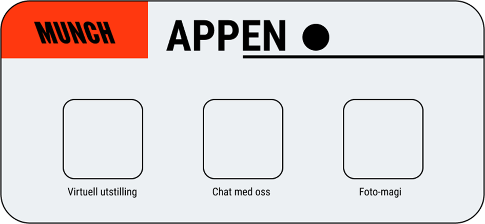
En viktig del av arbeidet var å finne frem til former og symboler som kunne skape en futuristiskfølelse samtidig som vi tok vare på noe av det tradisjonelle som du finner i Munchs kunstnerskap. Det startet med en wireframing og idemyldring i Figma den første dagen, hvor vi la grunnlaget for designelementene som vi har bruk i appen. Se bildet under:
Vi innså raskt at PowerApps ikke har avrundede hjørner, men vi ville bevare samme felling, så vi lekte litt med vektorer for å skape samme uttrykket, bare motsatt vei:
Vi ønsket en high-end feeling i appen og for å oppnå det ville vi gjerne ha litt flere alternativer å vlege blant enn de standard fontene i PowerApps. Vi stjal derfor komponenten PowerFont fra pcf.gallery som lot oss laste inn alle fontene fra Google Fonts direkte i PowerApps: https://pcf.gallery/powerfont/
Etter å ha diskutert en del frem og tilbake landet vi på Fira Sans Condensed, da denne har et uttrykk som var likt nok, men samtidig hadde ok kontrast til Munch sin custom-brand font.
Etter å ha brukt mye tid på å lage svg.-filen til topp-logoen i appen bestemte vi oss for å stjele resten av ikonene. Disse lånte vi fra: https://www.svgrepo.com/
Sammen med ulike figurer og former tilsynelatende plassert «tilfeldig» på lerretet, oppnådde vi det abstrakte og figurative uttrykket i appen som vi var ute etter (merk: knappene får den sterke Munch-rødfargen når man fører pilen over). Vi har også gjenbrukt mange av de samme elementene i vårt Power BI-dashbord.
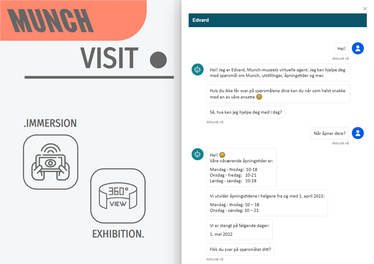
Vi ville også ha chatboten vår som en del av appen. For å embedde den stjal vi på nytt fra pcf-gallery. Denne gangen stjal vi komponenten PCF ChatBot for å få åpnet chatten direkte i appen: https://pcf.gallery/pcf-chatbot/.
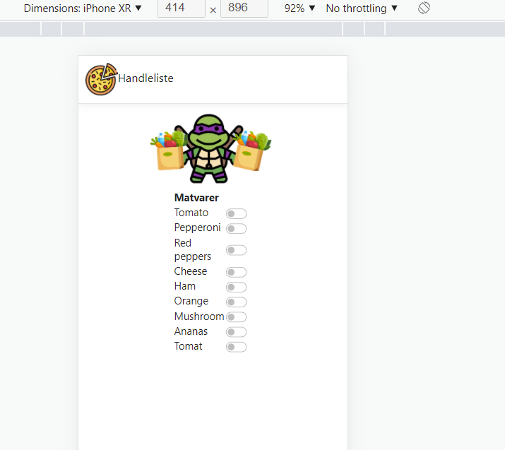
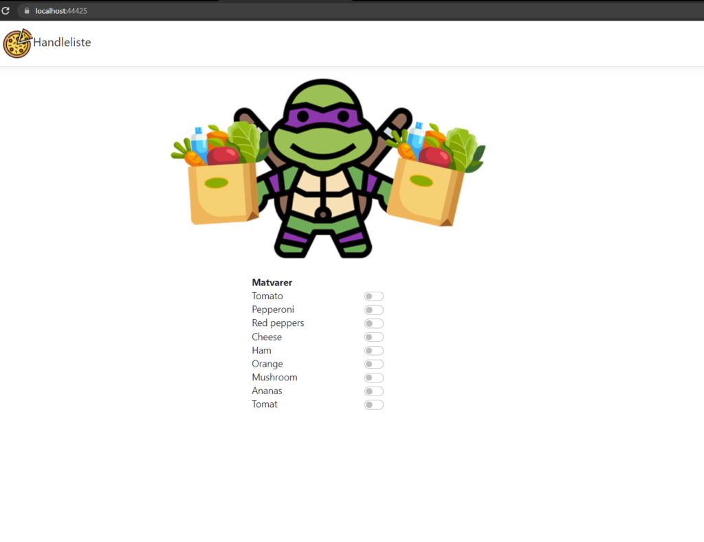
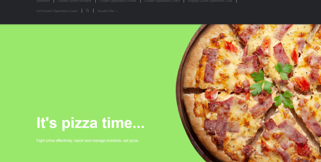
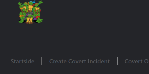
Ever used light mode? If so, we do not envy you! We did a complete overhaul of the Power App implementing a new color base and custom components. The color scheme is based on dark mode, as to protect our crime fighting turtles and rat’s fragile eyes. As custom components go, we have a beautiful logo on our page and a majestic landing page cover photo!
color scheme, with turtle green as accentcolor schemecustom cover photologo
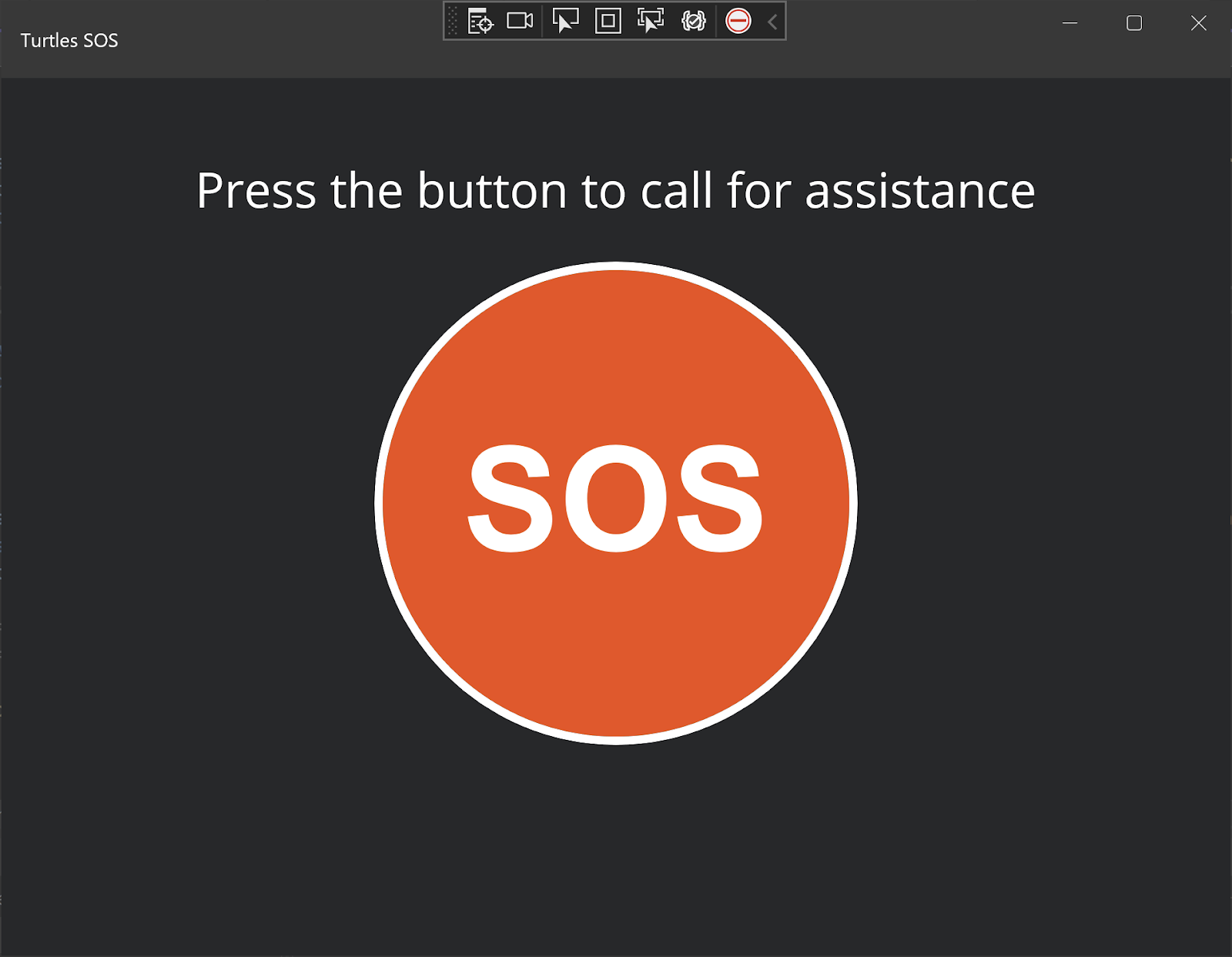
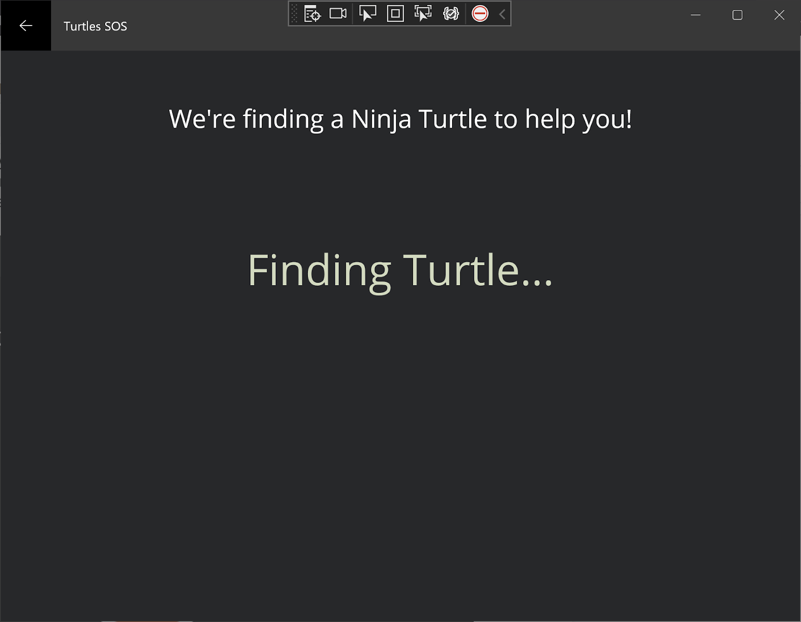
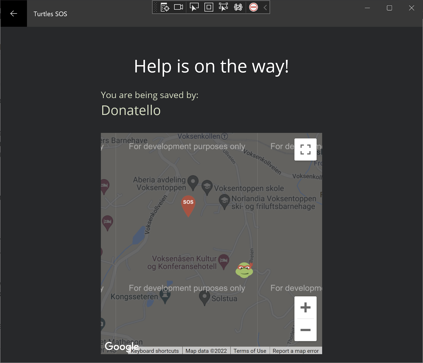
Sometimes you want to go all out with fancy effects and complex UI, other times you have to pull back and remove everything non-essential. We had to do the latter.
Our app is supposed to be used in emergencies and mostly older people. So designed our app to have large fonts and huge buttons so that the user always know what they have to press and what information is important.
It may seem simple, but creating custom layouts with .NET MAUI is hard. It’s still in preview and since it is cross platform it has to work on multiple devices. Pixels should be glossy, but also functional.
Here are some screens from our app running natively on Windows. It also runs on iOS, Android and macOS.