
User Experience is very important to PowerSwapCorp. To create great user experience we make sure that our visual identity is clear and consistent across all apps; for the customer as well as for the backoffice.
Visual identity
To start with a strong and clear visual identity is important. This is a guideline that all developers follow and will be embedded into all applications and communication we do as a company.
Logo
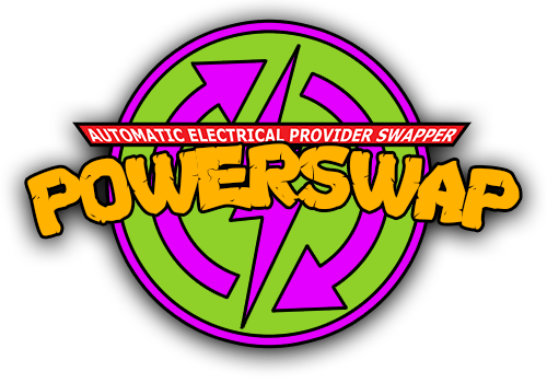
The logo comes first; it needs to depict the spirit of the company and tell you something about the company’s tone of voice. Our logo has a cartoony fell to it, has bright colours and high levels of contrast between the colours. This makes for an unserious appearance, a light and playful personality and personal tone of voice.
We created three versions of our logo – for different purposes.
The full logo looks like this:
The icon-version is the circle without the text. This version works well as icon, favicon in the browser and app icon.
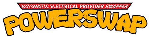
The version with only the text is suitable for business apps and other applications where there is limited vertical space:
Colours
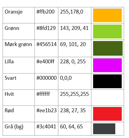
We get the primary colours from the logo, and use them to get attention, provide usability clues and add playfulness. The colours are:
Fonts
We wanted to use a special font that has the same associations as the logo and the colours; unseriousness, youth and innovation – but add a flare of techiness and geekiness. That’s why we chose the Google font “Source Code Pro” as our primary font.
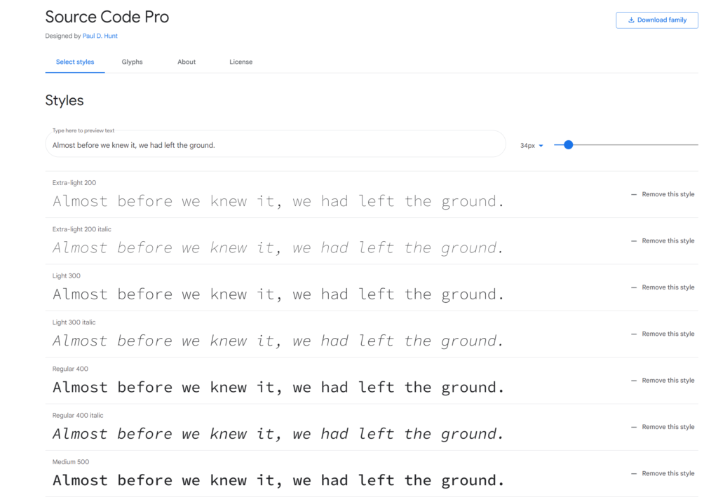
You find the font here: https://fonts.google.com/specimen/Source+Code+Pro
Portal
The customer portal is branded with the logo, our font and the colours. It’s the most important window out to our customers, and therefore the most important way we can infuse our brand.
Visit the portal here: https://powerswap.powerappsportals.com/
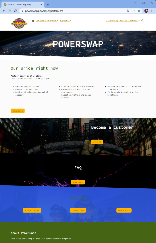
First, we made sure the favicon (browser icon) is our icon-version of the logo.
Then we implemented a theming system using SCSS based on bootstrap. Portals are built on Bootstrap 3.3.5. The font is added as well as images that enforce our visual brand as playful and fun.
Canvas App – Seller App
Customers can sign up in the portal by themselves, but sellers are also on the road selling to customers. We created a canvas app that enables the sellers to sign new contracts on the road from their phone. It’s also branded to to enforce the brand. This is important for employee apps as well as customer apps, as it will enforce the brand presence.
PowerBI
We also have PowerBI reports for the end under; embedded on the portal. This report also have branding with colours and logo according to the visual profile.
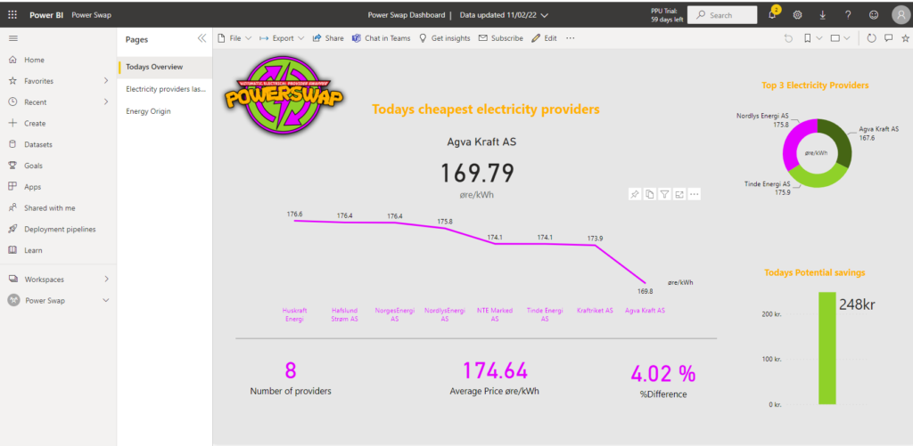
This report is also a tool for management when they need to follow up on customers savings and how the business is going.
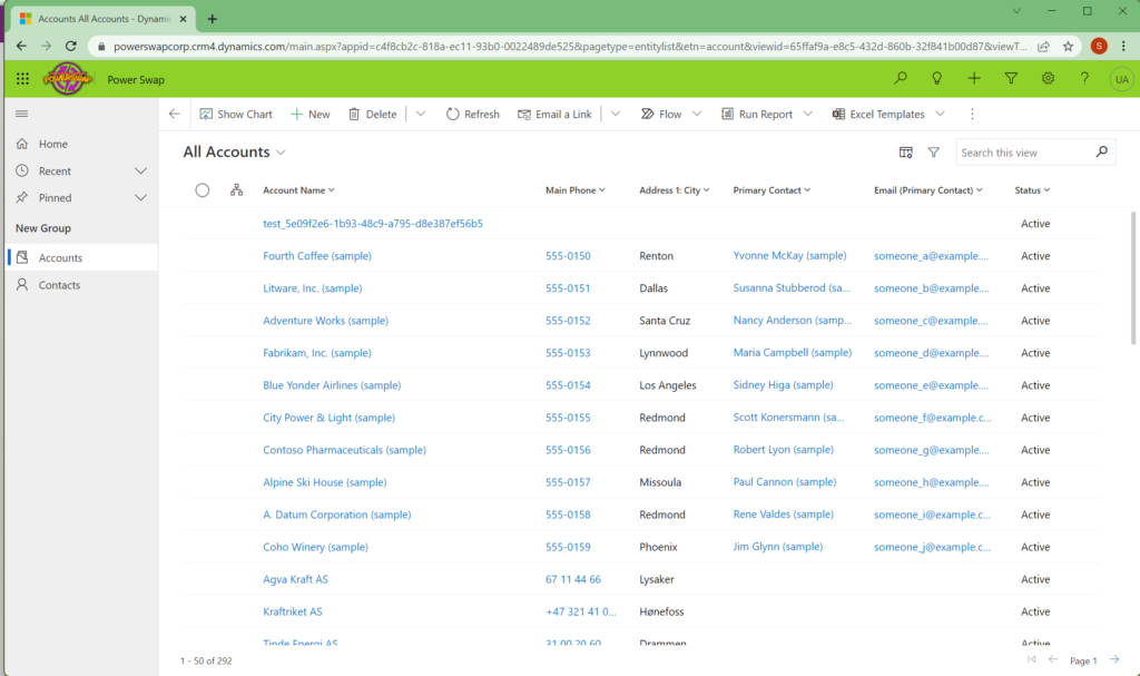
Model Driven
Of course the business apps the backoffice is using to handle all the customers, the contacts, their contracts and other related tables is branded.
This concludes the branding and glossy pixels for our solution.