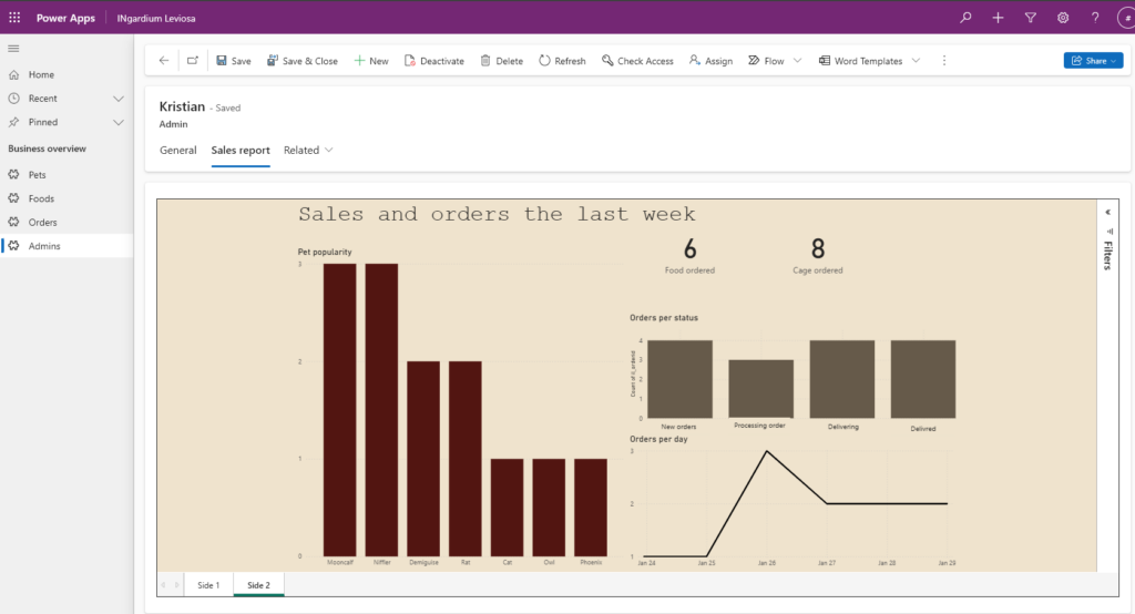
The orders are flying in like owls in the morning, and you are losing track. Our solution is giving the back-office of your shop an easy overview over new orders and sales. Integrated into your CRM-system.
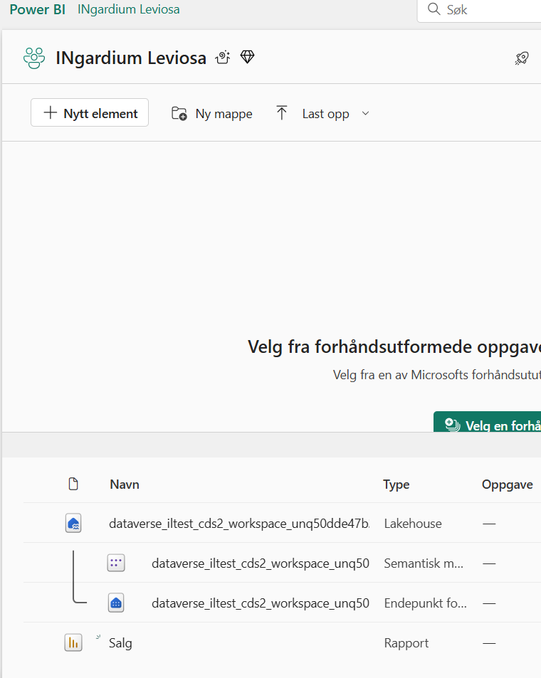
Data is synchronized through Dataverse to Fabric with the Fabric Link.
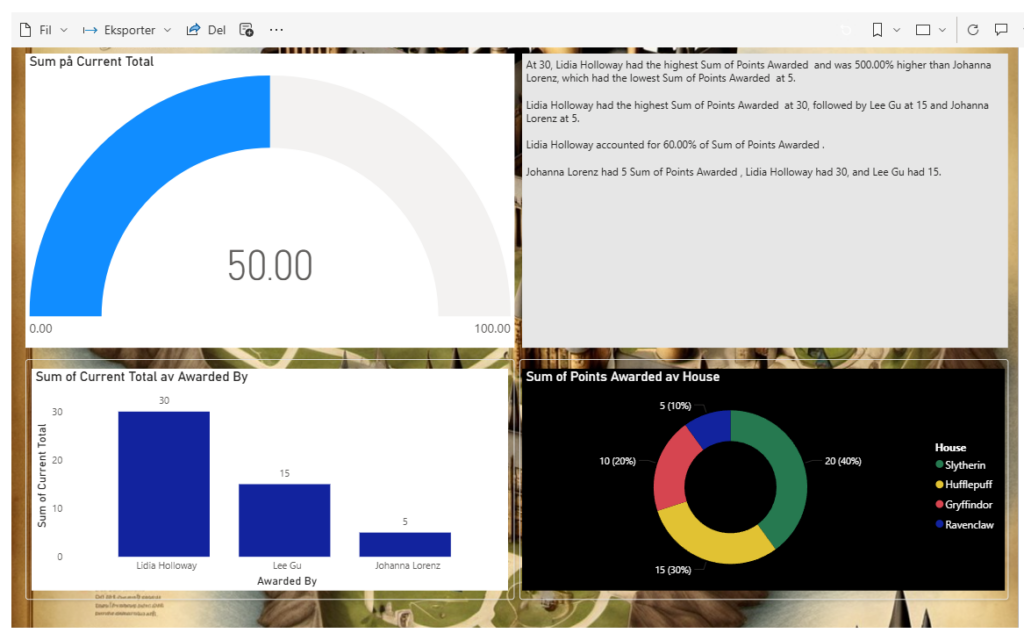
Dash It Out: In the spirit of the Marauder’s Map, we have conjured a dashboard that is both visually stunning and incredibly informative. This dashboard is not just a collection of graphs and KPIs; it is a powerful tool designed to provide valuable insights.
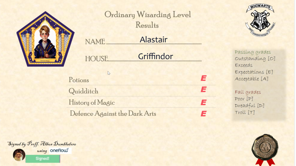
Current Total Points Handed Out for the Semester: Much like the House Points Hourglasses in the Great Hall, this graph shows the total points awarded throughout the semester, giving us a clear view of the academic achievements and contributions of our students.
Who Awarded the Most Points: This chart reveals the professors who have awarded the most points. It highlights the dedication and encouragement provided by our esteemed faculty members, fostering a competitive yet supportive environment.
Sum of Points Awarded by House: This graph, reminiscent of the House Cup standings, displays the total points awarded to each house. It provides a visual representation of the friendly rivalry between Gryffindor, Hufflepuff, Ravenclaw, and Slytherin, motivating students to strive for excellence.
Statistics About the Professors Who Awarded Points: This report, much like the meticulous notes of Hermione Granger, details the statistics of the professors who have awarded points. It includes insights into their teaching styles, frequency of awarding points, and the impact of their encouragement on student performance.
Creating this dashboard was we utilized our preferred data visualization framework, leveraging its capabilities to build a solution that is both robust and user-friendly.
At Team PowerPotters, we believe that knowledge is power, and what better way to empower potion masters than by providing them with real-time insights? Our Power BI report transforms data from Dynamics 365 Finance and Operations (FO) into an intuitive, visually compelling dashboard, providing immense business value to the alchemy lab.
Here’s why our dashboard deserves the Dash It Out badge and how it brings clarity to even the most complex potion-making processes.
🪄 A Dashboard with Real Business Value
Our Power BI report is designed for maximum utility in the alchemy lab, offering critical insights at a glance. Let’s explore its key components:
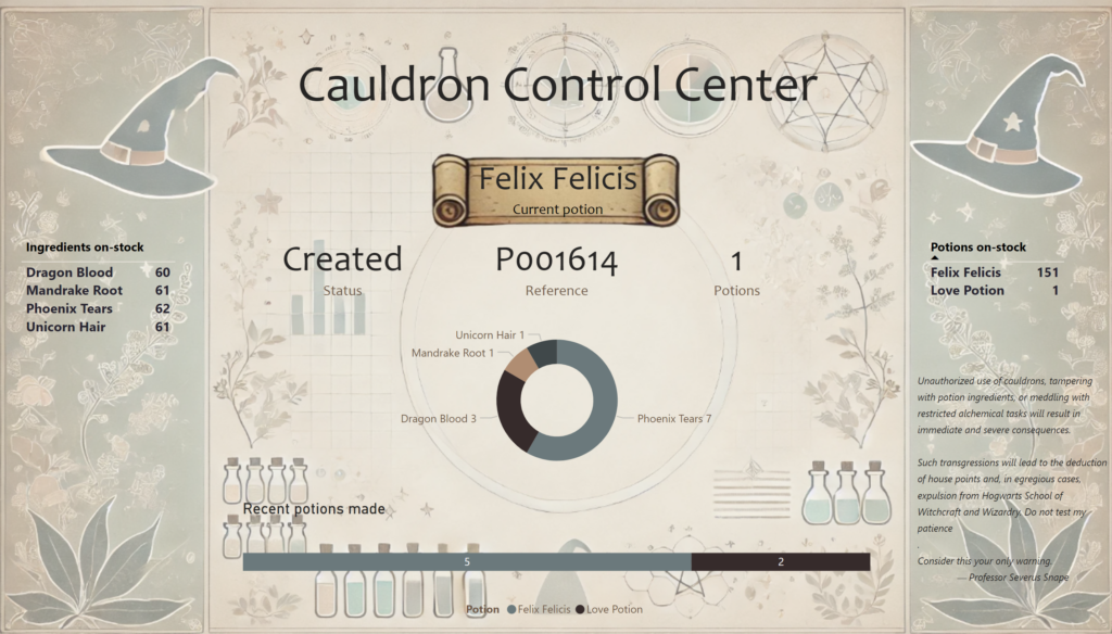
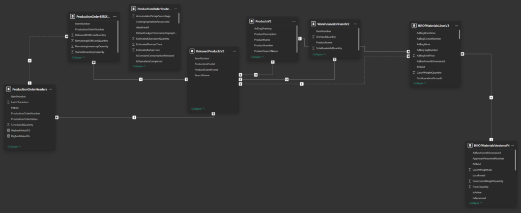
1. Current Inventory Overview
The dashboard displays the current stock of potion ingredients and finished potions, allowing potion masters to keep tabs on inventory levels without manually checking shelves.
This ensures the lab runs smoothly, with no delays caused by missing ingredients during critical production runs.
2. Recent Potion History
Potion masters can view a history of recently completed potions, providing insight into production trends and helping manage demand.
This data empowers Snape and his assistants to identify which potions are in high demand and adjust future production accordingly.
3. Live Production Updates
The heart of the dashboard is the latest production order section, which displays:
Potion Name: The potion currently being brewed.
Production Status: Directly linked to FO, showing real-time updates (e.g., “Pending Approval,” “In Progress,” “Completed”).
Production Order Reference: A clickable link back to FO for detailed information.
Quantity: The number of potions in the current production batch.
Bill of Materials Visualization: A breakdown of the ingredients required to complete the production, ensuring all materials are on hand.
This section enables potion masters to monitor active production closely, addressing issues like delays or ingredient shortages in real time.
✨ The Technical Magic Behind It
The Power BI report is powered by data directly pulled from D365FO using an OAuth legacy connection, ensuring accurate and timely updates.
Data Collection Process:
OAuth Integration: Data is securely extracted from FO tables, including production orders, inventory levels, and bills of materials.
Power BI Cloud: The dashboard will be published to the cloud and set to update at regular intervals, keeping the data as current as possible.
Future Vision: If time and licenses permitted, we would configure Fabric tables as a data source, enabling live, real-time updates for even greater accuracy.
🧙♂️ Why This Dashboard is Business-Critical
Real-Time Insights: Potion masters have access to live data on production and inventory, reducing downtime and ensuring smooth operations.
Transparency: The link to FO production orders allows for deep dives into production details when needed, keeping all stakeholders informed.
Inventory Management: By visualizing ingredient levels and recent potion production, the dashboard helps prevent shortages and ensures the lab runs like a well-oiled machine.
Efficiency: The bill of materials visualization eliminates guesswork, ensuring potion makers always know what they need for the next batch.
🐍 Why We Deserve the Dash It Out Badge
Our Power BI report exemplifies what the Dash It Out badge is all about:
Business Value: The dashboard delivers actionable insights, enabling better decision-making and smoother workflows in the alchemy lab.
Real-Time Data: By pulling data directly from FO and automating updates, we’ve created a near-live reporting tool that ensures potion makers are always informed.
Visual Impact: With intuitive charts, tables, and visualizations, the dashboard is as user-friendly as it is powerful.
Scalability: Our design ensures that the dashboard can grow with the lab’s needs, with the potential for real-time updates through Fabric in the future.
🔮 The Future of Alchemy Analytics
With our Power BI report, we’ve brought transparency and efficiency to potion-making, proving that even the most magical processes can benefit from data-driven insights. We humbly submit our case for the Dash It Out badge and invite you to explore the magic of analytics with Team PowerPotters: acdc.blog/category/cepheo25.
When building applications that leverage AI technologies, monitoring performance is crucial for ensuring that the system operates smoothly. One powerful tool for this is Azure Application Insights, which allows us to collect, analyze, and visualize telemetry data in a way that provides both technical insights and an understanding of user interactions.
Azure Application Insights is an Application Performance Management (APM) service that helps you monitor your applications in real-time.
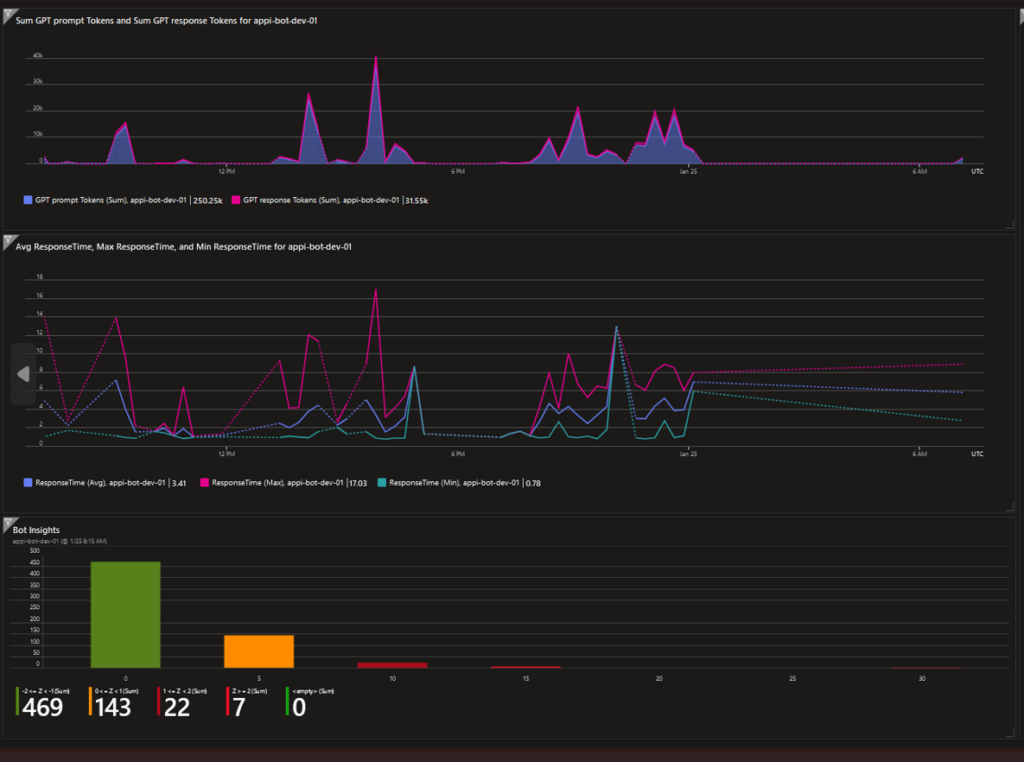
In this post, we’ll show how we used Azure Application Insights to create dashboards that track key metrics for our Sorting Hat, focusing on GPT prompt and response tokens, response times, user interactions, and language distribution. These insights can help us optimize the performance of our AI model, identify trends, and make data-driven decisions.
Let’s break down the key metrics that we are tracking:
GPT Prompt & Response Tokens: The number of tokens used in GPT prompts and responses can have a significant impact on performance and cost.
Average, Minimum, and Maximum Response Time: These metrics provide an overall view of how long the application takes to respond.
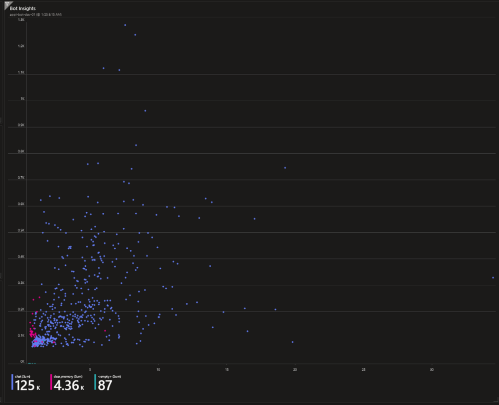
Response Time Distribution: This helps us understand how response times vary across different requests.
Response Time vs. Tokens: This allows us to correlate response time with the number of tokens used.
Active User Chats: Monitoring how many users are actively chatting with the AI at any given moment helps gauge the engagement level.
Language Distribution: When application supports multiple languages, this metric helps to track which languages are being used most often.
Average, Minimum, Maximum and Standard Deviation response time in last 30 days: These metrics help ensure that the application performs optimally and allow us to identify any unusual behavior or potential bottlenecks.
🏅 Dash It Out Badge – Crafting Enchanting Dashboards 📊✨
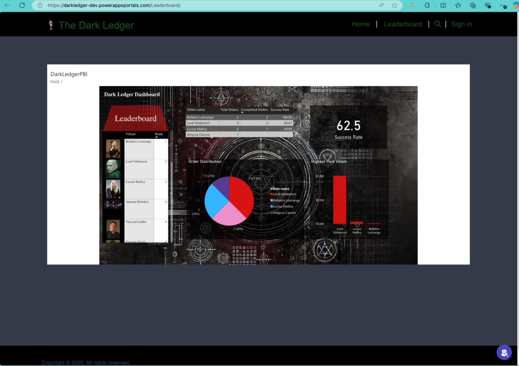
Welcome to the magical world of data visualization! We’ve summoned the powers of data and design to create a visually stunning dashboard integrated seamlessly into our Model-Driven App and Power Pages. This dashboard is not just a feast for the eyes but also a vital tool for tracking the Dark Ledger’s performance metrics and ensuring operational excellence.
Dashboard Highlights ✨📈
Our dashboard is designed to provide business value while capturing the mystical essence of the Dark Ledger. Here’s how we’ve structured it:
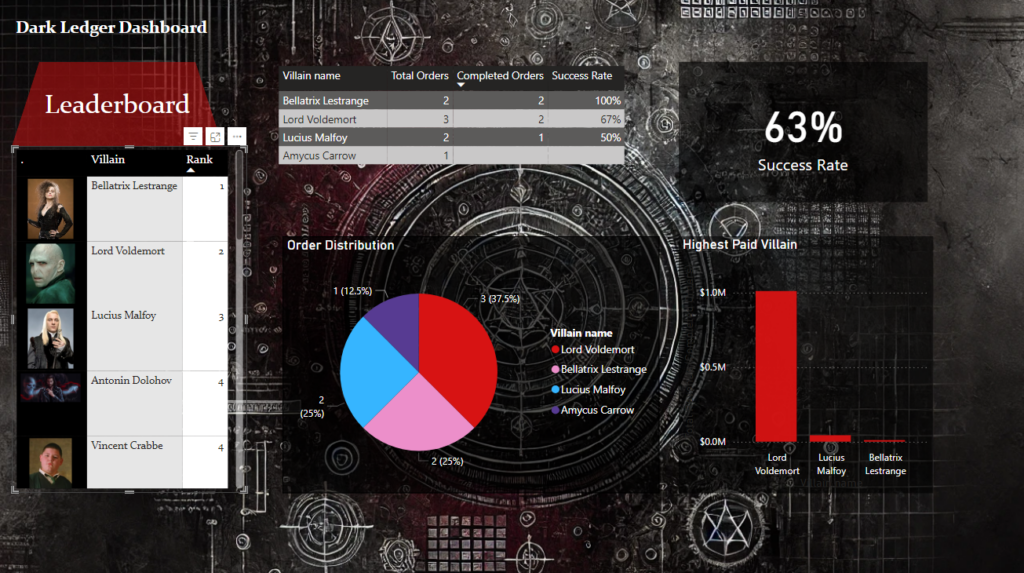
1. Leaderboard – The Hall of Infamy 🥇
A dynamic ranked list showcasing the top villains based on completed orders.
Metrics:
Villain Name 🧙♂️
Number of Completed Orders ✔️
Success Rate (%) 📈
Purpose: Encourages competition among villains while highlighting high performers.
2. Success Rate – The Measure of Mastery 📊
A sleek gauge graph visualizing the average success rate across all villains.
Business Value: Offers insight into operational efficiency and highlights areas for improvement.
3. Order Distribution – Workload Balance 🥧
An interactive pie chart showing the proportion of orders assigned to each villain.
Purpose: Ensures fair workload distribution and identifies underutilized or overburdened villains.
4. Highest Paid Villain – Who’s Earning the Most Gold? 🤑
A compelling bar chart that highlights the top-earning villain based on revenue from completed orders.
Metrics:
Villain Name
Revenue Generated
Business Value: Identifies revenue drivers and fosters friendly rivalry among villains.
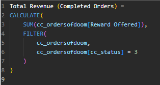
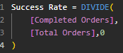
DAX Magic 🪄📋
Behind the scenes, we’ve worked our DAX wizardry to create calculated measures that drive these insights. From aggregating revenue to calculating success rates and ranks, our formulas ensure that every metric is accurate and meaningful.
Why It’s Magical 🌟
Integrated Design: The dashboard is seamlessly embedded within both our Model-Driven App and Power Pages, making it accessible to all Dark Ledger users.
Actionable Insights: These visuals empower administrators to make informed decisions, optimize performance, and celebrate top performers.
User-Friendly: With intuitive graphs and clear KPIs, even the darkest wizards can navigate the dashboard with ease.
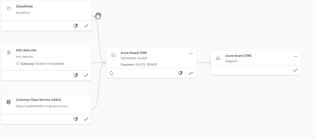
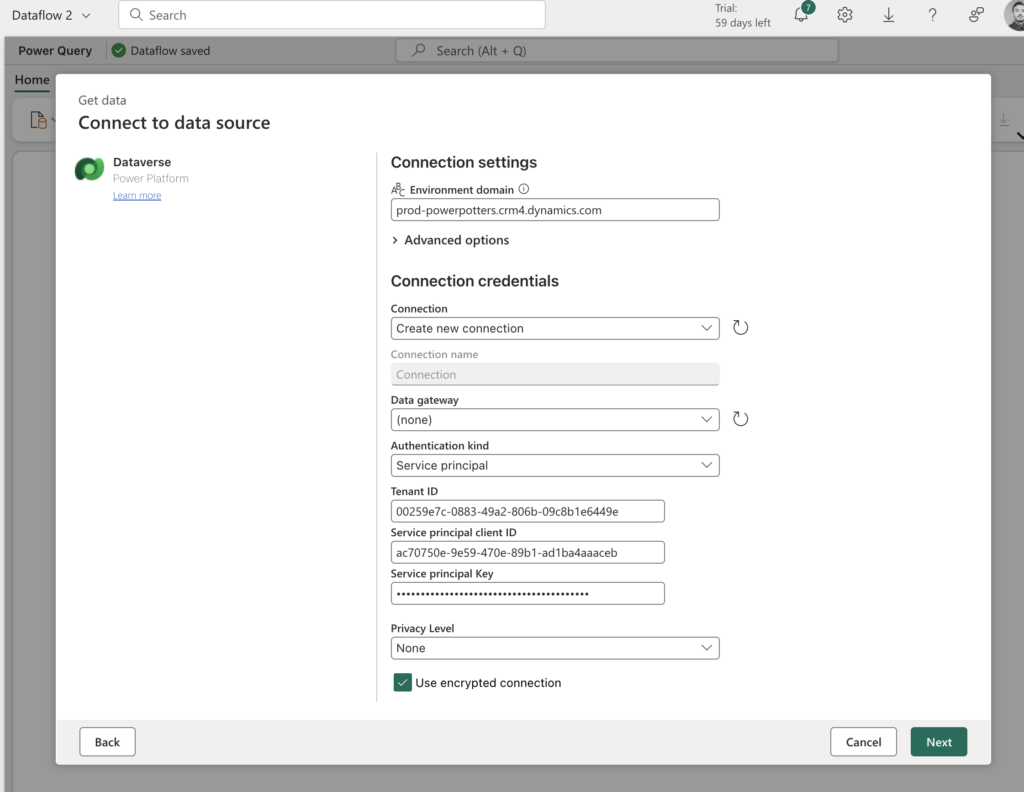
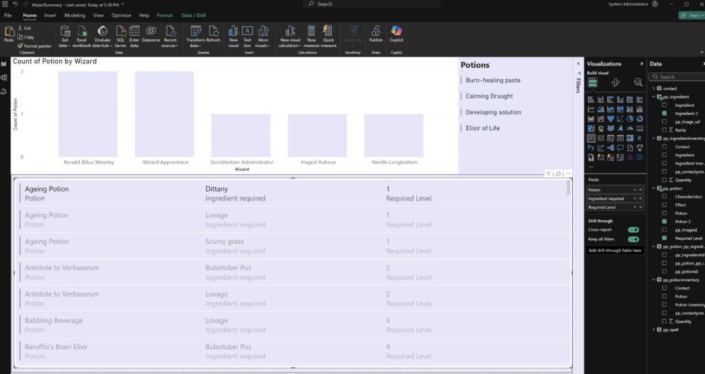
We all know that Power BI is a beautiful tool for dashboarding, but it’s always a tricky question of where to get the data from. It needs to be fast, and most importantly, it should be correct.
The traditional way, from what I gather, is using the CDS connector. Here, we get easily visible and editable tables.
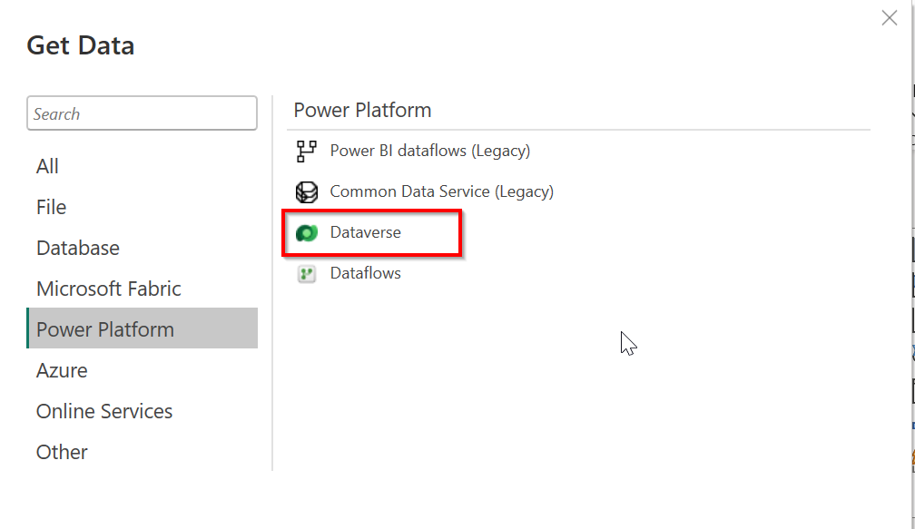
Another way, which will also give us Direct Query connection mode, is a connector directly to Dataverse.
But what about Fabric? If we need to create many reports on the same data from the CRM, then it would be perfect to have our data in OneLake, create DataFlow Gen 2 to transform it, and have a shared data model that will be utilized by different reports, dashboards, apps, etc.
For that, there are several ways to do it. The most tempting one is just using a Fabric Premium subscription to create a Lakehouse and using Azure Synapse Link to sync the tables from PowerApps to Fabric.
Unfortunately, when you have a Lab environment, it is not possible to create the OneLake on a Fabric workspace for now. Hopefully, this will be fixed in the future.
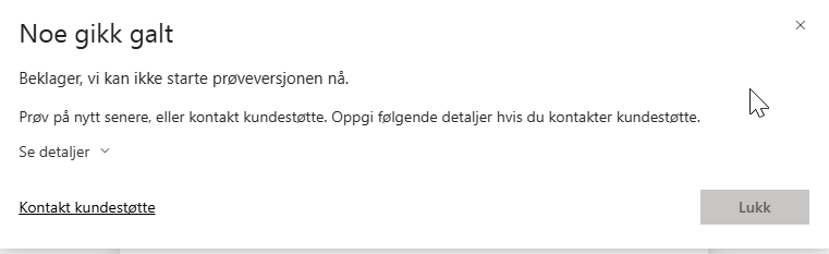
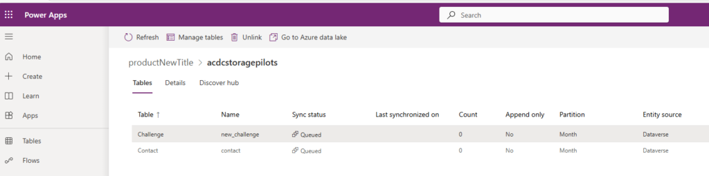
Another way is to create a resource group and create Azure storage account in the Azure Portal. If the user has the correct roles and access, then we should, in theory, be able to load tables from Power Apps to this storage and load them into a Storage Blob container. This approach got us much further, and we received a beautiful message on Power Apps.
However, when we try to create a link, the tables get queued but never appear in the Blob Storage.
However, for us, this approach did not work as our work tenant was registered in a different region from the Azure workspace where we are developing our CRM system.
Conclusion: If you are thinking of using Fabric, ensure your solution and Fabric are in the same region and don’t use the lab user.
In the end, to have a beautiful, real-time updating report, we will go for the second approach described here: connecting directly to Dataverse and using Direct Query to have a real-time update of the changes.
We also used SharePoint to get images to visualize in the report, and Excel files (xlsx) for some test data.
A first time for everything. I want to learn new spells and want to try fabric and power BI for the first time.
Testing import data to Power BI desktop – With both data import and Direct Query.
Setting the Data source credentials to get the queried data to the Power Bi Service.
Test is working – Now lets wave the wand and build!
Fabric
HACK:
Got help from a team in the same house – HUFFLEPUFF POWER.
We can not get the trial to work in our tenant that we have for ACDC, so i had to create a service principal user in the ACDC tenant – and make it available multitenant. And then use this service principal in fabric in my work tenant to get the data in there.
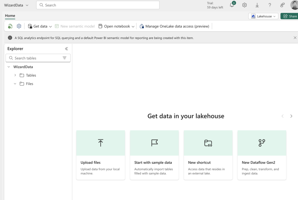
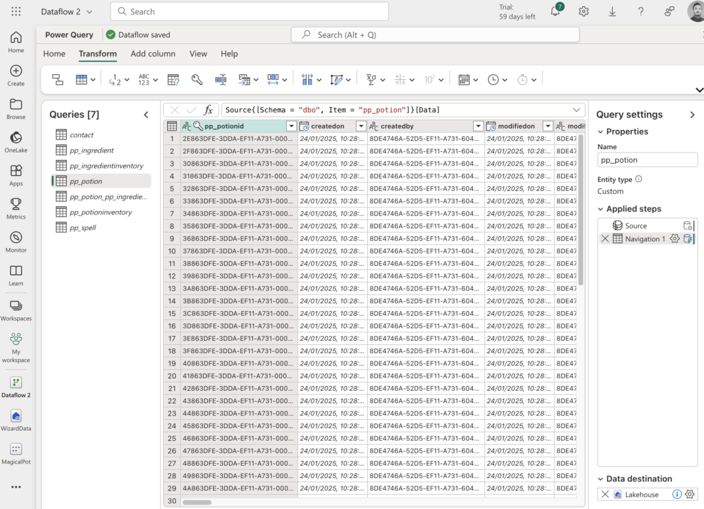
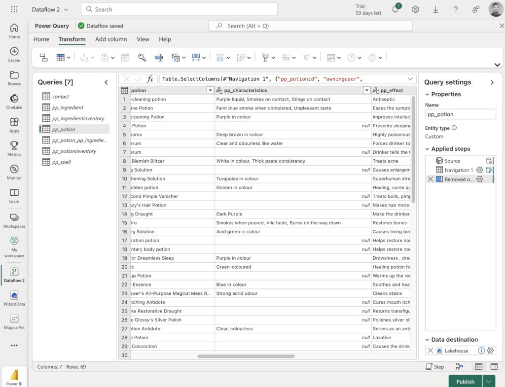
We want to make a lakehouse with fabric, so after the data is clean, we can use it in Power BI and also share the data with other instances that needs to use the data.
Made a new Lakehouse: WizardData
Made the connection to the ACDC tenant
Cleaned the data:
Did this for all 7 tables.
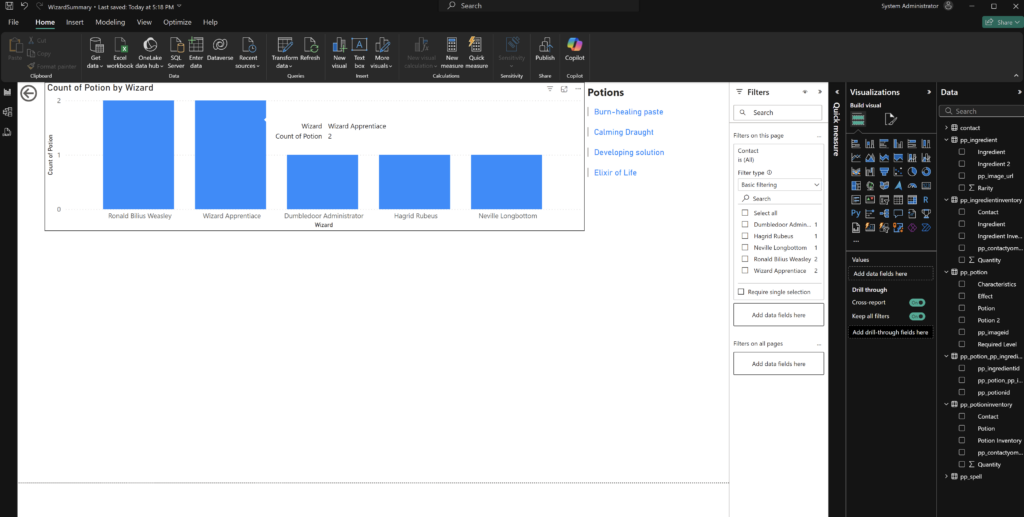
I could not get compliant with the Power BI for my work tenant. So i decided to use Power BI desktop direct query to get the data from Dataverse and build a dashboard.
Start of dashboard: To be continued.
One last comment – We helped another team with the HACK to get the ACDC data into another tenant. COMMUNITY! – SHARING IS CARING!
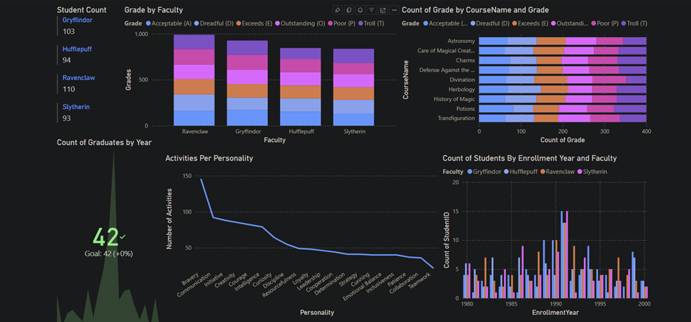
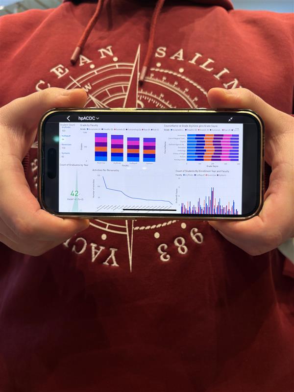
Our Faruk the Fabricator is living it now. Since yesterday, he was challenging himself on how to display the results in the best possible way… but he never questioned his Loooove to Fabric. And he also knows that the Fabric is the Marauder’s Map of data—you always know where everything is, even if it’s trying to hide.
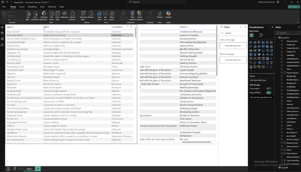
Here are the results of our data in Power BI report. We can see different metrics for student data.
We can also put KPI and compare ourselves with the so called Sorting Hat.
It is our first year since Wayfinder Academy was created and we introduced our Logiquill portal and we already show same performance, wait a few more years and we will leave him in the dust, as it already wasn’t dusty enough.
Here are our components inside Fabric
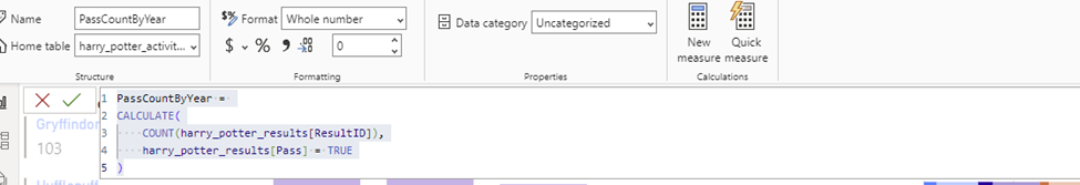
Our dax code in Power BI:
Here is why we also claim Chameleon badge, in addition to Dash it Out:
Solution is responsive. Adapts to all devices and screen sizes.
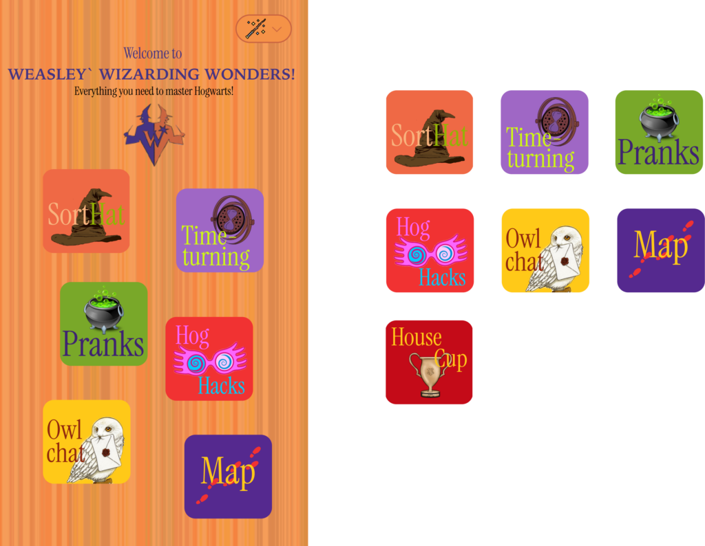
The design draws inspiration from the Weasley twins and their magical shop, embracing a playful and chaotic style with vibrant colors and patterns that break away from traditional design norms. Students highly value an app that combines bold, dynamic visuals with a user-friendly interface, as it greatly enhances their overall experience. A well-designed app with exceptional UX ensures they can navigate effortlessly and enjoyably, making it easy to access the information they need.
Our talented designer uses Figma to craft stunning designs that developers can seamlessly follow. Here are some examples of the designer’s work from today, which greatly simplifies the development process. Here is the color palette and the inspiration behind it:
Starting with the homepage, we want to give users a dynamic and engaging experience that reflects the app’s content and features. The idea is for the buttons to move and change positions, much like the shifting staircases at Hogwarts. While this might challenge usability, the goal is to highlight the app’s diverse possibilities and encourage exploration, ensuring no features are overlooked.
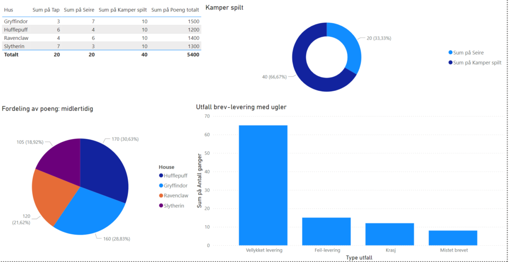
Houses Score, Quidditch and owlpost (Fabric)(Dash It Out)
House scores play a crucial role in students’ daily experiences throughout the year. To streamline this process, we aim to digitize the scores, making it easier for students to track which house has the highest score and understand the reasons behind it. Teachers continuously award and deduct points, so it’s essential for students to stay updated on the latest scores.
We plan to utilize Fabric’s OneLake to store our data, which is then visualized in our Power BI dashboards. These dashboards represent all the houses, their scores, and the teachers’ reasons for awarding or deducting points. Additionally, we include data about owl post and Quidditch, providing a comprehensive view of all aspects of student life at Hogwarts.
The App (Low-Code)
Students need a single place to find all the information they need to navigate life at Hogwarts. They need easy access to the school system to know which lessons to attend. Some may even need a Time-Turner to attend all their lessons.
Our mobile-friendly canvas app leverages the fantastic native drag-and-drop features Power Apps offers. With beautiful galleries, powerful data integration, and intuitive user interfaces, our app provides a seamless experience for students.
PCF (Pro-Code) (Power User Love)
It’s crucial for students to know who is in their house, but currently, there’s no system in place to facilitate this. Implementing a digital, visual, and accessible solution would be a smart move.
Low-code and pro-code can coexist peacefully. We have found a PCF component online, created by this cool dude called Scott Durow. We hope his code meets the judges’ expectations. Power Apps development and integrations is quite new to the pro-coder so this is still a work in progress, but we plan to use the component Network View (Network View | PCF Gallery).
From no system to complete digital solution (Digital transformation)
Hogwarts currently has no digital system (they send mail by owls). We want to digitize everything a student may need to navigate life at Hogwarts.
We plan to use multiple technologies from the platform, including Power BI, Fabric, Power Apps, and Copilot Studio. These technologies work (more or less) seamlessly with each other and will help us create a complete digital solution.
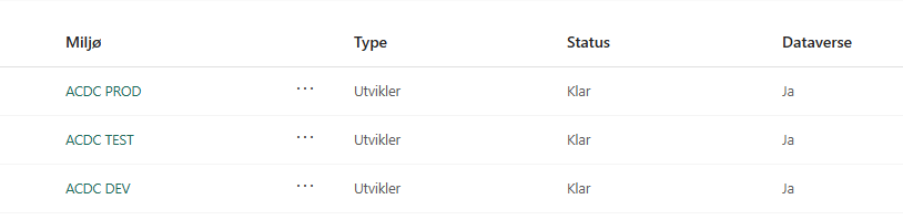
DEV-TEST-PROD (ALM)
Fred and George have never created an app before, so they need our assistance. We’ve explained the importance of ALM (Application Lifecycle Management) to them and set up three Power Platform environments.
Given that we’re participating in a hackathon for just a few days and the solution is currently quite small, we’ve decided to use the environment-centric approach (Environment vs. Source code centric ALM approach » Benedikt’s Power Platform Blog). While this is the most commonly used method, it has several drawbacks, such as vulnerability to environment issues, aging configurations, and reliance on manual deployments.
The magical students love the app (Magic Matrix)
All the students at Hogwarts love the app because it makes their daily lives easier. Transitioning from “pen and paper” to a fully digital solution is usually challenging, but for the students at Hogwarts, it was seamless. They appreciate having everything in one place, making it easy to navigate and find what they need.
I wish I had a similar app when I was a student. Back then, everything was scattered across different systems: one for school, one for living arrangements, one for information, one for stores, one for events, and another for books. Each had its own system, making it difficult to find anything. That’s why we believe it’s smart to consolidate everything into one place, making it easier to find.
The app isn’t just for school-related tasks; it also includes information about events, stores in Hogsmeade, where to find the cheapest butterbeer, sending pranks, and many other fun features the twins came up with.
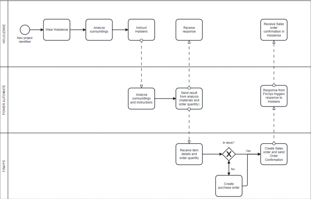
The BPMN diagram below is a simple representation of our KoopaKonstruct Manager.
In summary we are using Hololenses to inspect a chosen area where we want to e.g. hang up a coat rack, build a table, and similar. In order to make the Hololenses smart, we have integrated OpenAI. We are using Function calling to provide instructions about the requested project, information about necessary materials and quantity.This is where we are making our KoopaKonstruct really smart.
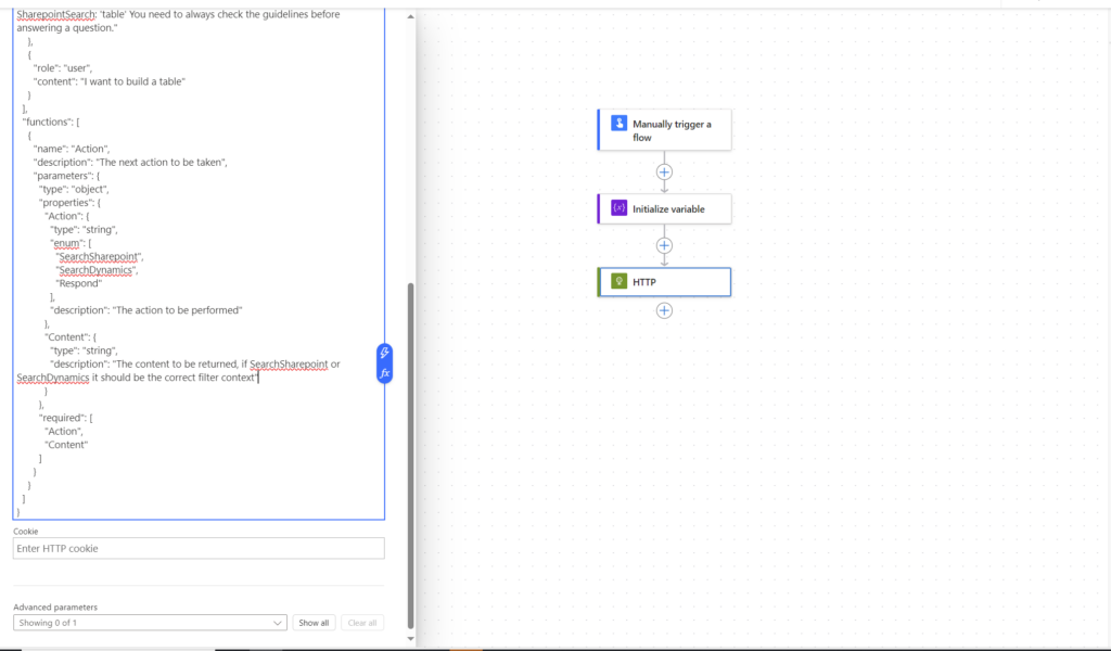
As real #Crawlers we use OpenAI’s Function calling to dynamically create the search criterias based on natural language. Google Speach to text is used to capture the natural language query. We are really integrating into everything that flips bits #Embedding numbnuts! With help of the search criterias, we are able to provide critical information further into the supply chain, meaning all the way down to the FinOps where we are improving critical business processes (this will be explained later in this blog post).
Below is a picture from the Hololenses where we use a button to speak with AI:
GPTVision helps us interpret work drawings and breaks it down into the steps needed, so that we can get a clear instruction of what materials we need, how many and how to build the desired object. Using Power Automate, we are able to share and send the item details and necessary quantity into FinOps.
As an addition to the OpenAI magic, we have also created a canvas app that is integrated in the Hololense #PlugN’Play. From this app you can perform business processes, such as triggering sales orders, check inventory status, and 4 different Power BI reports to monitor sales orders and follow up late deliveries #Dash it out.
And here is where we really improve business processes; when the information is sent to FinOps we use X++ code to check inventory status. If materials are in stock, a sales order is created and sales order confirmation is sent. If there are no (or not enough) materials in stock, we also create a purchase order in addition to the sales order. A link between the purchase order and sales order is created, enabling the ability to understand where the demand is coming from. Additionally, to make the KoopaKonstruct Manager adaptable to e.g. construction companies, we have created the possibility to link the purchase and sales orders with projects. This provides a lot of possibilities for detailed project management for the finance geeks.
Below is our argumentation to why we believe we should score high on all 4 categories!
Most Extreme Business Value
Our team embarked on a quest to redefine the meaning of business value, and we present to you KoopaKonstruct Manager – a solution that not only orders products through Hololenses but catapults business efficiency into a realm beyond imagination.
Automating the Complete Supply Chain with Hololenses
We harnessed the power of Hololenses to revolutionize the way products are ordered. One user, equipped with the mighty Hololens, registers the necessary quantity with a mere wave of the hand, triggering a Power Automate flow like a seasoned Mario collecting power-ups.
The adventure doesn’t stop there! Our Power Automate flow seamlessly transmits the order information to FinOps using the Execute action. The magic unfolds as FinOps automatically generates a sales order and a purchase order based on inventory stock. But here’s where the plot thickens – these orders are not solitary entities; they are linked together, creating a dynamic duo that unravels the mystery behind each purchase. There is no need to spend as much as a second wondering how or why the orders were created; the link indicate that there is a demand behind each purchase order.
See yourself sitting in an ordering office at a company where the customers are able to generate sales orders by only entering a demand. And, in addition to the automatic creation of sales order, imagine that you did not have to study the master plan to generate the purchase order as it is automatically created! And as a side salsa, you did not even have to trigger the sales order confirmation as it is sent automatically. So, while you are sitting there wondering about what to do with your life (and how long it takes before the CEO finds out that you are useless as the power of Power Automate and X++ took your job), you can relax and focus on other more important things in life, such as playing a Super Mario game.
Power Stars: Automated Project Linkage
But wait, there’s more! We also increased the business value for construction and engineering enterprises. With the ability to automatically link both the purchase and sales orders to projects, we’ve bestowed upon industries that thrive on projects a golden opportunity to enhance their efficiency and project management. It’s not just about ordering; it’s about constructing a bridge to a new era of project-linked prosperity.
The Warp Whistle to Most Extreme Business Value
We make a bold claim for the “Most Extreme Business Value” category in this year’s ACDC Hackathon. Here’s why our adventure deserves the highest score:
Efficiency: Our solution isn’t just about ordering; it’s about efficiency power-ups that automate the entire supply chain process, from order initiation to linkage in FinOps.
Dynamic and Time-saving: The automatic creation of linked sales and purchase orders provides unparalleled visibility into demand and supply, laying the foundation for strategic business decisions.
Project Linkage: For construction and engineering businesses, our automated project linkage is a treasure trove of golden coins, offering enhanced project management capabilities and business value beyond the ordinary.
Adaptable: Our solution is not only limited to the B2B-market, but can also be used for the B2C-market. Making the app available to customers, they can create orders automatically and receive high quality service as the complete supply chain has become even more efficient.
Excellent User Experience
We have created a Super Mario inspired canvas app that is adapted into the Hololenses. In other words, our app transforms ordinary into extraordinary!
Features:
Killer AI
Whether you’re a seasoned AI veteran or just dipping your toes into the mushroom-filled waters of innovation, our solution is a testament to the power that AI holds in shaping the future.
KoopaKonstruct Manager is not just a game-changer; it’s a game-transformer. Through the mastery of machine learning, we’ve empowered our solution to evolve, adapt, and learn from the challenges it encounters. From predicting order quantities to optimizing supply chain processes in the real world (and in FinOps), our AI-driven approach is a power-up for efficiency and foresight.
In the quest for the Killer AI “crown”, KoopaKonstruct offers more than just automated processes. It also includes magic in form of predictive insights, providing a glimpse into the future of demand, supply, and project landscapes. Strategic decision-making becomes second nature as our AI-driven system transforms data into actionable intelligence.
A mind of its own
In the pursuit of the existential risk badge, our AI solution goes beyond mere execution—it thinks, learns, and adapts with a mind of its own. Through autonomous decision-making capabilities, it navigates the complexities of supply chain processes and provides responses not even a 20 year old is able to find without searching the web.
KoopaKonstruct isn’t just smarter than a 5th grader; it engages in intelligent conversations that transcend the limitations of a classroom. It doesn’t just provide answers; it grapples with FinOps and supply chain complexities, understands nuances, and offers insights that reflect a level of intelligence resembling a dynamic dialogue.
Why KoopaKonstruct Manager deserves the Killer AI “crown”
Innovation Beyond the Blocks: KoopaKonstruct isn’t confined to the traditional boundaries. It breaks through the blocks of conventional solutions, paving the way for a new era of AI-driven innovation.
Adaptability in Every Pixel: Our solution dynamically adapts to the ever-changing business environment, ensuring resilience and adaptability in every pixel of our solution.
Mind Mastery: Our AI isn’t just a tool; it’s a mastery that elevates KoopaKonstruct into a symphony of efficiency, intelligence, and strategic foresight.
Pandoras Box
Equipping a Hololens with AI that can answer questions, order materials, and assist in selecting the right materials and tools for any project based on online instructions transforms DIY into an accessible experience for the less handy. This technology takes the guesswork out of building, offering tailored advice on what to build, the best materials and tools for the job, and even suggesting projects that match your interests and available space. It’s like having a personal tutor and assistant rolled into one, guiding you through the entire process from conception to completion. This seamless integration of technology with hands-on work not only makes crafting projects more approachable for beginners but also enriches the experience with educational value, ensuring that anyone can undertake and succeed in their DIY endeavors with confidence.