Adaptive solutions are always important as you no longer have any control on what kind of device the user is hacking along on.
Responsiveness was once considered a kind of black art, but fortunately, most modern solutions now offer robust support right out of the box. However, when integrating Power Pages, bots, and canvas apps, seamless functionality from the start isn’t always guaranteed.
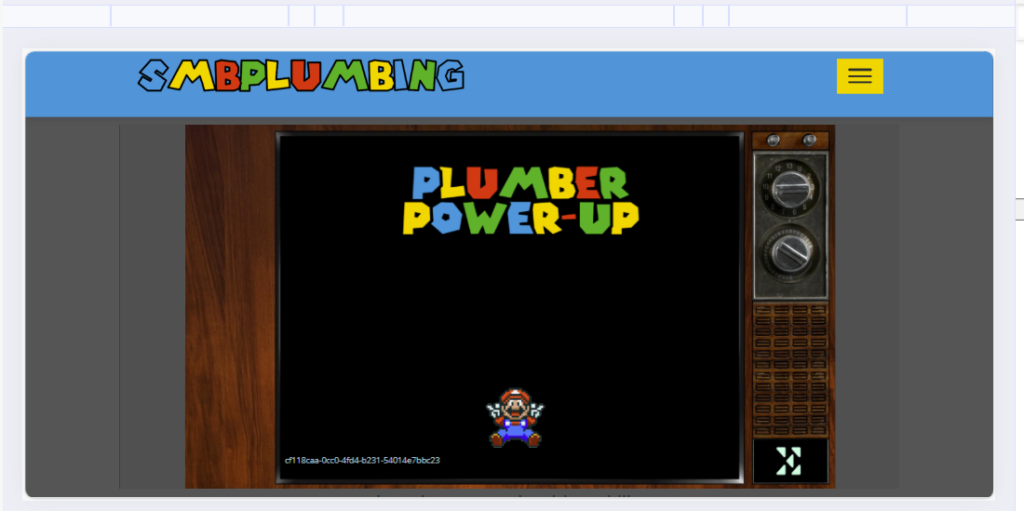
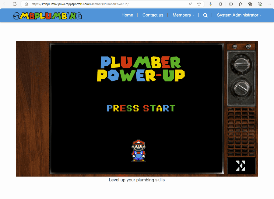
What realy gave us a headacke was embedded canvas apps. Yes they do resize, but leaves a lot of uneeded blank space on the top of the page which makes the app “disapear” on a mobile device:
The solution might seem quite obvious to a seasoned frontend designer, but for those of us who are more accustomed to low-code plumbing, navigating through CSS, JS, IFRAMES oh my my…
So we spent the better part of the day chogging along, and finally, we arrived at a solution we were happy with.
How can so little code take so mutch time???
@media (max-width: 1200px) {
    #il1tn4 {
    	margin: 0px !important;
        padding: 0px !important;
    }

    #iebs75 {
        padding: 0px;
    }
}

@media (max-width: 992px) {
    #il1tn4 iframe {
        height: 420px !important;
    }
}

@media (max-width: 767px) {
    #il1tn4 iframe {
        height: 170px !important;
    }
}