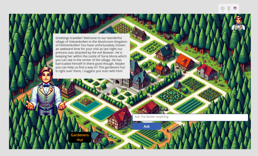
Our Faruk the Fabricator is living it now. Since yesterday, he was challenging himself on how to display the results in the best possible way… but he never questioned his Loooove to Fabric. And he also knows that the Fabric is the Marauder’s Map of data—you always know where everything is, even if it’s trying to hide.
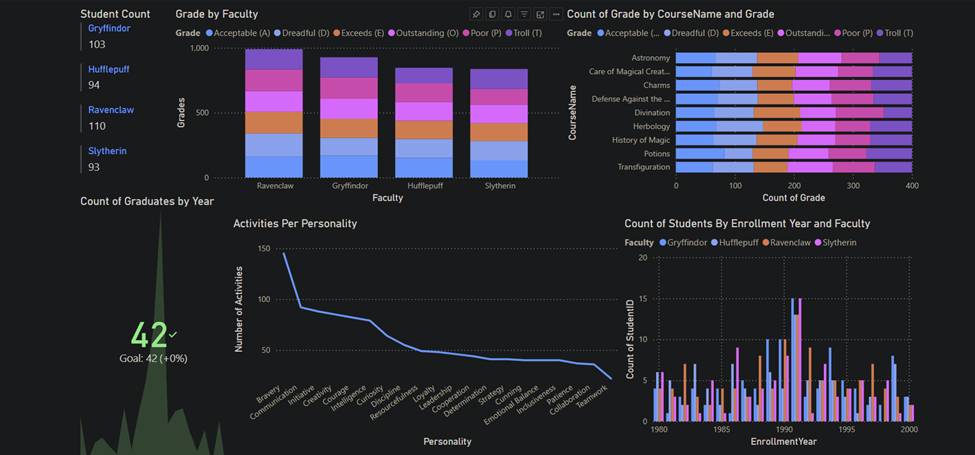
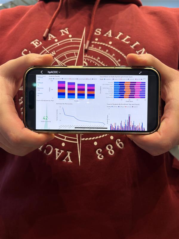
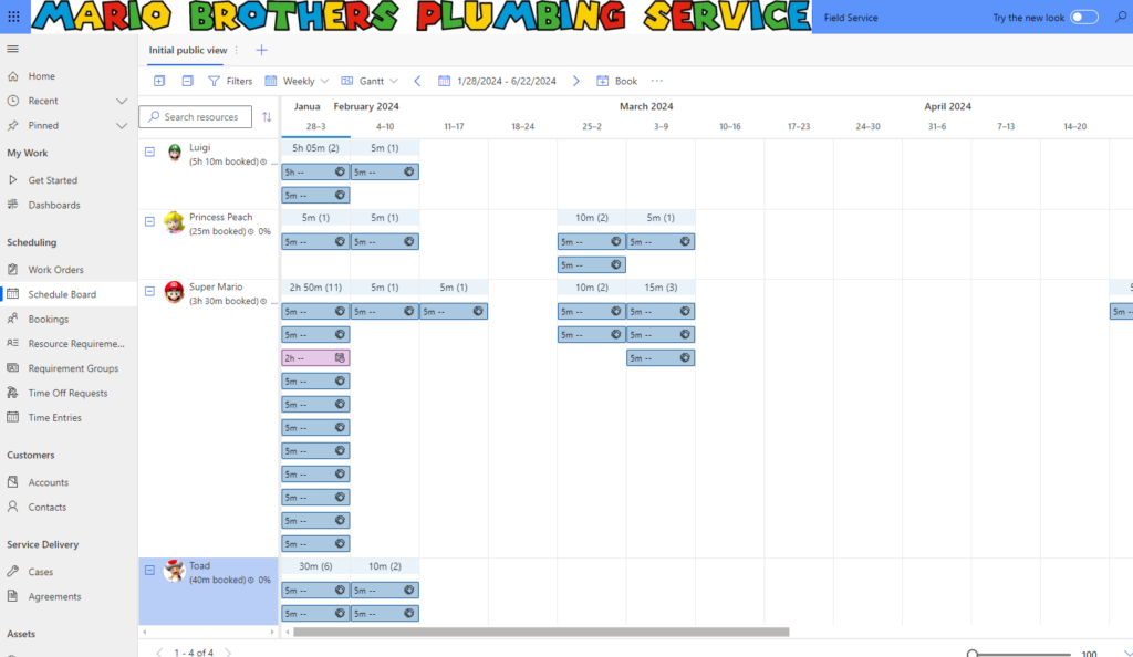
Here are the results of our data in Power BI report. We can see different metrics for student data.
We can also put KPI and compare ourselves with the so called Sorting Hat.
It is our first year since Wayfinder Academy was created and we introduced our Logiquill portal and we already show same performance, wait a few more years and we will leave him in the dust, as it already wasn’t dusty enough.
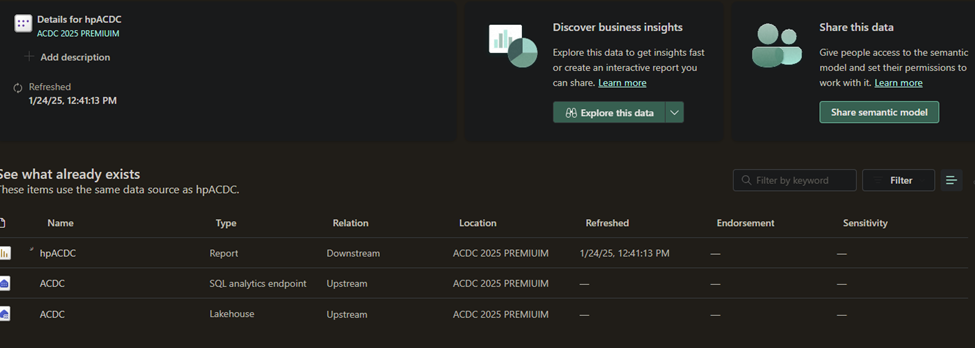
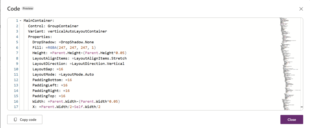
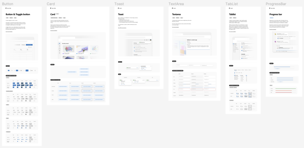
Here are our components inside Fabric
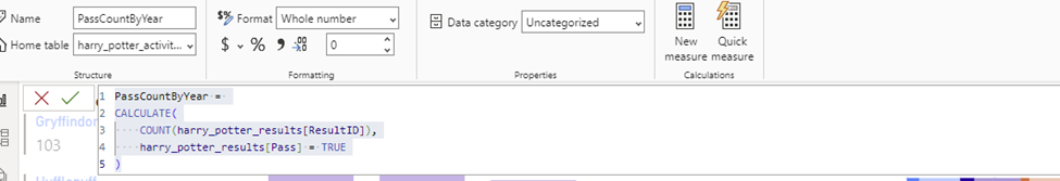
Our dax code in Power BI:
Here is why we also claim Chameleon badge, in addition to Dash it Out:
Solution is responsive. Adapts to all devices and screen sizes.
We are using containers in Power Apps custom pages to achieve a responsive layout and manage screen size to alter the application width and height. In Power Apps, we use the function Parent. to get the dynamic value of the screen width and height. The content is the centered and adjusting according to the values of the Parent.
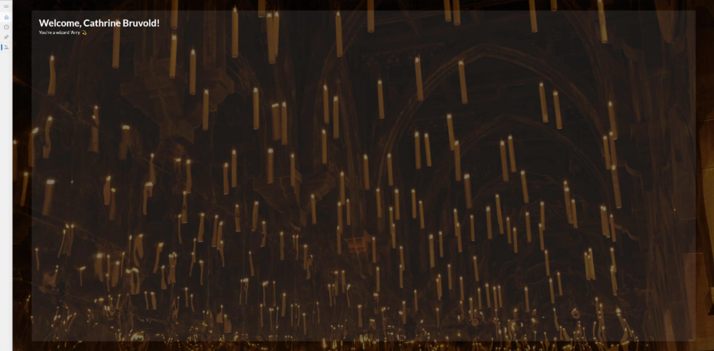
In full screen mode, the app (Custom page) is fully scaled to the browser screen size. Tbe blurred square is centered in the middle shown with as the rectangle has a 5% size margin to align it.
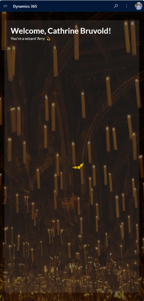
When the screen is adjusted to a smaller size, the rectangle and content is rightfully changed according to the screen size,
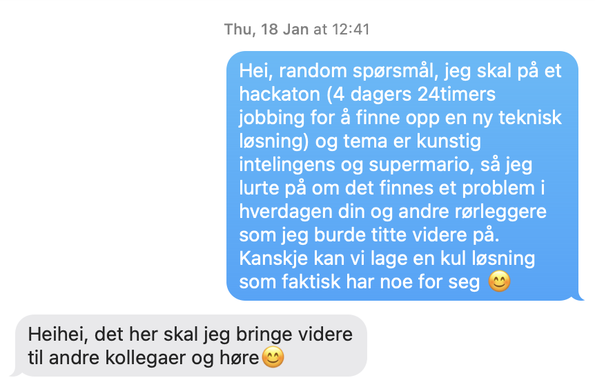
Before the hackathon we used some hours doing research, which included doing use research. Sofie on our team had experienced that renovating a bathroom includes a lot of back and forth between plumber, carpenter, project manager and several other people. It took more time then it needed to, to finish the bathroom due to bad communication, jo flere kokker, jo mere søl/Too many cooks spoil the broth.
We talked to two amazing plumbers, first asking a random question:
They, and their colleagues wanted: – A pipe planner for when they renovate a bathroom – Supply list with which pipes and other equipment – Pipe (hehe)line for all the workers including in building a bathroom
Sofie wanted: – Certificate of completion automatically …
We hade several calls with them before and during the hackathon, they gave us invaluable information and insight, and they have evaluated our solution each day.
This is our user journey
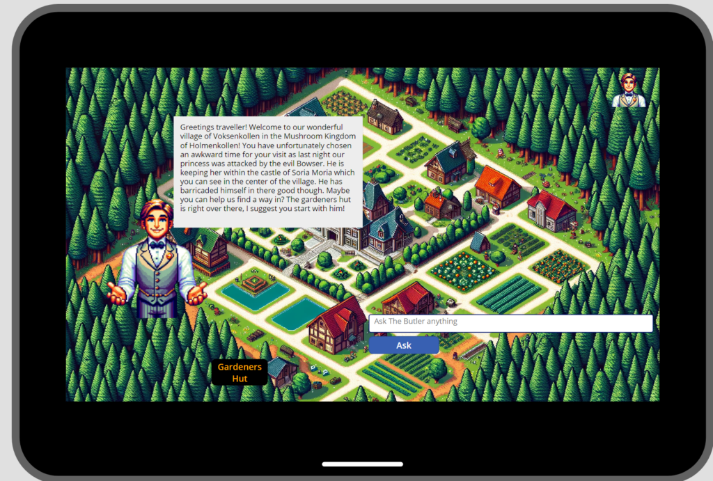
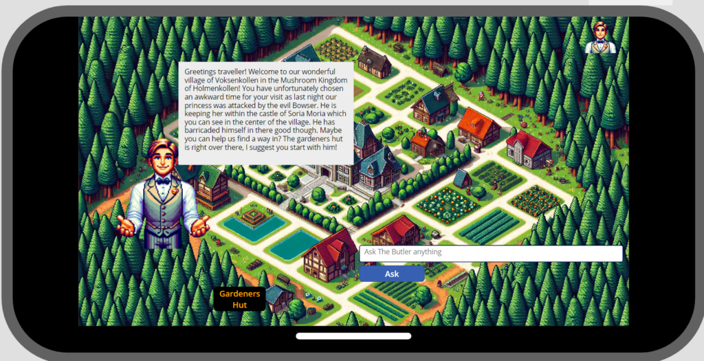
And of course, here is the user journey translated to Super Mario (please zoome in)
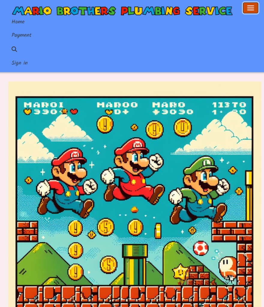
Late last night, after a couple of beers we finally found the perfect name for our plumber solution! Say hello to Tubi! We made a logo we are happy with, short and sweet!
Using Microsoft UI components, with a dash of Super Mario sprinkles on top, the UI is done.
Since this blog isn’t the best medium to showcase the design, please check it out at Behance
Glossy Pixels: For our app have we used Mario themed icons and Since we are Waken Koopa troopas have we choosen color-codes that represent Koopa Troopas colors. Green for their shell and yellow for their body. Synne, being our lead designer, made sketches for our final design:
Our final design ended up quite close to the envisioned design:
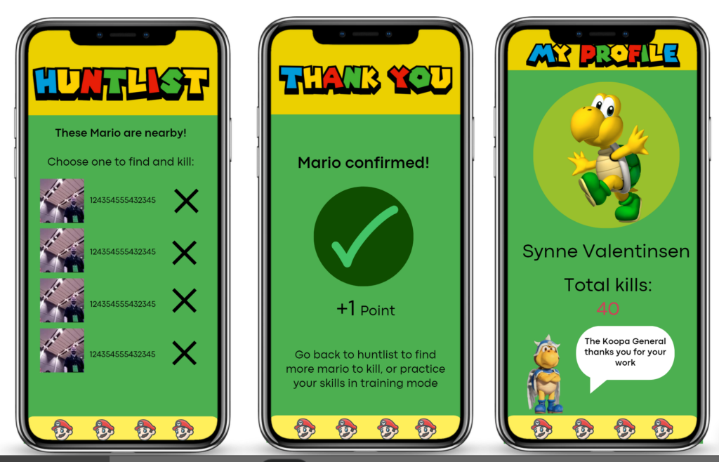
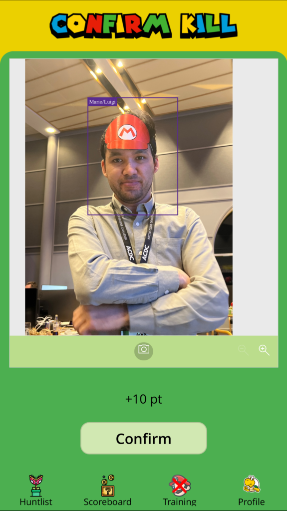
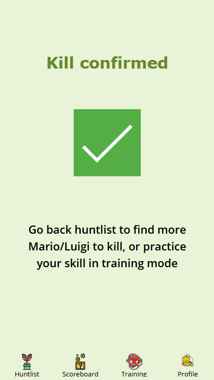
We also have a minigame where you get to hunt as many Mario can, where we liberally use Mario inspired design language.
Chameleon Our app is available both for desktop and mobile users. We also have built a responsive canvas app, however the minigame is only available in portrait mode so no one gets an unfair advantage 🙂
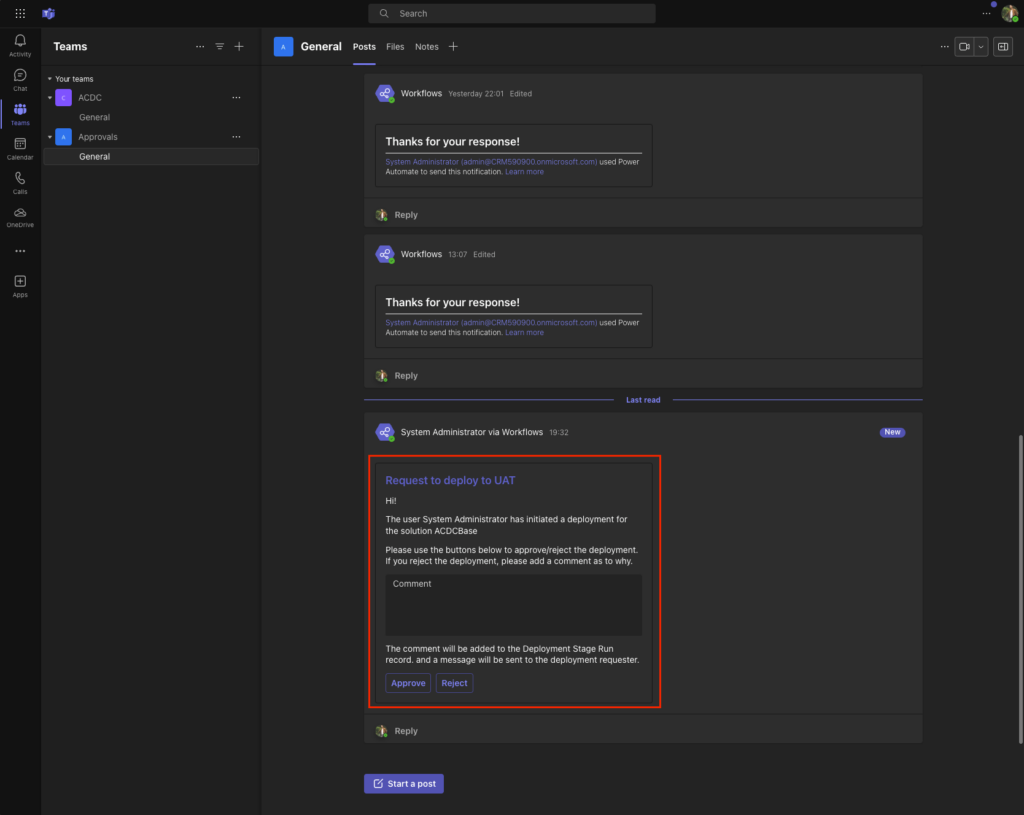
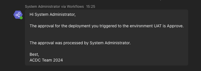
Streamlining Efficiency: The “Go with the Flow” Badge Achievement
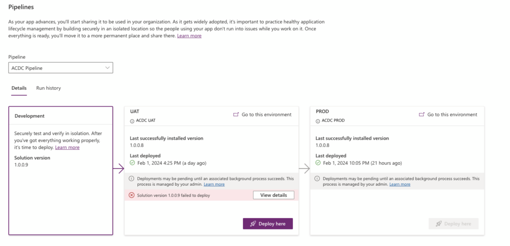
In the pursuit of optimizing business productivity within our solution, the implementation of an ALM pipeline has been a game-changer. This automated transfer of solutions between environments not only saves significant time and effort but also ensures that both unmanaged and managed versioning packages of the solution are seamlessly transitioned. Furthermore, the integration of a Power Automate flow for the approval of deployments has elevated our operational efficiency, marking a significant milestone in our journey to “Go with the Flow.” This achievement underscores our commitment to leveraging workflow automation for enhanced productivity.
Uniting Power and Simplicity: The “Power User Love” Badge
Our solution showcases an exemplary blend of low-code platforms with pro-code customization, embodying the #ProCodeNoCodeUnite philosophy. By implementing a Power Pages site for user interface and login, coupled with a PCF component coded in React and TypeScript for a gamified course, we demonstrate the power of integrating professional coding standards with low-code solutions. This approach not only streamlines development but also opens up a realm of possibilities for creating robust, user-friendly applications.
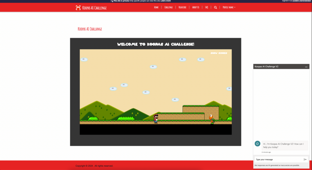
Gamification at Its Best: Achieving the “Mario Badge”
Elevating user interaction through gamification, the implemented PCF component with interactive controllers to navigate through course levels. Each course represents a level, challenging users to advance and showcase their proficiency. This gamification aspect not only makes learning more engaging but also encourages users to level up their skills in a fun and interactive environment.
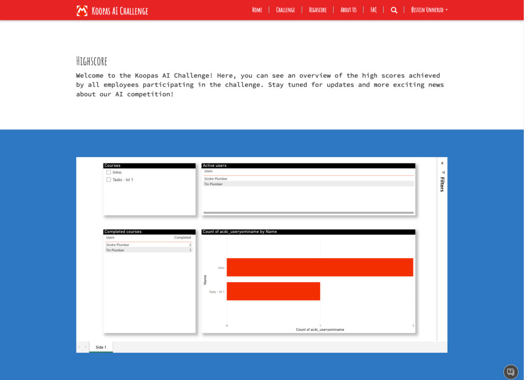
Visual Insights: The “Dash It Out” Badge
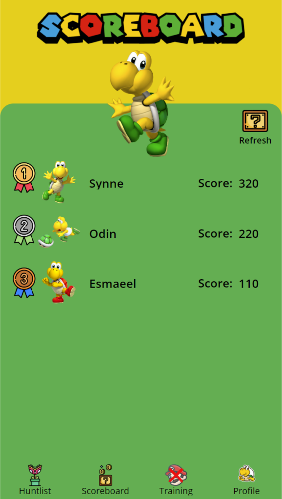
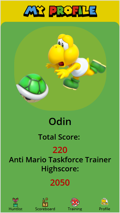
Our solution now features a Power BI report embedded within the Power Pages site, along with additional reports for user access to high scores and admins for an overview of active players and their progress. These reports, showcasing at least four graphs, gauges, or KPIs, highlight the business value of our dashboard. The integration of these visual insights ensures that both users and administrators have a comprehensive understanding of performance metrics at their fingertips.
Adaptive Excellence: Securing the “Chameleon” Badge
The responsiveness of the Power Page, adapting automatically to all devices and screen sizes, exemplifies our solution’s versatility. This inherent adaptability ensures that our application delivers a consistent and user-friendly experience across various platforms, earning us the “Chameleon” badge. It’s a testament to our dedication to creating solutions that are not only powerful but also universally accessible.
Glossy Pixels: We developed a custom Mario-themed UI for our Princess Self Services portal.
Chameleon: Our UI maintains it’s structure with the ever-changing screen size.
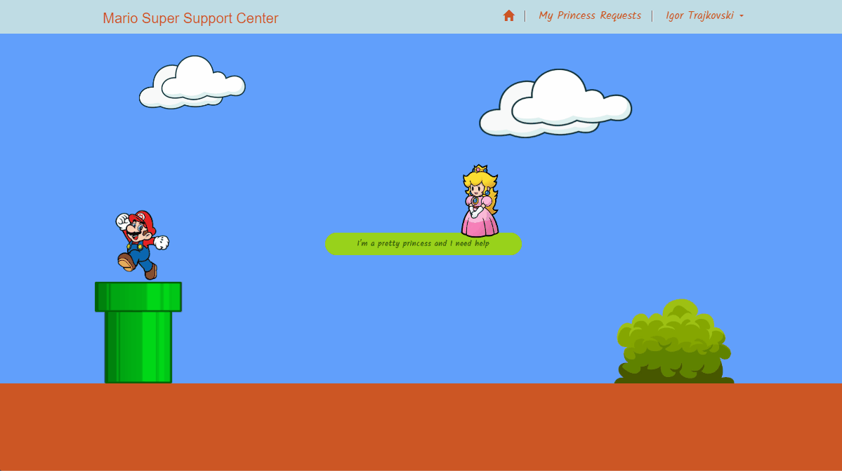
The backbone of our system is supporting whatever requests our princesses may have. With that in mind, one of the main objectives while planning for the princess-facing side of the system, we opted for simplicity and a fun user experience before all.
Our home page has only one button, so there is no confusion in their time of need. We went with the opposite logiq than the people that post recipes online.
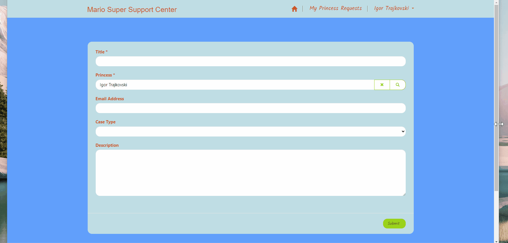
Once the button is clicked, and the princess creates their profile, the next step is a simple form to gather the important information.
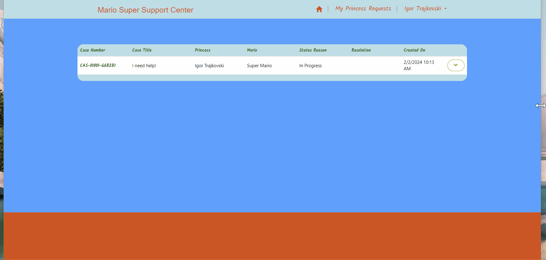
Once they are happy with their request details, and submit, they get redirected to a page listing all of their current and historical request.
Adaptive solutions are always important as you no longer have any control on what kind of device the user is hacking along on.
Power Pages comes with pretty good responsive support out of the box
Responsiveness was once considered a kind of black art, but fortunately, most modern solutions now offer robust support right out of the box. However, when integrating Power Pages, bots, and canvas apps, seamless functionality from the start isn’t always guaranteed.
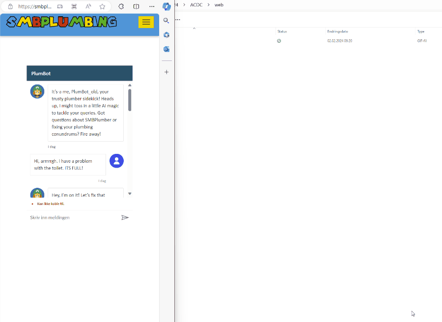
Embedding PlumbBot needed minimal adjustments to support responsiveness
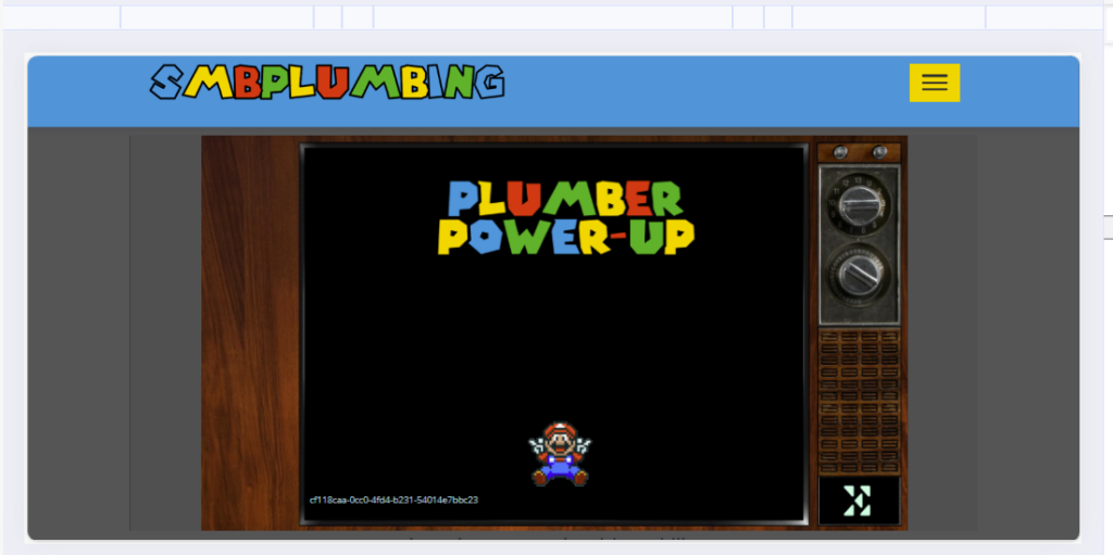
What realy gave us a headacke was embedded canvas apps. Yes they do resize, but leaves a lot of uneeded blank space on the top of the page which makes the app “disapear” on a mobile device:
Unwanted spacing in the top
The solution might seem quite obvious to a seasoned frontend designer, but for those of us who are more accustomed to low-code plumbing, navigating through CSS, JS, IFRAMES oh my my…
So we spent the better part of the day chogging along, and finally, we arrived at a solution we were happy with.
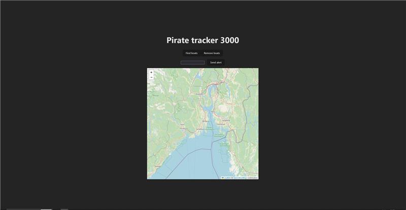
We have mentioned little about our front end web solution so far. But here is some info. The interface is made in React.js built with Vite. It is faster than Webpack.⏩
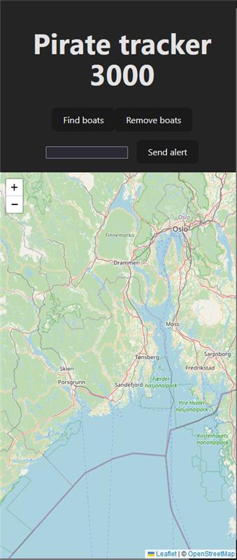
This is a page to be used by authorities, the coast guard or separate centers for shipping companies. The website is used to scan areas on the map for ships. If a pirate ship is detected, an alarm can be sent to all other ships in the area. In order to be able to be used on all surfaces, it is of course responsive 😉
Big ScreenSmall screen
Sending an alarm from the web interface will trigger an alarm in Teams clients over on the ships, as well as cause the light on the bridge to flash red.