With this blog post we are aiming for the Glossy Pixels badge

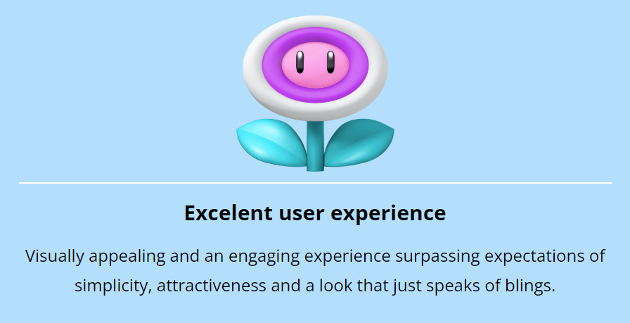
We will also argue that to have a consistent visual identity across all the games will create a good user experience, so this blog post should also be considered to count towards the Excellent User Experience category.
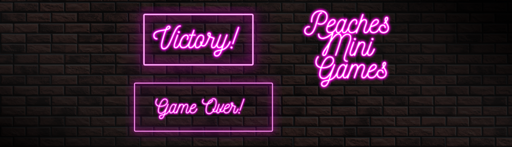
Logo
We created the logo first, to set the tone, find the colors and use this as a baseline in the visual identity.

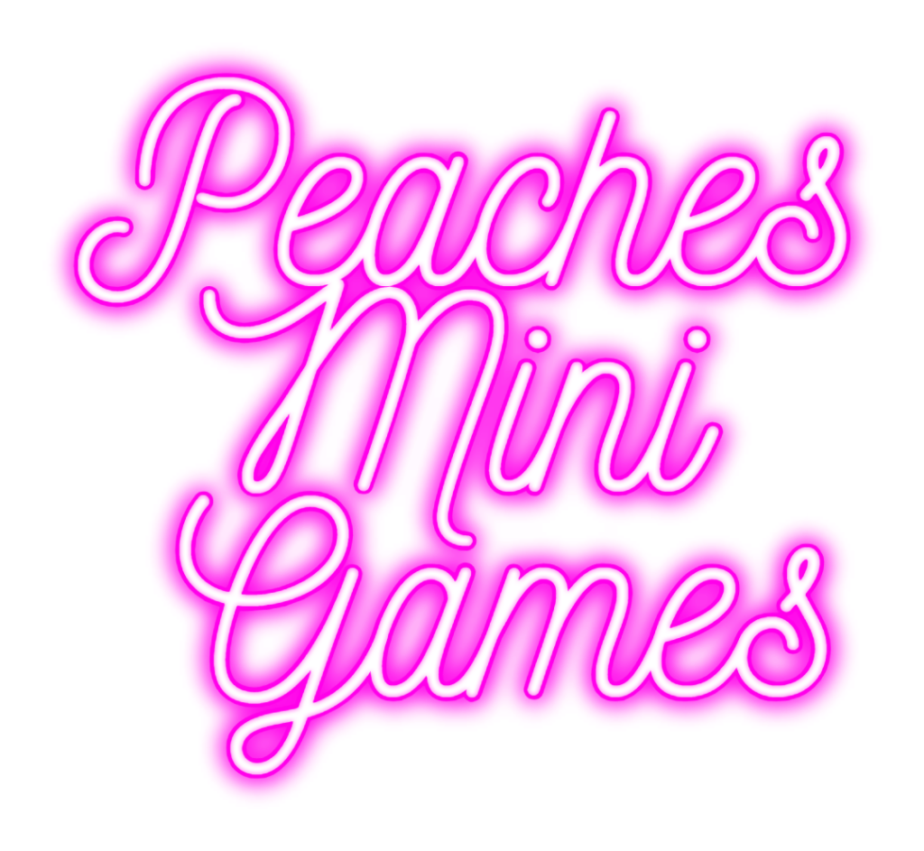
We use a website to generate this glowing effect
https://www.textstudio.com/logo/3d-neon-pink-text-27
Background
To get the same look and feel across the apps we also use the same background.
This is created from scratch with a picture of a brick wall and effects created in Photoshop
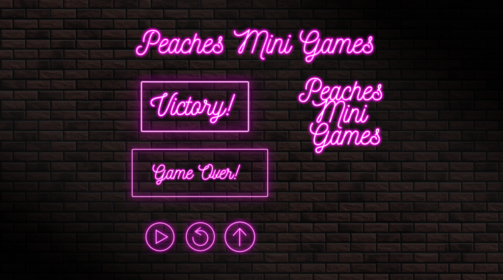
The buttons on the bottom and other geometrical elements used in the apps are created in Photoshop from scratch with the help of this tutorial:
https://www.youtube.com/watch?v=3JxCbwn-6bQ
Why do we bother creating this from scratch? Because it’s fun! 😀 And a bit retro to not use AI to generate everything?

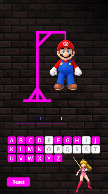
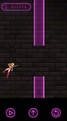
We found a good picture of Princess Peach where she is in her battle gear. In our “Peaches Mini Games” world she is saving Mario – so we wanted her to look badass..
Implement the visual identity across the apps
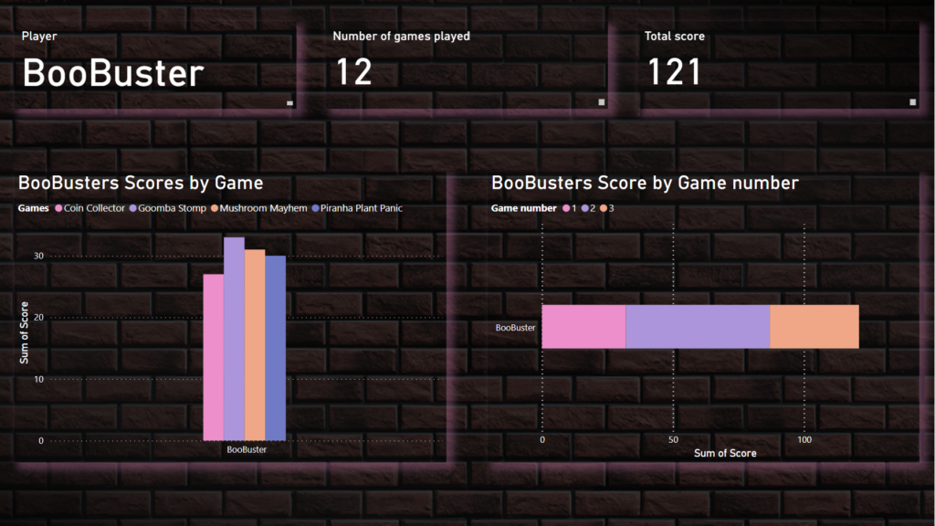
The Power BI Scoreboard
The Hangman Game
Peaches Flight App
We will also make sure to implement this visual identity across the other websites and apps that we make as the solution progresses to make sure that the user feels that they are playing games in the same universe.
We beleive true retro would be to draw by hand and scanned it to use in the app