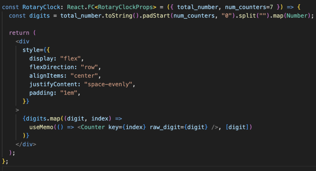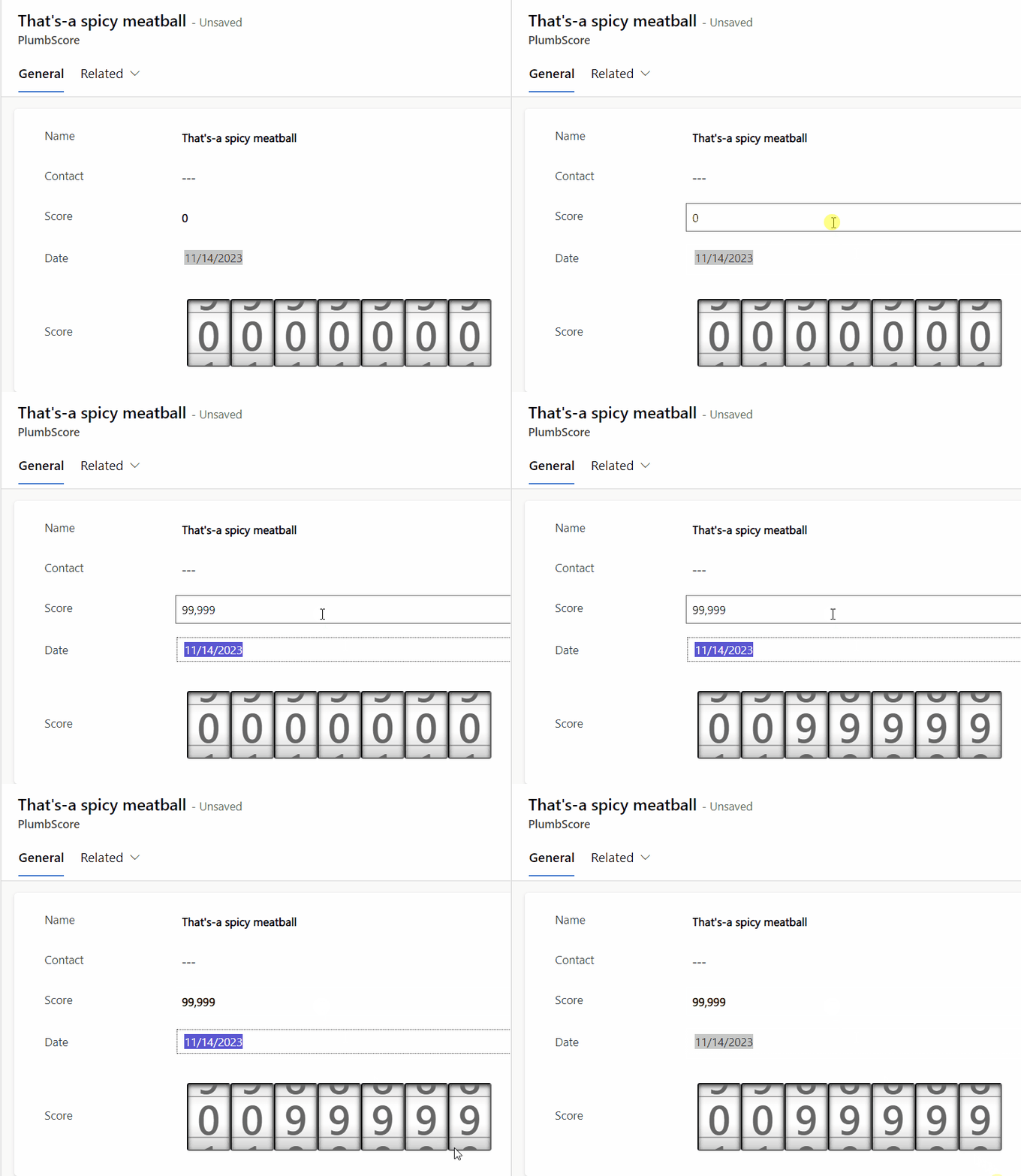
While this is a great visualisation, we must announce that the CSS and JS was not created by us, but by the great Developer VictorNP, which proposed a vanilla JS solution which we transformed into React functional components. As stated by the designer, It is mainly designed to be a read-only component used to display information – Therefore we’ve limited to bounded context fields.

This is an great example of how the limited possibilities of Dashboards in Dynamics directly, can easily be mitigated, as well making the visualisation reusable for different contexts through PCFs, making custom, code-first visuals in our Low-code solution. By harnessing the power of client-side processing, we ensure that our solutions are not burdened by heavy monolith front-ends, guaranteeing a seamless and responsive user experience every time. Of course, memorisation is applied to improve the transitions and performance of the visualisation.

Moreover, the PCFs functions as plugins for Power Apps, which further enriches the user experience through customisation. Our use cases will be mostly related to displaying important business and plumbing related KPI’s to keep track on the current state of our business. Lastly we wanted others to be able to reuse this visual and provide improvements to it, so we Open sourced it and made available on Github! Contributions are very welcome!

We don’t quite see the what business need this solves outside the text box you already have with the number for “plug’n’play”.