
Claiming Glossy Pictures:

We asked AI to create a pirate color theme:
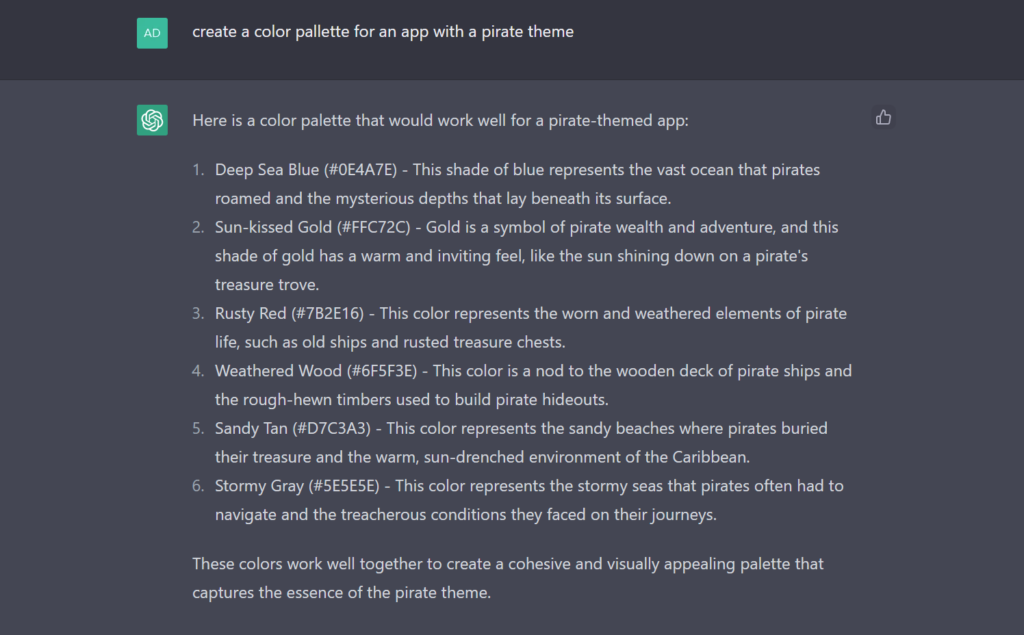
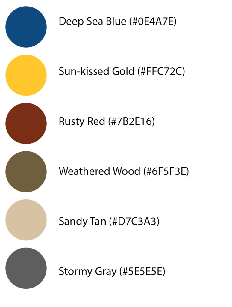
Here is a color palette that would work well for a pirate-themed app:
- Deep Sea Blue (#0E4A7E) – This shade of blue represents the vast ocean that pirates roamed and the mysterious depths that lay beneath its surface.
- Sun-kissed Gold (#FFC72C) – Gold is a symbol of pirate wealth and adventure, and this shade of gold has a warm and inviting feel, like the sun shining down on a pirate’s treasure trove.
- Rusty Red (#7B2E16) – This color represents the worn and weathered elements of pirate life, such as old ships and rusted treasure chests.
- Weathered Wood (#6F5F3E) – This color is a nod to the wooden deck of pirate ships and the rough-hewn timbers used to build pirate hideouts.
- Sandy Tan (#D7C3A3) – This color represents the sandy beaches where pirates buried their treasure and the warm, sun-drenched environment of the Caribbean.
- Stormy Gray (#5E5E5E) – This color represents the stormy seas that pirates often had to navigate and the treacherous conditions they faced on their journeys.
These colors work well together to create a cohesive and visually appealing palette that captures the essence of the pirate theme.
Based on the colors we drew a logo free hand using Microsoft Whiteboard and added the colors from the color profile.
The logo should appear everywhere to create cohesive branding.

UPDATE!
We updated the brand guide based in feedback from our pirates and this is what the new logo looks like:
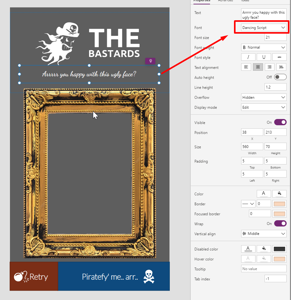
Font
All good brands with some selfrespect has special fonts that is designed to give the user crafted associations. Never underestimate the effect of a good font.
We use two fonts in our designs.
Headers and body text we use Lato Hairline in Canvas Apps and Lato Thin wherever this font is too thin.
Lato on Google Fonts:
https://fonts.google.com/specimen/Lato
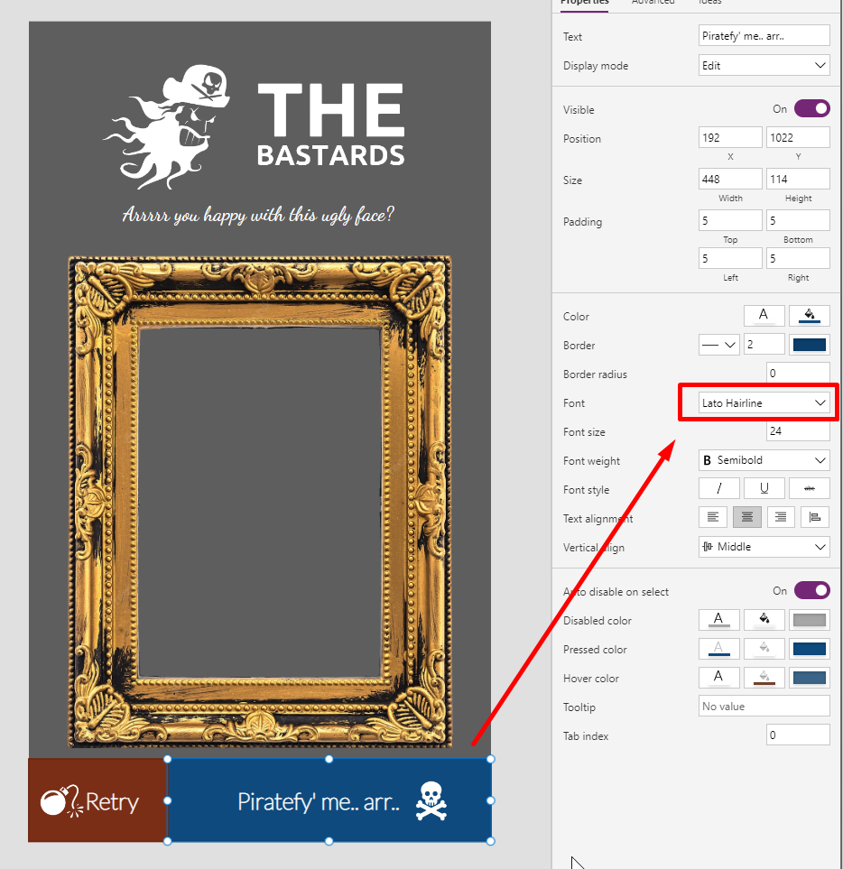
For decorative contrast we use the font “Dancing Script”.
Dancing Scripts on Google Fonts:
https://fonts.google.com/specimen/Dancing+Script
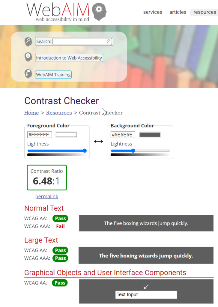
Color contrast
OF course we also checked that having that dark grey background with white text is accessible, and it is.
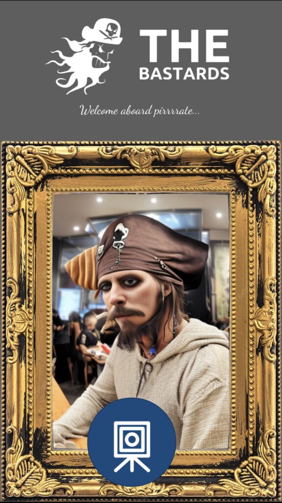
We used these graphics in our app that capture new pirates into our system:
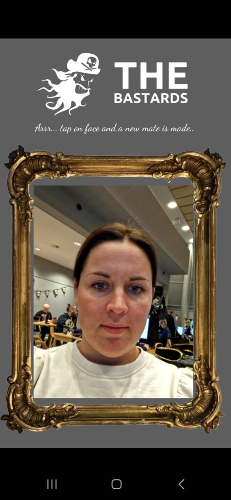
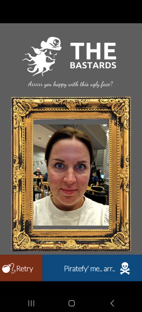
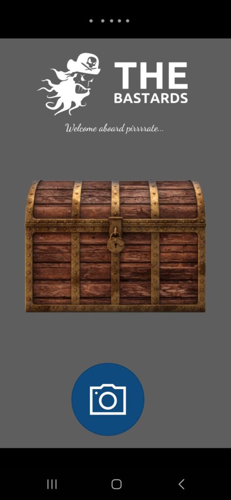
Tap the chest to reveal your new pirate self.
We think this is an awesome brand guide – and we look forward to see how you will apply this to your User Interface to earn this badge!