
We have created a dashboard in dynamics, and in that context we feel obliged to ask for the retro badge at the same time. Dynamics is fun to deal with when it comes to a lot, but dashboard and charts feels like it has been collecting dust since 2008 (poor thing). Its reliance on outdated aesthetics compromises functionality and accessibility.
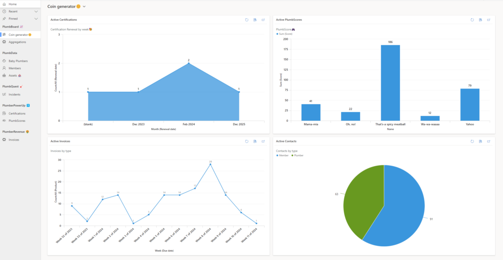
Our “PlumbBoard” shows the key values in our enviroment
– Certifications Renewal
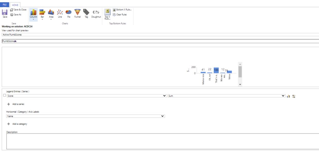
– PlumbScore: The number of individuals trying to obtain certification through our ‘Plumber PowerUp’ games
– Invoices: With an overview of when the invoices are due
– Contacts: It’s also important to have some indications of our different memberships. In our case, we have plumbers and members.
Make a separate case claim for Retro and explain why it really is doing something cool with legacy tech.