

We have created a visual identity for our brand
In OneNote we have a visual guide that all apps and services should follow.
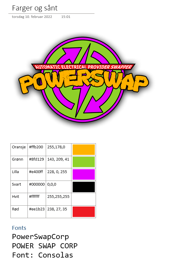
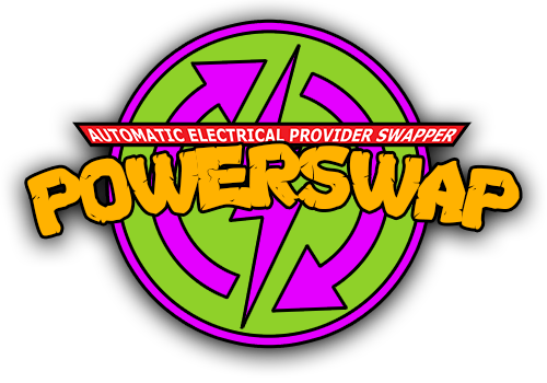
In addition we have created a logo that apply to the colours and embodies the playfulness and professionalism that the company embodies.
The logo is picturing a lightning symbol with arrows around it to symbolise that the company deals in swapping electrical providers. The lightning symbol is also indicating the automaticallity of the processes if switching from one provider to another.
The full logo will be used in the portal header and canvas app, as well as for SharePoint site and Power BI.
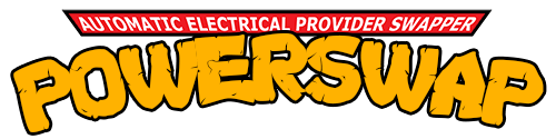
This logo text alone can be used where the full logo is to big or when the resolution is too low and the text becomes unreadable.
The logo icon will be used as favicon in portals, as icon in Canvas Apps and as icon for DevOpsTeam.