🏅 Dash It Out Badge – Crafting Enchanting Dashboards 📊✨

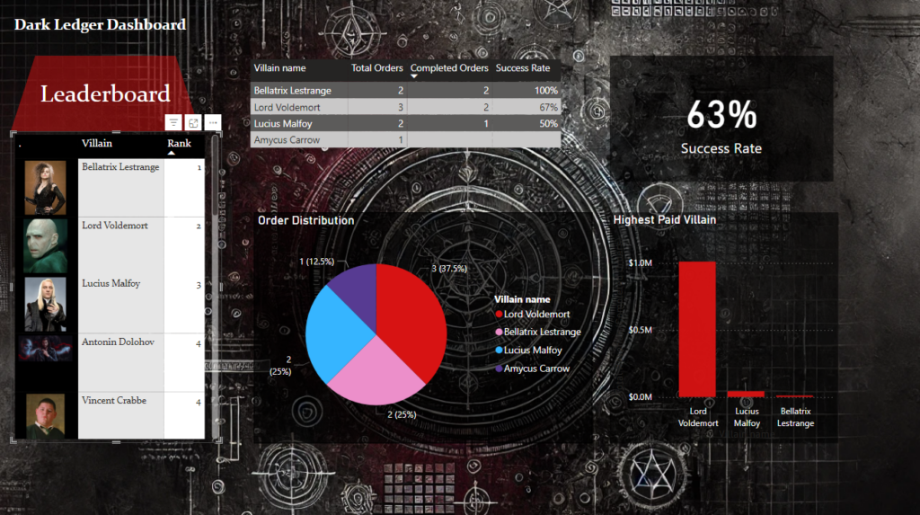
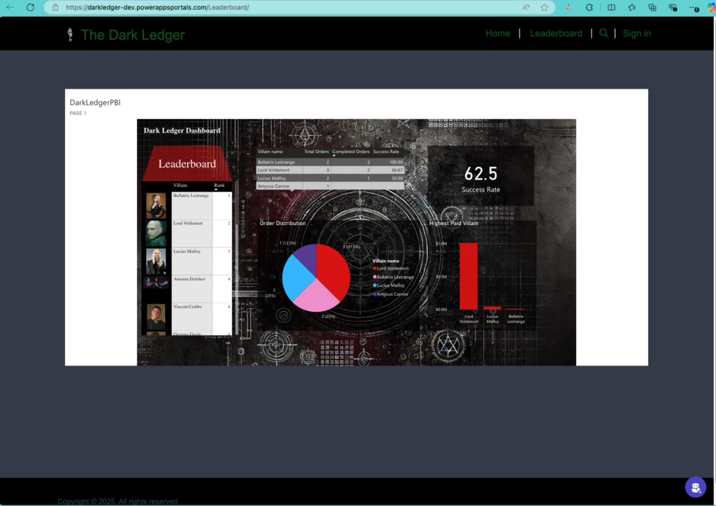
Welcome to the magical world of data visualization! We’ve summoned the powers of data and design to create a visually stunning dashboard integrated seamlessly into our Model-Driven App and Power Pages. This dashboard is not just a feast for the eyes but also a vital tool for tracking the Dark Ledger’s performance metrics and ensuring operational excellence.
Dashboard Highlights ✨📈

Our dashboard is designed to provide business value while capturing the mystical essence of the Dark Ledger. Here’s how we’ve structured it:
1. Leaderboard – The Hall of Infamy 🥇
- A dynamic ranked list showcasing the top villains based on completed orders.
- Metrics:
- Villain Name 🧙♂️
- Number of Completed Orders ✔️
- Success Rate (%) 📈
- Purpose: Encourages competition among villains while highlighting high performers.
2. Success Rate – The Measure of Mastery 📊
- A sleek gauge graph visualizing the average success rate across all villains.
- Business Value: Offers insight into operational efficiency and highlights areas for improvement.
3. Order Distribution – Workload Balance 🥧
- An interactive pie chart showing the proportion of orders assigned to each villain.
- Purpose: Ensures fair workload distribution and identifies underutilized or overburdened villains.
4. Highest Paid Villain – Who’s Earning the Most Gold? 🤑
- A compelling bar chart that highlights the top-earning villain based on revenue from completed orders.
- Metrics:
- Villain Name
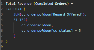
- Revenue Generated
- Business Value: Identifies revenue drivers and fosters friendly rivalry among villains.

DAX Magic 🪄📋
Behind the scenes, we’ve worked our DAX wizardry to create calculated measures that drive these insights. From aggregating revenue to calculating success rates and ranks, our formulas ensure that every metric is accurate and meaningful.


Why It’s Magical 🌟
- Integrated Design: The dashboard is seamlessly embedded within both our Model-Driven App and Power Pages, making it accessible to all Dark Ledger users.
- Actionable Insights: These visuals empower administrators to make informed decisions, optimize performance, and celebrate top performers.
- User-Friendly: With intuitive graphs and clear KPIs, even the darkest wizards can navigate the dashboard with ease.

