Creating responsive design for our applications.
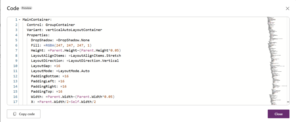
We are using containers in Power Apps custom pages to achieve a responsive layout and manage screen size to alter the application width and height. In Power Apps, we use the function Parent. to get the dynamic value of the screen width and height. The content is the centered and adjusting according to the values of the Parent.

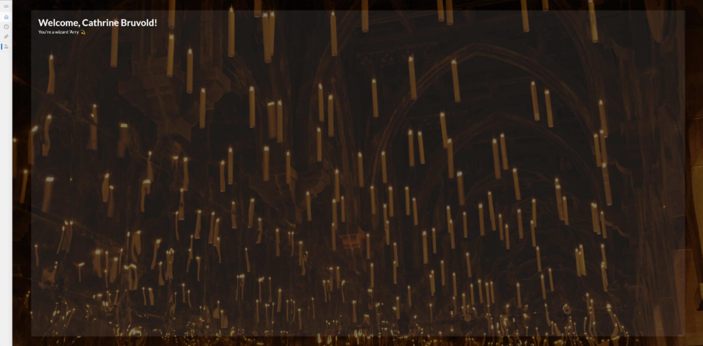
In full screen mode, the app (Custom page) is fully scaled to the browser screen size. Tbe blurred square is centered in the middle shown with as the rectangle has a 5% size margin to align it.

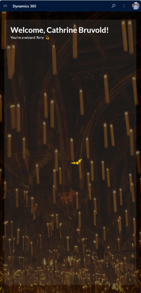
When the screen is adjusted to a smaller size, the rectangle and content is rightfully changed according to the screen size,

