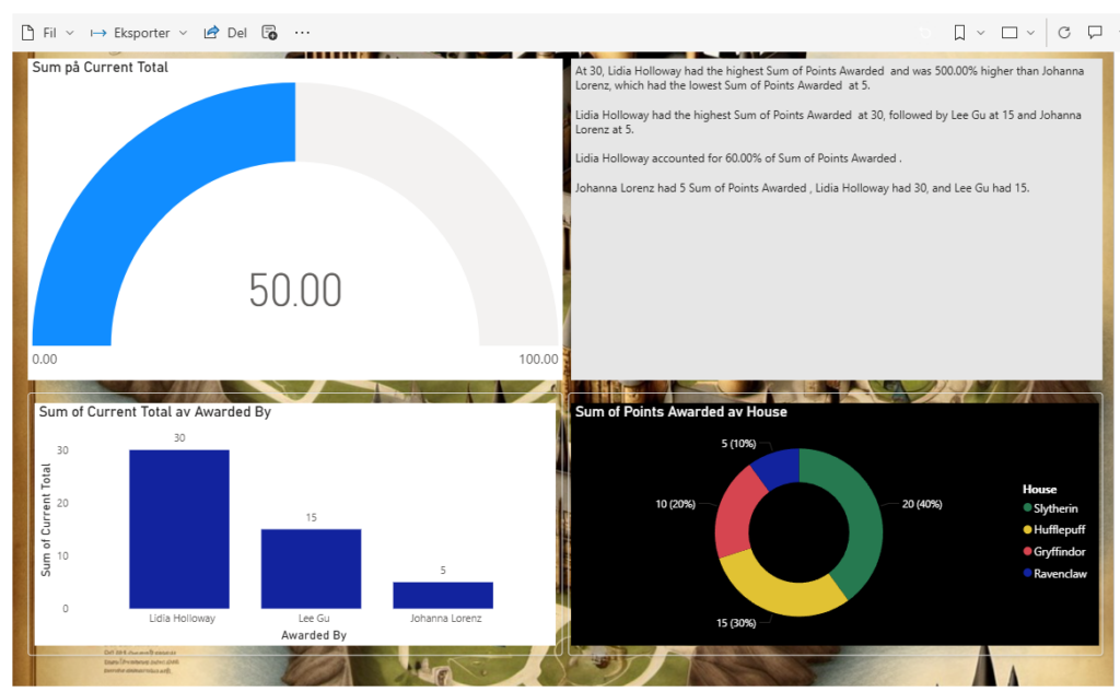
Dash It Out: In the spirit of the Marauder’s Map, we have conjured a dashboard that is both visually stunning and incredibly informative. This dashboard is not just a collection of graphs and KPIs; it is a powerful tool designed to provide valuable insights.
- Current Total Points Handed Out for the Semester: Much like the House Points Hourglasses in the Great Hall, this graph shows the total points awarded throughout the semester, giving us a clear view of the academic achievements and contributions of our students.
- Who Awarded the Most Points: This chart reveals the professors who have awarded the most points. It highlights the dedication and encouragement provided by our esteemed faculty members, fostering a competitive yet supportive environment.
- Sum of Points Awarded by House: This graph, reminiscent of the House Cup standings, displays the total points awarded to each house. It provides a visual representation of the friendly rivalry between Gryffindor, Hufflepuff, Ravenclaw, and Slytherin, motivating students to strive for excellence.
- Statistics About the Professors Who Awarded Points: This report, much like the meticulous notes of Hermione Granger, details the statistics of the professors who have awarded points. It includes insights into their teaching styles, frequency of awarding points, and the impact of their encouragement on student performance.

Creating this dashboard was we utilized our preferred data visualization framework, leveraging its capabilities to build a solution that is both robust and user-friendly.
Mischief managed! 🧙♂️✨
