Introduction
Creating visually engaging and insightful dashboards in Power BI is a game-changer in data visualization. This post focuses on building an effective dashboard for analyzing Mario Kart race performances, emphasizing both aesthetics and business value.
Dashboard Overview
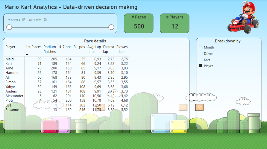
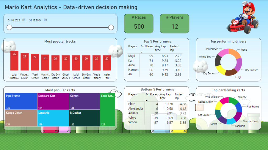
The dashboard comprises two main pages: the Overview Page for summarizing race results and the Analysis Page for detailed data exploration.
Overview Page Highlights
Track Popularity: Graphical display of most-chosen tracks.
Player Rankings: Visuals showing the best and worst performers over time.
Top Karts and Drivers: Easy-to-read charts highlighting popular choices.
Analysis Page Features
Dynamic Data Table: Customizable view using field parameters for in-depth analysis.
Slicer Panel: Enables quick data filtering for different variables.
Balancing Design and Utility
The key is to combine visually appealing elements with actionable insights, ensuring each part of the dashboard serves a practical purpose. For instance, understanding player preferences can guide marketing strategies, while top performer analysis might influence game development.


Power BI’s Role
Leverage Power BI’s capabilities for:
Efficient Data Modeling: Smooth handling of extensive race data.
Custom Calculations: Using DAX for unique insights.
Interactive Visuals: From basic charts to advanced graphics for user-friendly analysis.
Conclusion
This Power BI dashboard for Mario Kart race analysis not only demonstrates technical skills but also the importance of meaningful data presentation. It’s an ideal blend of form and function, turning complex data into accessible and actionable insights.
Note: This condensed draft provides a structured approach to crafting a blog post focused on creating a business dashboard in Power BI, using Mario Kart race data as a case study. Expand with specific examples or screenshots as needed.
