
Introduction
Developing an interface that is both visually stunning and functionally robust is key in app design. This post explores our journey in creating a user-friendly, shiny, and glossy interface for a Power Apps Canvas application, focused on streamlining race enrollments.
Design Approach: Sleek and Responsive
Aiming for a visually appealing and intuitive interface, we emphasized:
Shiny and Glossy Aesthetics: A design that is immediately engaging and visually appealing.
Intuitive Navigation: Ensuring ease of use for all functionalities.
App Highlights
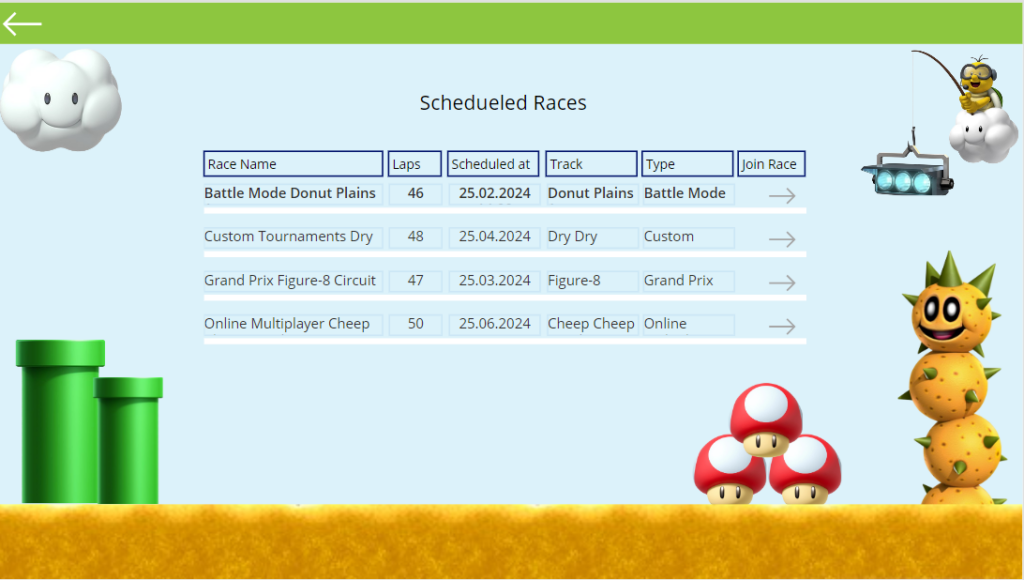
Streamlined Race Enrollments
Simplified Process: Making race sign-ups quick and hassle-free.
Interactive Elements: Engaging users with dynamic character selection features.
The application:


Conclusion
Our Power Apps Canvas project demonstrates how an attractive and responsive design can significantly enhance user interaction. By marrying a glossy aesthetic with responsive design principles, we’ve crafted an app that’s not only eye-catching but also highly functional on diverse devices.
Note: This concise draft outlines the creation of a user-friendly and responsive Power Apps Canvas application, ideal for expanding with specific technical insights or visual examples.