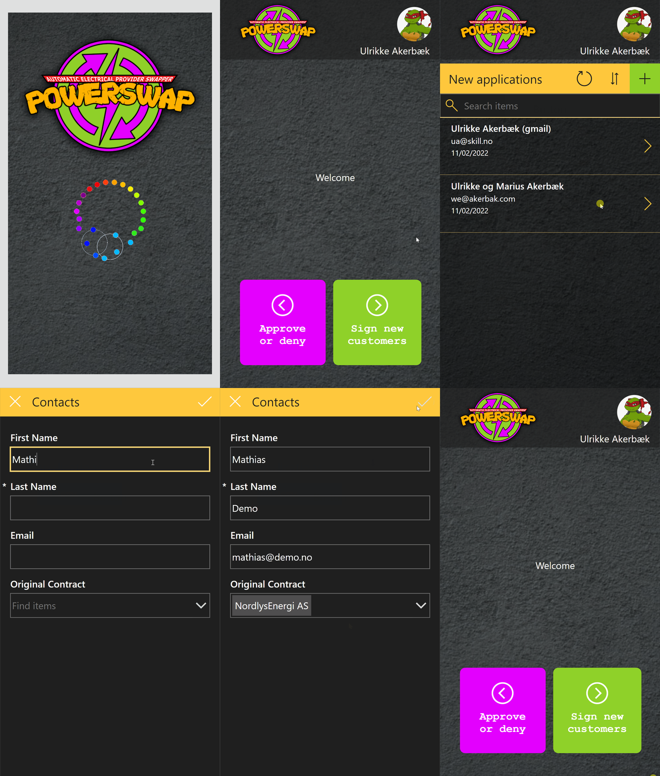
Cohesive branding across platforms and applications is important for the end user and create trust in the application. That’s why it’s important to have the same primary colour profile, images, fonts and logos across the platform. Also, applications need to be joyful and delightful to use. Good design is invisible in a sense. When it done right the user doesn’t think that it’s good design; it’s just “the way it’s meant to be”.
Seller Canvas Apps
Sellers on the go need to easily and swiftly approve or deny incoming contracts form new customers. We have open registration on our portal, and that means that anyone can sign up for å power agreement. Before we can start swapping electricity contracts for new customers, we need to manually check each one to know that it’s valid.
When creating interaction designs it’s good to look for established design patterns that exist and that users are already used to. For example Tinder’s Swipe Gesture. We waned to use the swiping as a was of approving or denying new contracts.
We used this tutorial:
Adoption is a key
If you want to increase your app adoption (for whatever reasons: revenue, targets or just ambitions) you have to care about UX (User Experience). Swipe behaviors can help you with that. How?
- Positive effect of the Swipe gesture is connected to our brain neurology. The move, if used in a write context, contribute to a feeling of empowerment in the user. The more positive effect your app has – the higher is its adoption.
- The tendency to abandon a shopping session is often attributed to choice paralysis — the inability to make a decision in the face of too many options and too much information. Swipe supports a binary output: yes or no, right or wrong, accept or reject, left or right.
- Swiping behavior are more attractive to mobile users
- Swipe will be natural in eCommerce, gastronomy and all company processes that requires binary decisions preferably with an image information
(Source: https://medium.com/app-partner-academy/the-psychology-of-swiping-in-apps-464895b2b485 )
Another point is that gallery control in Power Apps may cause delay in items display when user quickly scroll so using swiping behaviour with one item display at a time can positively influence overall app UX.
This is what the finished app works:

You can see the loading screen that engages the user right away while data loads into the application. At the start screen you can open the “Approve or deny” screen, or a form for creating new customers.
The “Approve or deny” first show the list of new agreements to give you a sense of the work load. Then when you open an agreement you can swipe right to approve – get to a success screen – or swipe left to deny – and get to a “successfully denied” page.
You can also create new contacts from the list page. When a seller is on the go it’s important that they easily can sign new contracts.
