
SOS Operator life is hard, and even harder when you have to handle everything on a SOS-by-SOS basis. In order to aid operators in dispatching the correct resources and communicating preventative measures, MaMNT have now set up a Power BI dashboard that gives operators an overview of the current and past situation in the Oslo area.
Being new to Power BI, we explored a number of different metrics that could be useful to operators in report form. Not all of them were feasible, but the heatmap we set up is the crown jewel of the report. It will act as a basis for preventative measures and staffing (turtle) needs around the city.
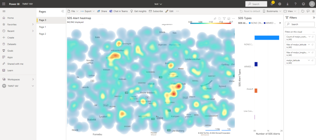
The first page of the report contains a heatmap of SOS calls throughout the Oslo area, which is updated every 15 minutes with new, incoming SOS calls. It also shows the spread of SOS types, and the map can be filtered to specific types by clicking the columns.
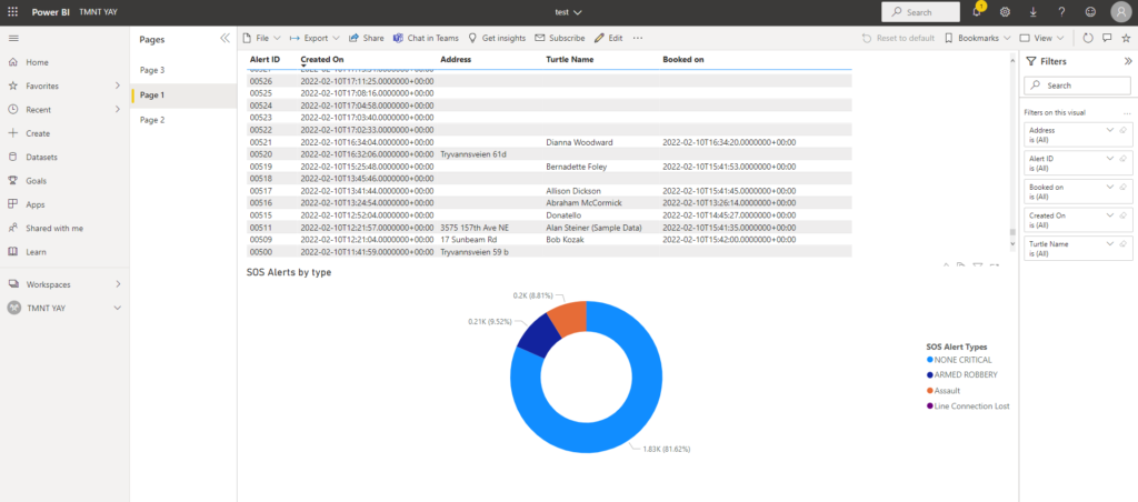
The second page shows a pie chart of the SOS types, combined with a list that shows detailed data on each SOS call.
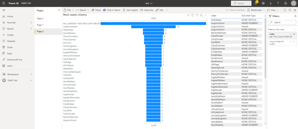
The third page shows the 30 “neediest” citizens by number of SOS calls. The list on the right shows the types of calls made by each of the needy citizens.