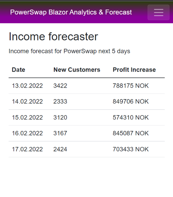
In order to forecast the income for the next coming days (Pizza Money)
The turtles have created a Blazor app to forecast the income:
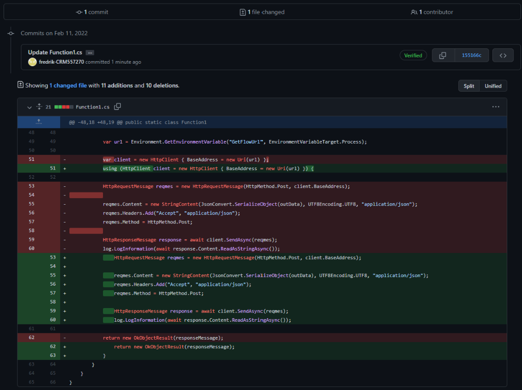
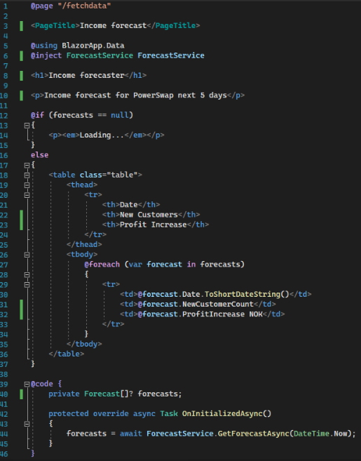
And here is the awesome razor code for that page

In order to forecast the income for the next coming days (Pizza Money)
The turtles have created a Blazor app to forecast the income:
And here is the awesome razor code for that page
User Experience is very important to PowerSwapCorp. To create great user experience we make sure that our visual identity is clear and consistent across all apps; for the customer as well as for the backoffice.
To start with a strong and clear visual identity is important. This is a guideline that all developers follow and will be embedded into all applications and communication we do as a company.
Logo
The logo comes first; it needs to depict the spirit of the company and tell you something about the company’s tone of voice. Our logo has a cartoony fell to it, has bright colours and high levels of contrast between the colours. This makes for an unserious appearance, a light and playful personality and personal tone of voice.
We created three versions of our logo – for different purposes.
The full logo looks like this:
The icon-version is the circle without the text. This version works well as icon, favicon in the browser and app icon.
The version with only the text is suitable for business apps and other applications where there is limited vertical space:

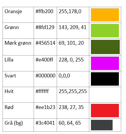
Colours
We get the primary colours from the logo, and use them to get attention, provide usability clues and add playfulness. The colours are:
Fonts
We wanted to use a special font that has the same associations as the logo and the colours; unseriousness, youth and innovation – but add a flare of techiness and geekiness. That’s why we chose the Google font “Source Code Pro” as our primary font.
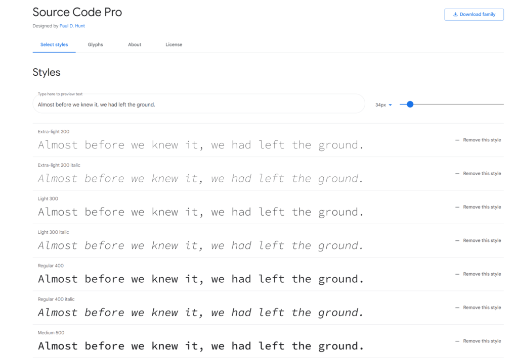
You find the font here: https://fonts.google.com/specimen/Source+Code+Pro
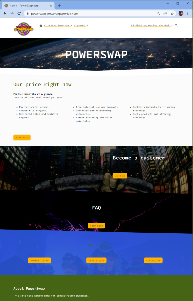
The customer portal is branded with the logo, our font and the colours. It’s the most important window out to our customers, and therefore the most important way we can infuse our brand.
Visit the portal here: https://powerswap.powerappsportals.com/
First, we made sure the favicon (browser icon) is our icon-version of the logo.
Then we implemented a theming system using SCSS based on bootstrap. Portals are built on Bootstrap 3.3.5. The font is added as well as images that enforce our visual brand as playful and fun.
Customers can sign up in the portal by themselves, but sellers are also on the road selling to customers. We created a canvas app that enables the sellers to sign new contracts on the road from their phone. It’s also branded to to enforce the brand. This is important for employee apps as well as customer apps, as it will enforce the brand presence.
We also have PowerBI reports for the end under; embedded on the portal. This report also have branding with colours and logo according to the visual profile.
This report is also a tool for management when they need to follow up on customers savings and how the business is going.
Of course the business apps the backoffice is using to handle all the customers, the contacts, their contracts and other related tables is branded.
This concludes the branding and glossy pixels for our solution.
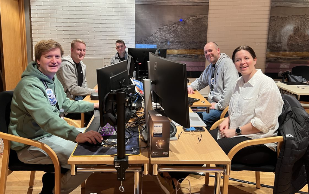
The team kept an extremely good team spirit throughout the day, we meet up at 07:45 am to start hacking!
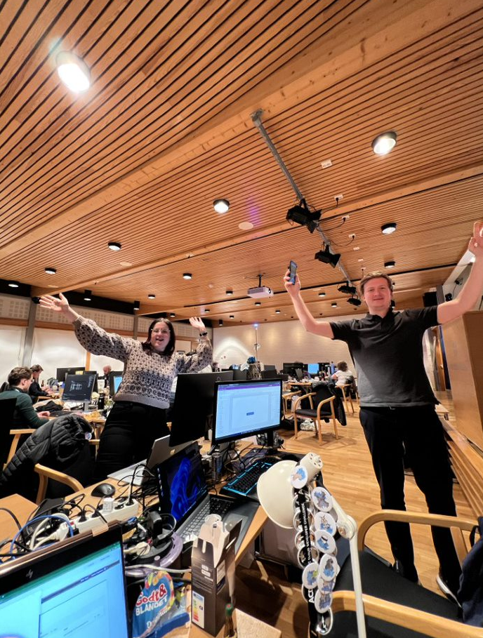
Throughout the day we started to feel the need for that little extra, so we got it!
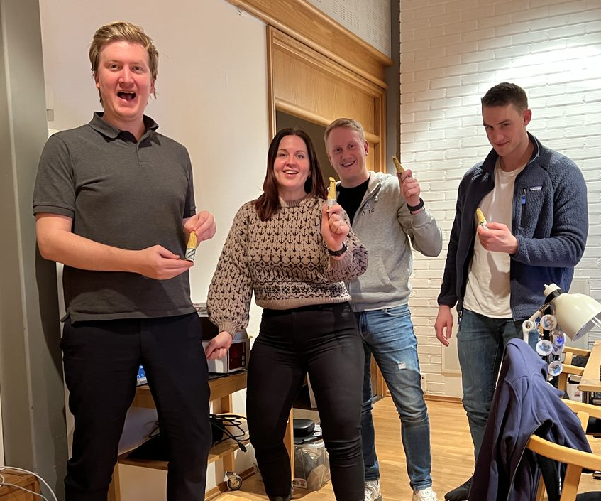
Later on, another team turned on their speaker and started playing music!

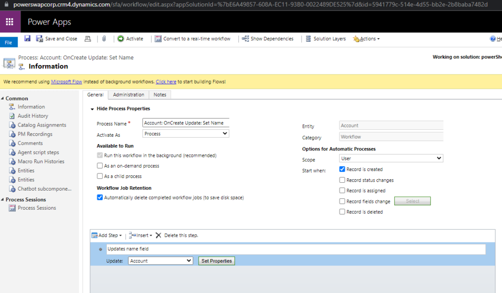
As a CRMguy started developing and customizing CRM before it came under Power Platform I’m used to editing and customizing in the old editor. It’s said it won’t be supported for much longer…
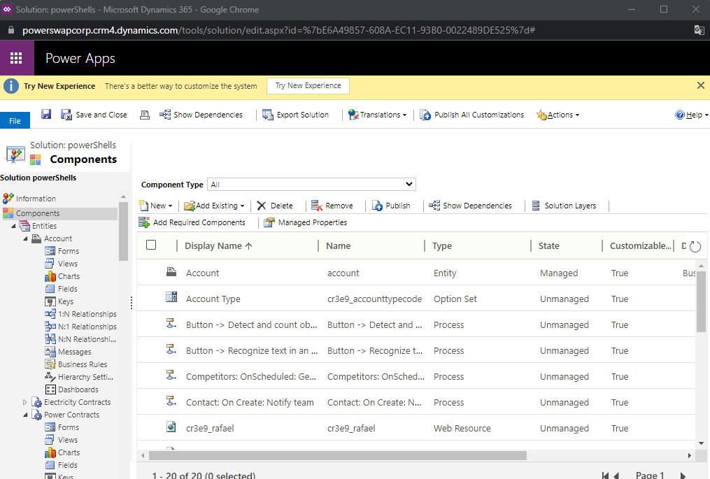
At the same time, we are also using old-type workflows to set values on Account, instead of Cloud Flows.

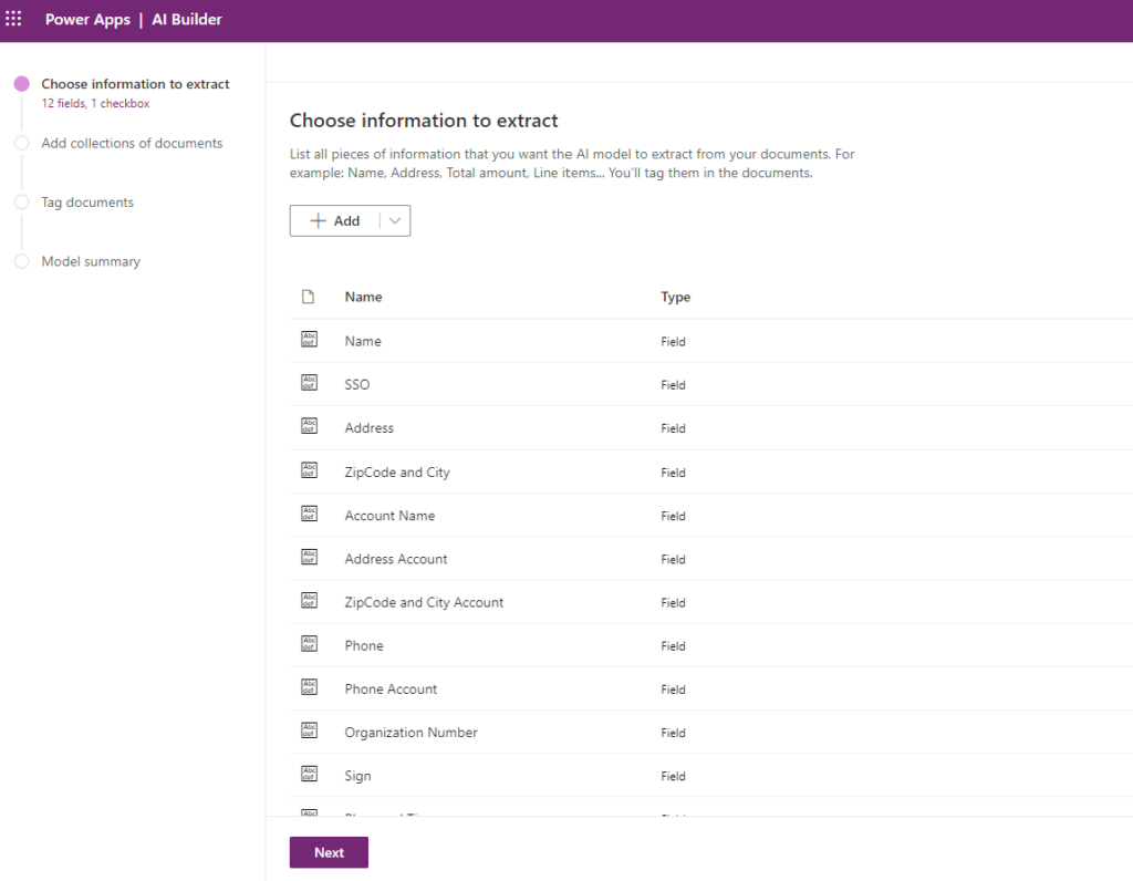
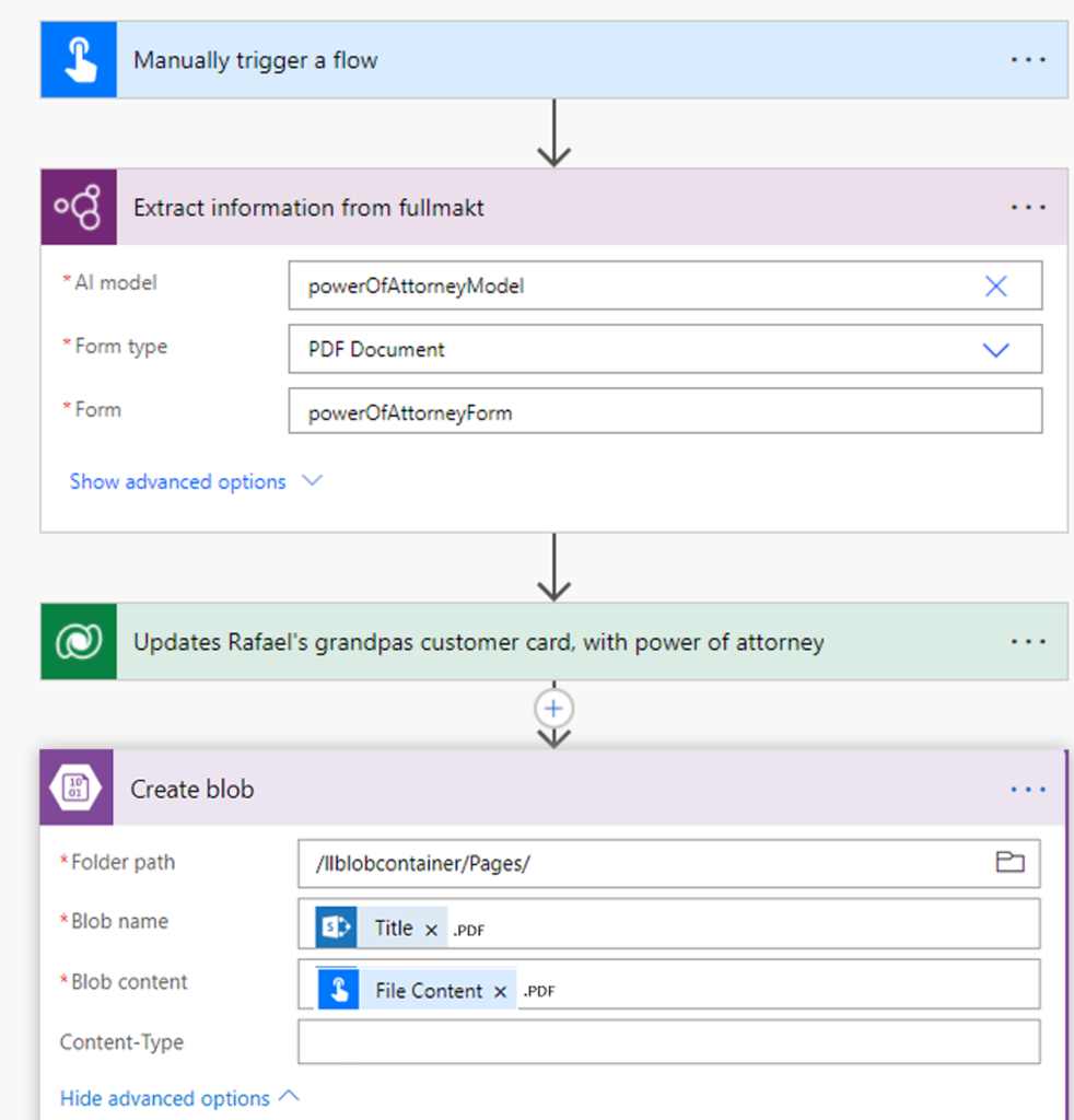
Rafael is starting to get happy with our product and recommended this to his grandpa. The issue is that he doesn’t have “BankID for Mobil” to sign the deal. This makes it necessary to add functionality for him to sign a paper, scan, and send.
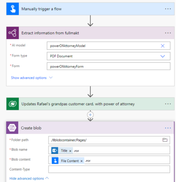
Using Word we created a document that Rafael’s grandpa could sign. Using AI Builder with text recognizing we could bring out this data and add the operational data to DataVerse and store the document in a safe place.
We started by creating an AI Builder model to get fields from the document
After training this model based on our document, we have created a flow that has an input of a document. This is where we will be sending the PDF in, to analyze and get the values from it. After getting the data from the document that is needed on the contact card, the PDF is sent to Azure Blob for storage.
In this post, we will demonstrate using images and text to show the judges what we have developed and created since yesterday.
We have sorted our data in DataVerse to properly store everything we need to show the end customer. So today we have been creating a couple dashboards for our end users.
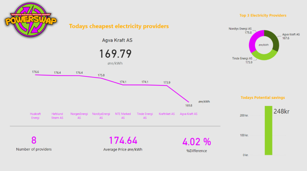
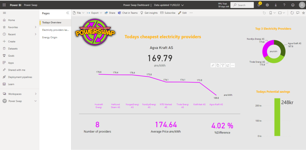
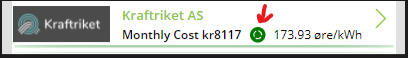
“Today’s Overview” page are showcasing today’s electricity price and the provider with the best and lowest price. It is easy to compare between electricity providers and get an overview of how today’s market behaves. You can also see your maximal potential savings.
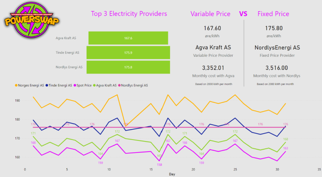
The “Electricity providers last 30 days” page gives the customer an even greater overview of the current market situation. All the electricity providers are matched up against the Spot Price, and it is easy to spot the providers with the biggest fees. We have also included a comparison between the cheapest variable price and the fixed price.
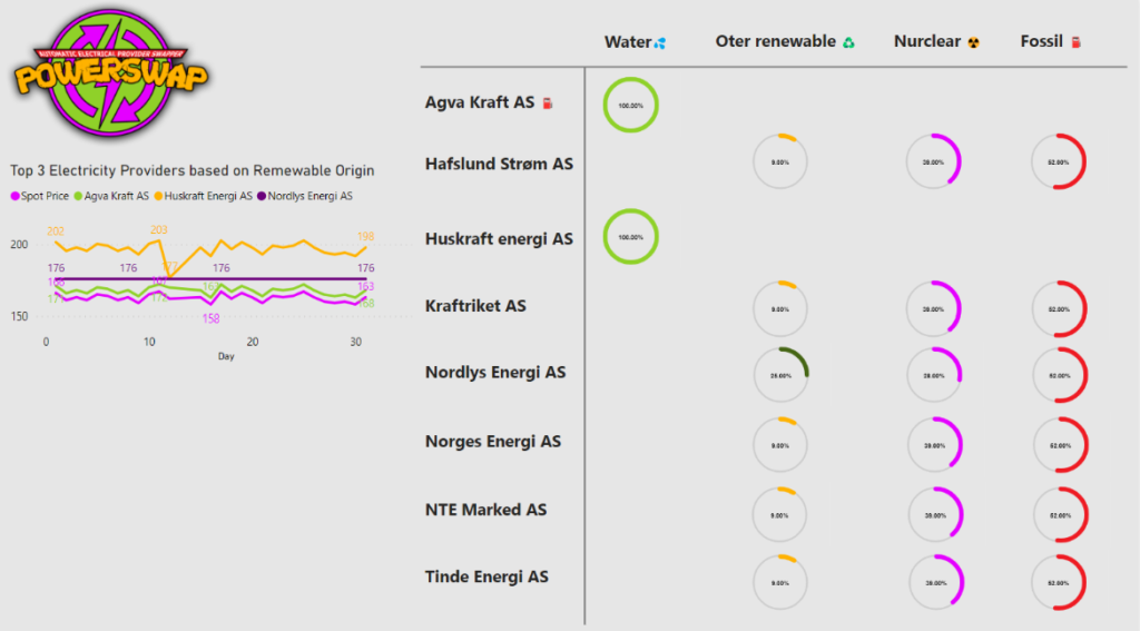
We have created a great-looking dashboard with three pages for potential and current customers. “Today’s Overview” page are showcasing today’s electricity price and the provider with the best and lowest price. It is easy to compare between electricity providers and get an overview of how today’s market behaves. You can also see your maximal potential savings. The “Electricity providers last 30 days” page gives the customer an even greater overview of the current market situation. All the electricity providers are matched up against the Spot Price, and it is easy to spot the providers with the biggest fees. We have also included a comparison between the cheapest variable price and the fixed price. The “Energy Origin” page gives you an overview of where the electricity is generated between the providers. And to the left in the graph, we can analyze the top three providers with the most renewable electricity and compare it to their electricity price
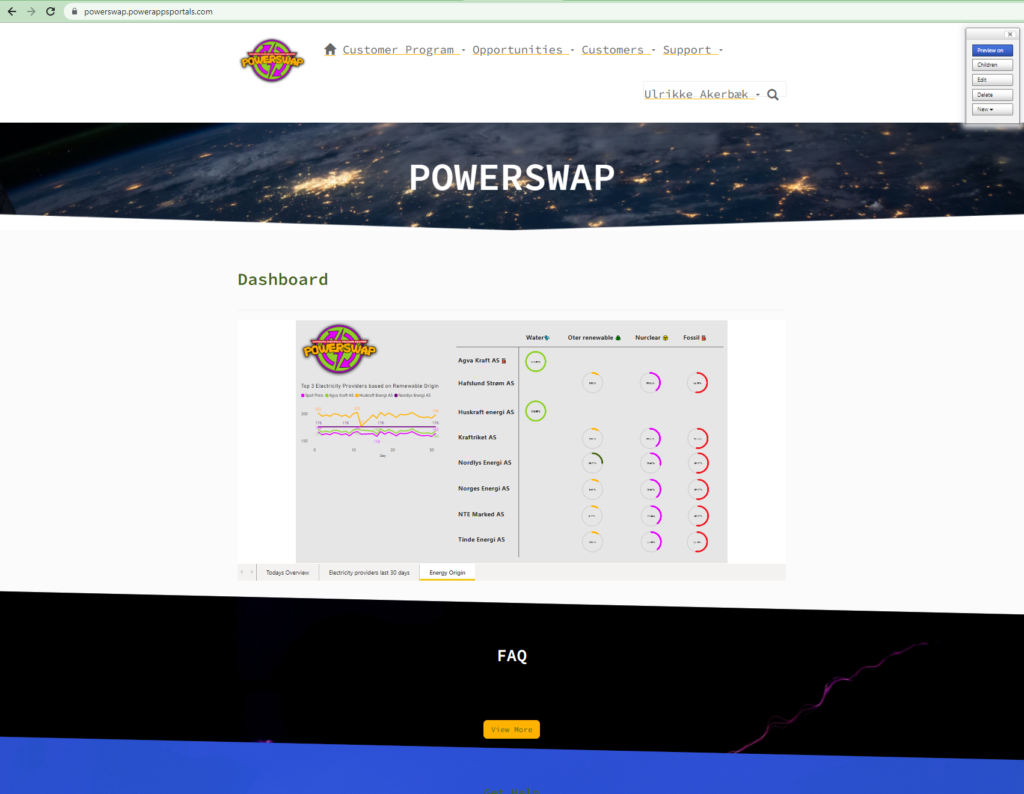
We have embedded the dashboard in a Power Apps Portal for our customers to view. This will serve as a dashboard for them to get an overview of their spending.
When the user is logged into the portal they see the power bi report on their home screen.
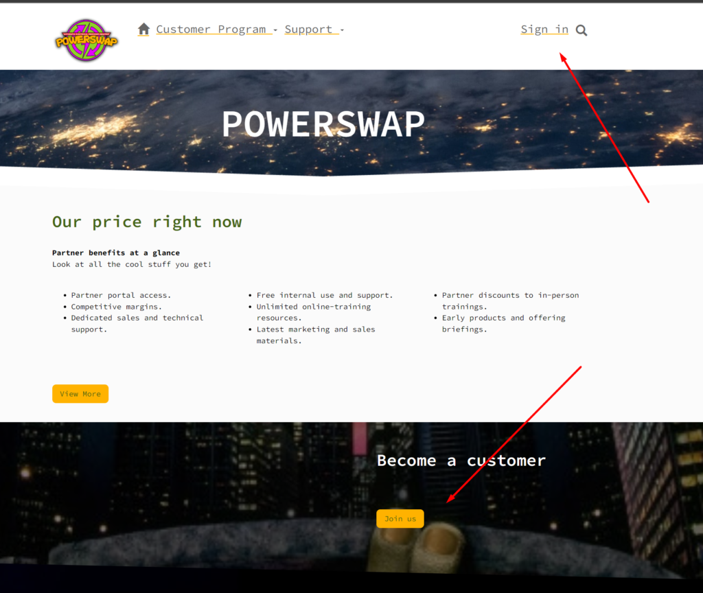
If a user visits the portal without logging in the report is not shown, and instead, they get information about what we offer to our clients, and a section for “Become a customer”
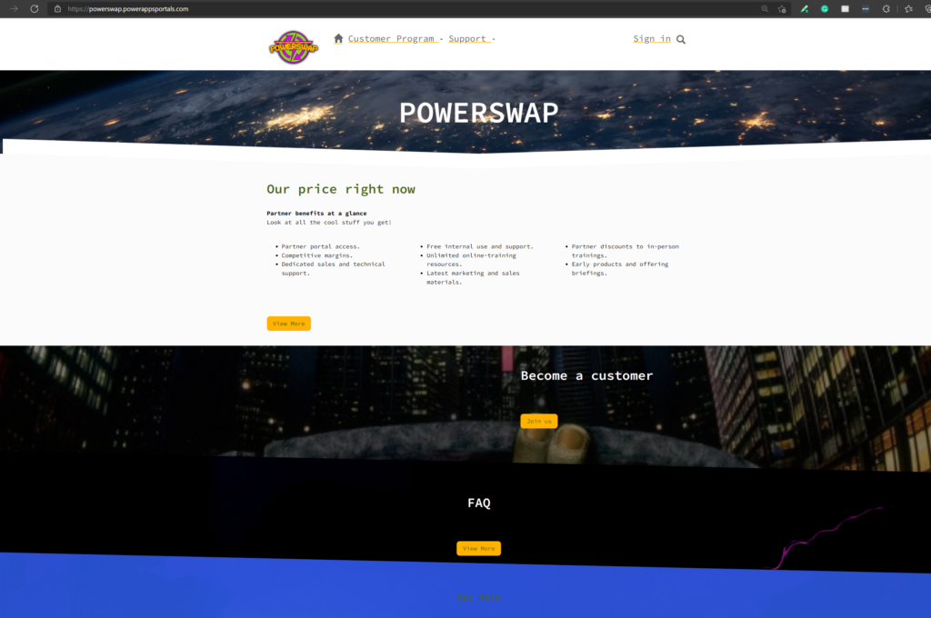
This user portal is built with Power Apps Portals. It’s user-friendly, responsive, and accessible.
Use this QR-code to see the portal on your phone:

You can register as a user and log in with Microsoft or Google account. New users click “Login” in the top menu – or click the “Join us” button in the “Become a customer” section on the home page.
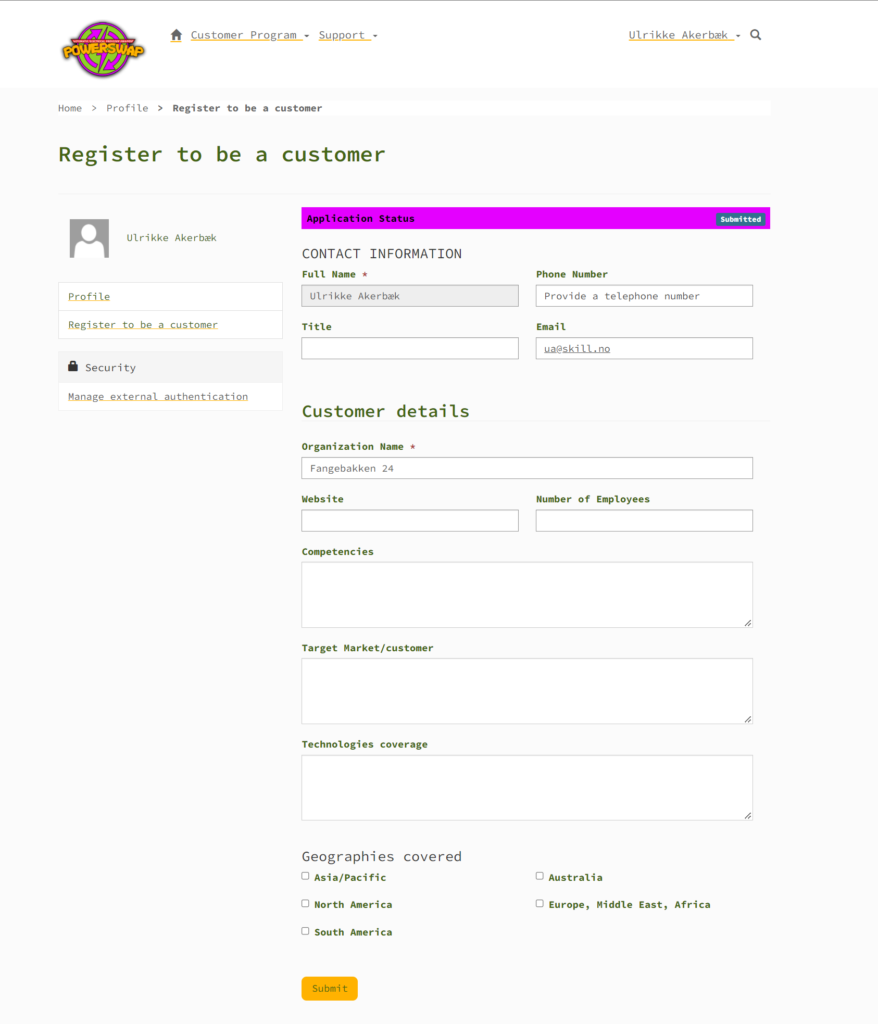
Clicking the “Join us” will take you to an information page telling you more about our offering and let you start the process of becoming a customer:
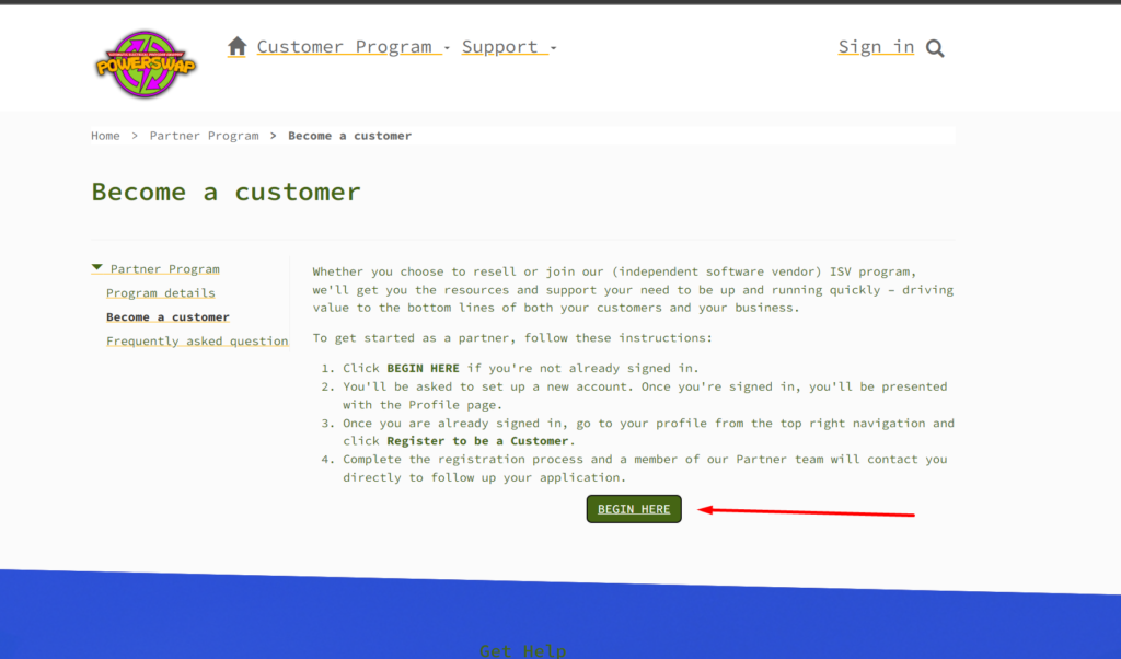
Clicking “Begin here” takes you to the “Sign in” page. You can register as a user by selecting the “Register” tab.
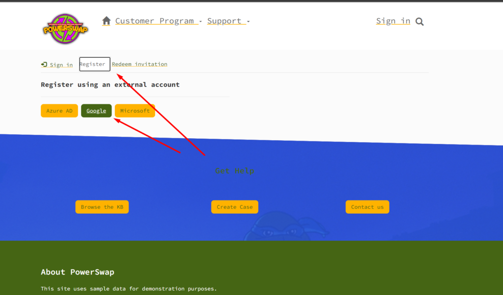
When you have access to the portal as a new user you are able to register to be a partner. Right now the form is a default form, but we will add options here for customers to choose what kind of electricity they want (green, cheap, or destructive).
When the application is sent, it appears in an app for the salespeople to review.
What’s next?
We’re working on a Canvas App for salespeople on the go, where they can accept/deny applicants and sign new customers.
Then we’ll set up flows that automatically send emails to new customers when they apply and also when their applications are denied/approved.
Our first customer
We were also able to test our solution on a real customer, Fredrik was the first man out to test this functionality on this home.
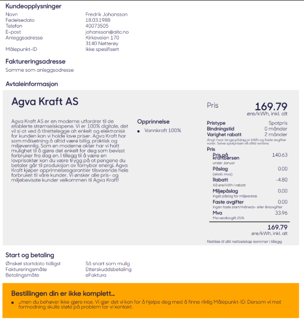
Our first customer has signed up and automatically changed his contract
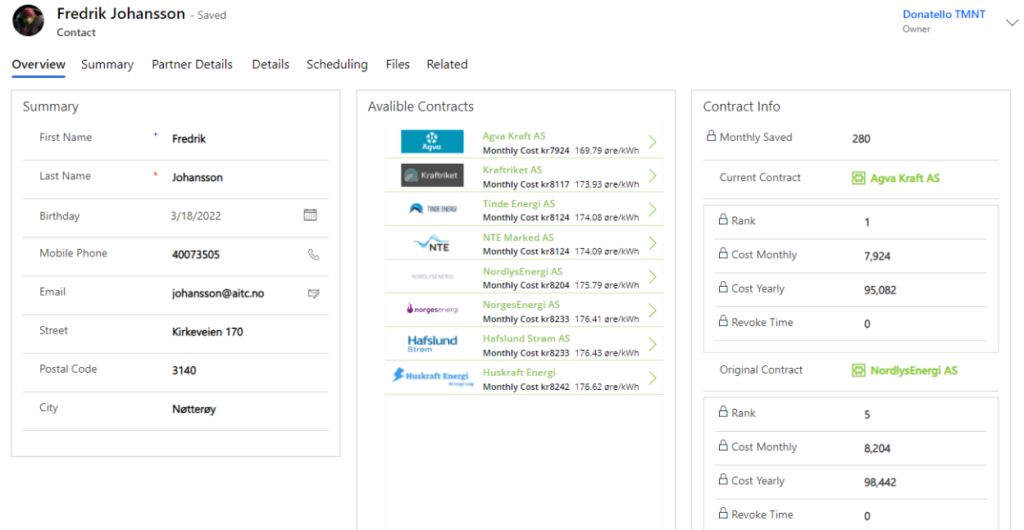
He also received a receipt
What about grandpa without Bank ID for mobile?
Rafael had a concern when he recommended this deal for his grandpa because he was unable to sign with Bank ID for mobile. So it would be necessary to write a paper contract, scan this and submit it to us.
We created a flow to receive this document, and build an AI model to read out the content and add the relevant information on the contact form. Then we stored the document in an Azure blob for the archive.
Business value and how we are going to make money from this business idea
Our services are proven to be a great business idea and an idea that adds value for our customers. But how are we going to make money and maintain a healthy economy within Power Swap?
For now, we have two main income sources, the first one is the “Swap Fee”. Swap fee is a one-time fee we will charge the customer every time they swap electricity providers, but we will not charge any fees if the swap didn’t save the customer any money. We will only charge the customer 10% of the amount our customer saves on a swap. This means that we have a low-cost service and a service that benefits both parties only when a swap is profitable. 10% of a profitable swap may do not seem much of a profit, but remember this is a service that will swap providers in high volume, and with a customer base in Norway of 3.2 million and an even bigger customer base overseas, will this fee be a great income.
Our second income source will be our “Premium Providers”. Premium providers stand for a group of electricity providers that pay us a monthly fee for being a part of our premium program. So now you may ask yourself, what is this premium program? Let us tell you… A premium program is a group of providers that we will treat as a preferred electricity provider when two or several providers offer the same electricity price. If the are two or several providers with the same electricity price, that both are “Premium providers” we will run a randomized picker and choose one of them.
How do we communicate with all the contract vendors
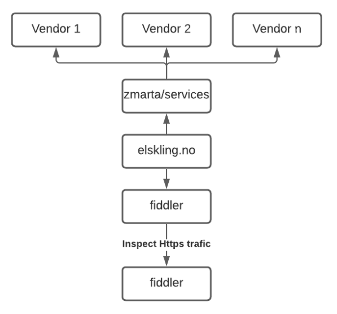
First, we found a basic site that that have a list of all contract vendors.
We reversed engineered their solution with fiddler in order to find what apis they used.
We found one for the contracts and one for signup.
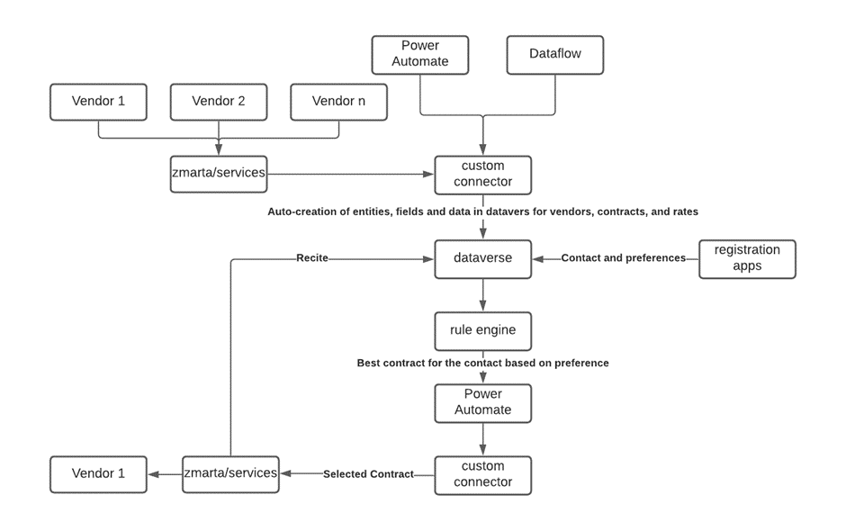
From this api information we created our own custom connector, so all the apis we need are available in the Power Platform
This is how we than use the connector to get contracts and change customers contracts on an hourly schedule.

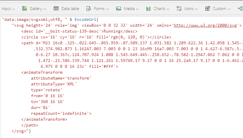
We have used HTML5 inside Canvas App to add blurry line shadows between each contract in the list.
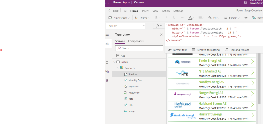
In order to symbolize reusable energy, we needed to add a rotating image that scales.
This is not possible in a canvas app without some custom HTML
The solution was SVG tags
We have created a great-looking dashboard with three pages for potential and current customers.
“Today’s Overview” page are showcasing today’s electricity price and the provider with the best and lowest price. It is easy to compare between electricity providers and get an overview of how today’s market behaves. You can also see your maximal potential savings.
The “Electricity providers last 30 days” page gives the customer an even greater overview of the current market situation. All the electricity providers are matched up against the Spot Price, and it is easy to spot the providers with the biggest fees. We have also included a comparison between the cheapest variable price and the fixed price.
We have created a great-looking dashboard with three pages for potential and current customers. “Today’s Overview” page are showcasing today’s electricity price and the provider with the best and lowest price. It is easy to compare between electricity providers and get an overview of how today’s market behaves. You can also see your maximal potential savings. The “Electricity providers last 30 days” page gives the customer an even greater overview of the current market situation. All the electricity providers are matched up against the Spot Price, and it is easy to spot the providers with the biggest fees. We have also included a comparison between the cheapest variable price and the fixed price. The “Energy Origin” page gives you an overview of where the electricity is generated between the providers. And to the left in the graph, we can analyze the top three providers with the most renewable electricity and compare it to their electricity price

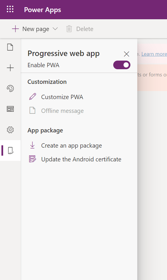
“Enable your portal as a Progressive WebApp (PWA)” is a preview feature that will go GA in February 2022. This is pretty hipster.

When Portal is enabled as a PWA it can be published to Google Play and Microsoft Store and be used as a native app on mobile devices

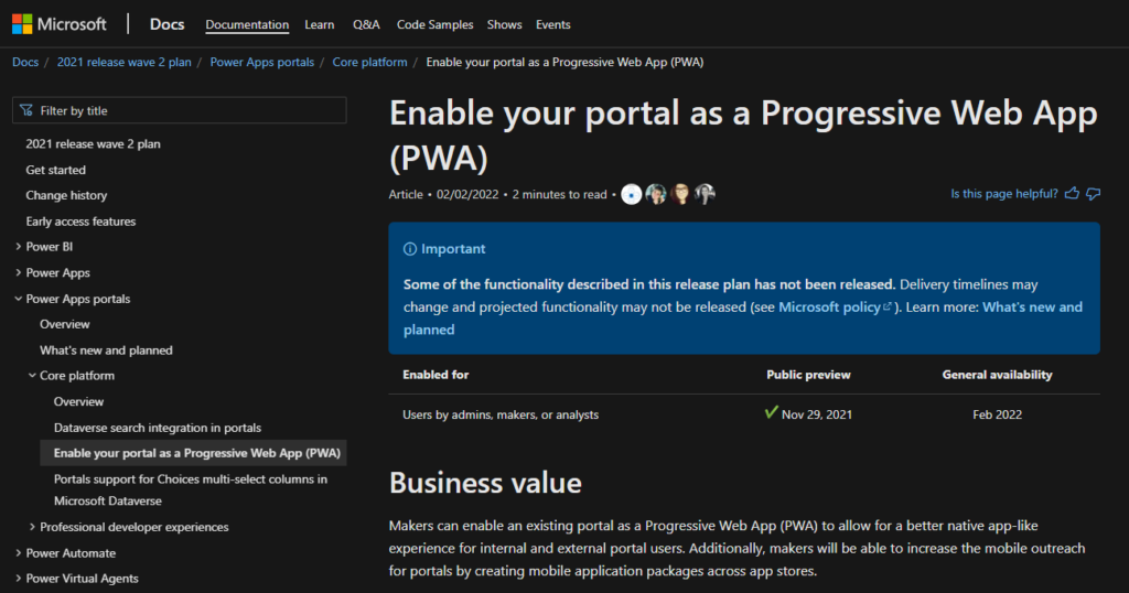
Enabling the portal as a progressive webapp means that users will experience it as a mobile app on their phone. It can also be packaged and uploaded to Microsoft Store and Android Google Play.
We want the end user to have a mobile app on their phone where they can see what kind of agreement they currently have, look at reports on their agreement history and see forecast on what their price will be in the future.
Microsoft documentation here: https://docs.microsoft.com/en-us/powerapps/maker/portals/build-progressive-web-apps
Open make.preview.powerapps.com
Identity the portal and click the element menu. Click “Edit”
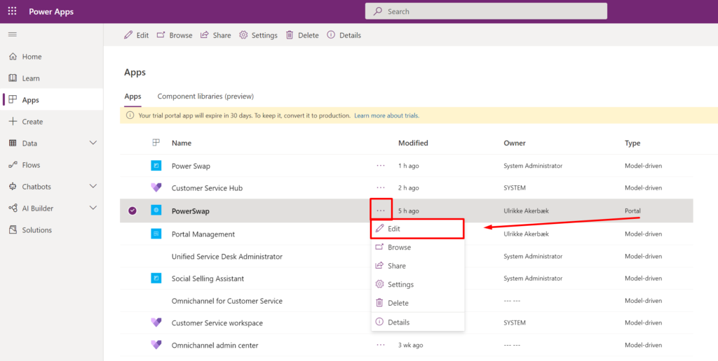
This will open up Power Apps Portals Design Studio.
When it has worked a little while it’s good to go.
So “preview” that it doesn’t work..
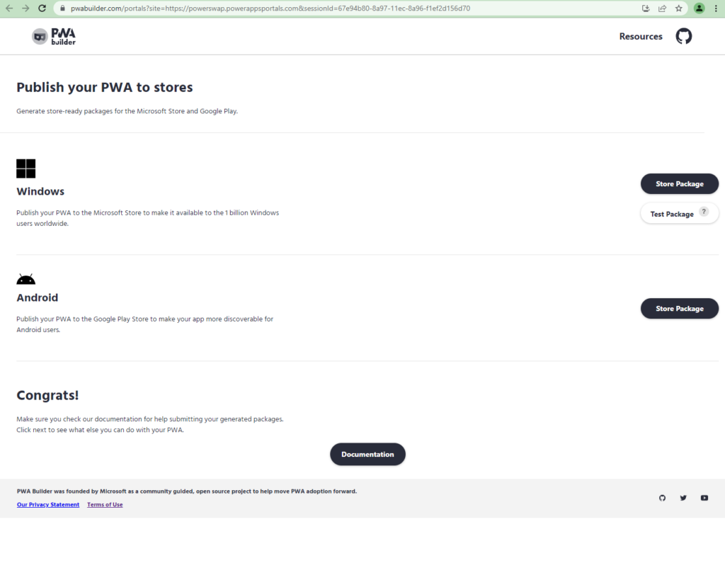
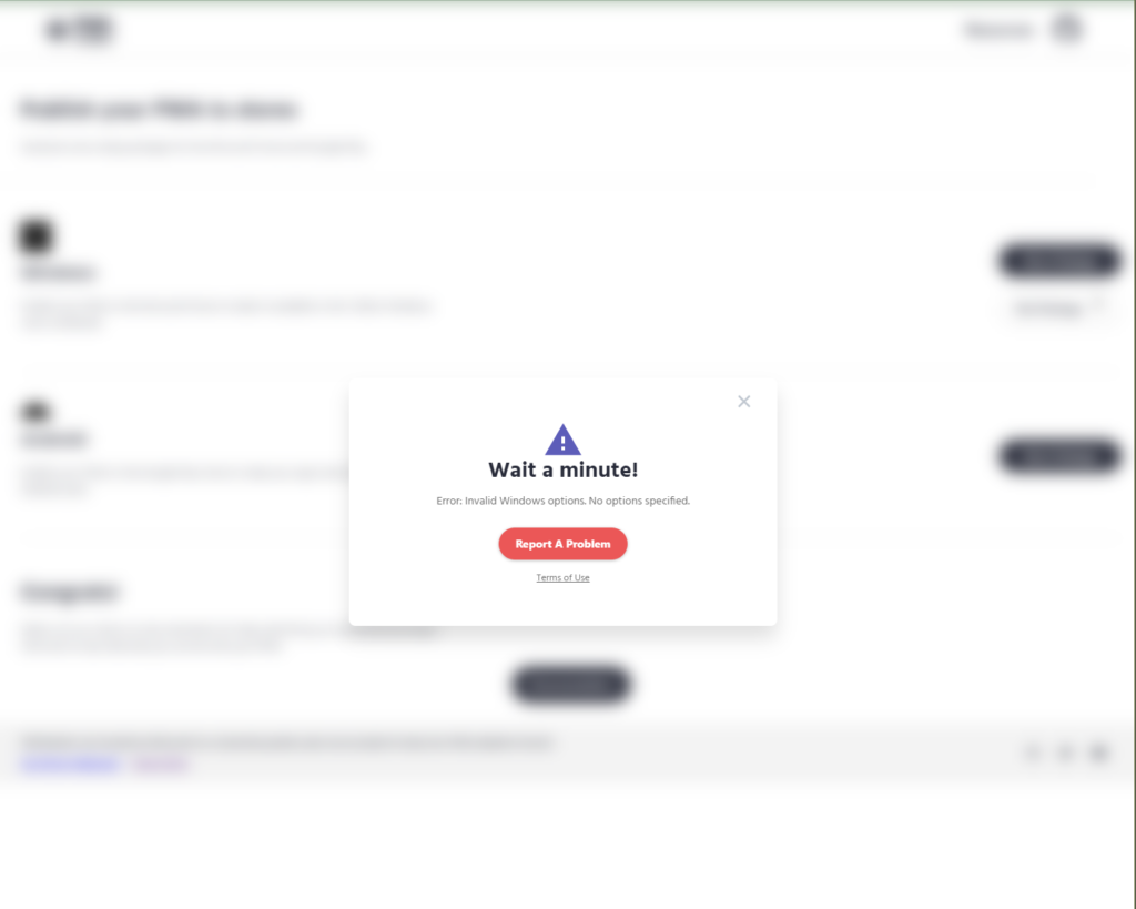
We wanted to upload the app to Microsoft Store and Google Play so users can have it as a native app on their mobile device. This is proving difficult, and it’s apparent when working in the PWA Builder that things are not quite ready..
We care about quality and have made our solution available for everyone to contribute.
We have also contributed back! And “Skill Bombshells” have received some good updates